
İçindekiler
Aydınlatma ve gölgelemeyi anlama
Kumaşların ve Baskıların Renderlenmesi
Kumaşları ve dokuları keşfetmek
Suluboya
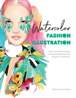
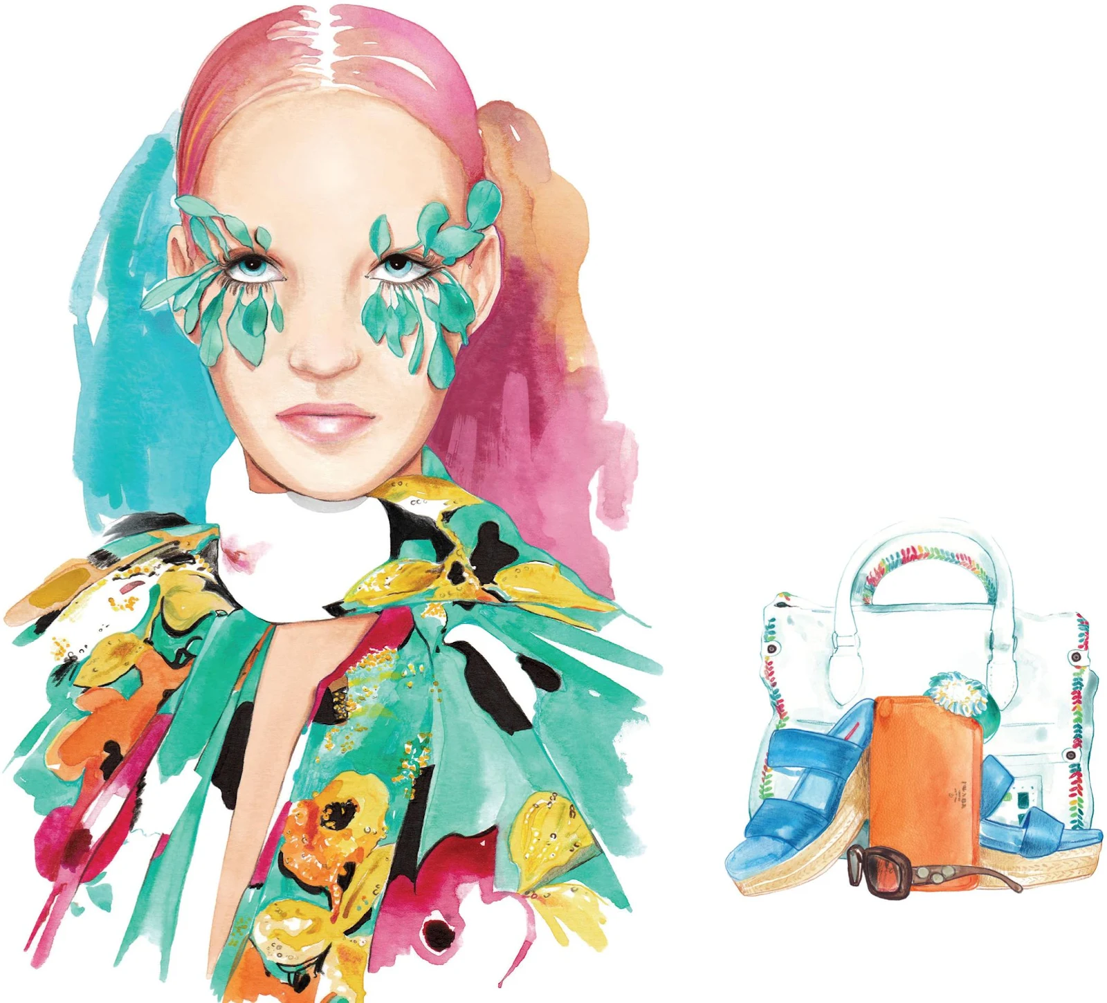
MODA
İLLÜSTRASYON
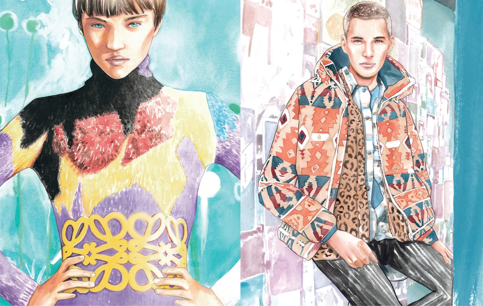
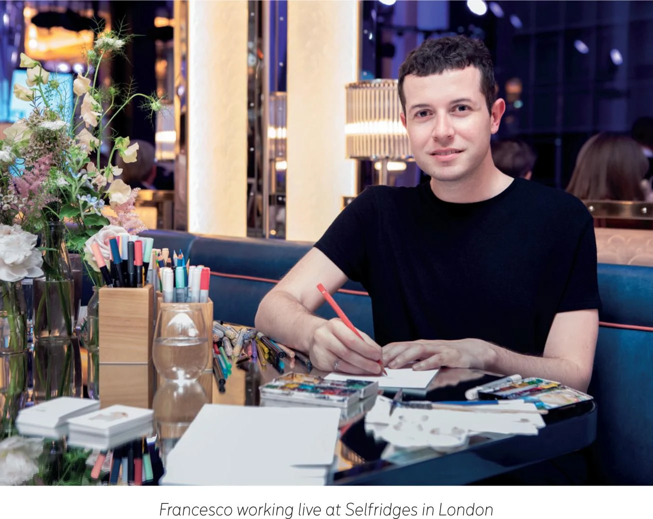
Francesco Lo Iacono

İçindekiler
Aydınlatma ve gölgelemeyi anlama
Rendering kumaşlar ve baskılar
Kumaşları ve dokuları keşfetmek
Önsöz
Bu kitabı açtığınızda bir keşif yolculuğuna çıkacaksınız, suluboya resim yapmanın zorluklarıyla nasıl başa çıkacağınız konusunda desteklenecek ve tavsiyelerde bulunacaksınız. Fırça izlerinin bulanıklaştırılmasından, duygu sıçramalarıyla ifade edilen katmanlı yıkamalara kadar, sulu boya resim küçük ve çevik olabilir; hareket halindeyken çizim yapmanıza veya belki son derece ayrıntılı, hatta soyut veya grafik tipografi yapmanıza olanak tanır. Her seviyeden sanatçının bir palet alıp denemesine olanak tanıyan, çok yönlü ve anlık bir ortamdır. Suluboya resim, eğlenceli, doğrudan ve hatta avangard olabileceğiniz, fırsat ve amaç için bir alandır. Suluboya resim sanatı, tüm izlerinizin açığa çıktığı, görülmeye ve keşfedilmeye açık olduğu, gerçeğin ve özgünlüğün yeridir.
Sanatta güzellik sadece yaptığınız görüntülerde değil, karşılaştığınız insanlarda ve edindiğiniz arkadaşlarda da gizlidir. V&A'da Christian Dior için çizim yaparken, kendi alanlarında lider olan ve modayı yakalama konusunda benzersiz, ilginç bir yaklaşıma sahip sanatçıları arıyordum. Hem suluboya hem de moda illüstrasyonunda sektörde tanınan bir profesyonel olan Francesco Lo Iacono'yla karşılaştım; bu aracı hem moda koleksiyonunun özünü yakalamak hem de özel moda anlarını belgelemek için kullanıyordu. Francesco her zaman modayı belgeleme konusunda ön saflarda yer almıştır ve çalışmalarını ilk keşfettiğimde Paris'teki bir defilede canlı çizimler yapıyordu. Francesco ve ben o zamandan beri birbirimizi şahsen tanıdık ve onun Moda İllüstrasyon Çizim Ödülleri'nin (Fida) elçisi olmasından dolayı çok heyecanlıyım. Fida, sektördeki en iyi moda illüstratörlerini sergileyerek dünya çapında moda illüstrasyonuna yönelik yeni bir vizyonu temsil ediyor. Fida, bu topluluk için bir alan geliştiriyor, işlerini paylaşmalarına ve sergilemelerine olanak tanıyor, moda illüstrasyonunun ve bir uygulama olarak çizimin gelecekteki vizyonunu sorguluyor, sektördeki rolü ve her ikisinde de nasıl ön plana çıkabileceği konusunda tartışmalar yaratıyor ticari moda reklamcılığı ve zanaatkar imaj yapımı.
Hem sanat hem de ticari illüstrasyon dünyası için sulu boya resim, parlak ve canlı, hatta karanlık ve kasvetli olma yeteneği nedeniyle çok sevilen bir araç olmuştur. Suluboyalar geçmişteki ve günümüzdeki pek çok usta zanaatkarın alet çantasında bulunur: Manzaralarını veya ilham perilerini yakalayan David Hockney ve William Turner ile Tracey Emin'in narin otoportreleri. David Hockney'in belirttiği gibi, “Sulu boyayla izleri kapatamazsınız. Resmin yapılış hikayesi var, sonra resim başka bir hikaye de anlatabilir.”
Sanatta olduğu gibi, moda illüstrasyonunun da, sulu boya ve mürekkep konusunda tutkulu bir ressam olan ünlü David Downton, moda figürünü en doğrudan ve düşünülmüş fırça darbeleriyle yakalayan Antonio Lopez ve Kenneth Block gibi usta suluboya sanatçıları vardır. Francesco, nihai sonuçlarını düzenlemek ve iyileştirmek için suluboya ve teknoloji becerilerini birleştirerek bu ortamı modern bir çağa taşıyor. Zengin, canlı tonları her zaman keyif verir ve her oturuştan sonra izleyicinin damağında daha fazla tat bırakır.
Francesco'nun genç bir çocukken ilk sulu boya setinin gökkuşağı paletini ortaya çıkarması gibi, bu kitap da size kendi izlerinizi yaratma ve kendi hikayenizi anlatma olanağı verecek.
Sanat sadece nasıl çizileceğiyle ilgili değil aynı zamanda vizyonunuzu paylaşmanın ve daha parlak bir konuşma yaratmanın bir yoludur.
Patrick Morgan RCA
Fida Kurucusu ve moda sanatçısı
GİRİİŞ
When I tell people that I work as an illustrator, it’s not always easy to describe my job or explain what I do. It has been—and still is—an exciting journey, and for me, one of the perks of being an illustrator is that it’s an ever-challenging and constantly new experience. Drawing is, of course, at the core of my work. I’ve always loved drawing. Like many, I started when I was still a child. I vividly remember drawing in my primary school books, filling them with sketches and impressions, and I feel like I’ve never stopped.
Of course, my practice has evolved since then. During my academic studies back in Italy, I fell in love with watercolor, which has become my favorite artistic technique by far, and I started to explore photography as well.
Photography eventually led me to fashion, and not long after, I decided to move to Paris, where I briefly worked in the womenswear department of a trend-forecasting agency. During that time, I felt like all of my interests could be combined in fashion illustration, and from that moment on I’ve worked hard to make this my full-time job. Over the years I’ve also trained as a teacher, led some classes in Italy, and, more recently, tutored a monthly fashion life-drawing class for over two years in London. It has been a very enriching experience, and I see this book as the natural following step.
Using this book
Over the following pages, after a brief overview of the materials I use daily, we’ll start to explore the basics of watercolor. I’ll share some essential information about lighting and shading, the first principles of color, and some further notions about fashion illustration. Following up, we’ll focus on the human figure, with specific information about the face, hair, and body, then later we’ll move on to how to render fabrics, textures, and prints with watercolor.
THE TUTORIALS
The core of the book is represented by a series of twenty tutorials. These projects have been conceived to take you gradually from the basics of watercolor fashion illustration to more articulated artwork. Completing these tutorials will allow you to build up a strong portfolio that investigates womenswear, menswear, accessories, beauty, and more.
This book is filled with all my love for watercolor and fashion illustration. It highlights my method and way of working. Page by page, I’ll give you meaningful insights and tips about my modus operandi, with the aim of supporting your vision in order to find your voice and explore your own universe.
YOUR FASHION ILLUSTRATION JOURNEY
I would love for you to see this book as the beginning of your explorations into watercolor fashion illustration. More than that, I wish for this journey to be packed with joy, curiosity, and excitement, which are to this day the foundations of my practice.
A BRIEF HISTORY OF FASHION ILLUSTRATION
The blooming of modern fashion illustration in the early 20th century is inextricably linked to the historical, social, and economic background that led fashion to develop as a real and profitable business. Fashion magazines like Vogue and Harper’s Bazaar were beginning to flourish in the USA alongside the new fashion industry, and they needed to show their readers the key pieces and trends of each season. This offered a spotlight to fashion illustrators and their art. The covers and pages of these magazines presented faithful renditions of the garments and their textures, inspiring desire in consumers and contributing to the development of the fashion market.
This period is often considered the “golden age” of fashion illustration, but it hit a setback when photography revolutionized the industry, giving a more accurate and true representation of the clothes. Although on the one hand this limited the role of fashion illustration for many years, it also allowed its transition to exciting new ways to explore fashion, trends, and style. It enabled illustrators to push the boundaries of creativity and eventually cemented fashion illustration’s position as an alternative to photography.
Over the decades, pivotal figures like René Gruau, Antonio Lopez, and Jean-Philippe Delhomme, among many others, led the way for a new generation of illustrators that have given new worth to fashion illustration. Without the need to portrait and render fashion precisely, illustrators have had the chance to propel their artistry to new levels and in different directions, laying the foundations of contemporary fashion illustration. Now the accent is on expression, inspiration, interpretation, and much more.
Tools and materials
As the first stop on our Watercolor Fashion Illustration journey, let’s have a basic look at the tools and materials available. I’m going to highlight the materials that I use regularly and list some others that you may want to try out according to your needs.
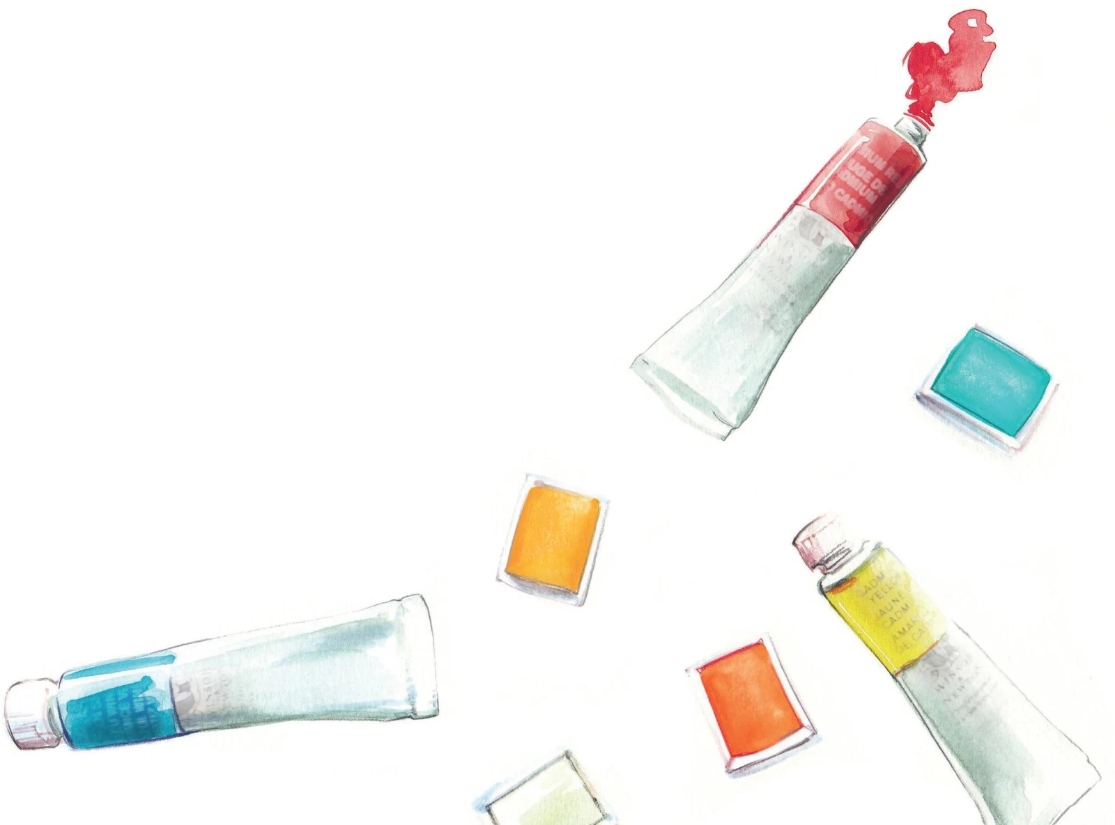
PAINTS
Watercolors are usually available as tubes or pans. I use both, even though I have a penchant for the latter. Pans are little dried “cubes”, meaning that they need to be rehydrated before use. They are long-lasting, handy, and the best option for when you’re traveling or need to work fast. A twelve-watercolor pan set is a very nice, easy way to get started with watercolor, and it’s actually something that I still use to this day. You can create many shades by mixing just a few colors, and you’ll gradually learn how to do this (see see Exploring Watercolor: Understanding Color), so you won’t need many pans at first—especially if you’re a beginner. If you find other color options you’re interested in, you can add them to your set little by little.
With tubes, you can use the paint direct from the tube for some particular effects, or just add water in a more conventional way. Mixing colors with tubes is definitely easier when you need a lot of paint as it’s a bit less complicated than with pans, where you need to prepare your mix carefully in advance. I use tubes when I need to cover a large area (an abstract background, for example). Remember to put the lid back on your tube every time, otherwise the paint will dry out.
If you’re a beginner, watercolor pans are possibly easier to use as you have more control, but try both and see what works best for you. Also, you can, of course, mix pans and tubes in the same work.
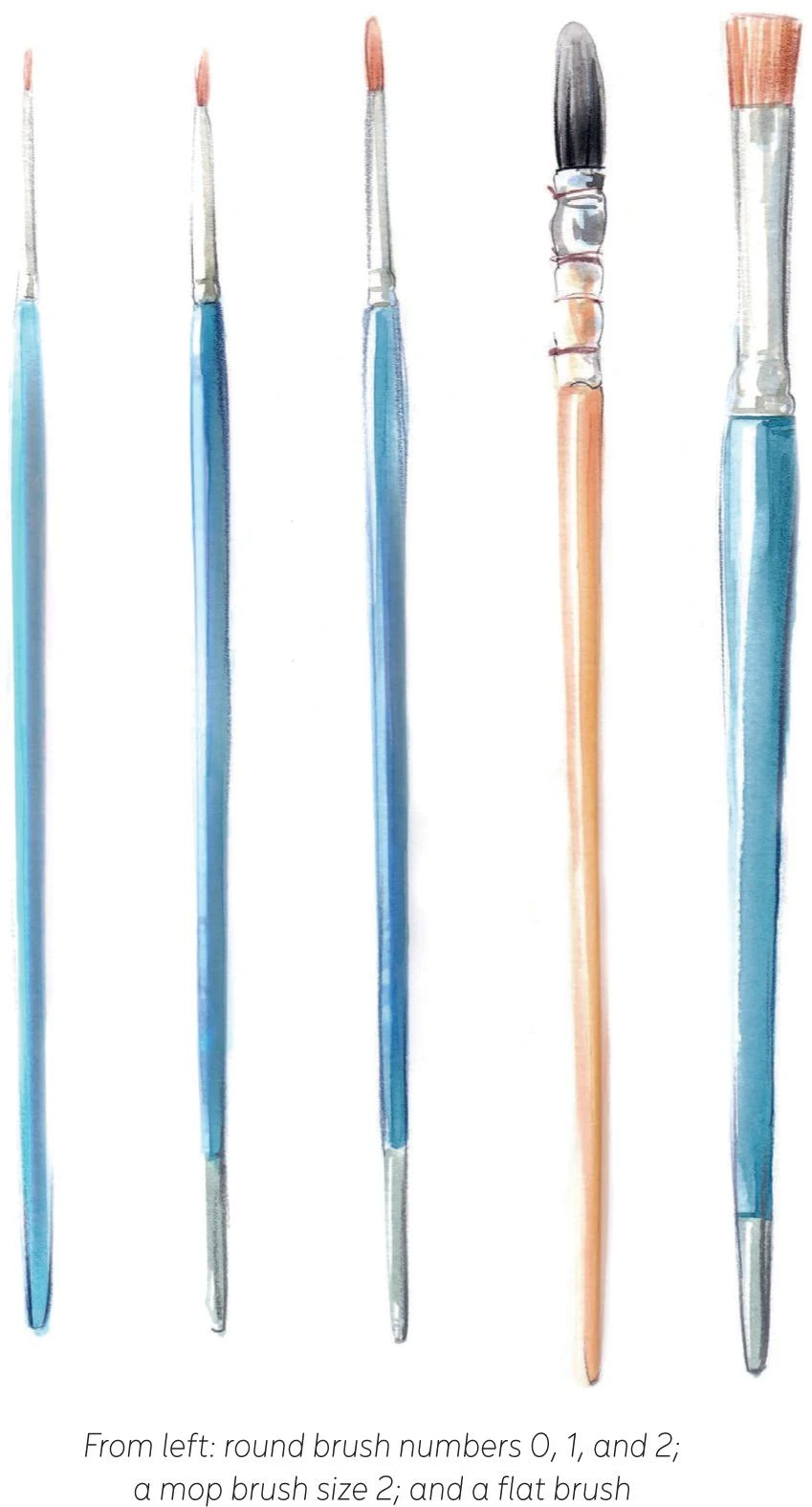
BRUSHES
Sometimes people underestimate the value of brushes, but I would say that they are equally as important as the paints. There is a wide variety of watercolor brushes available, and each type creates a very different effect. That’s why you should have a basic understanding of brushes and put them to the test to see what’s most suitable for your work.
We can sort watercolor brushes based on their hair type, shape, and size. A good brush should hold a nice quantity of water and paint, keep a fine point, and maintain its original shape once it has dried. Animal-hair brushes usually have all of these qualities, so they’re considered as the best quality, however this means that they can also be quite expensive. A synthetic brush, or one that’s a mix of animal and synthetic hair can be a more convenient, cheaper option, but sometimes these don’t last as long as the natural hair types.
BRUSH SHAPES
We also have different shapes of brush, each one with distinctive features. I’m going to show you some of the most common ones and their outcome on paper.
Round brushes. Because of their versatility, these are probably the most common watercolor brushes. A round brush can be easily employed for different strokes, wide or small areas, and also to add detail.

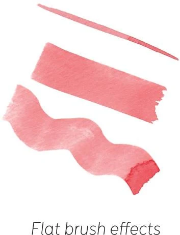
Flat brushes. These are suited to creating precise, sharp, and graphic lines. They can also be really useful for unusual effects and textures.
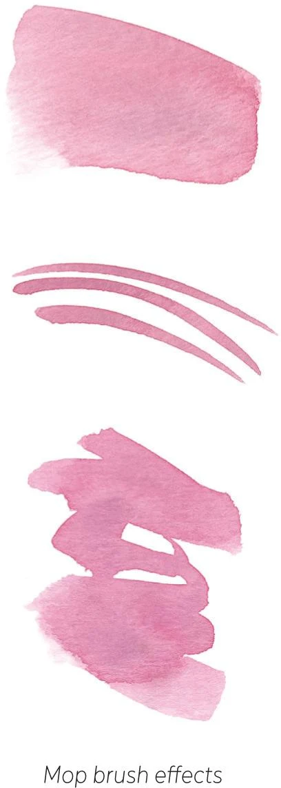
Mop brushes. The unique shape of a mop brush allows you to produce fine lines with the pointed tip, while their irregular form is perfect for creating beautiful, unexpected outcomes. They are also ideal for covering large areas. Mop brushes can be very convenient, and I use them often.
BRUSH SIZES
Brushes come in a great range of sizes—the smaller the number, the smaller the brush. Choosing what will be best for you depends, of course, on the way you’re going to use them. Most of the time I work on A4 paper, so I mostly work with small brushes, plus a few larger ones. I use about five types regularly: three round brushes (size 0, 1, and 2), a mop brush (size 2), and a flat brush. These are the brushes that we’ll use later in the tutorials.
It’s highly important for you to take care of your materials. Be sure to rinse your brushes after each painting session to keep them in good condition for as long as possible.
Once you understand the requirements of your work, you’ll find that you don’t need many brushes and you can seek out the specific brushes that help you achieve the effects you want. Think carefully about what you want before purchasing any new brushes, as the most precious ones can be quite expensive, too.
PAPER
In order to achieve the best outcome when using watercolor, you need the right surface. Watercolor paper comes in different sizes, weights, and varieties. I mostly use the A4 format, or sometimes A5 or A3, and always look for paper that’s no less than 300 GSM (grams per square meter).
There are at least three varieties of paper: hot-pressed, cold-pressed, and rough. Hot-pressed paper is the smoothest, while cold-pressed has a soft texture. Rough paper, as the name suggests, is even more textured. I prefer to use hot-pressed paper as I think it’s the most suitable for my kind of work. Just like with paints and brushes, you should take some time to choose the right paper for your style. Brands carry different varieties and weights that are worth investigating, so explore, and pick the paper that’s best for you.
COLORED PENCILS AND MARKERS
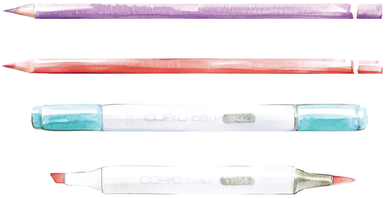
I often use colored pencils and markers in my work. They complement my watercolor strokes, and I mostly use them to add more details once the paint has dried. I am sure most of you are already acquainted with colored pencils, as we often used them as children. I tend to use pencils for small details or to create textures. I have some pencils that I use more than others,such as skin tones, grays, and blacks to accentuate the contrast of certain strokes. Keep your pencils well sharpened and ready for use.
There are several brands of marker available right now. I’ve tried many, but I favor Copic Ciao markers for my kind of work. Made in Japan, those alcohol-based ink markers come in many different colors, and they are often used by designers, architects, and comic-book artists. I find these markers quite useful for accentuating dark tones: with their delicate shades and their soft nib they blend well with watercolor.
MORE TOOLS
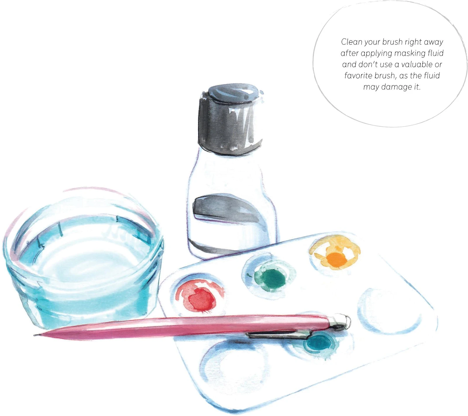
Over the course of our watercolor journey, you’re going to need some extra tools, and you may enjoy playing with their effects as your exploration of this medium continues.
- For the exercises and tutorials in this book, you’ll need a fine pencil for your first drafts. You don’t need anything fancy, as these preliminary lines will be erased. I often use a 0.7mm HB#2 mechanical pencil. You’ll also need an eraser.
- A water jar is, of course, essential. Anything will do, but remember that it’s important to keep your water clean, especially if you’re working with dark colors.
- Another important tool is a palette for mixing your colors. I have two plastic palettes: a small one and another that’s slightly bigger for when I need lots of color. Most watercolor sets come with their own palette, which can be useful, especially when you’re on the go. Keep your palettes clean and aim to use the same spots for dark or bright colors.
- Paper towel can be helpful for removing watercolor strokes you’re not happy with. Use your brush to add some clean water to the area of paint you want to erase, then lift the color very carefully from the paper with a clean piece of paper towel.
- One more tool you can try once you’re more experienced in watercolor is masking fluid. It protects any areas you want to keep clear of color, either to leave white or to keep clean for another pale color. Once the fluid is dry, it peels away to reveal the unpainted area underneath. I seldom use masking fluid, as it’s not strictly necessary for my kind of work, but it can be useful for creating positive/negative space or if you’re creating an intricate print.
EXPLORING WATERCOLOR
I have always found watercolor magical. It’s a versatile medium that allows you to work fast if you’re aiming for a fresh take, or paint more slowly, working layer by layer to achieve beautifully detailed images. Watercolor can be playful, unpredictable, surprising, and whimsical. It requires a little practice to understand and learn the qualities of the paint, but once you start to grasp its magic, I’m sure you’ll fall in love with it, too!
Approaching the blank page
Try not to be afraid, and be patient if this is your first approach to watercolor. You are bound to make some mistakes along the way, and you’re going to need to practice, process, and experience in order to grasp the techniques. You may get frustrated at times, and that’s why, above all, you must remember to enjoy yourself along the way!
Mixing your paints
One of the first things to learn is how pigment and water work together. To master watercolor, you have to understand how to mix colors using the right ratio of these two components. There is no exact recipe that reveals the perfect balance, because it changes according to how you want to use the paint. Next, you need to learn how to apply your paint, understanding how it will interact with the paper, and discover how to make the most of your brush.
For a soft approach to watercolor, we’re going to explore its features through some exercises. This is the time to familiarize yourself with your materials—there’s no better way to put everything into practice in order to get to know watercolor!
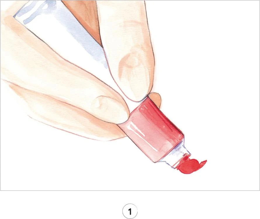
1. For each exercise, you’ll start by preparing some paint on your palette. Squeeze out a pea-sized blob of paint from a tube, or activate your watercolor pan with a drop of water and transfer some color onto the palette.
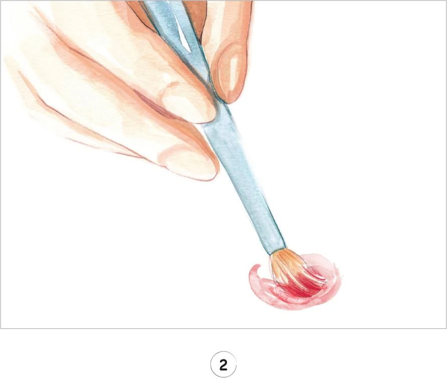
2. Load your brush with water, and gradually mix it into the paint on the palette. Try not to use too much water at first as it’s easy to overdo it, and then you’ll have a hard time controlling the paint.
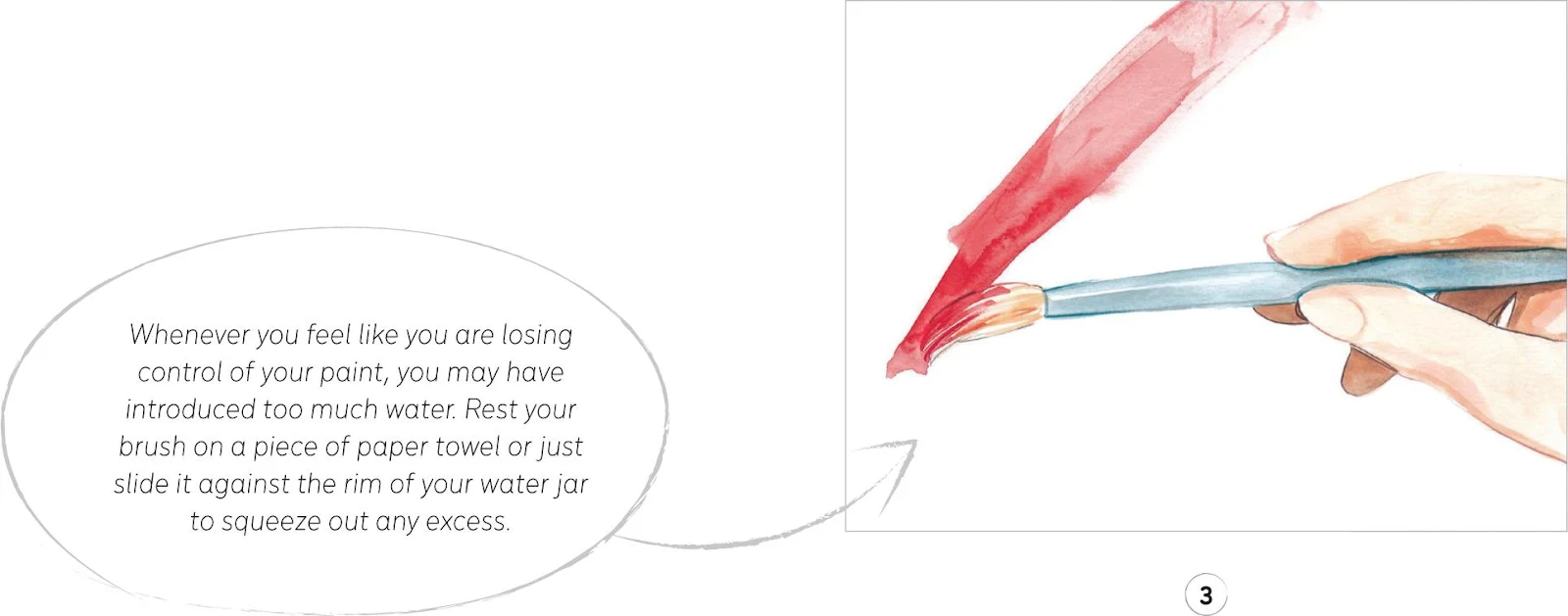
3. With the mix on your palette, you’ll already have an idea of its consistency, but to check if you have the right balance—especially if you’re a beginner—there’s no better way than to try it out on your paper. The mix should flow smoothly, so if you feel like the paper is resisting your brush, your mix may be too dry. Add a little more water. A more diluted paint is also useful for creating lighter tones—we’ll explore this more in Understanding Color.
Practice exercises
Painting with watercolor is a never-ending game to find the right consistency that satisfies you and your particular need at that moment. We’re now going to try some simple exercises to get better acquainted with the paint.
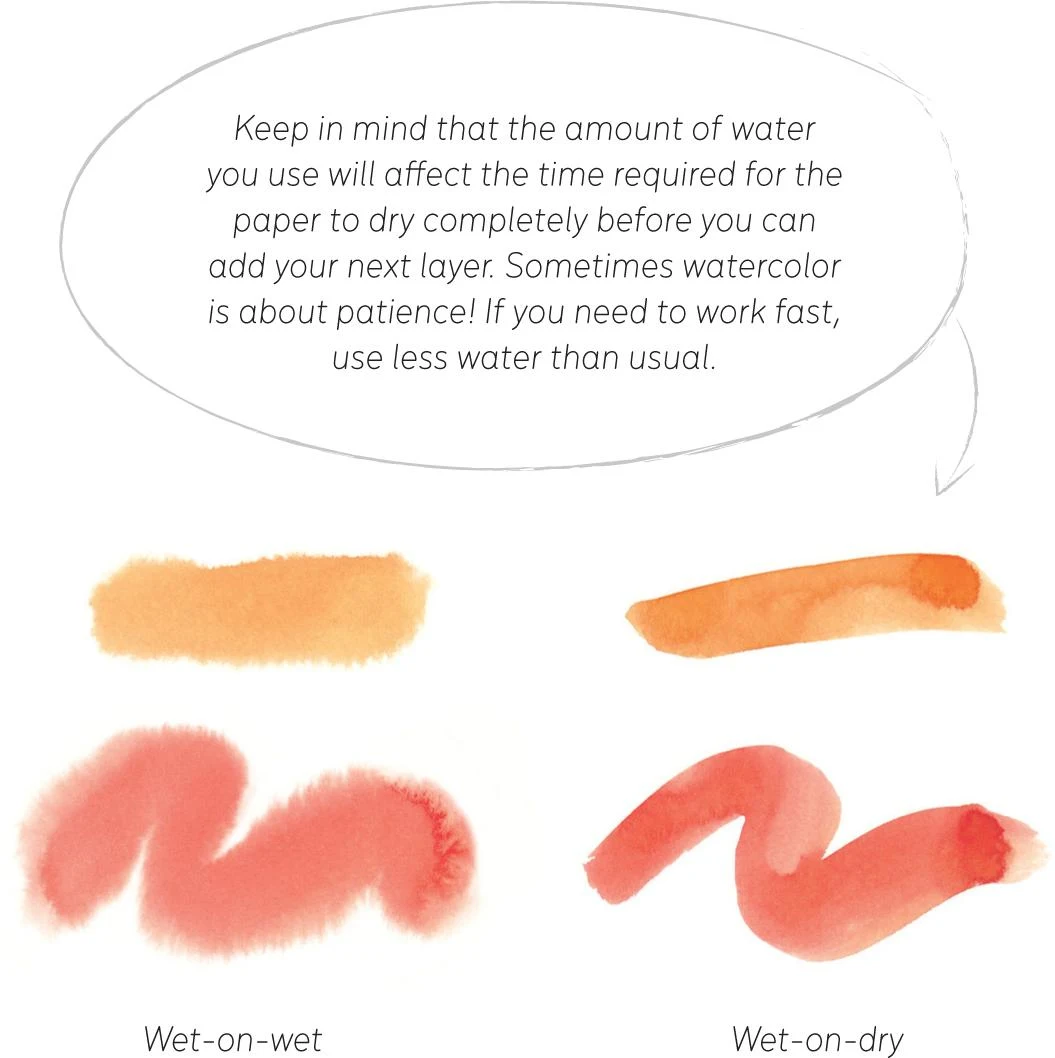
WET-ON-WET AND WET-ON-DRY
Wet-on-wet and wet-on-dry are two possible options for watercolor. For the wet-on-wet technique, first wet your paper using a large flat brush loaded with clean water, then apply your paint to the wet paper. This method is often used by watercolorists to create evocative landscapes, since the pigment will follow the water already on the paper to create smooth shapes with soft edges. This is something I don’t often use for my work as I try to keep my fashion illustrations full of detail, but it’s something worth exploring—for example, you may want to create an effective abstract background for your figure, and this could be developed using the wet-on-wet method.
The wet-on-dry option—applying your mixed paint to dry paper—is the one that I use the most. It’s potentially easier, allowing more control as you build up your artwork layer by layer and giving you time to focus on the details.
WASHES
A watercolor wash is a layer of color applied to your paper. There are different kinds of washes, and they can be considered as the basics of watercolor. We are going to practice some washes here to help you better understand the qualities of the paint. The following examples have been created on dry paper, but you can also use wet paper for a slightly different outcome. Explore and discover what works best for you.
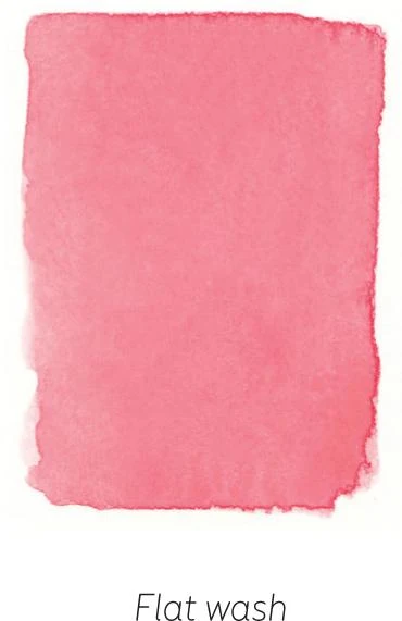
FLAT WASH
The aim of this exercise is to reproduce an even surface. To create a flat wash, load a mop brush with paint, then create a horizontal line. You need to be quick, as you want to add the next horizontal line before it dries, or you could generate some hard marks. Keep adding lines to create a full shape, keeping it as uniform as possible and remembering to load your bush with color for each line.
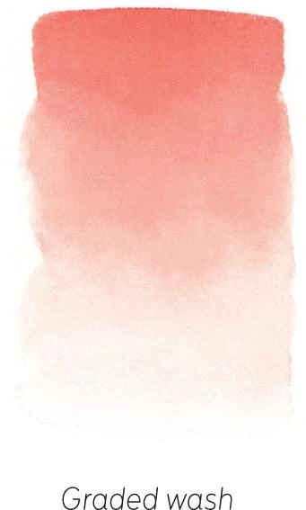
GRADED WASH
Understanding how color works and how to dilute it is crucial as a watercolorist. This exercise shows how to create a smooth transition from dark to light with the same color. Load a mop brush with some color and paint a horizontal line as before, then dip your brush in clean water, without adding more color, and create another horizontal line. Continue to dip your brush into clean water for each new line, until you reach a sufficient gradation.
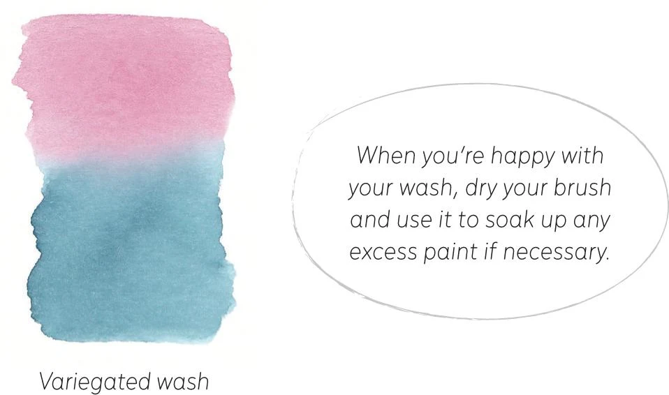
VARIEGATED WASH
A variegated wash works in a similar way to a graded wash, but in this case, we are going to use two colors and let them blend midway. You’ll need to be quite quick in this exercise. Start by creating a horizontal line with your first color, then add clean water for each new line, just like you did for the graded wash. Once you feel it’s time to start the color transition, somewhere around the middle of your wash, turn your paper upside down and load your brush with the second color to repeat the process. As you reach the first color, use your brush with water only to let the two colors blend.
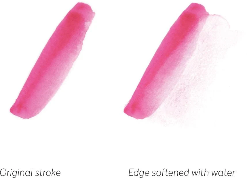
DILUTING EDGES
Another interesting exercise you may want to try out is softening edges by diluting them. With a mop brush, create some strokes and then leave to dry for a while. Now use the same brush (or a smaller one) filled with clean water to dilute the edges, letting them blend with the paper. This technique is extremely useful, not only to improve your work, but also to edit it or correct mistakes. Of course, the more the paint has dried, the harder it will be to soften the edges.
FILLING
Painting is not about filling an area with uniform color. From the start, think about giving a sense of direction and intention with your brush strokes, imitating the movement of surfaces and how the light reflects on them. Starting to think about surfaces in this way will help when we come to look at the next chapter, Understanding Lighting and Shading.
Understanding lighting and shading
For your work to really come to life, no matter what the subject is, it needs to acquire a three-dimensional appearance. You create this illusion based on the observation of light, its direction, and its intensity. It’s fundamental to understand how light works to create successful illustrations, and this is one of the basics of my work—something that I keep in mind and respect whenever I approach a new sketch or illustration.
We’re not able to see light itself, but we can see how a surface reacts to it. In particular, any light hitting a surface produces a shadow. This is how we perceive light, and it’s what we are going to investigate here.
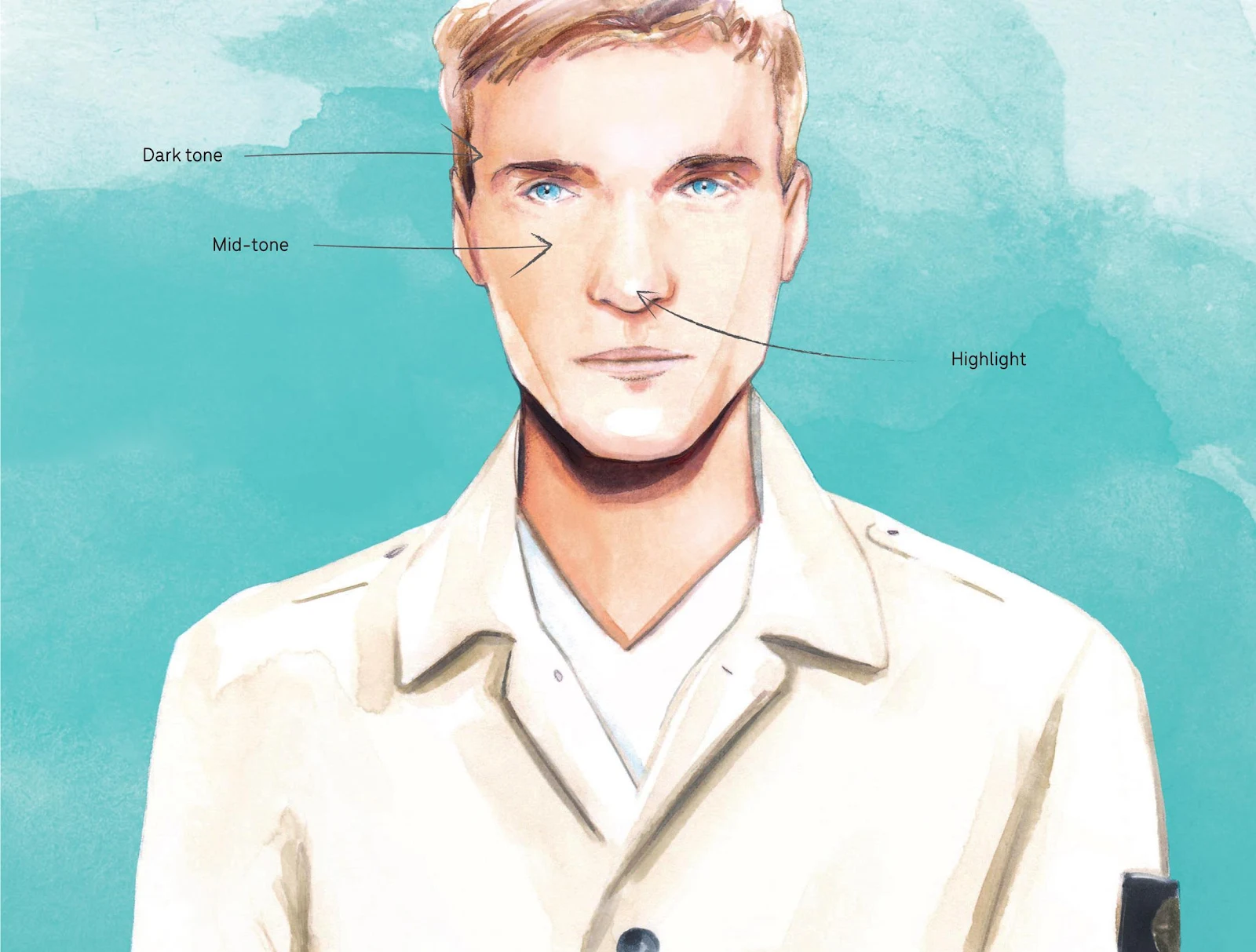
Every time you approach a new work, take a moment to analyze where the light is coming from and how it interacts with your subject. The shadows created are, of course, a direct response to the source of light. They will shape and give depth to your subject and are fundamental in the creation of the illusion of realism to your work.
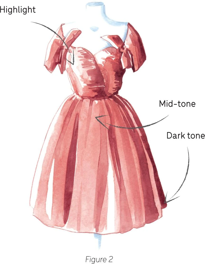
Before you begin, identify these three areas: highlight, mid-tone and dark tone. The highlight is the lightest part of your subject, where the light directly hits the surface. In watercolor, you’ll use the white of the paper as the highlight of your illustration. You’ll start to paint with the mid-tone—the layer between the highlight and the dark tone. It’s the layer where the other two areas blend chromatically. The dark tone is, naturally, the darkest area of your subject and is applied last. By studying the source and direction of light and identifying these three areas, you’re going to create a convincing three-dimensional artwork.
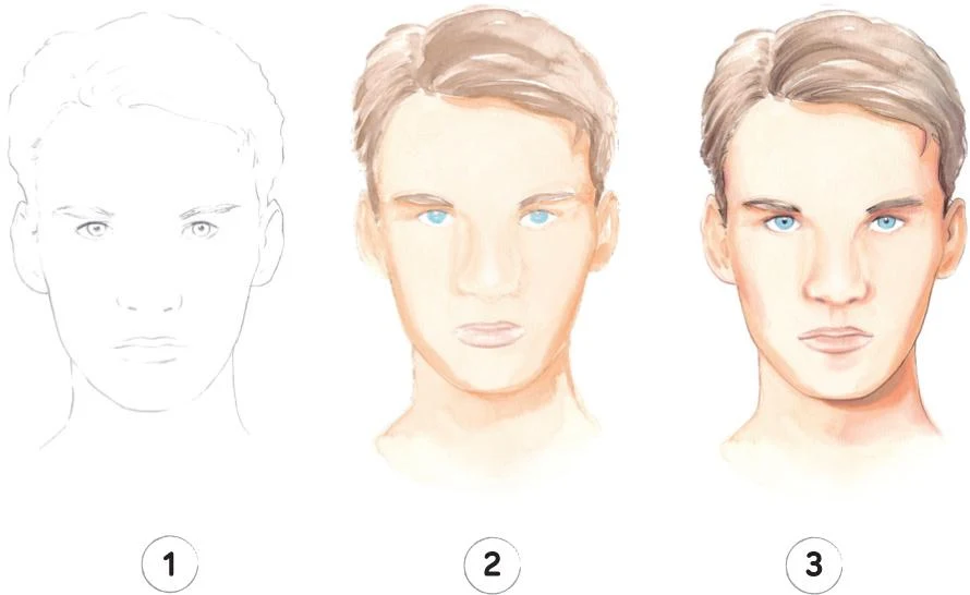
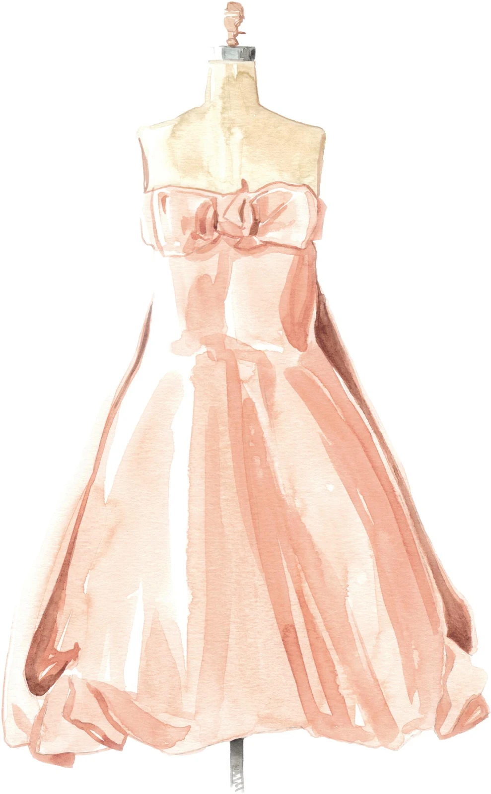
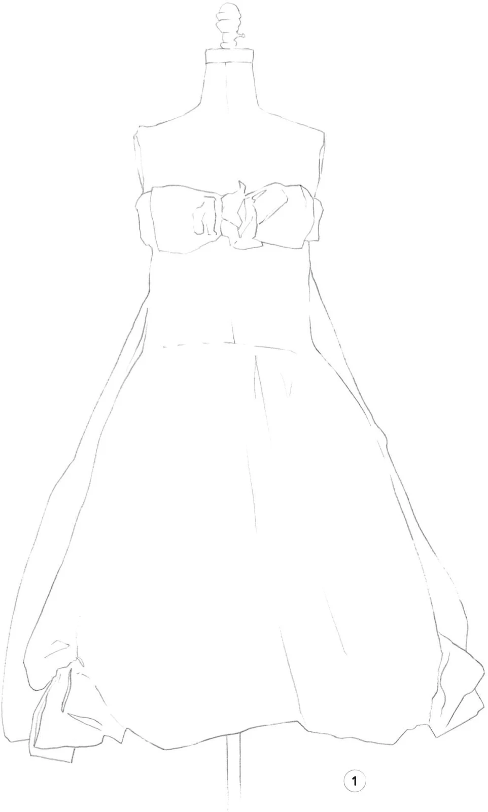
ADDING SHAPE WITH TONES
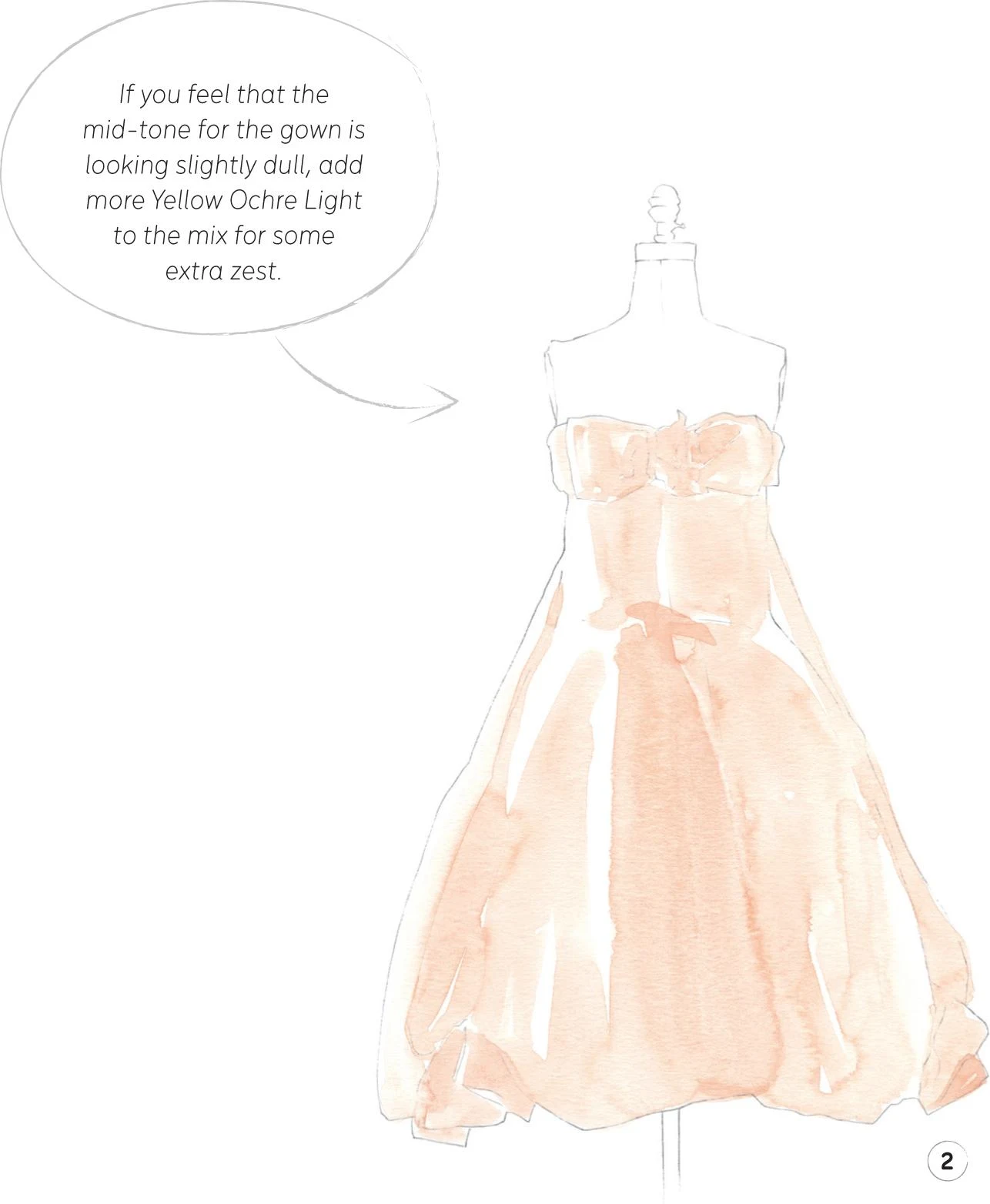
In the previous sketch of a dress, the light is coming in straight from the left. To build the three-dimensional appearance, I created the mid-tone layer first (Figure 1), in a game of superposition. This begins to shape the dress, but also quickly and firmly defines the highlights in the unpainted areas of white paper.
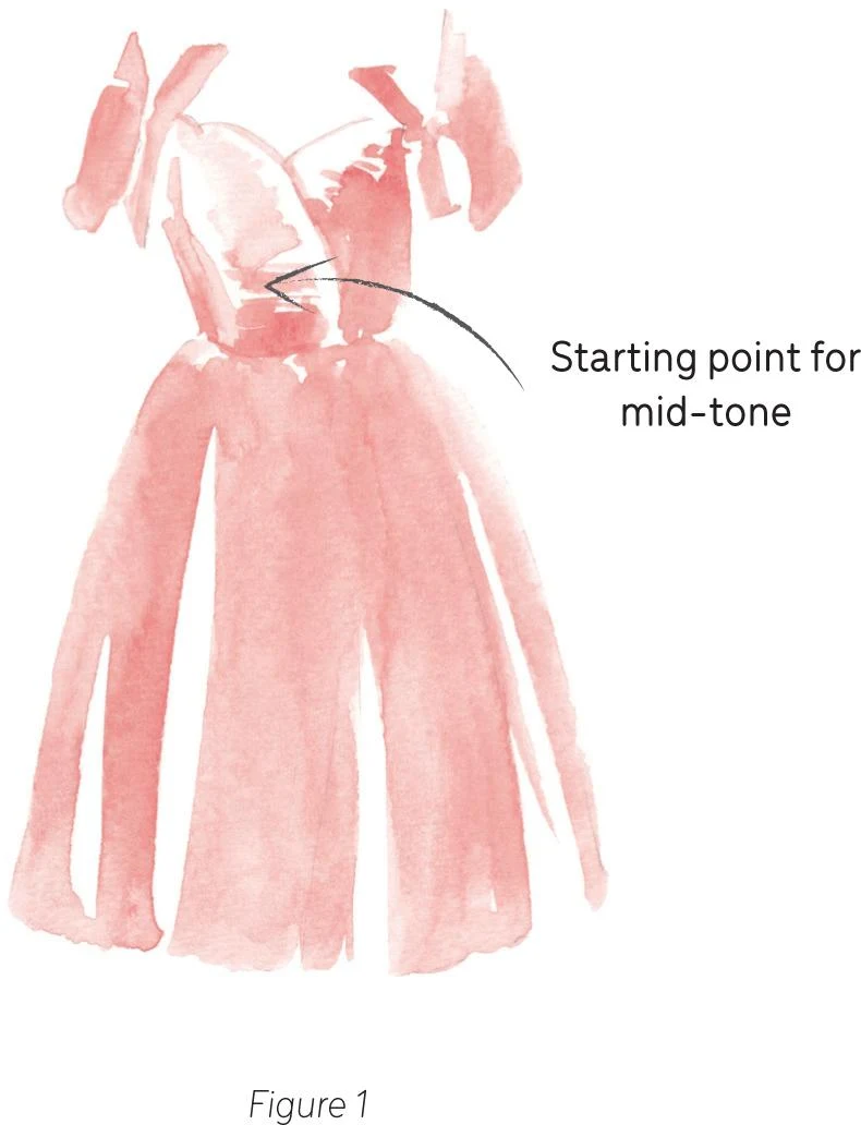
I didn’t just add a plain layer of paint as the mid-tone, but graded it with some water to build the shape. I started applying my paint at the bottom of the chest, and then quickly added a little water to dilute my paint, making it more transparent toward the highlights. This technique will become highly precious to you as a watercolorist, so it’s well worth practicing.
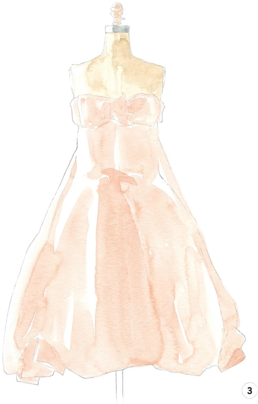
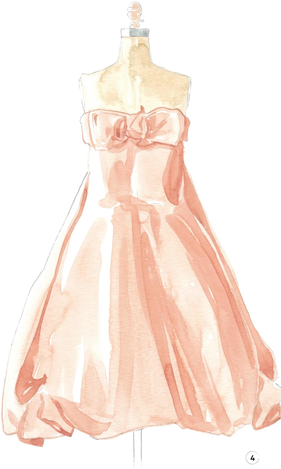
To complete the sketch, I added the dark tone to the dress (Figure 2), always considering how the light would hit the surface. I painted in the dark areas, shaping the bows, the chest and taking into account the shadows created by the folds.
The principles applied to the dress are true regardless of your subject. With careful observation, the same rules can be applied to human figures and in particular to the face (see below). Spend some time identifying the three areas of interest by observation from real life—you’ll find this an extremely useful resource.
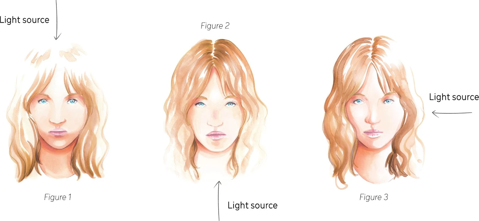
LIGHT ANGLES
Identifying the direction from which the light hits your subject is also fundamental to a successful work. Observe how in Figures 1 to 3, the different sources of light distinctly shape the same subject. Light is useful for creating a certain atmosphere, so you should give some thought to it according to your desired outcome. Notice how the light works differently not only on the features of the face (eyes, nose, lips…), but also on the hair.
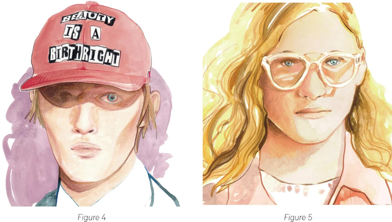
MULTIPLE LIGHT SOURCES
So far, we have only taken into account a single source of light. This is the most simple approach, but it doesn’t truly reflect the real world, where there is often more than one light source. In the fashion industry, this can be particularly relevant—think of a fashion show, where multiple lights hit the catwalk.
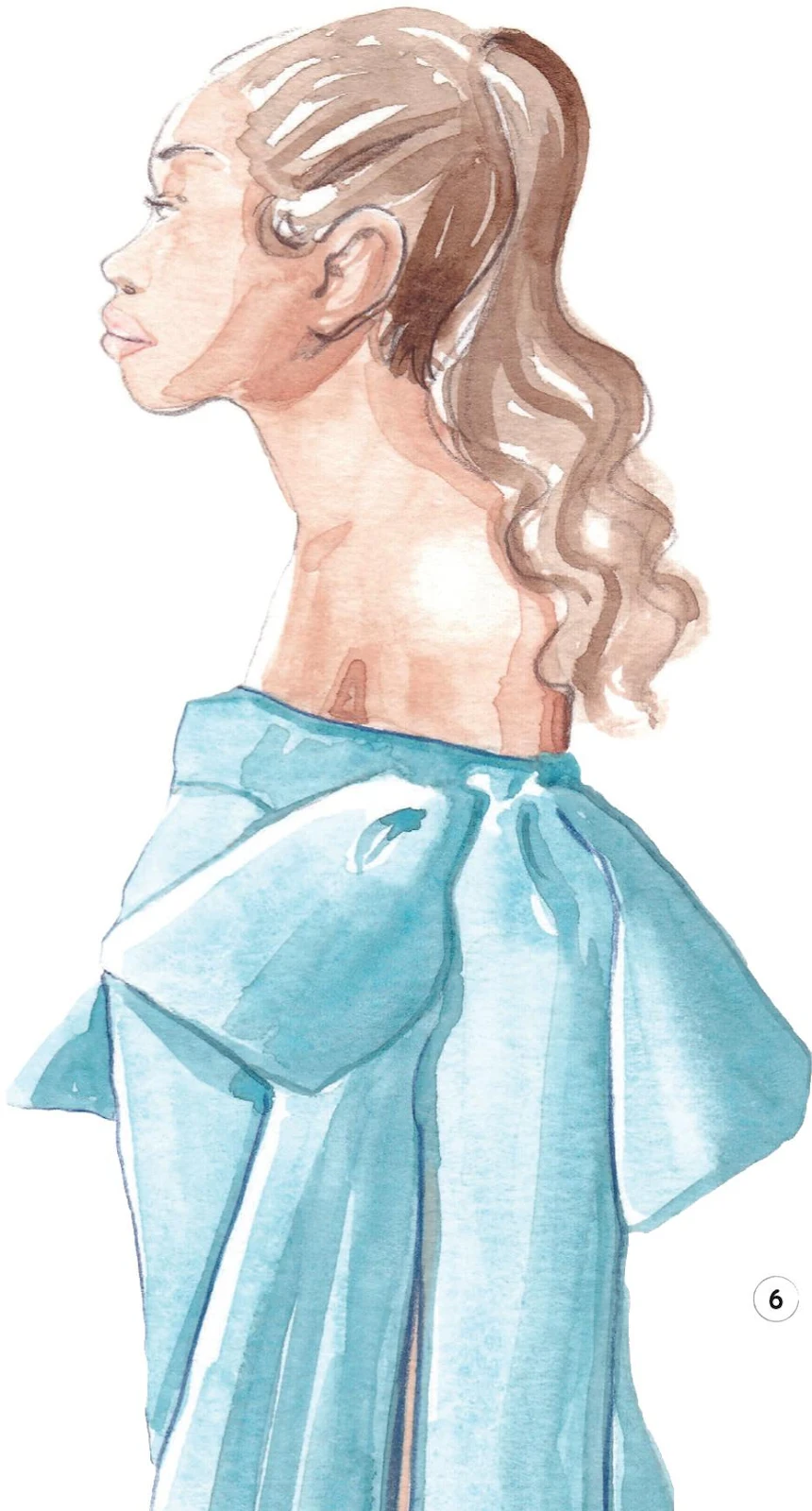
There are some other factors you should consider when analyzing light. Pay attention to the light intensity, for example, as you may need a softer or a more dramatic response. You should also think about how objects, hair, and accessories create their own shadows on other surfaces. In Figure 4, we see a dramatic shadow cast onto the face of the model by the hat, and in Figure 5, there’s an unusual shadow on the face cast by the model’s glasses.
Understanding color
Having a little knowledge about colors and how to mix them can really help you make the most of watercolor. We usually classify colors in three categories: primary, secondary, and tertiary.
PRIMARY, SECONDARY, AND TERTIARY COLORS
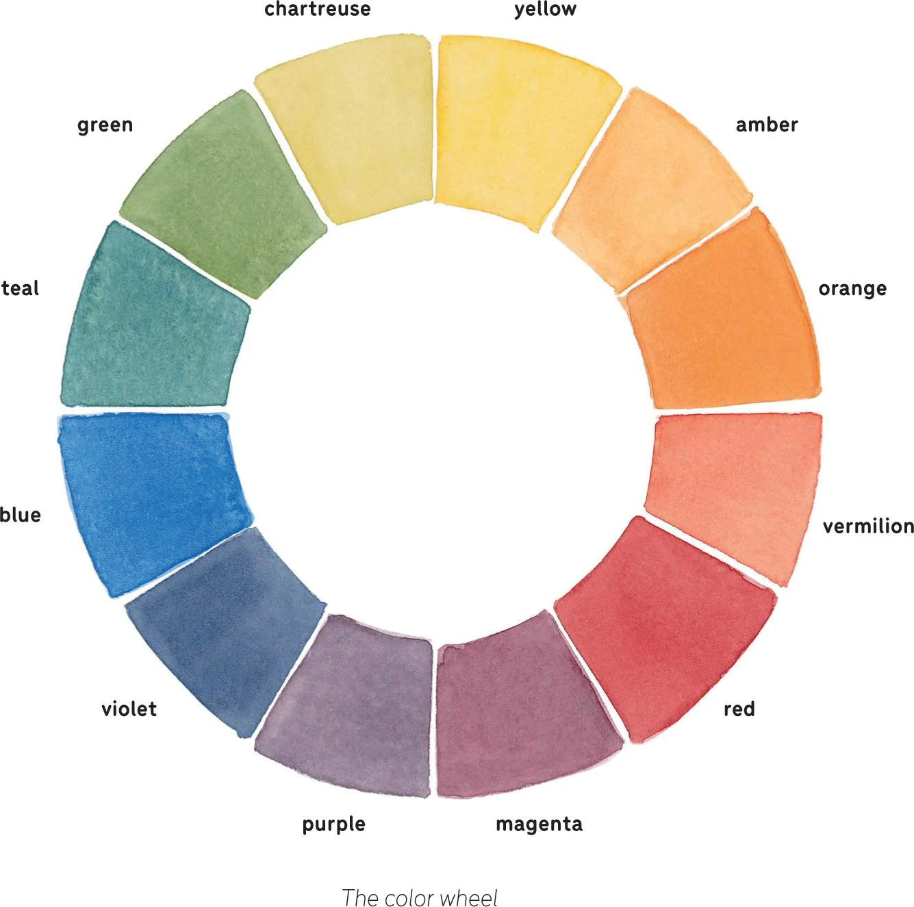
The primary colors are yellow, red, and blue. They cannot be made from other colors, meaning they are the basis of any palette. You obtain the secondary colors by mixing two primary colors in equal parts: if you mix yellow and red you’ll have orange; mixing red and blue will give you purple; while if you mix blue and yellow you’ll obtain green. If you mix a primary color in equal parts with a secondary one, you’ll make a tertiary color (an intermediate one). There are six tertiary colors: yellow and orange mixed together give amber; orange and red produce vermilion; red and purple make magenta; purple and blue give you violet; blue and green make teal; and green and yellow combined create chartreuse.
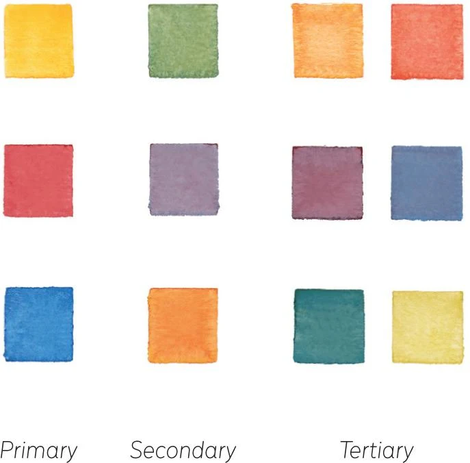
THE COLOR WHEEL
All twelve colors—primary, secondary and tertiary—form the color wheel (see below). The color wheel is the basis of color theory and can be quite useful. You should always have an idea of the colors you would like to use before starting a new illustration, and the color wheel can help a beginner grasp how colors interact. There are also some classic schemes that the color wheel can help you define (see Understanding Color—Color schemes), suggesting interesting solutions. Use it to inform you when picking the colors you want to mix.
COLOR SCHEMES
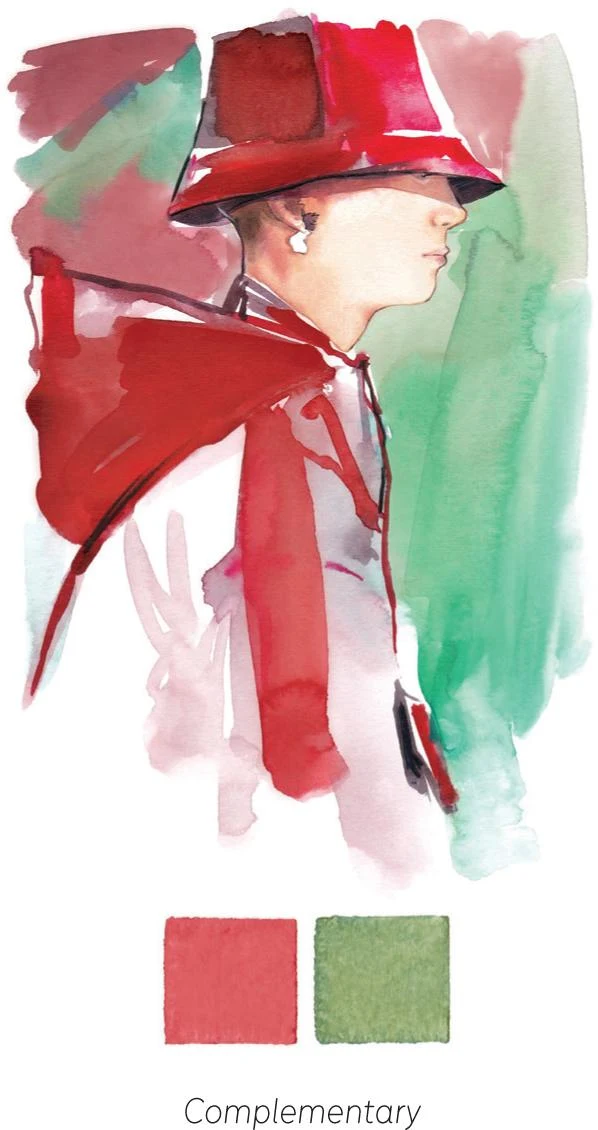
COMPLEMENTARY: The complementary color scheme combines two colors that are directly opposite one another on the color wheel, for example red and green. The contrast between complementary colors instantly creates a lively visual atmosphere.
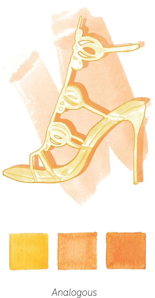
ANALOGOUS: The most harmonious of the schemes, an analogous scheme uses colors that are side by side on the color wheel, for example yellow, amber, and orange. These colors usually work really well together, assuring a balanced chromatic composition.
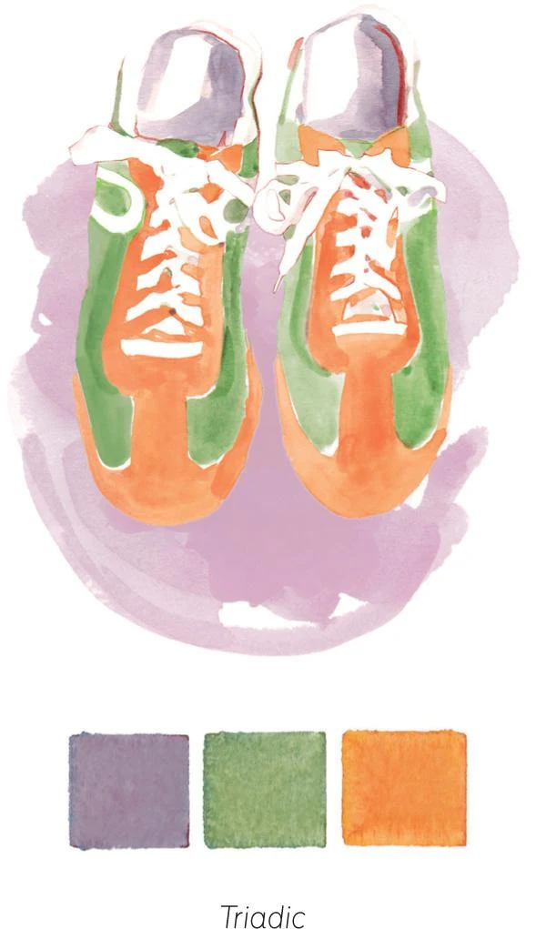
TRIADIC: The triadic color scheme samples three colors on the wheel that are equally distanced from each other. In the example, I picked the secondary colors (orange, purple, and green). The triadic scheme usually gives very interesting combinations.
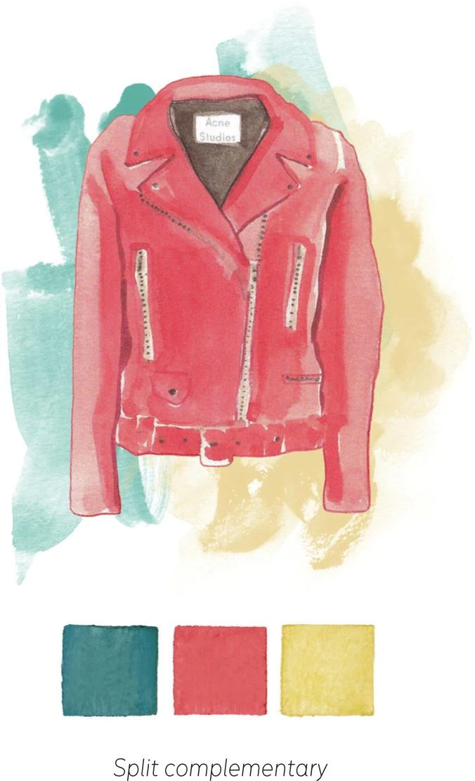
SPLIT COMPLEMENTARY: The split-complementary scheme is an easy way to obtain a unique combination of colors. Pick a color from the wheel, then pick the two colors that sit either side of its complementary color (that is, either side of the color directly opposite it on the wheel). In my example, I chose red and then used the colors on either side of its complementary color (green): teal and chartreuse.
PUTTING THE THEORY INTO PRACTICE
Think of the twelve colors of the wheel as the starting point of your color palette. Mixing and combining these colors is one of the most exciting parts of watercolor. You may like to create your own color wheel to explore and fully understand how colors relate to each other. As you feel your way, you’ll discover more shades and try out new colors.
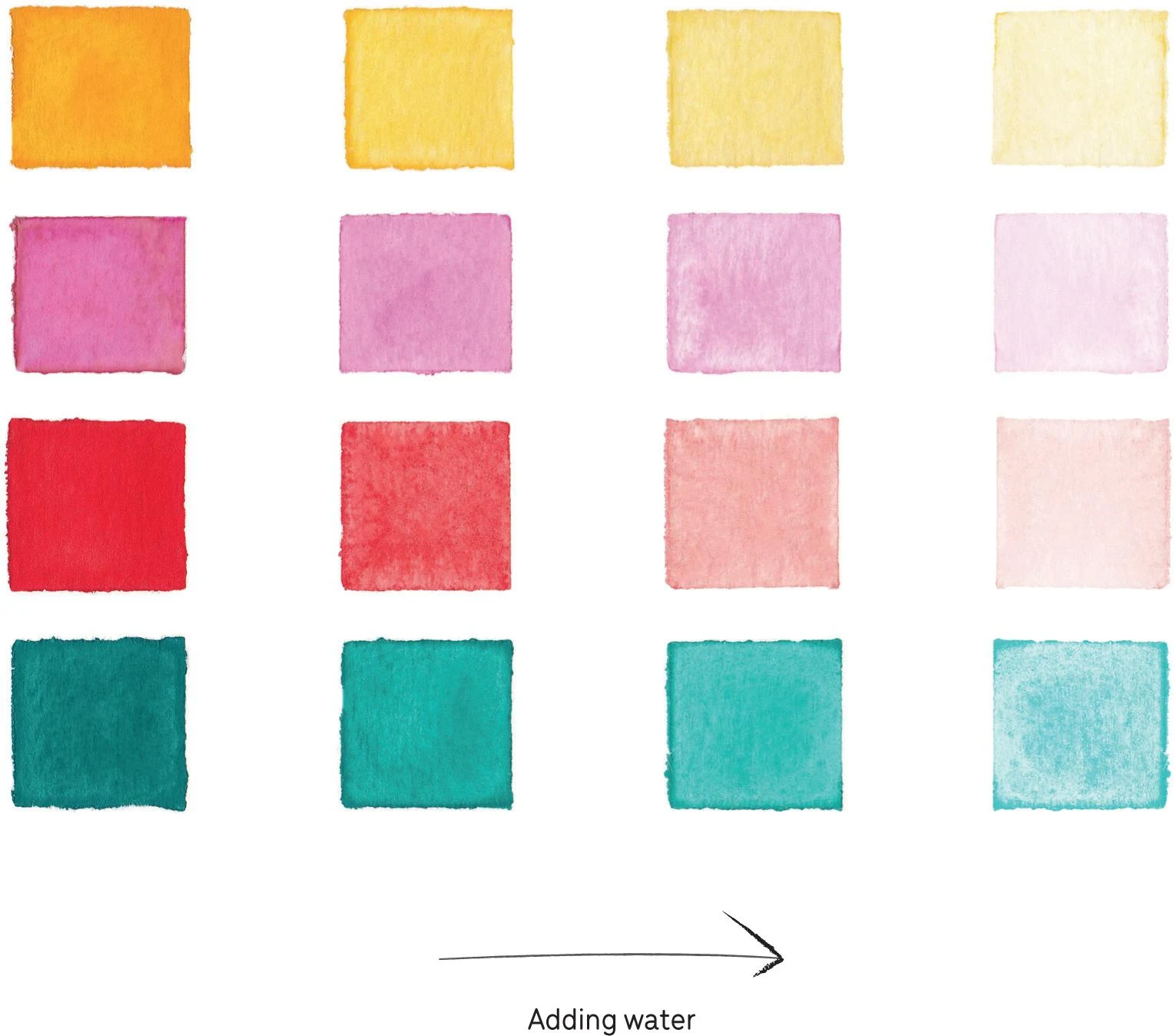
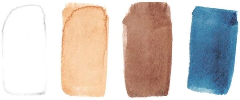
Another useful exercise, especially in the beginning, is to create color swatches. Once you have mixed your paint color, you can use water to control its lightness or darkness. Swatches are an easy way to become familiar with how this works and to understand the quality of every single color.
First, load your brush with the paint and create your first square, then dip your brush in the water, press off any excess against the rim of the jar or on a piece of paper towel, then add a second square. Continue to add more squares, dipping the brush into water each time. As well as learning about diluting paint, you have created a chart that will tell you how that particular color reacts to water—a handy reference whenever you need a specific shade.
HIGHLIGHTS AND WHITE PAINT
The peculiar transparency of watercolor when compared to other techniques like acrylic or gouache makes it difficult to paint light over dark. That’s why the white of the unpainted paper functions as the lightest area in your work and you paint in layers from the palest to the darkest tones. This means that you must think ahead to plan where the lightest parts of your illustration will be. However, I quite often use white watercolor paint when I am mixing colors to lighten them. This is something that a pure watercolorist would never do, but I find it useful as it allows me to create soft shades. Bear in mind that white watercolor may add a layer of opacity to your mix.
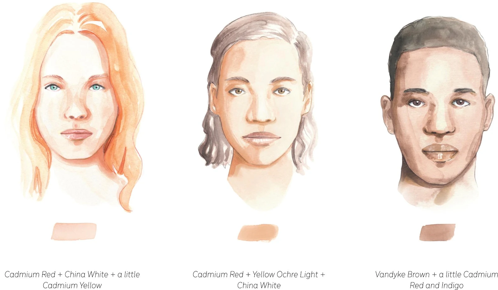
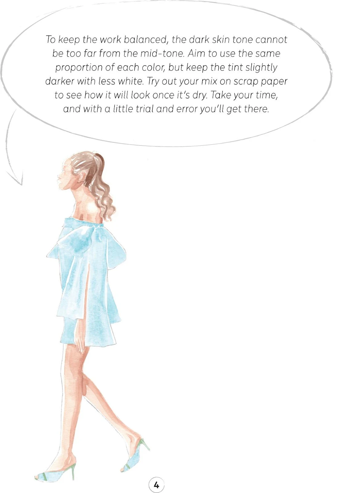
MIXING SKIN TONES
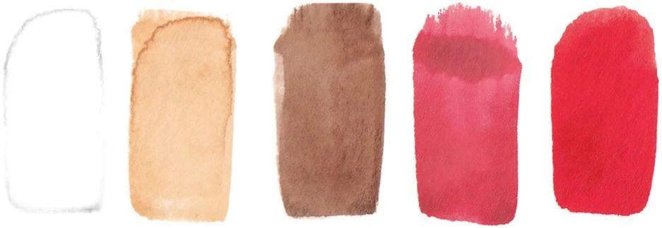
We cannot talk about color without discussing skin tones, which are likely to demand a lot of your attention. Reproducing the perfect skin mix chromatically can be challenging and may take some time to master. Often, a skin tone is based on a mix of yellows, oranges, and browns. Before continuing on our trip into watercolor fashion illustration, take a moment to try out some effective skin-tone mixes. I’ve listed the colors that I used in the sketches below, so have a go at trying to reproduce them for your work.
USING COLOR FOR YOUR PROJECTS
Once you start working with watercolor, you’ll naturally be attracted to certain colors, mixes, and shades. I have my own color palette, which I’ll be inviting you to use for the projects in this book. I am sure that in no time you’ll find your own, too.
Remember that all the notions here are suggestions for you to get acquainted with watercolor. The color schemes listed are just a starting point, and you may soon begin to make your work more personal; things change quickly—especially in fashion illustration! More organized compositions will require different approaches, and this, along with your personal taste, is what will make your work unique.
ILLUSTRATING FASHION
Illustration is a valuable asset within the fashion industry, with a network of possibilities and different purposes having developed since the golden age of the early 20th century (see Introduction: Using This Book—A brief history of fashion illustration). It now sits comfortably alongside live shows and photography as a way for fashion designers to develop and showcase their concepts and designs.
Working in the fashion industry
Being an illustrator is a real job: fashion brands and designers often seek out collaborations with illustrators in order to find new ways to present their collections and expand their vision. These partnerships eventually lead to the production of illustrated content that can be used in many different ways. Fashion illustration can then be employed in advertising, different media, or to create beautiful campaigns.
DEVELOPING ROLES
The growth of digital platforms and social media has not only provided a new way for illustrators to present their work, but has also generated some new professional openings. Fashion brands, for example, often demand illustrated content for their websites, newsletters, online platforms, and official social media accounts.
Trend-forecasting agencies predict the trends of each season in the world of fashion and design, and they usually compile trend books to present their analysis visually. These agencies often work with illustrators to create head-to-toe silhouettes that quickly describe a specific theme. The silhouettes are filled with details that need to be realistically rendered.
Publishing companies, magazines, and newspapers are still of great interest to fashion illustrators. Illustrators often create covers and editorial illustrations for fashion magazines and books, and other areas to explore are lifestyle, beauty, and portraiture.
Working as a live illustrator during events, fashion shows, or for reportage is another interesting domain. I’ll tell you more about this later, as it has been a consistent part of my practice (see Ready for Business: Working Live).
THE STORY CONTINUES
Fashion illustration never stops evolving, steadily finding new means of expression. For me, it’s like a lens—able to document and at the same time filter the fashion universe. Fashion illustration is a never-ending investigation of style and society; a non-stop quest for new creative solutions and an open dialogue between inside and outside.
My background is not in fashion design, so this book presents fashion illustration under a different light, setting aside the technical methods and renderings typical of a designer’s approach. For me, fashion illustration is more about expression, communication, and exploration. It’s about developing the ability to deliver a message, to actively unfold a story and to represent a feeling, an idea, an atmosphere. An illustrator should be able to find the best solution to a given brief, respecting the stated vision while carrying and filtering their own creative world.
CREATING A CHARACTER
It is a common belief that in fashion illustration, garments and accessories are the primary concern—the main focus to create an effective and outstanding artwork. In truth, the face, hair, and body are all just as important. As a fashion illustrator, it can be quite fun to discover and explore this!
Just as a fashion designer or photographer may have a muse to define their vision, illustrators create their own universe, combining their inspiration and desires with the proposed briefs. A face with a certain look, hairstyle, and attitude can match the look of the clothes to help convey a specific message. Let’s investigate this now.
General features
Illustrating a full face can be challenging, but there’s nothing to be afraid of, and I hope you will enjoy it! The first fundamental step to capturing a look is to observe. A face can be complex, and the shape can vary drastically, therefore observation exercises from life or pictures are key to mastering the realistic creation of a face.
In fashion illustration, artists have different approaches. Some use less authentic proportions in order to create a more slender and balanced face, others apply personal stylization. I usually try to stay faithful to reality, but this doesn’t mean that you can’t add your unique perspective.
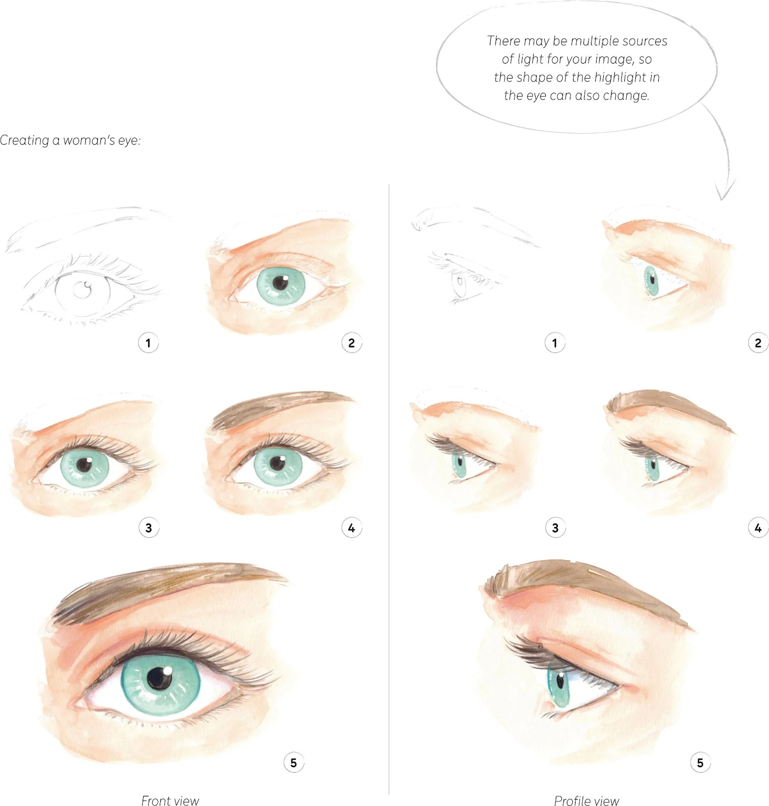
EYES
Eyes are the most distinctive feature in a face. They really characterize someone, and quite often they are all we need to recognize each other. Pay great attention to the eyes while creating your faces—they can define the whole expression and so will impact your message.
The eye is shaped like an almond. It is formed by the upper and lower eyelids, with a pupil (the black dot) in the center of the colored iris. The pupil and iris are surrounded by the sclera (the white of the eye). Together they create a spherical shape, lightly covered by the eyelids.
The upper eyelid usually creates a shadow on the sclera; including this will give more depth to your drawing. Equally important is the highlight: the light reflected on the eye puts life into everything, so be sure to include a small white or very pale dot.
Eyebrows and eyelashes can define the expression of the eye and of the whole face. Start with an initial layer to create the full shape, and then use a smaller brush or colored pencil to add hair detail to it.
In profile, the eye looks more like a triangle. The highlight could be absent, but I suggest adding one to your work, as it creates a much more effective look.
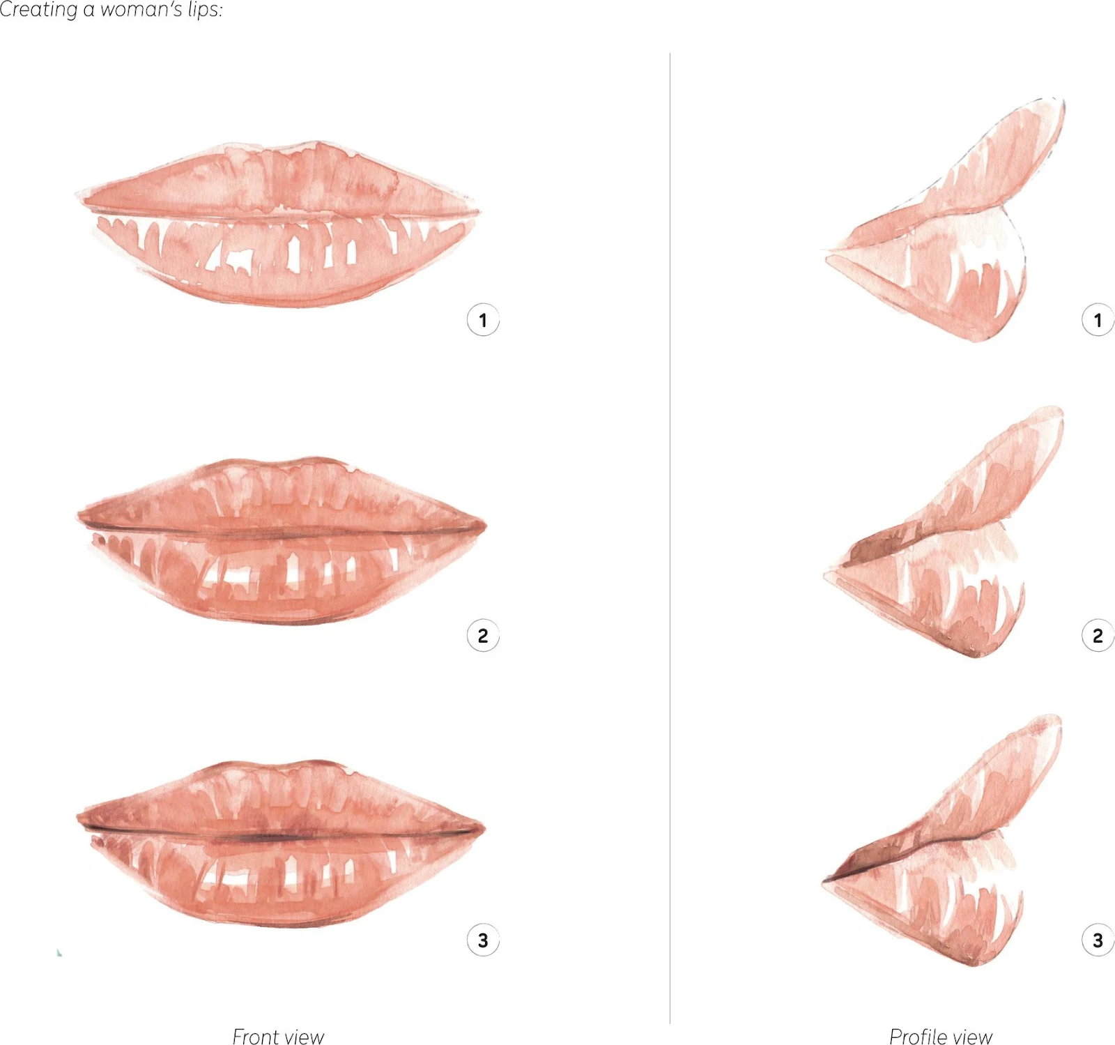
LIPS
The upper and lower lip form the mouth. The shape of the lips varies from person to person of course, but usually the upper lip is smaller and the lower lip fuller.
The same applies to a side view of the lips. In profile the upper lip usually sticks out a little more than the lower one.
A really effective way to give more depth to a mouth with watercolor is to leave a couple of small light areas, especially on the lower lip. In order to create more contrast, I suggest accentuating the line between the two lips.
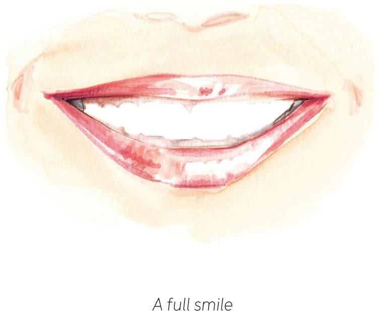
Along with the eyes, lips contribute to the overall expression of the face. If you decide to give a full smile to your character, I recommend that you do not show every single tooth. Instead, just give the idea of the smile, like in the ‘A full smile’ sketch. Lightly describe the gums and create darker parts on the corner of the smile. This will keep the smile as elegant as possible.
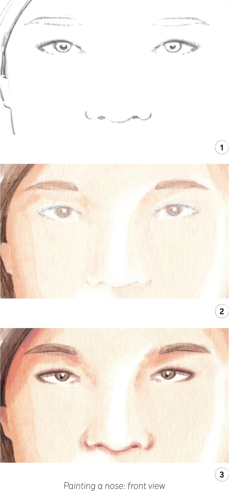
THE NOSE
In a front view, the nose is usually simple to draw. To make it look as three-dimensional as possible, follow a few easy steps, identifying the lightest and darkest parts.
The bridge is often just hinted at; I suggest you focus on the nostril holes, which will be the darkest dots, along with the fleshy part of the nostrils, to give shape to your nose immediately. Keep the tip as the lightest area.
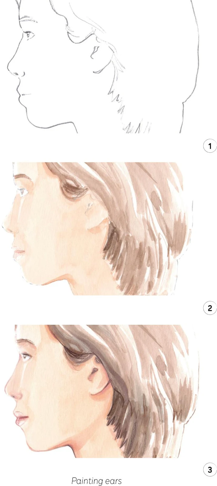
THE EARS
In the very same way, to quickly depict the ears, I advise identifying the darkest areas. This will instantly give an idea of the ears so you can reproduce them quickly.
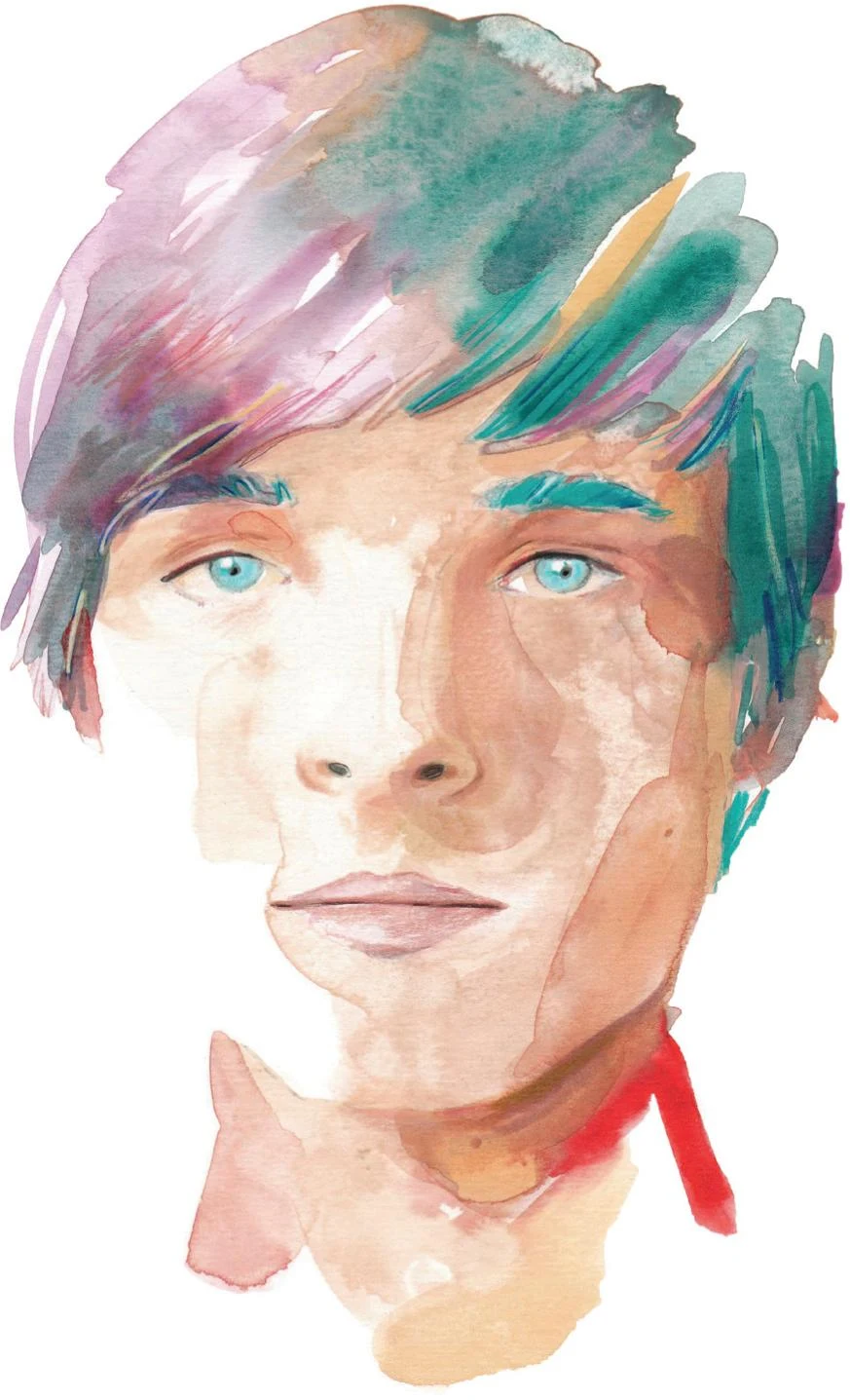
Women’s faces
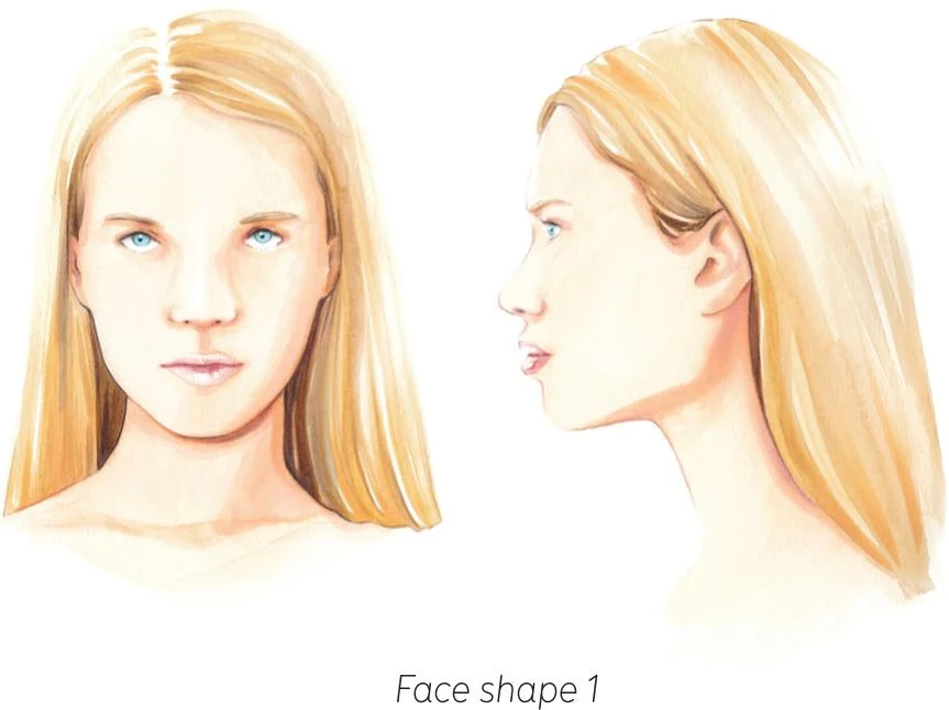
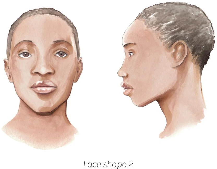
A woman’s face usually has more elegant and graceful features than a man’s. We’ve already explored how to draw eyes, eyebrows, lips, noses, and ears; now incorporate these into the face shape, keeping the proportions realistic.
FACE SHAPE
The area under the chin is quite often the darkest part of a face. No face is perfectly symmetrical, so try not to look for perfection. Take your time to enjoy and appreciate the different features of each face.
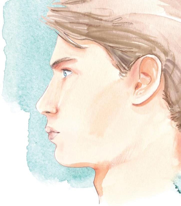
A side view can be easier than the front one, as there are fewer features to include and less perspective to take into account. However, it is still a challenge to capture. Focus on the curves that create the profile, particularly around the eyebrows, and aim to create harmony with the nose, lips, and the curve of the chin. The nostrils and beneath the chin and ears are usually the darkest parts of a profile.
Every face has its own characteristics. Take time to observe and capture the details of different ethnicities so that you’re confident in drawing a diverse range of models.
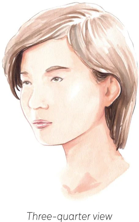
The three-quarter view of a face (see below) can be harder than the frontal and side views, but it offers a unique angle that can be useful in fashion illustration and may allow for new possibilities in your work. Take into account the different perspective–in particular, one of the eyes, including the brow, is smaller than the other.
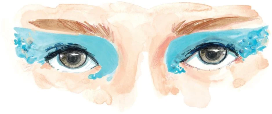
MAKEUP
In fashion illustration, makeup should contribute to your vision. Makeup artists have a central role in the fashion industry, and a curated eye makeup could enhance your work, too. Makeup could be the focus of your illustration, or use it to strengthen the outcome and value of your work.
Lipstick, and its array of different colors, is, of course, something to play with and explore when illustrating lips.
Men’s faces
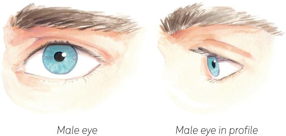
Compared to a woman, the man’s face usually has stronger features. The nose can be more pronounced, with the bridge slightly more present. The jawline and the chin might be a bit more rigid and less rounded.
EYES
The approach to the male eye has a few differences. Because of the bone structure, the eyebrow is usually closer to the eye, its angle is less arched, and it is thicker than a female brow. Eyelashes are usually shorter and less refined. Different ethnicities may have more delicate or stronger attributes.
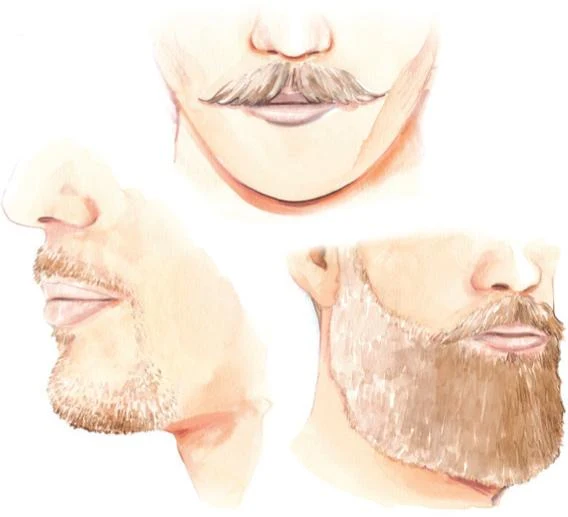
FACIAL HAIR
Facial hair can add an interesting dimension to faces. Stubble, beards, and moustaches all offer different characteristics. I suggest you keep everything natural and not too detailed, as this can result in a caricature style. Identify the dark and light parts of the facial hair, then add individual strokes with a small brush or pencil in the darkest parts to give more depth. Be conscious of the shadows that facial hair casts on the face.
OTHER DIFFERENCES
Chromatically, I often give a man’s lips an opaque tone, keeping them finely blended to the rest of the face and not too bright. The line between the upper and the lower lip can be more accentuated compared to a woman’s lips.
The male face profile line is generally less curved and harmonious than the female, culminating in the Adam’s apple, which can vary in prominence from person to person.
GETTING STARTED
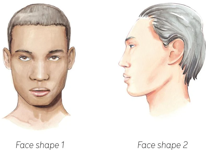
It’s now time for you to put into practice what I’ve shown you. Take time to observe the face, and understand its features and the variations between different genders and ethnicities. You can try to work live from a peer or a model, or find inspiration in women’s and men’s Face shapes 1 and 2, and in magazines and online. Explore the amazing diversity of the human face, view it from different angles, and with and without makeup and facial hair. Have fun!
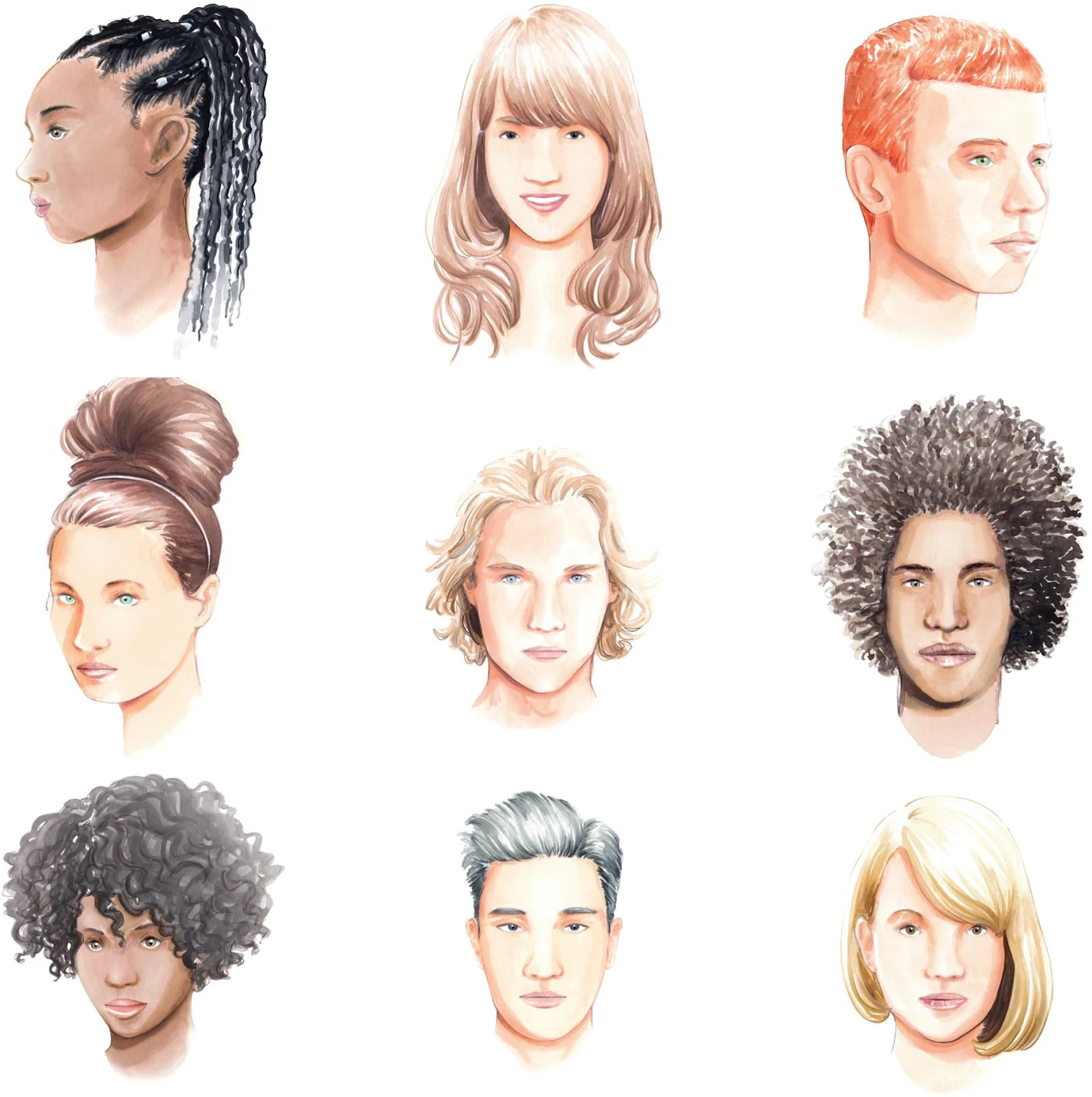
Hair
Just like makeup, the hairstyle should contribute to your vision and help create your mood and character. Here are just a few examples of the different styles and haircuts you can try–I’ll show you how over the next pages. There’s so much to explore! Hairstylists are known in the fashion industry for their art and mastery, able to create amazing styles and sometimes over-the-top cuts for models hitting the catwalk or the pages of fashion editorials in magazines. Each hairstyle has its own identity, and it should allow you to create your particular look.
Painting beautiful hair
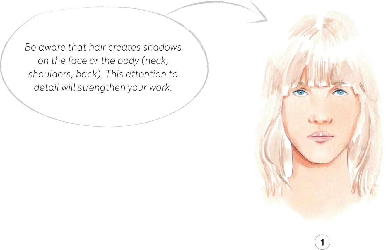
Creating beautiful and stylish hair is equally as interesting as painting the face in fashion illustration. I find watercolor particularly suitable for depicting hair, as it can really express lightness, texture, and softness. Do some research, stay updated, and check different hairstyles that you would like to reproduce: it’s time for you to practice how to create beautiful hair! Generally speaking, the best way to successfully render hair is to clearly define at least three different layers that will give you sufficient volume and enough interesting shapes. In order to create these layers, you have to take into consideration the source and direction of the light and how it reflects on the surface of the hair.
For this sketch, I used some Vandyke Brown watercolor, much watered-down for the first step, and a round synthetic brush number 1.
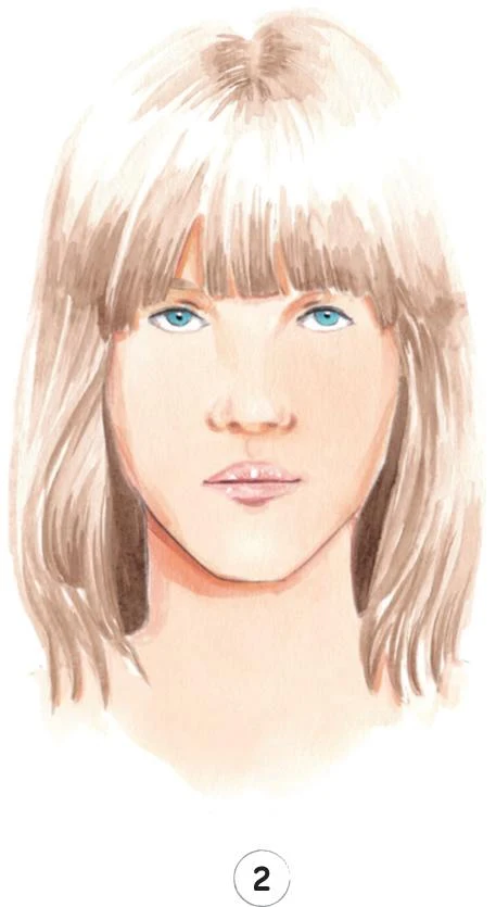
1. In watercolor you normally use the white paper as the highlight. So, for hair, start by creating a mid-tone layer, taking into account the highlights you purposefully want to leave paper-white.
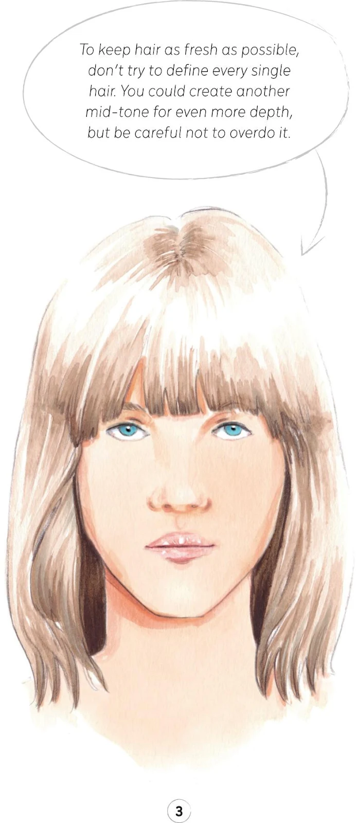
2. Once your first layer has dried, you can add a darker tone.
3. At this stage, I added just a little colored pencil in order to define some sections.
POSES
The human body has provided inspiration for artists since forever, and continues to fascinate us today. Usually in fashion illustration, the human body and its poses are functional to enhance the garments. For this reason, specific poses work for different clothes and accessories. It is important to define which pose will strengthen your illustration and then work toward that. Poses can be dynamic or static, and you should consider this in order to increase the value of the designs and the specific outcome you want to achieve.
The body
Observation from life, along with a little understanding of anatomy, is key to successfully reproducing a pose that’s supportive to the needs of your work.
In fashion illustration, realistic human proportions are not always respected, with illustrators using artistic license to fulfil their vision. In my work, I usually try to reflect reality, as with the examples on these pages. More stylization is always possible, and is something you could consider once you’ve mastered the fundamentals.
Exploring the human form can be an exciting experience. Don’t be afraid to approach it; it takes time to fully appreciate the beauty of the human body, but it’s going to be a rewarding process.
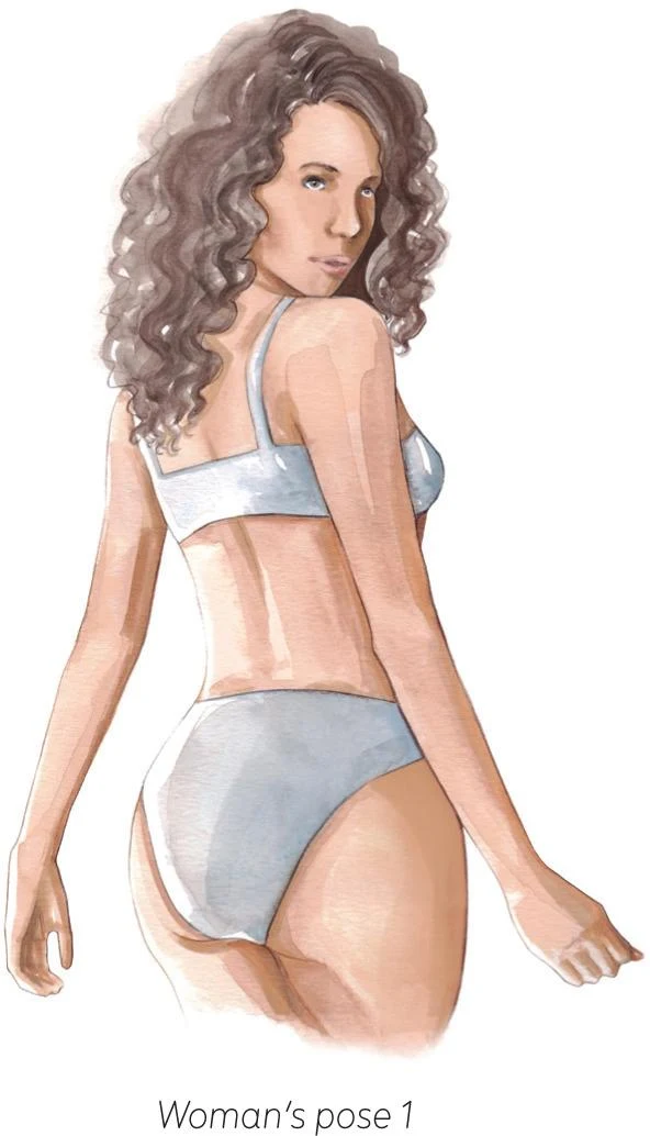
REAR AND THREE-QUARTER VIEWS
A back view (see Woman’s pose 1) should be considered when you need to increase the attention on the rear view of a garment. As a less common variation, a back view could bring something new and exciting to your work.
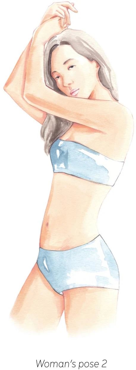
When choosing a more dynamic pose, always take into consideration how garments and accessories are going to be placed and displayed. A three-quarter view (see Woman’s pose 2) can be powerful and essential at the same time, and it’s a perfect choice to enhance certain designs. The arm and hand gestures can convey elegance and attitude.
FRONT VIEWS
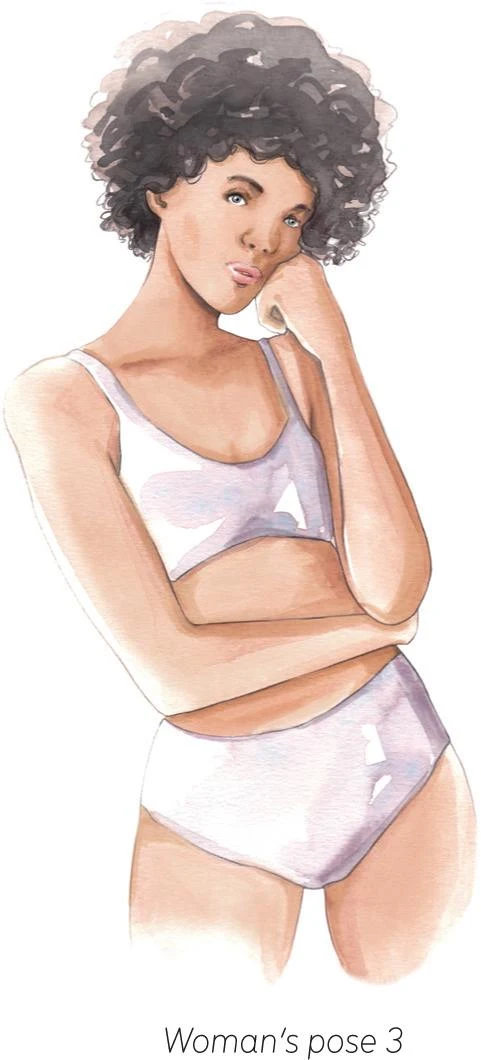
You may want to shift your attention from the garments to communicate a specific mood, often used in editorial illustrations. When it’s more about delivering a message than displaying the garments, the pose should be linked to the attitude of the model (see Woman’s pose 3).
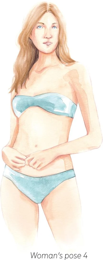
A front-on static pose is used frequently in fashion illustration. Think of collection lookbooks, where the models stand frontally to the camera (see Woman’s pose 4). This is the easiest way to enhance the garment, and can be used whenever you want to focus on the designs.
ADDITIONAL POSES
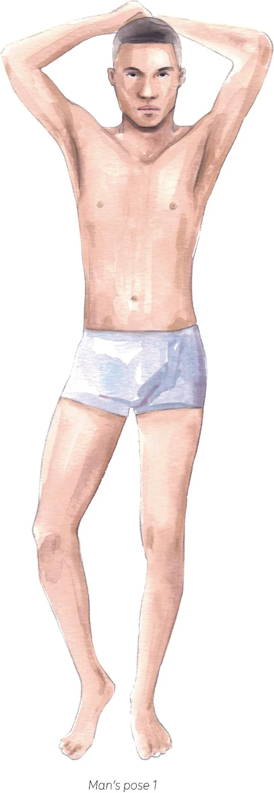
Raising the arms can slim your figure and create a captivating pose (see Man’s pose 1), plus it draws attention to the top garment being modelled, so it’s something to use if you are keen to achieve this effect.
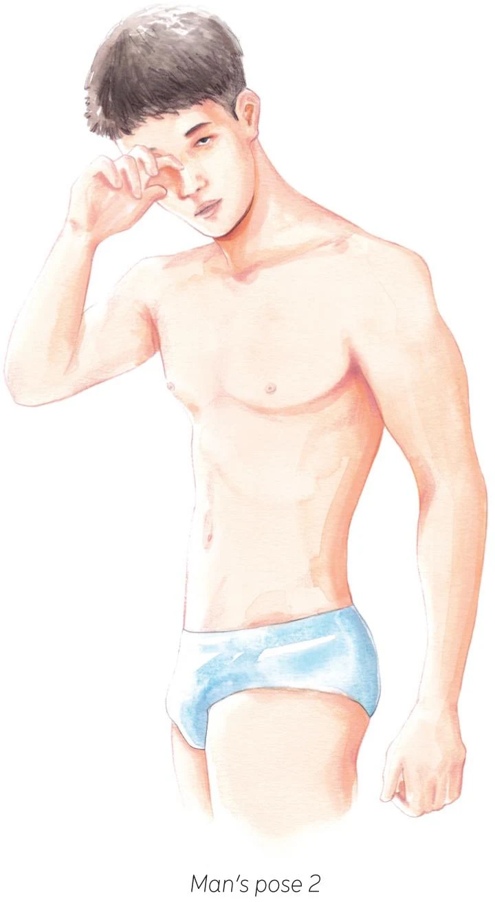
Playing with arms and hands can be tricky, but it usually creates a compelling and lively pose (see Man’s pose 2).
Man’s pose 3 looks quite static, yet the unbalanced arms create a simple but powerful posture, especially along with the angle of the neck and head.

RUNWAY POSES
The runway pose is emblematic in the fashion industry and so also in fashion illustration. Arms are often held down alongside the body in a relaxed way, or, for a more confident attitude, hands can be placed in pockets or on the hips. To achieve a sense of movement, render the hair carefully, and consider the motion of garments as well. To capture the action of the moment perfectly and create tension, it’s quite effective to leave a leg and foot behind, sometimes shaded in a slightly darker tone (see Runway poses 1 and 2).
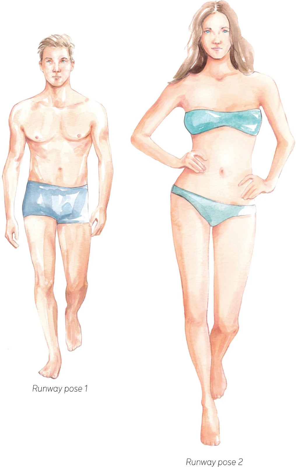
Here you can also compare the female and male bodies and the ways they can be depicted in fashion illustration. In a purely conventional way, compared to the man’s figure, the woman’s body shape is conceived as gentler, smaller, and with lighter bones and less muscular structure (see Runway pose 2). The woman is more graceful, and arm and leg shapes are represented elegantly and smoothly while hips are slightly accentuated. The male figure has, as a general rule, a lean and sharpened line: shoulders are highlighted and the muscular details are more defined.
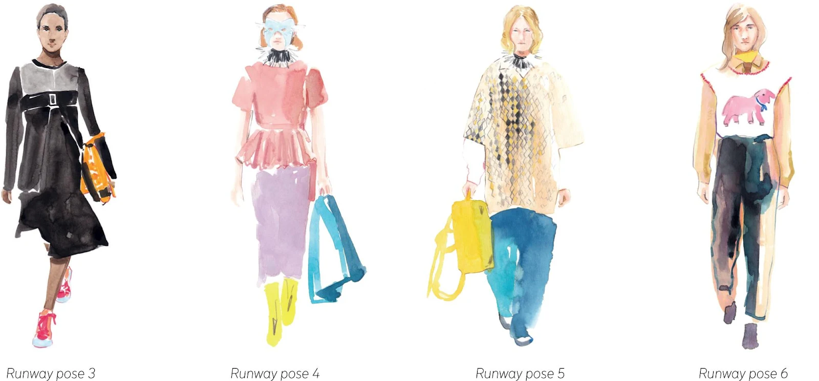
The runway pose instantly conveys a certain attitude and references the glamour of the catwalks, fashion shows, and magazines that present the trends of each season. It’s stylish, sophisticated, energetic, and strong. A front view ensures clear visibility of the designs. Along with this pose, you can present accessories such as handbags in very natural ways, as models are simply carrying them on their arm or in their hand (see Runway poses 3 to 6).
Examples
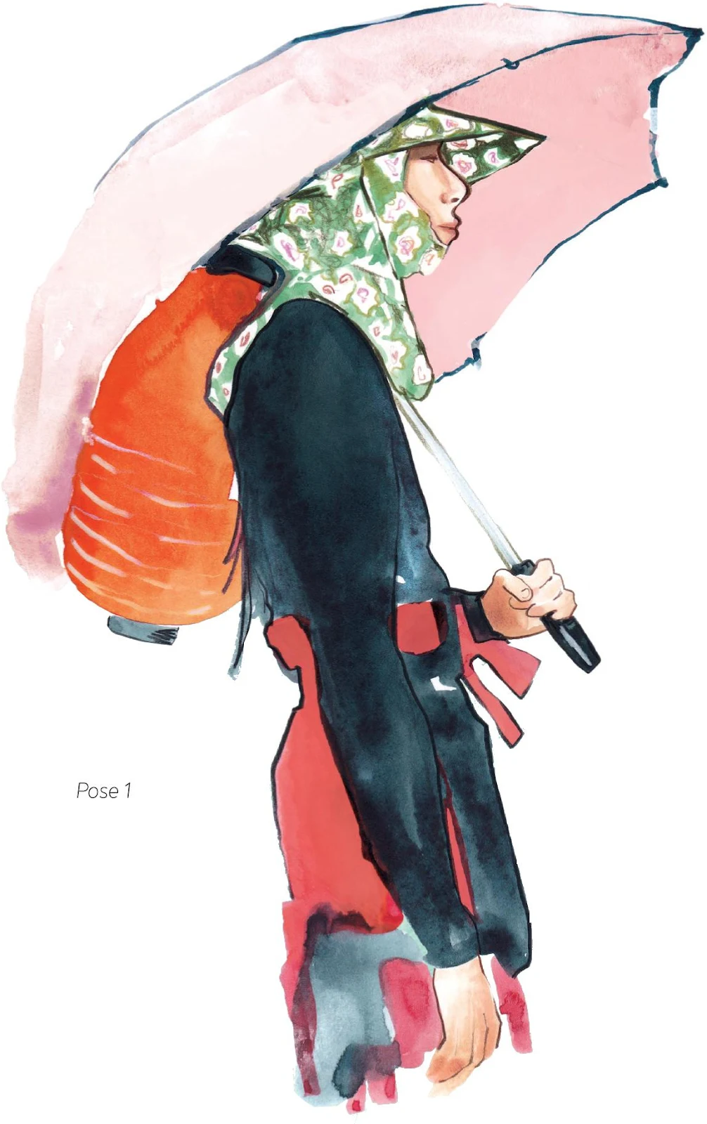
Accessories can contribute to your vision or may even be the element you build your illustration around, as in Pose 1 where the umbrella and lantern support the whole figure.
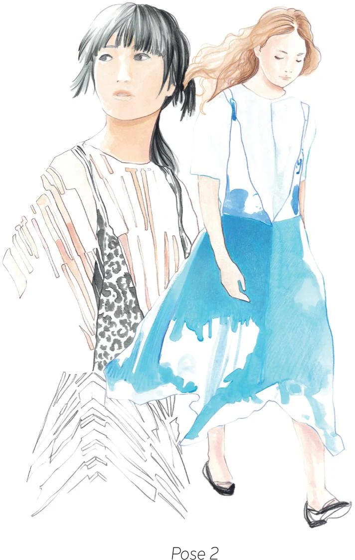
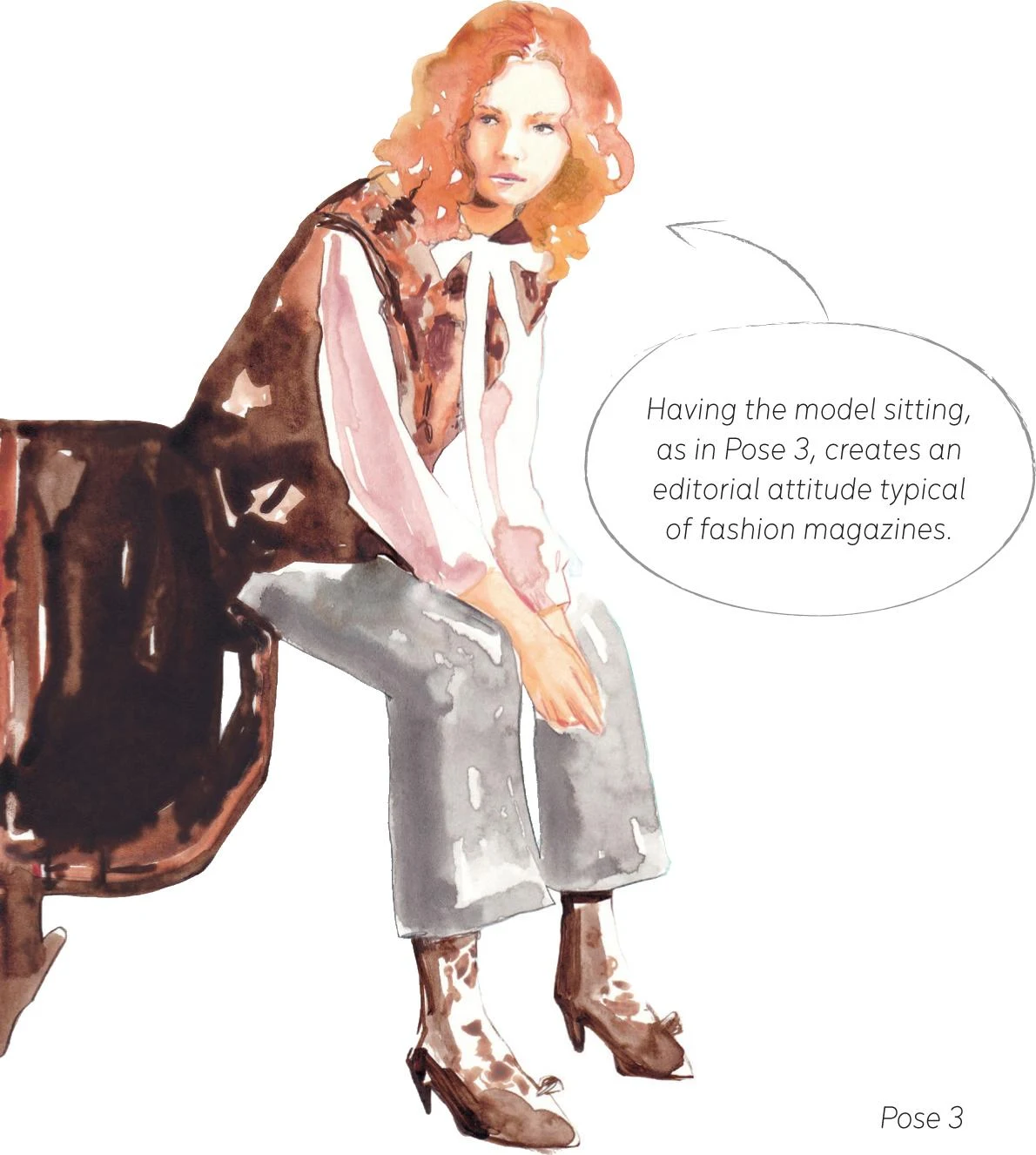
The composition in Pose 2 is gently sustained by the sense of movement generated by the model’s walking posture, with attention to the flow of the hair and skirt. In contrast, a seated model creates a different dynamic (see Pose 3).
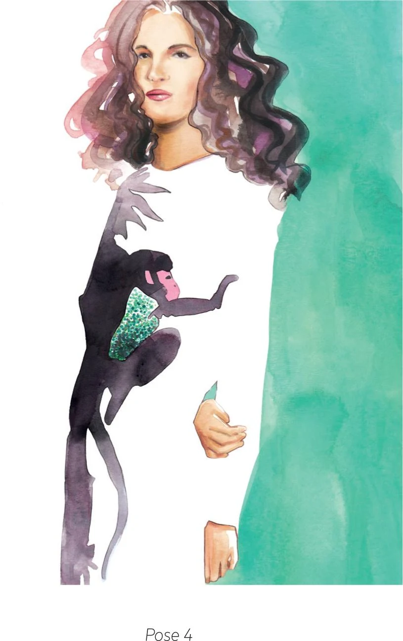
In Pose 4, the use of negative space draws your focus to the model and the print of the dress. The pose is almost set back, to accentuate this effect.
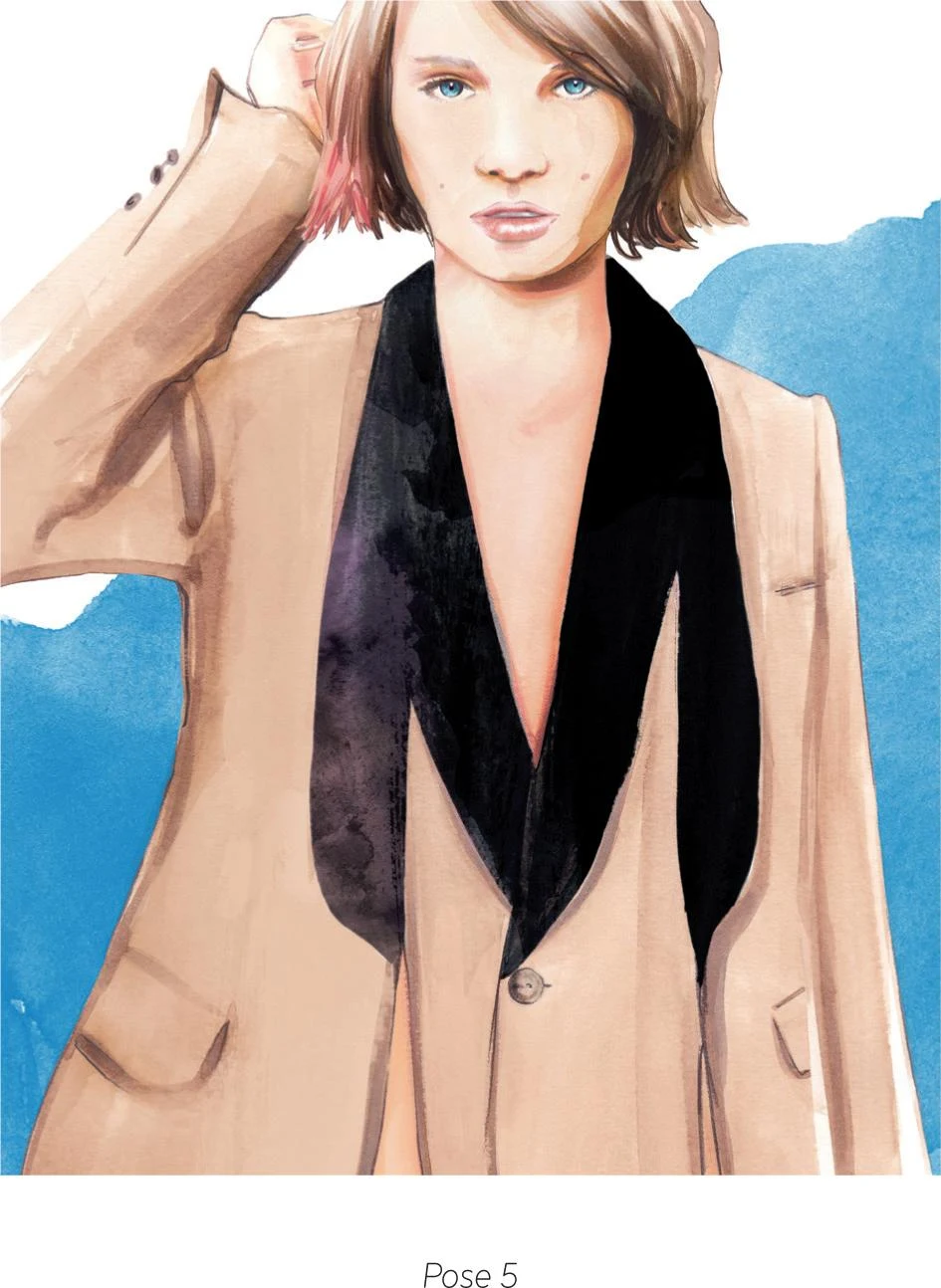
The model in Pose 5 is looking straight at us, but by having part of her head cropped, the illustration still gives prominence to the sartorial look of the design.
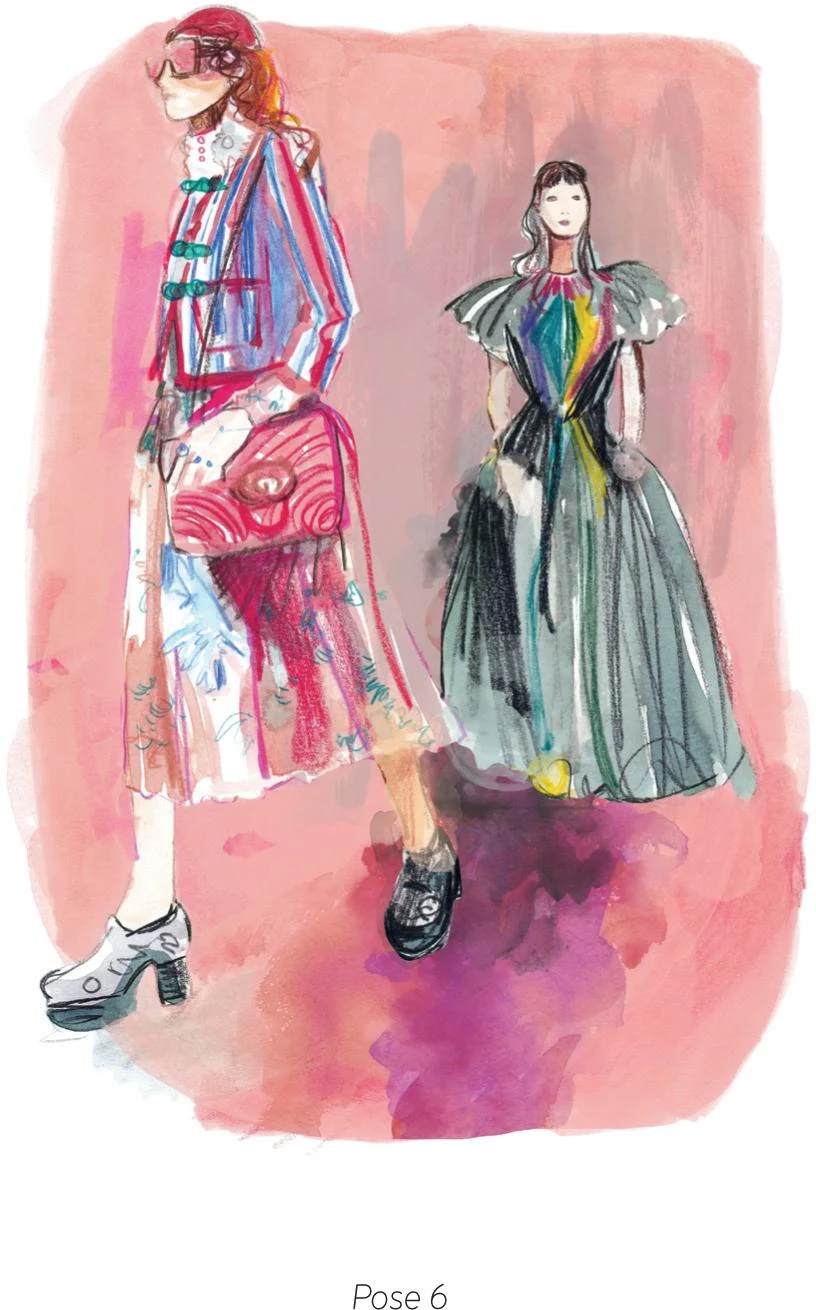
Pose 6 shows a runway moment, but not from the usual front view. This piece, with its imprecise rendering, places you directly in the thrilling atmosphere of a fashion show.
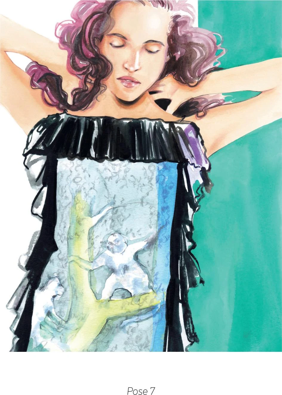
Pose 7 shows the figure raising her arms, generating a sensual pose and putting the dress in the foreground, including parts that would have been hidden by the arms.
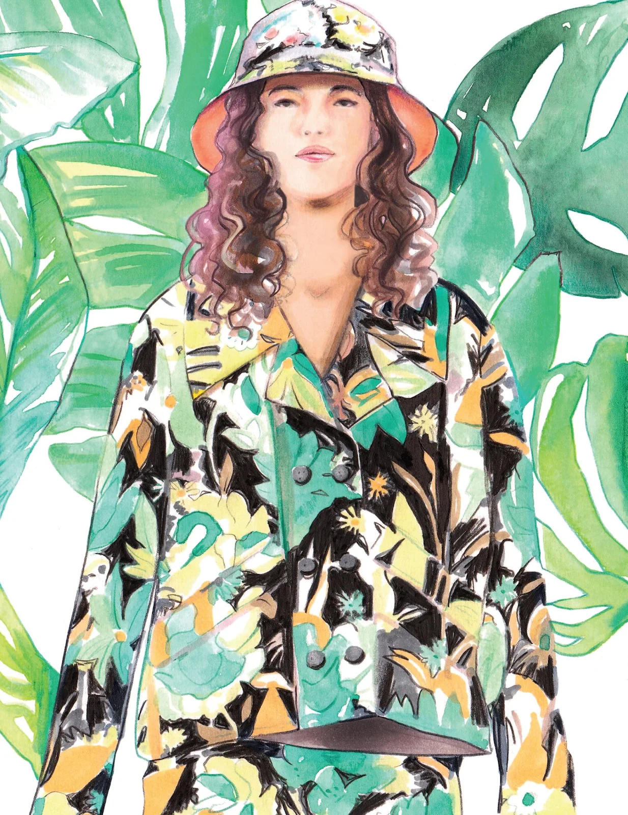
RENDERING FABRICS AND PRINTS
Over the next pages we’re going to see how to reproduce different textures and patterns. The world of fabrics and prints is vast and almost limitless. In my opinion, watercolor can be very effective for recreating some of these options, and that’s what I am going to show you here.
Exploring fabrics and textures
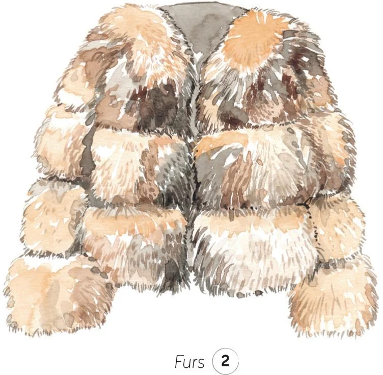
In fashion, there’s an extreme variety of furs. In this mini-exercise below, I’ve sampled a classic fox-fur coat. After that, we’ll take a look at some other challenging fabrics, including feathers, sheers, knits, wools, plastics, and PVC.
FURS
1. To create the first layer of texture, apply the paint quite loosely with the tip of a mop brush. Use different shades of brown and ochre to create shape and volume, thinking about how the light hits the surface.
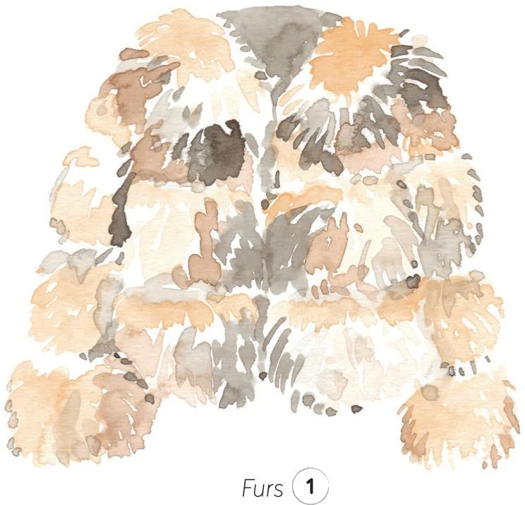
2. Next, work the details with a small round brush, adding individual hairs little by little. Create a soft outline for the coat with more small strokes. Be careful not to overdo it, keeping the sketch as fresh as possible.
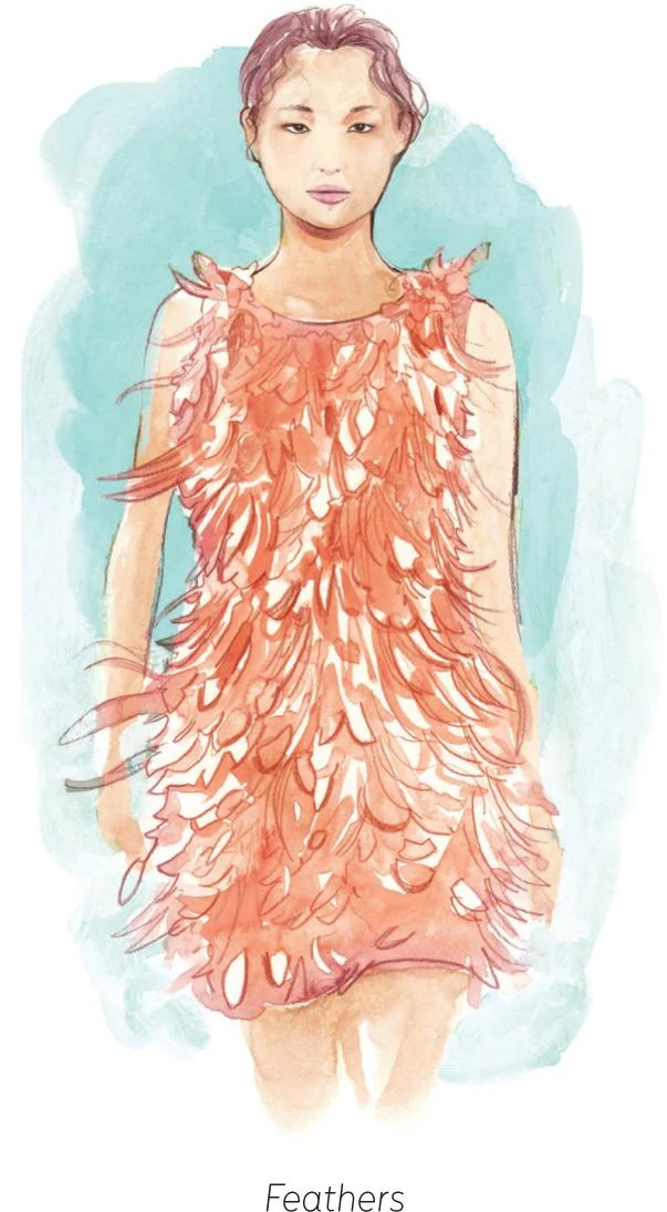
FEATHERS
Feathers work in a similar way to fur. You can’t describe every single feather, so it’s important to create a sort of rhythm, working up lighter and darker areas. In the Feathers sketch, I recreated the sense of movement by having some of the feathers pop out from the silhouette.
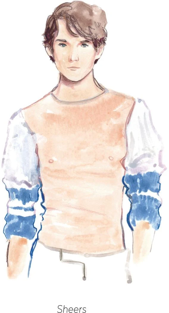
SHEERS
Watercolor, with its peculiar transparency, is the perfect medium to represent sheer fabrics. In the Sheers illustration, I applied the first layer of sufficiently wet paint with a mop brush, leaving some small white areas as the highlights. Adding darker areas suggests folds in the fabric, giving volume to the sketch.
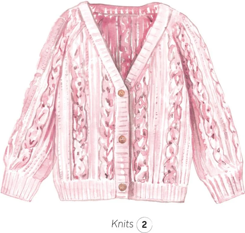
KNITS
1. Knits are soft yet quite structured at the same time. When recreating this fabric, use a slightly dry brush for the first layer, to begin to build this sense of structure.
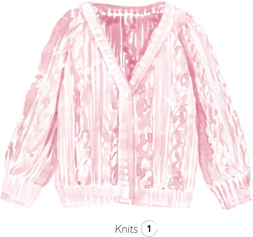
2. With a small round brush and a darker mix, describe the details of the cable braids, typical of certain knits. Small dots and fine lines also help replicate the texture.
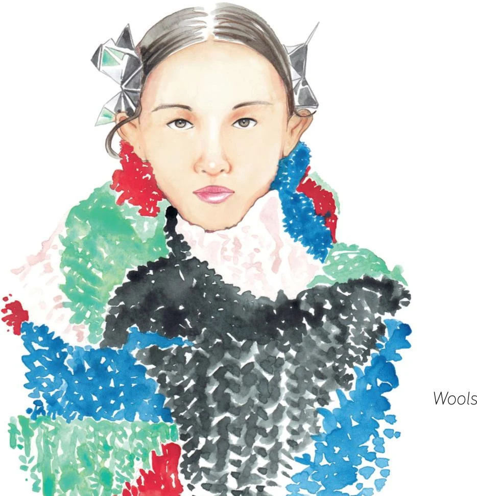
WOOLS
In the Wool illustration, I used the tip of a quite wet mop brush to recreate a woollen fabric, building it up with bold strokes while leaving small areas white to create space. This way there are no outlines, resulting in an overall soft vibe.
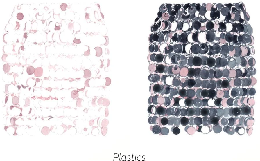
PLASTICS
Plastic fibers are a constant in fashion clothing. The even surface needs to be reproduced quite sharply. The silvery skirt, see Plastics sketch, is made of rounded plastic sequins. Before you paint a garment like this, make a clear sketch of the whole structure. The trick to rendering it successfully is to identify from the start which are going to be the highlight, mid-tone, and dark sequins. Begin with the mid-tones, then add in the dark ones.
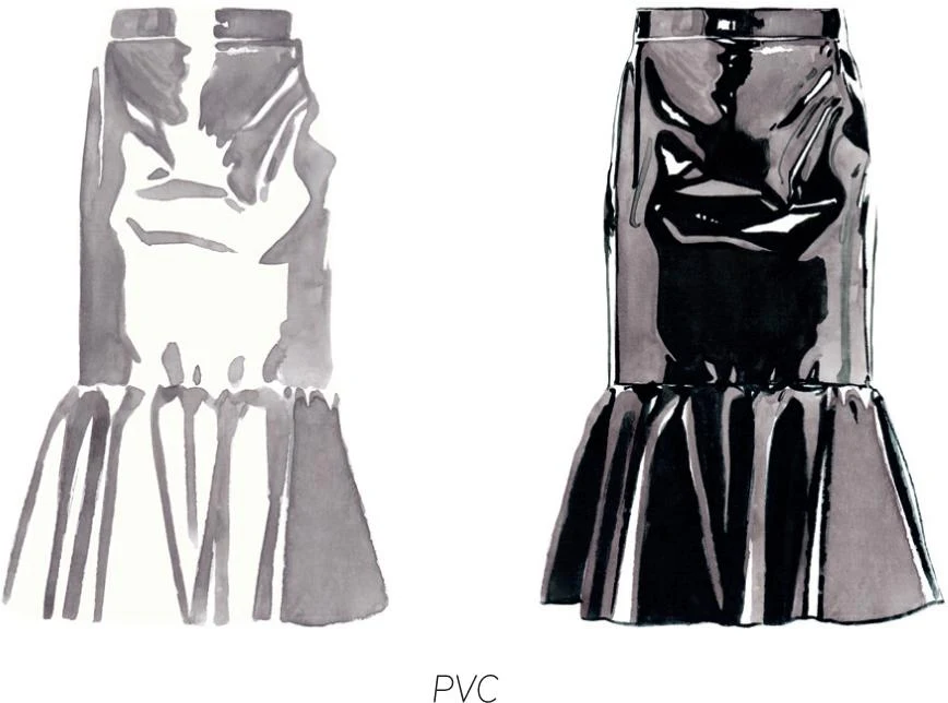
PVC
PVC garments like the skirt in the PVC sketch require strong, neat, precise brush strokes. Again, it’s vital to think about the light and identify the highlights straight away. Start with the mid-tone, then add the dark tones. Round brushes are perfect for reproducing these sharp surfaces.
Prints and patterns
Prints are a huge and fundamental part of fashion. Some prints have become the signature of specific designers, while others are iconic in fashion history. There are infinite kinds of print, and we’re going to explore some of them now from the point of view of a watercolorist.
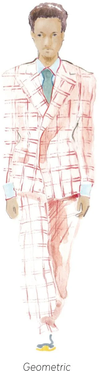
GEOMETRIC
Stripes and checks have been explored and combined in many ways, resulting in prints such as tartan, gingham, plaid, argyle, and more. Given the superposition nature of geometric prints, with layer placed upon layer, watercolor is a very good option to represent them. Pay attention to the design, and be as precise as possible.
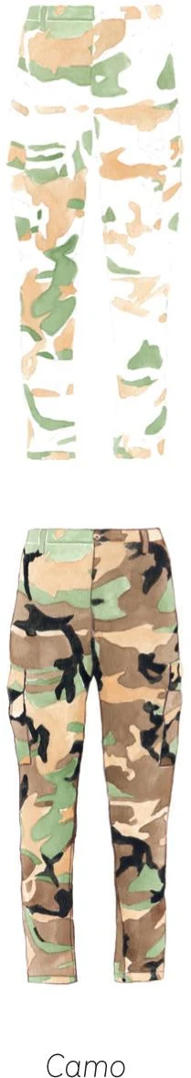
CAMO
The camouflage print has been revisited and used in many ways by designers over the years. This military print needs to be built up bit by bit: work from light to dark using a small round brush.
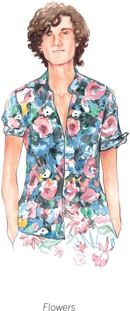
FLOWERS
Floral prints are quite popular, and watercolor can help you achieve the delicacy and gentleness that’s typical to many. With an appropriate color palette and unique motifs, flower prints can evoke a certain feeling and enhance an entire collection. I have a soft spot for these prints and have explored many in my work. They are a labor of patience and precision: build the pattern up motif by motif, identifying all the colors and shapes involved ahead of painting.
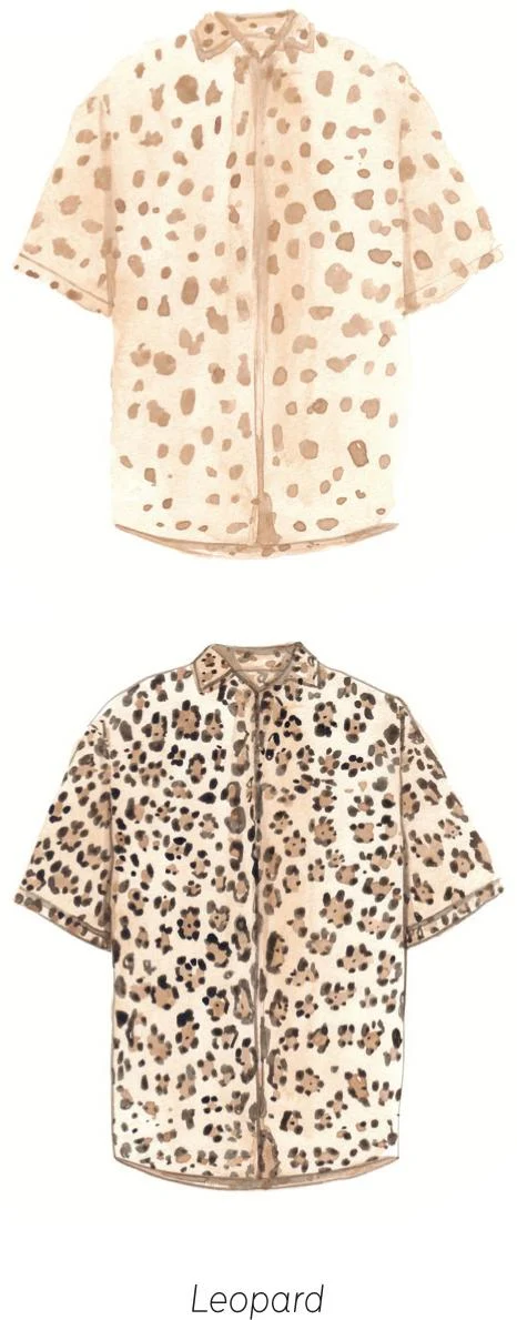
ANIMAL PRINT
The leopard is possibly one of the most popular prints. Start by applying an even light-ochre layer over the whole shirt with a mop brush. Add little round ochre shapes and leave to dry. Once this first layer has dried, add brown dots to bring the print to life.
TUTORIALS
Now for the really exciting part—in this section of the book we’ll look at twenty tutorials, recreating some of my favorite fashion illustrations. We’ll start with some simple projects to ease you in, then move through the intermediate section, and finally into the “high” category that includes artworks that require a higher level of skill. Let’s dive in and start building your portfolio!
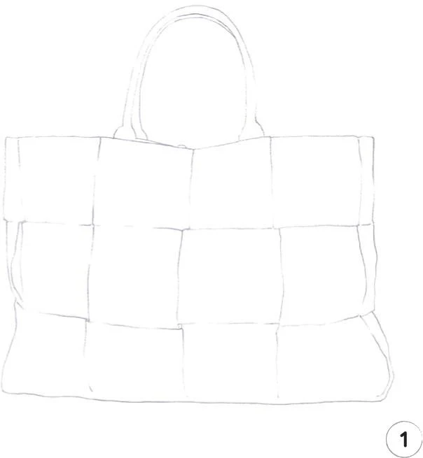
Canvas tote bag
LEVEL: EASY BRAND: BOTTEGA VENETA
For our first tutorial, I’ve chosen an uncomplicated project so that you can approach watercolor gently. The design of this canvas tote bag is quite simple, and we can work the surface in an incremental way, almost square by square. We will gradually build up an essential color palette so that you can learn to mix colors little by little.
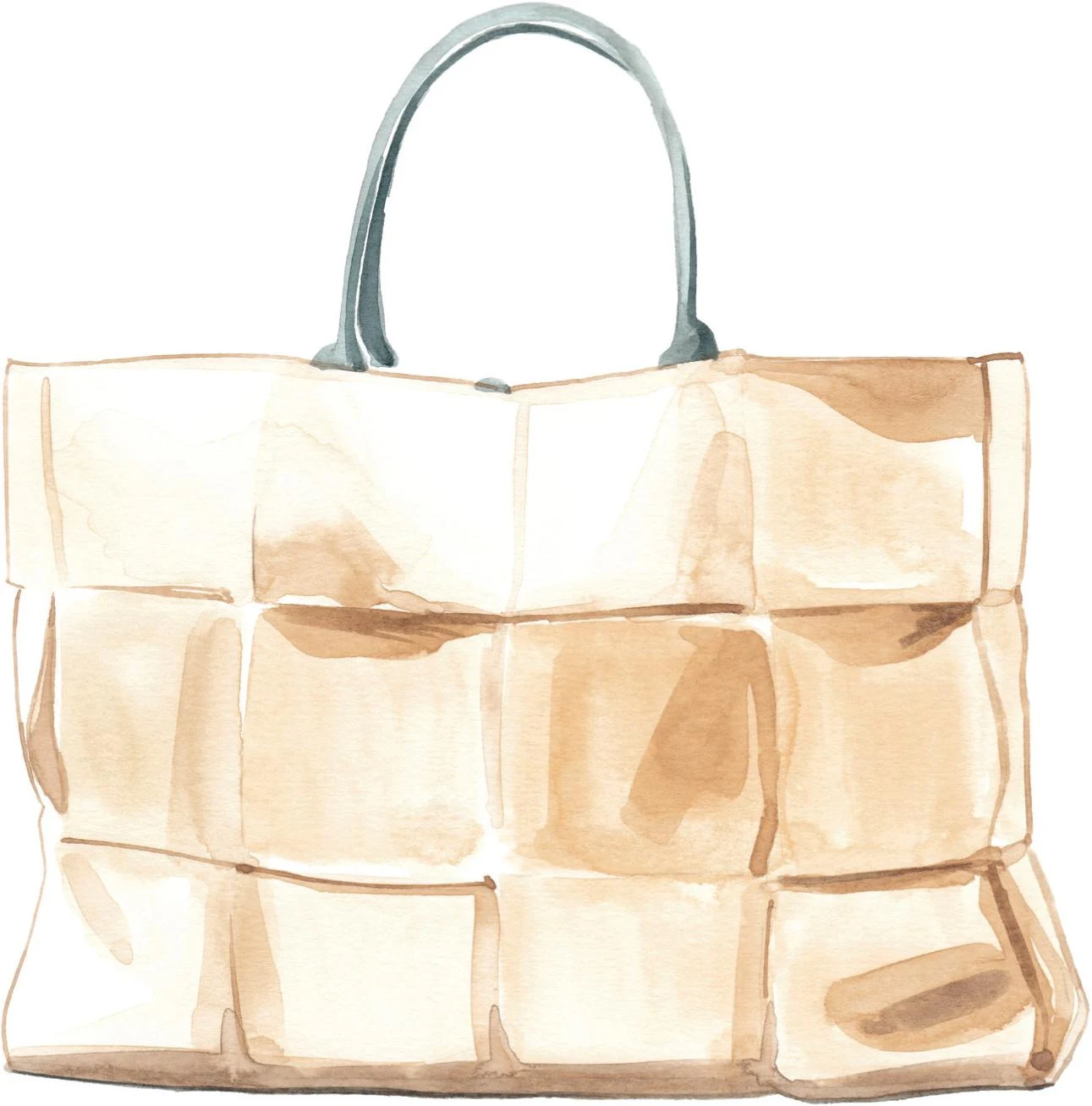
MATERIALS
Essentials:
- fine pencil
- eraser
Paper:
- A4 watercolor paper (300 GSM)
Brushes:
- squirrel mop brush size 2
- round synthetic brush number 0
- round synthetic brush number 1
Paints:
- China White
- Yellow Ochre Light
- Vandyke Brown
- Indigo
1. When working in the studio, my starting point is a pencil sketch of the full illustration. This is how we’ll begin every tutorial in this book. These pencil lines work as landmarks to guide you when applying the watercolor, so keep the lines light. Quite often they’ll be covered by watercolor and, at some point, we’ll erase them. Use a light, fine pencil, such as a 0.7mm HB #2 mechanical pencil.
2. Use your palette to create a mid-tone for the first layer of the bag: mix some China White with Yellow Ochre Light. Prepare enough of this mix to cover almost the full surface of the bag. Apply with a mop brush size 2, leaving some unpainted white areas, especially on the upper part and on the left of the bag. Paint square by square to build volume with the mid-tones.
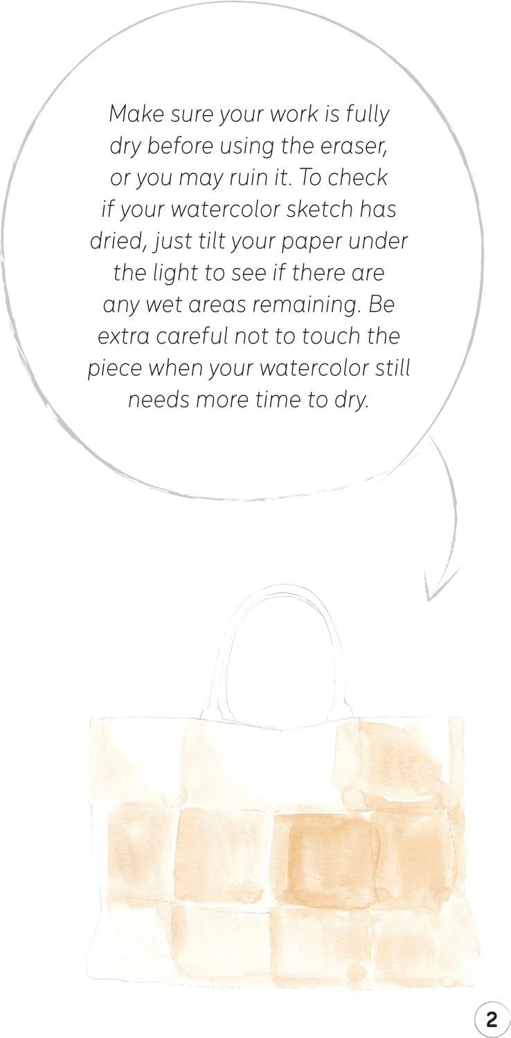
3. While waiting for your first layer to dry, mix some Vandyke Brown with Indigo to create a mid-tone for the handles. Add some water to produce a light shade of gray. Use a round synthetic brush number 1 to apply the paint to the handles.
Once dry, add some dark tones to the bag. Mix China White with Yellow Ochre Light, but this time add a little Vandyke Brown. Return to the mop brush to create dark tones on the bag, mostly on the right-hand side.
Next use the fine point of the mop brush to paint in some details such as bordering on some sides of the squares. Now, leave to dry. Once completely dry, use an eraser to rub out the pencil marks.
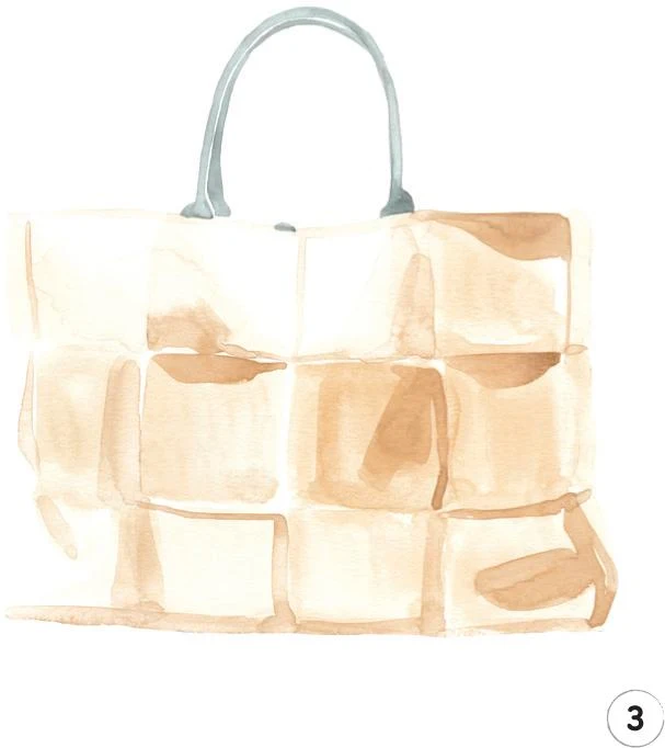
4. Now to add the finishing touches! Mix equal amounts of Vandyke Brown and Indigo to obtain a natural shade of black. Paint only the rear handle with black using the round brush number 1.
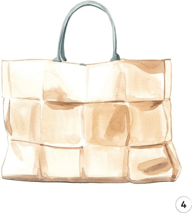
Mix China White with Yellow Ochre Light and Vandyke Brown. Use a round synthetic brush number 0 to create borders on the left-hand, upper, and right-hand sides of the bag. Add some fine dark marks on the dark tones we created in Step 3, to create more depth.
Finally, using mostly Vandyke Brown and our mop brush, you can create a nice shadow on the lower part of the bag, giving even more depth. Finish by adding a fine line of Vandyke Brown and black at the very bottom of the bag.
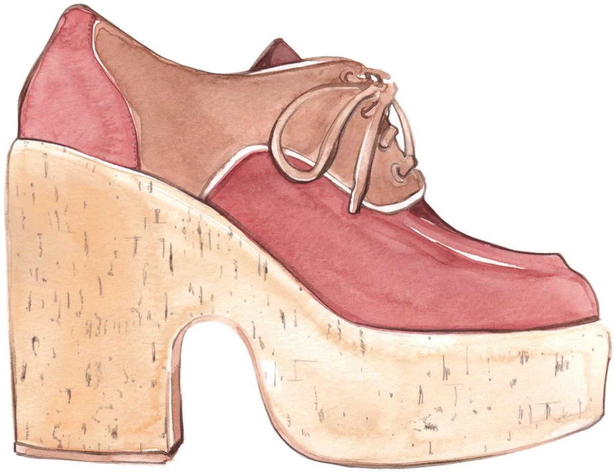
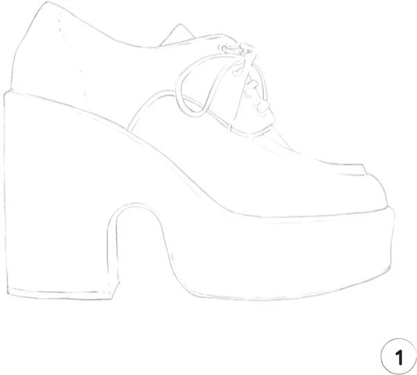
Wedge platform shoe
LEVEL: EASY BRAND: MIU MIU
For our second tutorial, we’re going to create a wedge platform shoe. We’ll practice mixing more colors this time, creating warm shades by playing with a small selection of paints.
MATERIALS
Essentials:
- fine pencil
- eraser
Paper:
- A4 watercolor paper (300 GSM)
Brushes:
- squirrel mop brush size 2
- round synthetic brush number 0
- round synthetic brush number 1
Paints:
- China White
- Yellow Ochre Light
- Vandyke Brown
- Winsor Red Deep
- Cadmium Red
Pencil:
- Walnut Brown 177
1. Our first step is to create a light pencil sketch of the whole subject. Although this wedge platform shoe design is not complicated, the shoelaces are likely to require the most attention: be sure to mark enough pencil lines to give yourself plenty of clear landmarks.
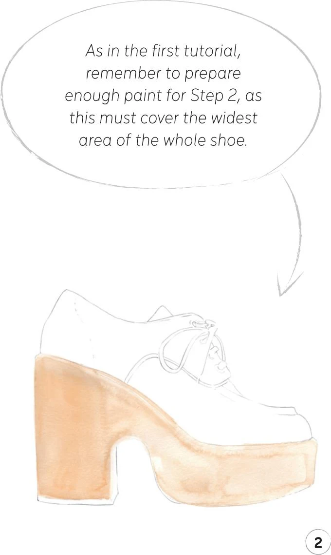
2. Let’s start adding some paint. Begin with the cork platform wedge, creating a nice shade of light beige by mixing some China White with Yellow Ochre Light. Use a mop brush size 2 for this area. Paint from left to right, adding more water to your mix as you approach the right-hand side to start building up the impression of light and shade.
3. Now bring your focus to the middle part of the shoe, known as the quarter, including the shoelaces and eyelets.
Create a shade of brown, mixing Vandyke Brown with Yellow Ochre Light and a little Cadmium Red. For the quarter continue to use the mop brush, but for the shoelaces, the eyelets, and the small area around them, swap to a round brush 1.
With the same mix and the round brush 1, paint the sole to define some darker areas of shade.
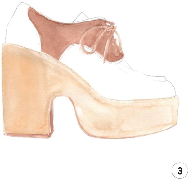
4. Next, paint the counter (at the back) and the vamp (the section of the upper beneath the laces), up to the tip of the toe. Mix Winsor Red Deep and Cadmium Red with a little Vandyke Brown and China White, then apply with the mop brush. Make sure you leave a white line between the quarter and the vamp in the front part of the shoe.
Now mix Vandyke Brown with a little Winsor Red Deep. With the round brush 1, paint the tongue of the shoe carefully, continuing “beneath” the laces down to the tip of the toe with a narrow line.
5. Leave everything to dry completely, then rub out any visible pencil lines. A round brush 0 will give you the precision you need to add the finishing touches: use some Vandyke Brown to add an outline to the whole shoe for definition.
To complete the illustration, use a Walnut Brown pencil to mark some texture on the wedge platform, imitating the cork surface.
Gown on mannequin
LEVEL: EASY BRAND: YVES SAINT LAURENT
Our tutorials so far have featured accessories, but here we’re going to describe a beautiful, elegant gown! Again, I’ve kept the color palette minimal so we can focus on mixing the paint. We’ll also put into practice what we have learnt so far about lighting.
MATERIALS
Essentials:
- fine pencil
- eraser
Paper:
- A4 watercolor paper (300 GSM)
Brushes:
- squirrel mop brush size 2
- round synthetic brush number 0
- round synthetic brush number 1
Paints:
- China White
- Yellow Ochre Light
- Vandyke Brown
- Permanent Sap Green
- Cadmium Red
- Indigo
1. Our starting point is a pencil sketch of the complete gown and the mannequin. Since the color of the dress is quite light, keep the lines soft.
2. Start by creating a mid-tone for the pale salmon pink gown, mixing Cadmium Red with Yellow Ochre Light and China White. In this illustration, the light is coming from the right, so take that into consideration as you apply the paint. Leave some white areas on the left-hand side of the gown, placing the mid-tone mostly in the middle section, but also on the right, where it will be supplemented with a darker tone later.
Use a mop brush size 2 for this step. You can work the smaller parts of the bows with the pointed tip, or you may feel more comfortable using a round brush 1. See which works best for you.
3. Now create a mid-tone for the mannequin. For the body, mix Yellow Ochre Light with China White and a little bit of Permanent Sap Green. Apply the paint with a round brush 1, taking into consideration how the light touches the mannequin—as with the dress, the left side of the mannequin should be lighter.
For the metallic disk on the neck, mix some Indigo with Vandyke Brown and China White to make a light gray. Apply it to the small area with a round brush 0 for precision.
Continue with the round brush 0 for the tip of the mannequin, mixing some Vandyke Brown with Yellow Ochre Light and China White and applying more color on the right-hand side.
4. It’s now time to add the dark tones to the gown. Mix Cadmium Red with Yellow Ochre Light, but this time use less China White than before and add a little Vandyke Brown.
For the smaller areas of the gown, use the round brush 1 or 0 so you can be as precise as possible. This applies in particular to the bow on the chest and also to the ruffles at the bottom of the gown. Take your time to give shape to the bow, then create a soft contour for the top band of the dress, helping it to stand out a little against the mannequin.
For the rest of the dress, you can use the mop brush, focusing mostly on the right-hand side. Create folds at either side of the dress with some darker lines.
5. Let everything dry completely, then rub out the pencil lines, and we’re ready to complete this illustration with the final touches. Using Vandyke Brown, add some extra dark tones to the folds at the sides of the dress—these will be the darkest part of the illustration. Use the round brush 1, as the lines get quite narrow toward the top. Then, with the round brush 0, add a few thin dark strokes on the bow across the chest.
Continue with this brush, using slightly more water in your paint mix to create some soft lines at the sides of the mannequin. Add an outline from the shoulder to the neck on the right-hand side, then outline the right-hand side of the tip of the mannequin.
Mix some Indigo with Vandyke Brown to obtain an almost black color and with the round brush 0, add a shadow to the right-hand side of the metallic disk. To finish, draw the mannequin piper below the gown, using the same mix and brush, gradually adding more water so the color fades away softly at the bottom.
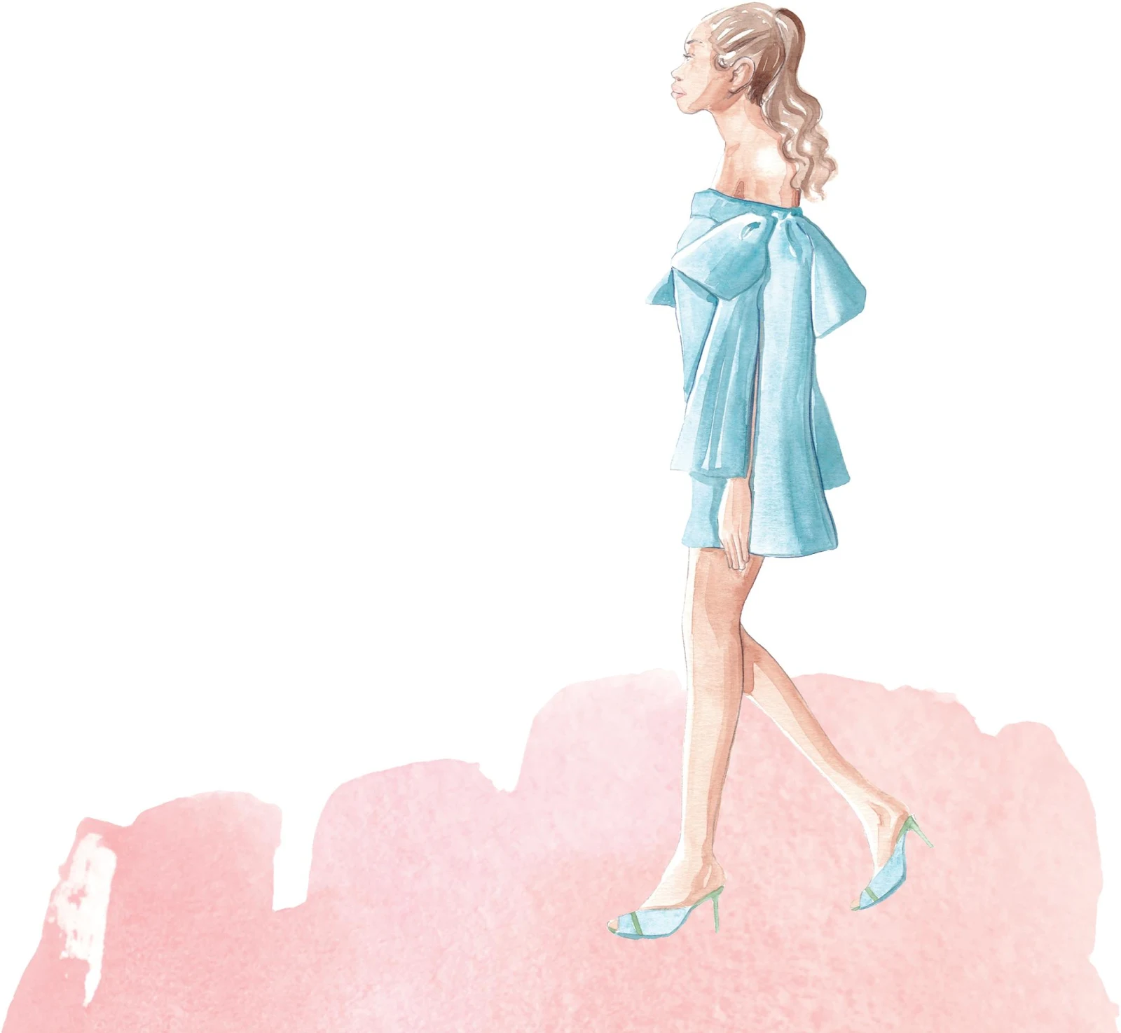
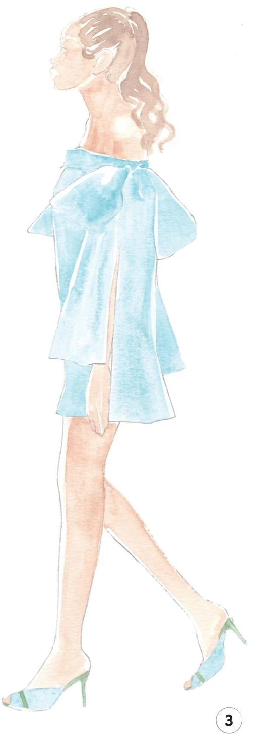
Womenswear head to toe
LEVEL: EASY BRAND: BERNADETTE + MALONE SOULIERS
This tutorial includes our first human figure, but that’s no reason to feel nervous. Mastering sketching and watercolor can be a long process, so remember that this is just the beginning of your journey—you’ll have plenty of opportunity to improve! A profile is the easiest view to start with, and you may like to refer back to the Creating a Character section of this book for more tips.
MATERIALS
Essentials:
- fine pencil
- eraser
Paper:
- A4 watercolor paper (300 GSM)
Brushes:
- round synthetic brush number 0
- round synthetic brush number 1
- round synthetic brush number 2
Paints:
- China White
- Yellow Ochre Light
- Vandyke Brown
- Indigo
- Opera Rose
- Cadmium Red
- Permanent Sap Green
- Cerulean Blue
Pencils:
- Walnut Brown 177
- Indanthrene Blue 247
1. As usual, our first step is to make a light sketch of the whole illustration. Be careful to include enough detail on the face, but don’t be tempted to add too many lines for the other sections such as the dress or hair, as we will build everything up little by little with watercolor.
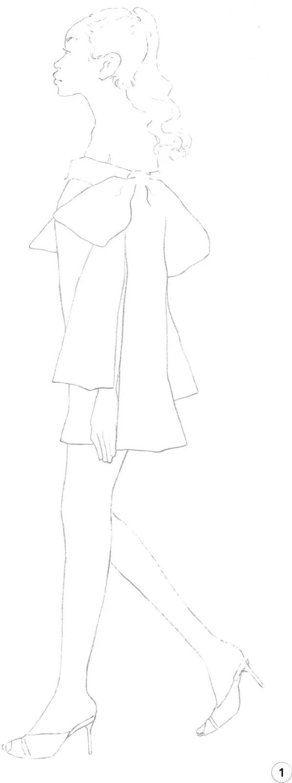
2. Next, create a mid-tone for the skin and hair by mixing Cadmium Red, Yellow Ochre Light, Vandyke Brown, and China White. In this illustration, the light is coming from the left, so apply the mid-tone accordingly. Paint the face, neck, and shoulder with a round brush 1, leaving some white paper on the left side of the girl and on the shoulder, where there should be a small rounded highlight.
For the hand, work quite precisely with a round brush 0, aiming to leave some thin white space between the fingers. For the legs, use a round brush 2.
To create the mid-tone for the hair on the head, apply a slightly diluted Vandyke Brown paint with the round brush 1, then create soft curls for the ponytail.
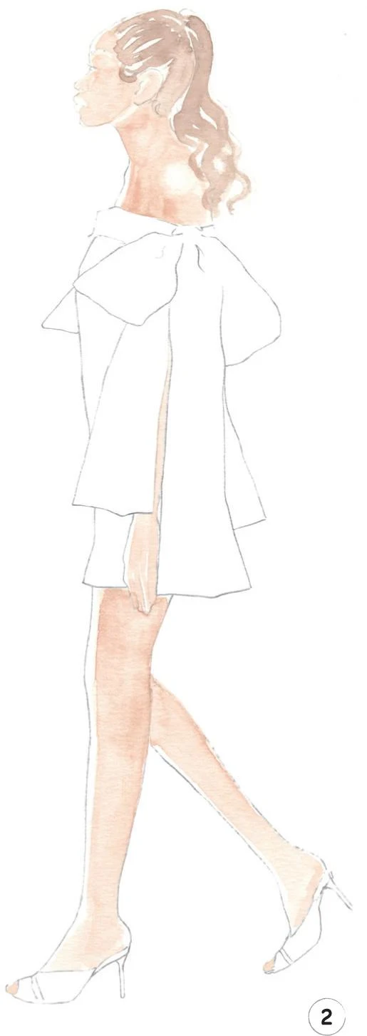
3. Now we’ll create a mid-tone for the dress and shoes, mixing Cerulean Blue and China White. Use the round brush 2 for the dress and the number 1 for the shoes.
To complete this step, mix some Permanent Sap Green with China White, then paint the details on the shoes, including both heels, with the round brush 0.
4. In this step, we’ll add the dark tones to the skin and hair. For the skin, make another mix of Cadmium Red, Yellow Ochre Light, Vandyke Brown, and China White, but this time use less China White (see tip). Use the round brush 1 to create shadows on the cheek, ear, under the chin, and down to the shoulder. With the round brush 0, add a soft dark tone under the eyebrow and on the nostril, then use a thin stroke to suggest the clavicle.
The visible thin line of the arm is shadowed by the sleeve, so it should be dark as well. Paint it with the round brush 0, along with some tiny thin lines of shadow between the fingers. For the legs, use the round brush 1.
Use some Vandyke Brown and the round brush 1 to add some dark tone to the hair. I focused more on the bottom part of the head, then added some locks.
5. Now add a dark tone to the dress. Mix Cerulean Blue and China White with a bit of Indigo. Once again, consider how the light touches our figure: you’ll mostly add the mix to the right-hand side of the dress, using the round brush 1.
With the same mix and the round brush 0, create a thin line on the soles of the shoes.
6. Her şey kuruduktan sonra görünür kalem izlerini silin. Son dokunuşlar için biraz Opera Rose ve Yellow Ochre Light'ı karıştırın. Yuvarlak fırçayı 0 kullanarak dudakları ekleyin.
Bu nispeten küçük bir çizim olduğundan, Ceviz Kahvesi kalem kullanarak göz ve kaş çizin, ardından dudaklar arasında yumuşak bir çizgi oluşturun. Kulağı küçük koyu kalem işaretleriyle tanımlayın. Saça, ellere ve bacaklara belirginlik kazandırmak için Ceviz Kahvesi kalemi kullanmaya devam edin.
Aynı şekilde elbiseyi güzelleştirmek için Indanthrene Mavisi kalem kullanın.
Erkek giyimi tepeden tırnağa
SEVİYE: EASY MARKA: BERLUTI
Artık tepeden tırnağa bir takım elbise giyen bu modelle ilk erkek giyim görünümümüzü keşfetmenin zamanı geldi. Bu derste, öncekine göre daha az tipik bir ışık kaynağını ele alacağız.
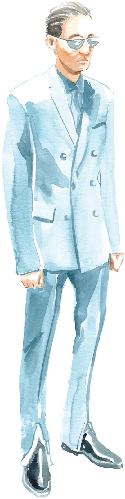
MALZEMELER
Temeller:
- ince kalem
- silgi
Kağıt:
- A4 suluboya kağıdı (300 GSM)
Fırçalar:
- sincap paspas fırçası boyut 2
- yuvarlak sentetik fırça numarası 0
- 1 numaralı yuvarlak sentetik fırça
- 2 numaralı yuvarlak sentetik fırça
Boyalar:
- Çin Beyazı
- Sarı Toprak Rengi Işık
- Vandyke Brown
- Çivit mavisi
- Kadmiyum Kırmızısı
- Gök Mavisi
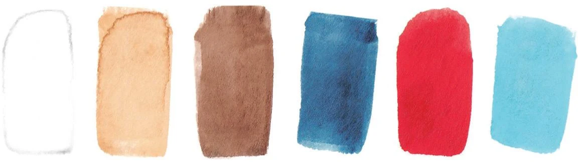
Kalem:
- Ceviz Kahve 177
1. Bir kez daha yapılacak ilk şey, resmin tamamının hafif bir taslağını yapmaktır. Güneş gözlüklerine ve pantolonun eteğine özellikle dikkat ederek ihtiyaç duyduğunuz kadar ayrıntı çizin .
