
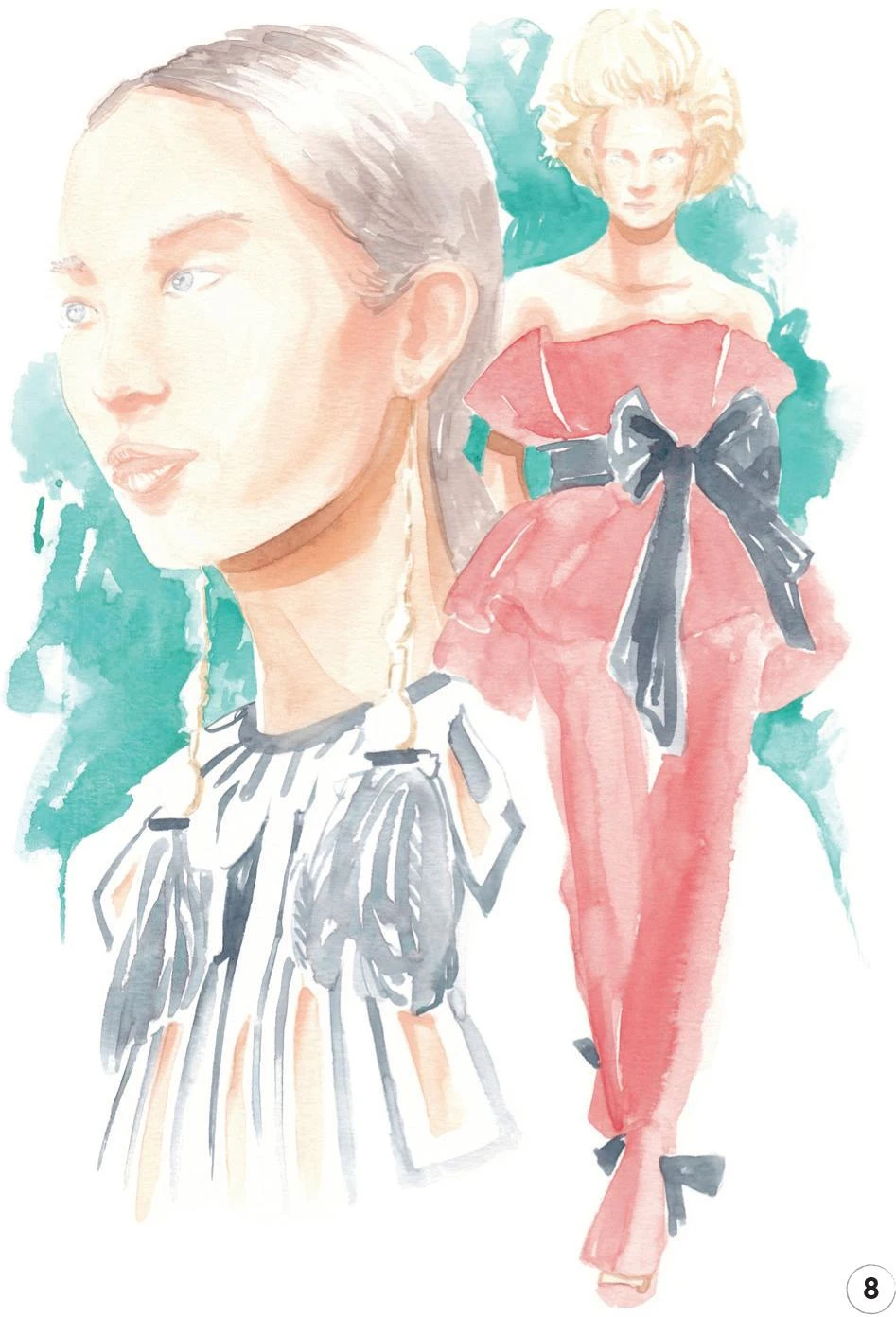
2. Şimdi cilt ve saça odaklanacağız. Tüm bu adım için yuvarlak bir fırça kullanın 1. Kadmiyum Kırmızısı, Açık Sarı Sarı ve Çin Beyazını karıştırarak yüz ve eller için bir orta ton oluşturun. Yüzünüze, boynunuza ve ellerinize uygulayın, beyaz alanları vurgu olarak bırakmayı unutmayın ( ipucuna bakın ).
Saçlar için Vandyke Brown ve Indigo'yu karıştırın. Bu karışımı saçınızın yan kısmına ekledikten sonra daha fazla suyla seyrelterek saçın geri kalanını tamamlayacak daha hafif bir karışım elde edin.
3. Şimdi takım elbise için gök mavisi, çivit mavisi ve Çin beyazını karıştırarak kravat ve gömleği de içeren bir orta ton oluşturacağız . Daha küçük alanlar için yuvarlak fırça 1'i kullanmanızı öneririm, elbisenin geri kalanı için ise 2 numara paspas fırçası iyi sonuç verir.
4. Şimdi cilde koyu tonu ekleyin. Daha önce olduğu gibi aynı karışıma biraz daha Vandyke Brown ekleyin (Kadmiyum Kırmızısı, Açık Sarı Sarı ve Çin Beyazı).
Kaşların, burnun ve çenenin altında daha koyu alanlar oluşturmak için yuvarlak bir fırça 0 kullanın. Parmaklarınızın arasına da biraz daha koyu çizgiler ekleyin. Fırçanın ucunu temiz suya batırın ve dudakları hafifçe seyreltilmiş renkle boyayın.
Yuvarlak fırça 0 ile devam ederek, bir miktar Indigo'yu hafifçe seyreltin ve güneş gözlüklerine renk katın. Küçük bir alan olduğundan çok dikkatli olun. Işığın bu tür yüzeylere kumaştan daha güçlü çarptığını göz önünde bulundurarak çizgileri oldukça grafik ve tanımlı tutun.
Adımı tamamlamak için biraz Vandyke Brown ve Indigo'yu karıştırın ve ayakkabıları boyamak için yuvarlak fırçayı 1 kullanın. Her ayakkabının üzerine beyaz bir çizgiyi vurgu olarak tanımlayın, ardından koyu alanları boyamak için karışımı kullanın. Orta tonu oluşturmak için karışımınızı seyreltin ve bunu ayakkabıların geri kalanında kullanın .
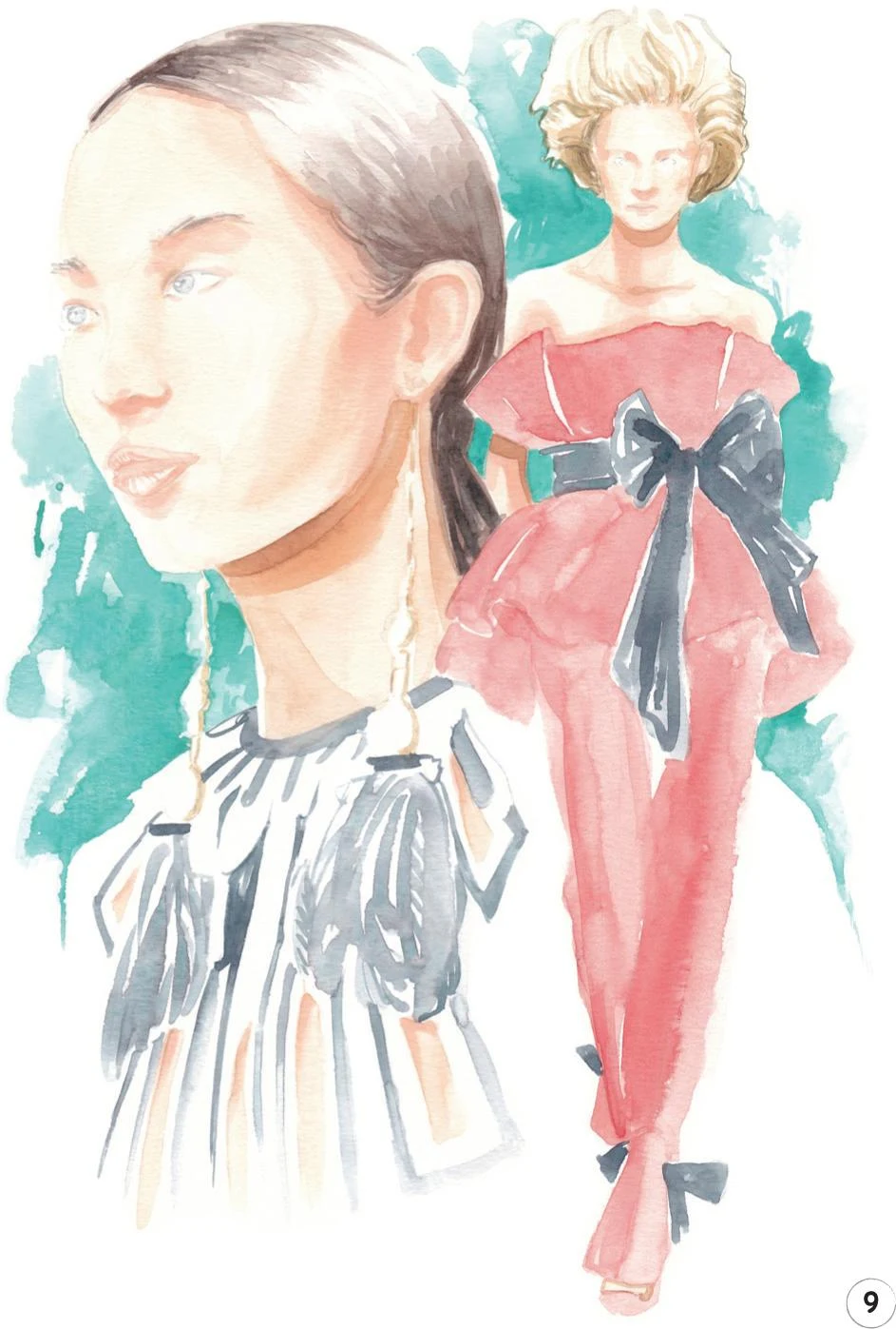
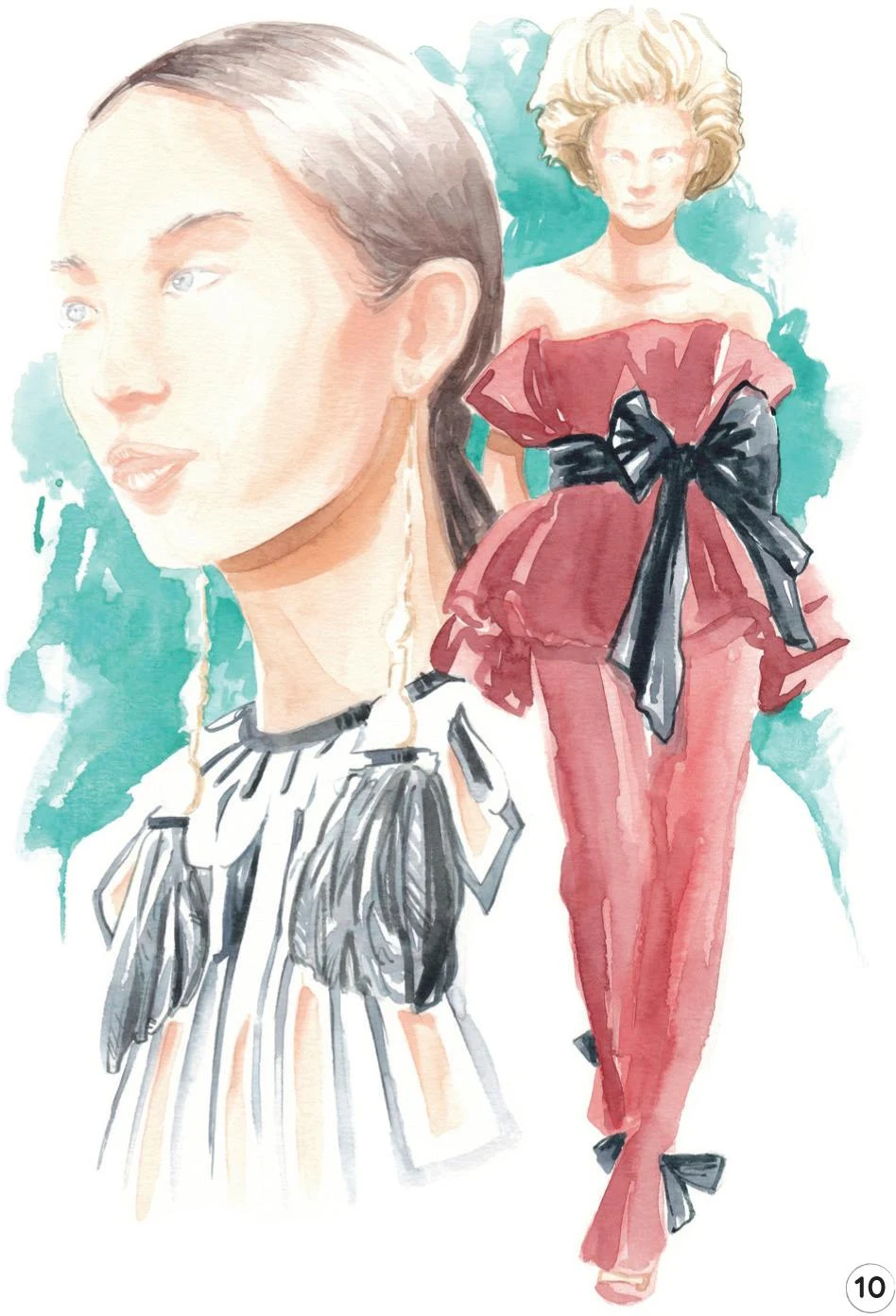
5. Görünür eskiz izlerini silmeden önce her şeyin tamamen kurumasını bekleyin, ardından son rötuşların zamanı geldi. Takım elbiseye koyu tonunu ekleyelim.
Cerulean Blue ve Indigo'yu karıştırın, ardından ihtiyacınız olan hassasiyete göre farklı fırçalarla uygulayın. Örneğin bacaklardaki gölgeler için yuvarlak fırça 2 mükemmelken, gömlek yakası, cepler, düğmeler ve pantolonun etek ucu gibi daha küçük detaylar için yuvarlak fırça 0'a ihtiyacınız olabilir.
Yukarıdan gelen ışığın neden olduğu kafa gölgesini oluşturmak için kravatın yanındaki karanlık bir alanı boyayın. Ayrıca omuzlar gibi gerekli olduğunu düşündüğünüz yerlere belirginlik kazandırmak için bazı ince çizgiler ekleyin.
Bu çizimi tamamlamak için, yüzü ve elleri yumuşak bir şekilde tanımlamak ve kaşları ve dudakların arasına ince bir çizgi eklemek için Ceviz Kahvesi kalem kullanın.
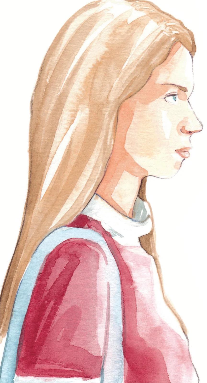
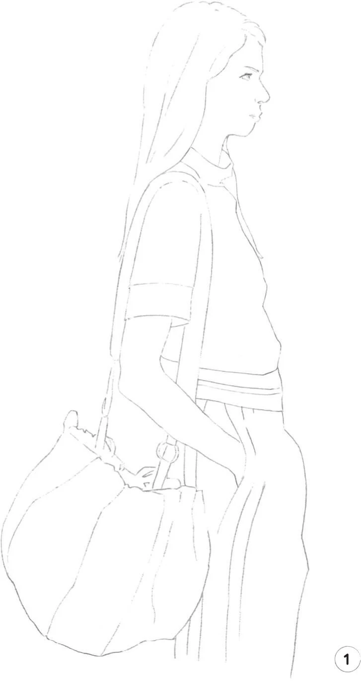
Çantalı kız
SEVİYE: EASY MARKA: SUZI LEE
This is the final tutorial in the “easy” section. We’re going to explore the human figure once again, but this time we’ll add in another element: a shoulder bag. Let’s see how all these elements interact in this illustration!
MATERIALS
Essentials:
- fine pencil
- eraser
Paper:
- A4 watercolor paper (300 GSM)
Brushes:
- squirrel mop brush size 2
- round synthetic brush number 0
- round synthetic brush number 1
- round synthetic brush number 2
Paints:
- China White
- Yellow Ochre Light
- Vandyke Brown
- Indigo
- Cadmium Red
- Cadmium Yellow
- Cerulean Blue
- Winsor Red Deep
Pencils:
- Walnut Brown 177
- Indanthrene Blue 247
- Cobalt Turquoise 153
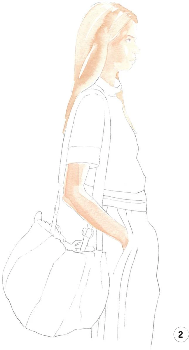
1. A light sketch of the whole illustration is our first step once again. Be sure to include enough details on the bag and the face, but don’t add too many lines in other parts such as the hair to keep everything as clean as possible.
2. Now create a mid-tone for the skin and hair. In order to create the right shade for the skin, mix Cadmium Red, Cadmium Yellow, and China White. In this illustration, the light is coming from the right, so remember to take this into account throughout the steps. Paint the face, neck, and arm with a mop brush size 2, leaving some small white areas such as on the forehead and cheek. Use the tip of the brush to paint any narrow areas.
For the hair mid-tone, slightly dilute Yellow Ochre Light and apply with the mop brush. Add the eyebrow and the hair behind the neck and down her back with a round brush 0.
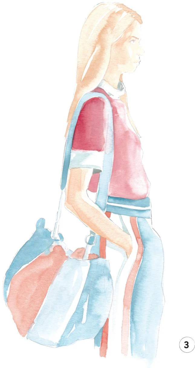
3. This is going to be a slightly long step, as we’re going to add all the mid-tones for the rest of the figure. Start by painting soft shadows on the white parts of the garments: the collar, the bottom of the sleeve, and the stripe on the pants. Mix some Indigo with a lot of China White, and use the round brush 0 for the the collar and a round brush 1 for the sleeve and the pocket of the pants. Create a soft line under the arm to reproduce the shadow that it creates on the pants.
For the t-shirt, slightly dilute a mix of Winsor Red Deep, Cadmium Red, and China White. Apply with the mop brush, using the round brush 0 or 1 for smaller areas.
Now we’ll add the orange. Mix Cadmium Red with a little Cadmium Yellow and China White. Use the round brush 1 to paint the narrow orange stripes on the pants and the mop brush for the orange sections of the bag.
The last mix to add to our sketch is a shade of blue, created by mixing Indigo, Cerulean Blue, and China White. Apply to the shoulder strap of the bag, the bag itself, and the pants, leaving a horizontal white line around the waist. Use a round brush 2 for the strap, then switch to the mop brush for the pants and the larger sections of the bag. Dilute the blue mix and add in the lighter portions of the bag. Use this diluted mix for the links of the shoulder strap using the round brush 0.
4. Leave everything to dry and erase any remaining sketch lines (see tip).
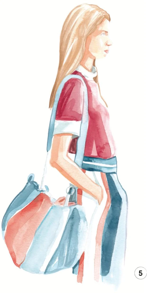
We’ll now add a dark tone on both the skin and hair. For the skin, again mix Cadmium Red, Cadmium Yellow, and China White. If you need the mix a bit darker, add a little Vandyke Brown, but be careful not to overdo it.
Add to the face with the round brush 1, continuing under the chin. Swap to the round brush 0 to create a small shadow beneath the eyebrow and under the nose. Return to the round brush 1 to add this mid-tone to the back of the arm, then create a soft dark shadow under the sleeve.
For the hair, mix Yellow Ochre Light with a little Vandyke Brown, then apply with the round brush 2, using brush 0 for the finer lines.
To complete this step, mix some Winsor Red Deep with China White and paint the lips.
5. Now we’ll add the dark tone to the garments. Start applying some Winsor Red Deep to the shirt with the round brush 2. Add some Vandyke Brown, and use the round brush 0 to define the line between the arm and the shoulder strap.
With some Cadmium Red, create a soft shadow on the orange stripe of the pants under the arm, then add the darker tone to the orange portions of the bag, using the round brush 1.
Mix some Indigo and Cerulean Blue and add the dark tones to the small parts around the waist of the pants using the round brush 0. For the darker blue stripes on the pants and the bag, use the mop brush. Use the same mix slightly diluted for the lighter blue portion of the bag.
6. We’re almost done! For this final step, we’ll use colored pencils: draw the eye with Walnut Brown and Cobalt Turquoise. Then continue with the Walnut Brown pencil for more definition on the hair, for the nostril between the lips, and on the arm. Outline other parts, such as the bag and parts of the t-shirt, with an Indanthrene Blue pencil to finish.
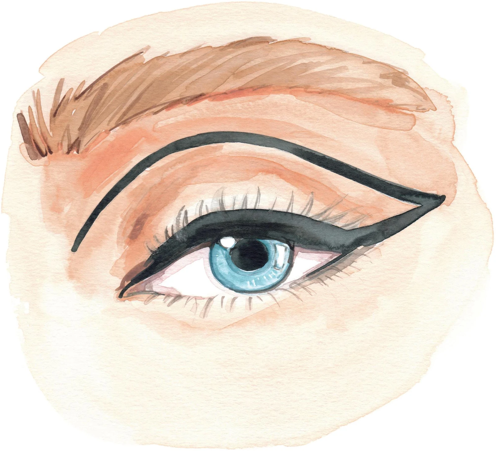
Eye makeup
LEVEL: INTERMEDIATE
Welcome to the first tutorial of the Intermediate section! Here, we’re going to explore the eye in more detail, including makeup. This is going to be exciting and fun, but stay focused!
MATERIALS
Essentials:
- fine pencil
- eraser
Paper:
- A4 watercolor paper (300 GSM)
Brushes:
- squirrel mop brush size 2
- round synthetic brush number 0
- round synthetic brush number 1
- round synthetic brush number 2
Paints:
- China White
- Yellow Ochre Light
- Vandyke Brown
- Indigo
- Cadmium Red
- Cadmium Yellow
- Cerulean Blue
- Opera Rose
- Cobalt Turquoise
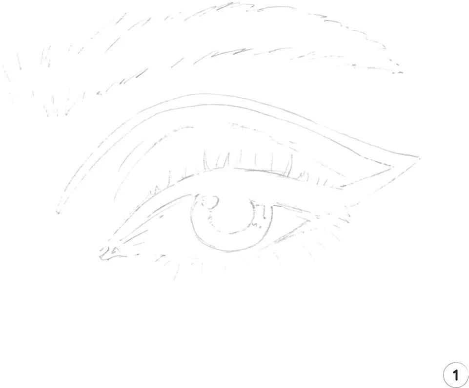
1. For our first step, start with a sketch of the illustration. Keep your preliminary lines light and you won’t need to erase them, as this time they’ll be fully concealed by the paint.
2. Let’s create a mid-tone for the skin. Start by mixing Cadmium Red, Yellow Ochre Light, and China White. Dilute this mix slightly more than usual, then apply with a mop brush 2 right under the eyebrow (the darkest part of the skin). Continue to apply your mix over the rest of the area.
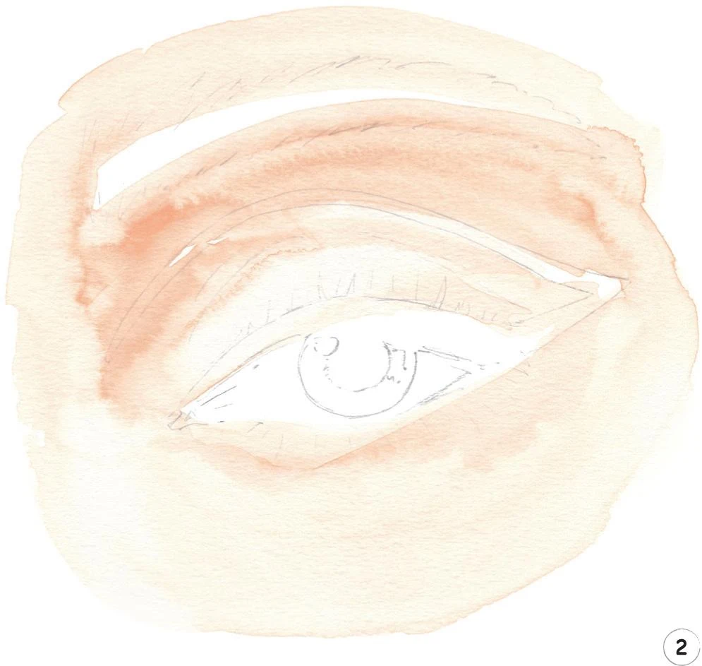
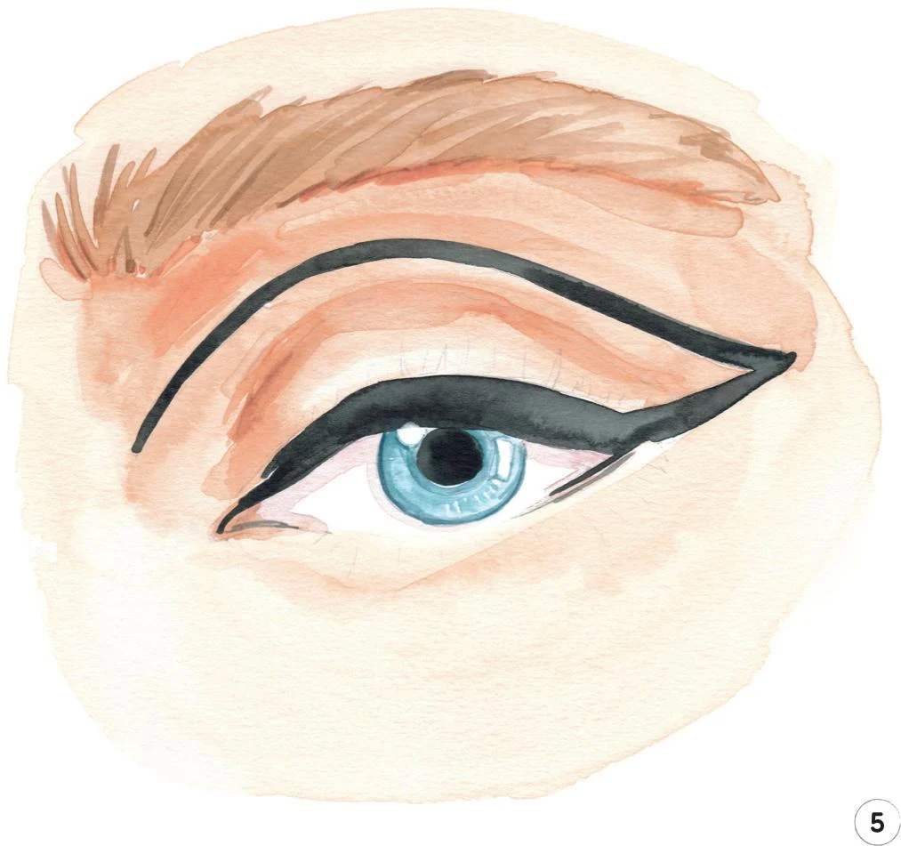
3. Now start adding the color to the eye itself. Mix some Opera Rose with China White and a little Cobalt Turquoise. Use a round brush 1 to create a soft shadow beneath the upper eyelid. Next, mix Cerulean Blue and a little China White and paint in the iris. Be careful here as you need to leave some white areas to act as the highlights—a rounded highlight on the left and a squarer space on the right—and to give yourself space to add the pupil. Use a round brush 0 so you can be as precise as possible.
For the eyebrow, mix some Yellow Ochre Light with China White, and start painting from left to right, slightly diluting your mix as you work your way across. Use the round brush 0 to add a few single hairs at the beginning of the eyebrow for a touch of realism.
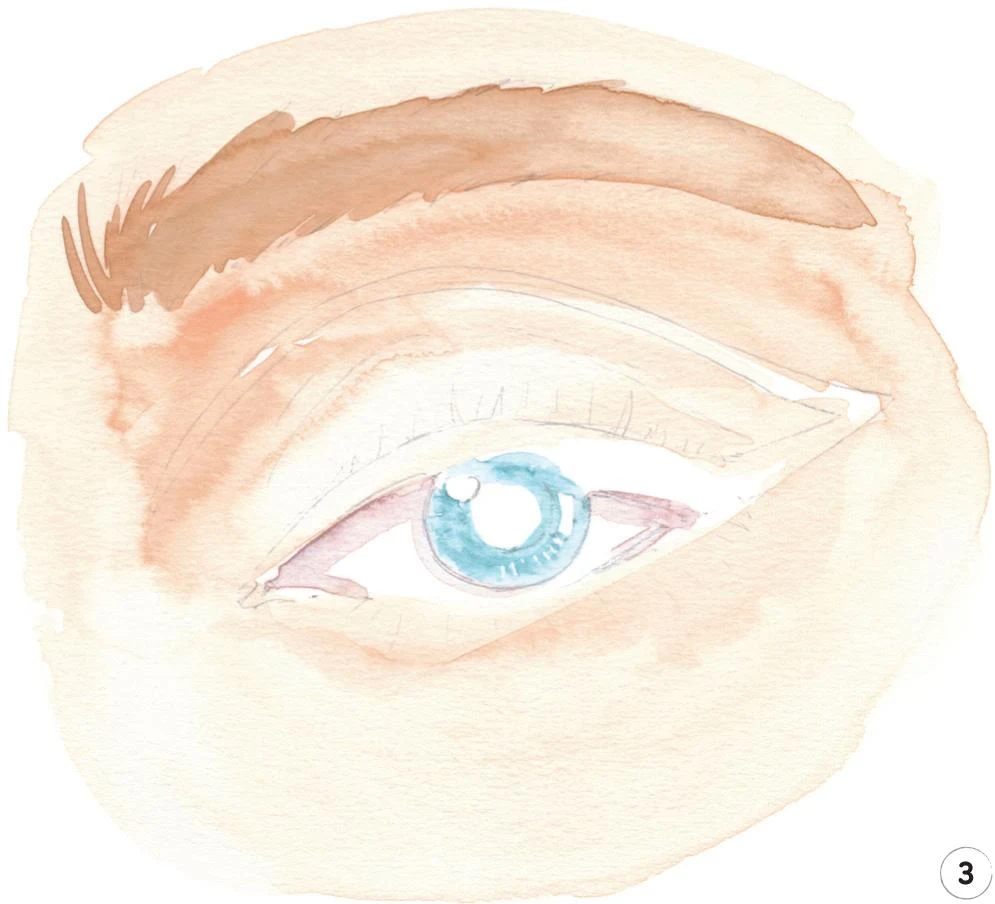
4. Next we’re going to add some shadows on the skin, iris, and eyebrow. We’ll use the mix from Step 2 (Cadmium Red, Yellow Ochre Light, and China White), but this time using finer brushes to create the darker tones. Alternate the round brush number 1 with a number 2 depending on the size of the area you’re working, adding shadows under the eyebrow, at the sides of the eyelid, and wherever else you feel they’re necessary.
Mix Cerulean Blue with a little Indigo and add some dark values to the iris. Use the round brush 0 to outline the iris and around both highlights.
Now use some Yellow Ochre Light and the round brush 1 to add more hair to the eyebrow.
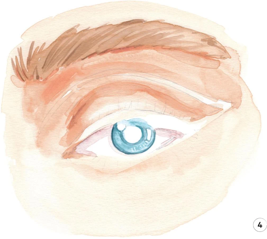
5. Create a nice shade of black by mixing Vandyke Brown and Indigo. With the round brush 1, add the pupil. With the same mix, paint the upper eyelid and continue to follow the line of the makeup. Be as precise as possible, switching between the round brushes 1 and 2 as necessary.
Complete this step with the round brush 0, adding some soft lines on the lower lid, particularly at the corners of the eyes.
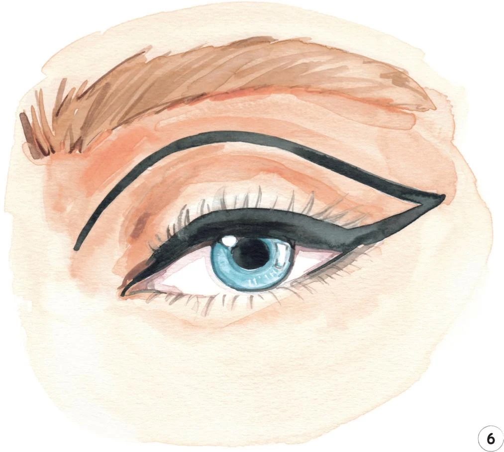
6. It’s time for the finishing details. For this whole step, I used the round brush 0. Use the same black mix as in Step 5 to paint the lashes on both lids and to accentuate the outline of the two highlights.
Add some dark hairs to the eyebrow with some Vandyke Brown. Darken the skin tones on the inner side of the eyelid.
Mix some Opera Rose with China White and a little Cobalt Turquoise and use to accentuate the shadow cast by the eyelid on the sclera (white of the eye).
If there are any pencil lines left you can now erase them.
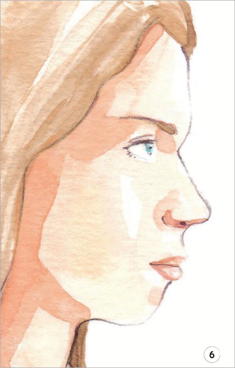
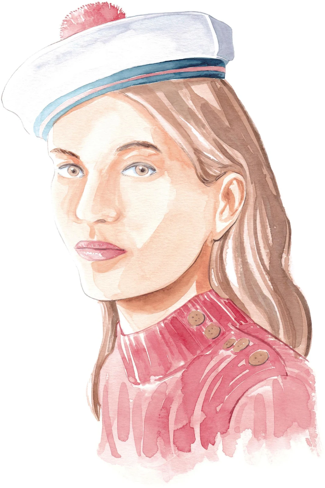
Girl with hat
LEVEL: INTERMEDIATE BRAND: PATOU
In this tutorial, for the first time, we’re going to depict a close-up of a girl’s face. We’re also adding a lovely hat to enhance the whole illustration. Letting your characters interact with accessories is always a good idea, and it contributes a more refined feeling to your work.
MATERIALS
Essentials:
- fine pencil
- eraser
Paper:
- A4 watercolor paper (300 GSM)
Brushes:
- squirrel mop brush size 2
- round synthetic brush number 0
- round synthetic brush number 1
- round synthetic brush number 2
Paints:
- China White
- Yellow Ochre Light
- Vandyke Brown
- Indigo
- Cadmium Red
- Cadmium Yellow
- Opera Rose
- Winsor Red Deep
- Cobalt Turquoise
Pencil:
- Walnut Brown 177
Copic Ciao Markers:
- Warm Gray No.2 W-2
- Pale Blue Gray B60
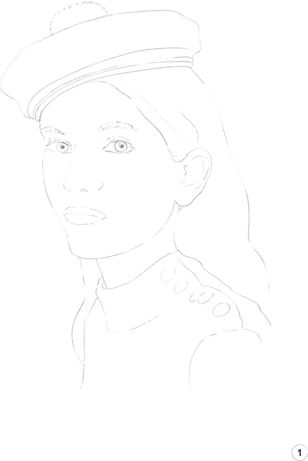
1. As this is a close-up portrait, you’ll find it useful to be quite detailed on the eyes and the lines on the hat when you draw your initial pencil sketch of the full illustration.
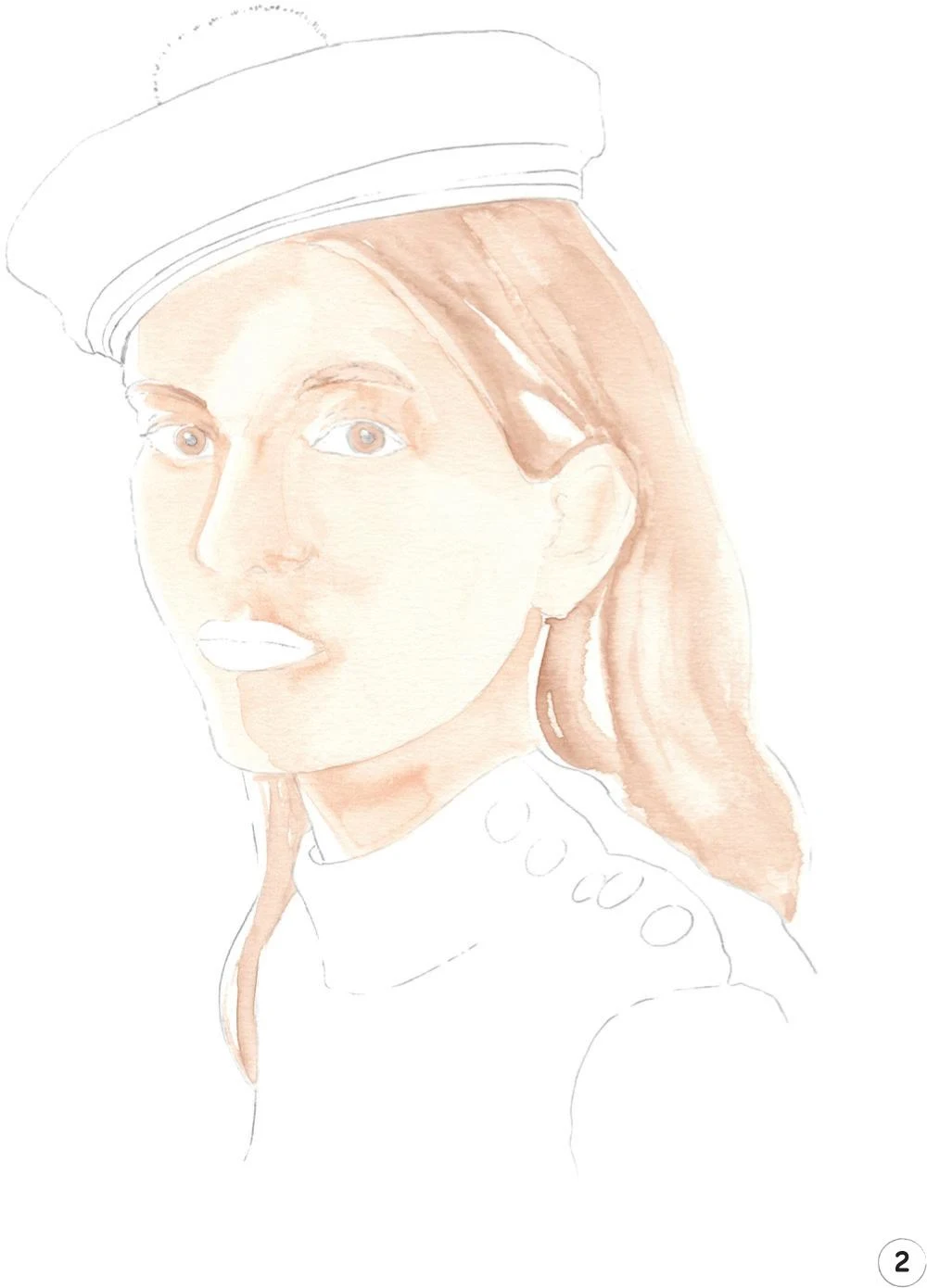
2. In the second step, we’ll create the mid-tones for the skin and hair. For the skin, I mixed Cadmium Red, Cadmium Yellow, and China White. In this illustration, the light is coming from the left, so be sure to apply the mix accordingly.
For the small parts of the face such as the irises, eyebrow arches, and the nose, I suggest using a round brush 1. For the rest of the face and neck, use a mop brush 2. Keep the mid-tone as even and light as possible by adding more water as necessary.
Let’s move on to the hair: mix some Yellow Ochre Light with a little Vandyke Brown and China White. Apply with the mop brush to keep the first layer of hair light and soft. With the same mix, but this time using a round brush 0, gently paint the eyebrows and both of the irises, too.
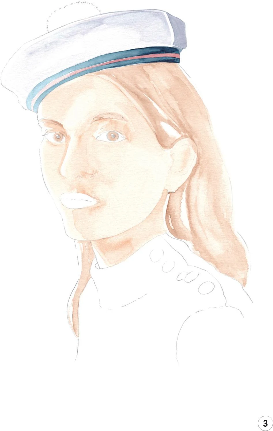
3. This step is all about the hat. Mix some Cobalt Turquoise with a little Opera Rose and China White, and apply it to the small area of shadow on the right. Continue to paint the main part of the hat, working from right to left and gradually diluting the mix on the paper so you move from a dark tone to a mid-tone, finally fading to the white of the paper at the edge of the hat. A round brush 2 is perfect for this step.
We’re now going to paint the three decorative strips on the hat. Start with the red one in the middle, using some Winsor Red Deep and the round brush 0. Again, paint from the right and add more and more water to dilute your color as you move toward the left. Now do the same with the two navy lines, using some Indigo.
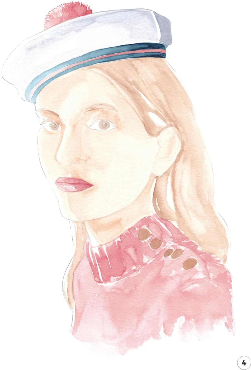
4. Now let’s focus on the red parts of the illustration. Mix some Winsor Red Deep with Cadmium Red to keep your paint bright. Start with the pom-pom on the top of the hat, applying the paint with the round brush 0. Outline the pom-pom with small dots of color to imitate its fluffy texture. Keep adding water as you work toward the left side of the pom-pom to respect the lighting.
Now, with the same mix and brush, move on to the lips, always taking into account the light and referring to Creating a Character: General Features—Lips for more tips on painting lips with watercolor. Use the same mix to create the mid-tone for the sweater, applying it with the mop brush.
To complete this step, use the round brush 1 and a mix of Yellow Ochre Light and Vandyke Brown to paint the buttons on the sweater.
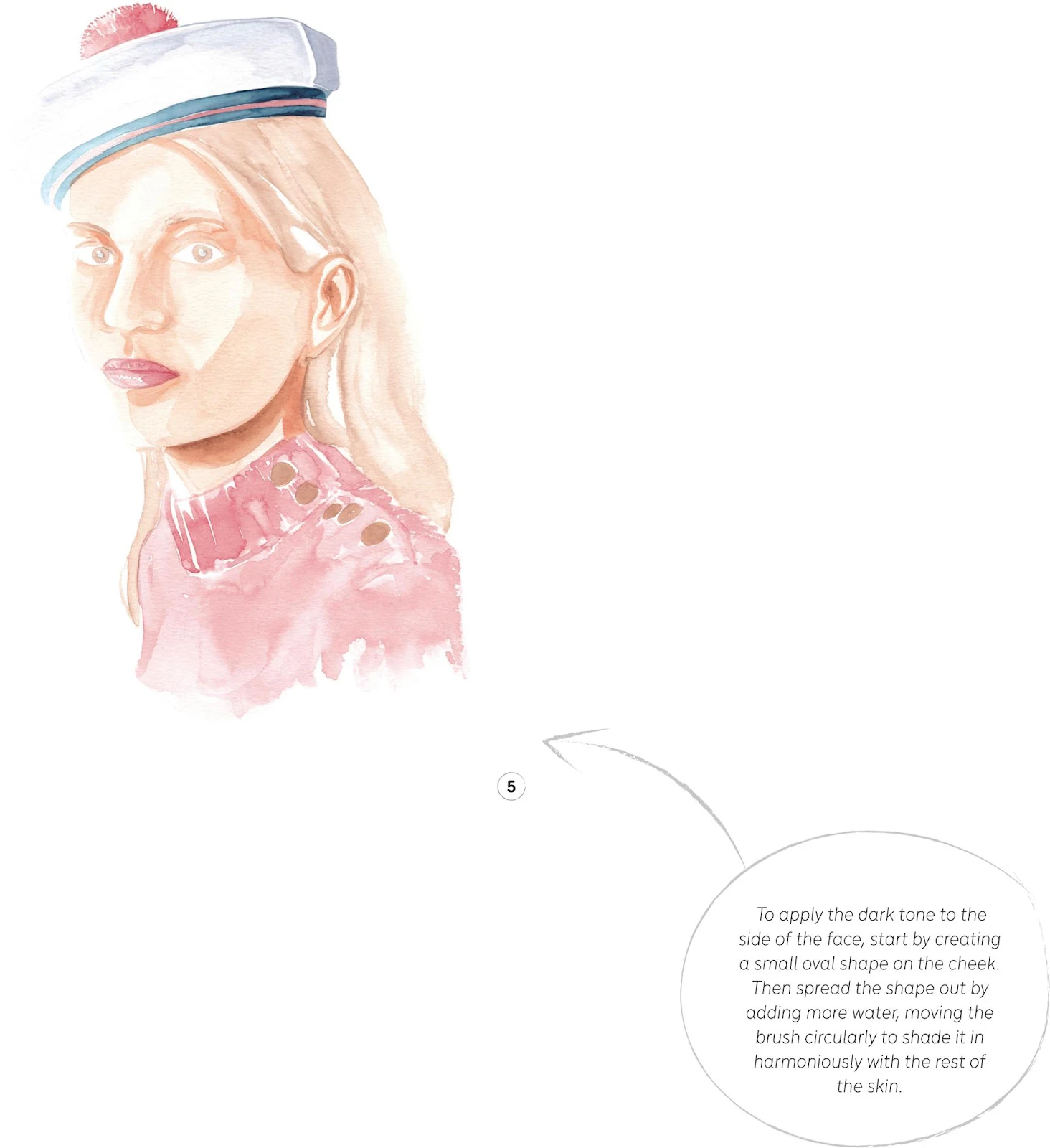
5. Erase any visible sketch lines, then we’ll focus once again on the skin. For the dark tone, use the mix from Step 2 (Cadmium Red, Cadmium Yellow, and China White), but diluted with less water. Apply it under the eyebrows, along the nose, under the lips, and in the ear folds with the round brush 1.
Switch to round brush 2 to add a soft dark line at the top of the forehead where the hat casts a small shadow, and across the right-hand side of the forehead.
Now apply the darker tone to the right-hand side of the face with the mop brush (see tip). To complete this step, add a little Vandyke Brown to your skin mix in order to paint, with the round brush 2, the shadow that the chin casts on the neck, which is quite often the darkest part of a portrait. You can add more dark lines in the ear, too, using the round brush 1.
6. In this step, we’ll add a dark tone to the hair and eyebrows. Mix Yellow Ochre Light and Vandyke Brown and use the mop brush and the round brush 2 to define the locks of hair. Then use the same paint mix with the round brush 0 to finely define the eyebrows.
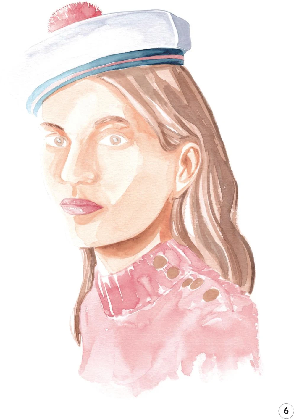
7. Let’s now add some dark tones on the sweater using some Winsor Red Deep. Start by adding fine lines with the round brush 0 to better define some parts around the neck and on the shoulder. Then, using the mop brush, add some soft lines over the rest of the sweater to imitate its texture.
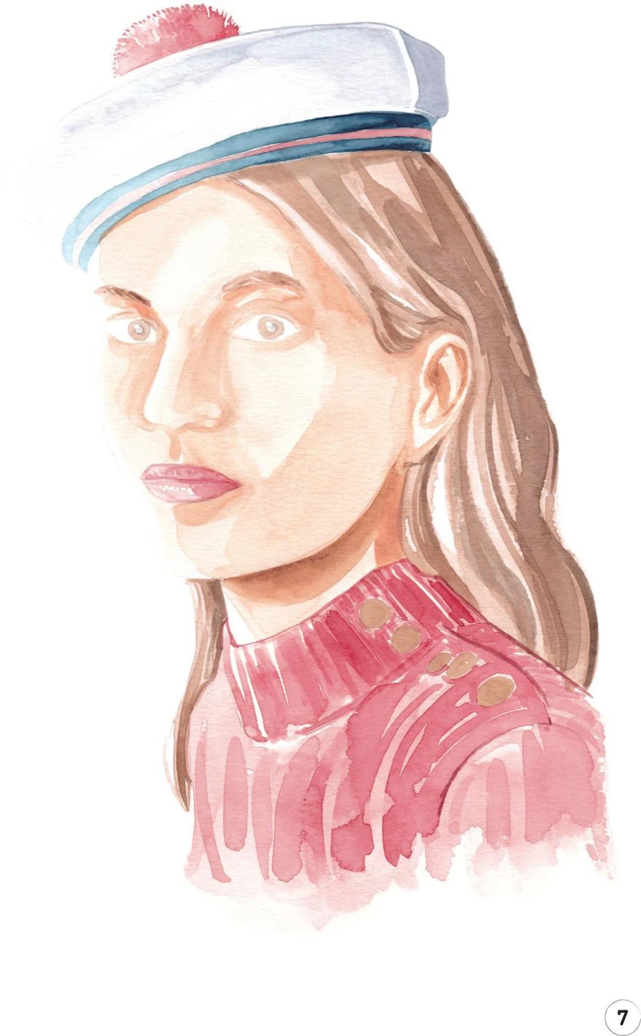
8. In this final step we’ll focus on the eyes, then add some finishing touches. For each eye, use the Copic Marker B60 to create a soft, thin shadow on the sclera (white of the eye), right under the top lids. Outline both lids with a Copic Marker W-2. You can use the same marker to lightly draw in the prominent nostril.
For the last touches, use a Walnut Brown pencil to add definition where needed. I used the pencil to add more details on the eyes, including the pupil and the top lids. I also added to the eyebrows, drew a soft line between the lips, and defined the outline on the left of the hat and around the face and chin. To complete this illustration, add some lines on the buttons of the sweater.
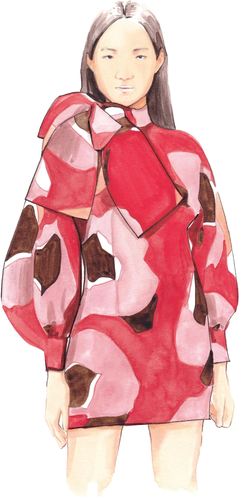
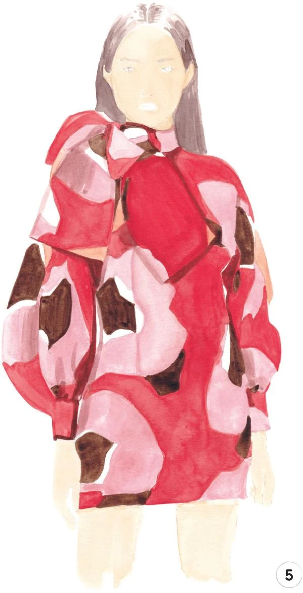
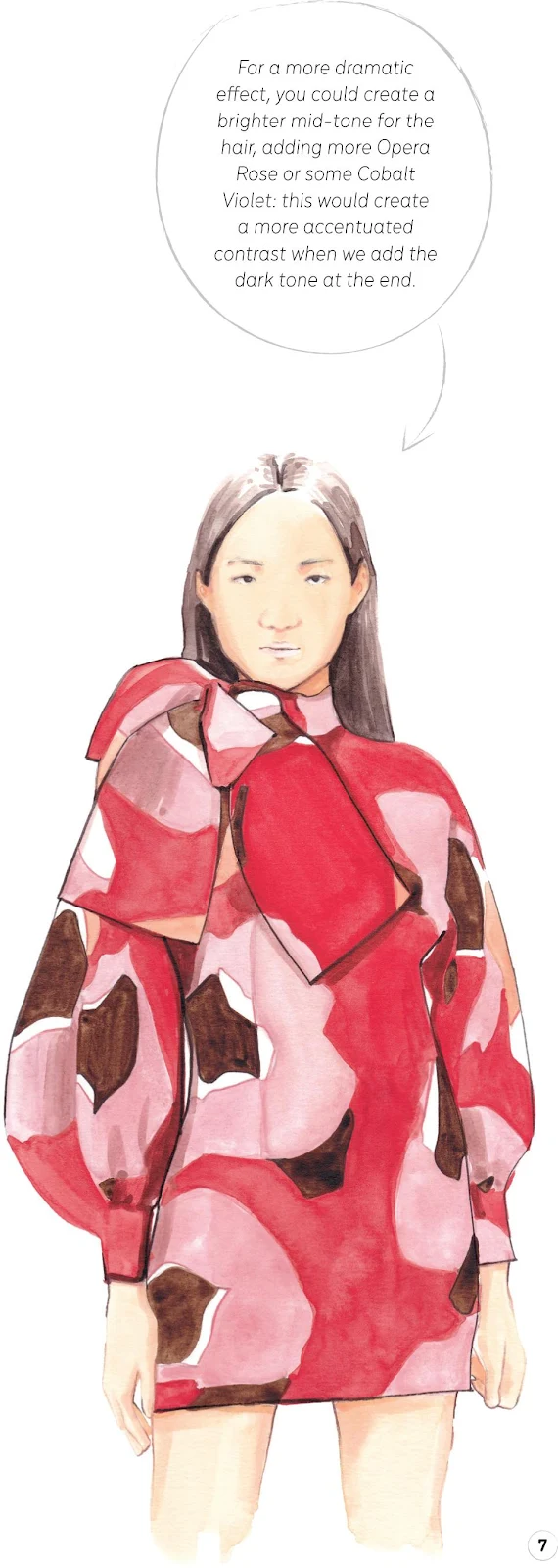
Woman in print dress
LEVEL: INTERMEDIATE BRAND: ELZINGA
In this tutorial, we are going to explore the front view of a figure for the first time. We’re also going to learn how to create a lovely print dress successfully, making up the pattern with five different colors.
MATERIALS
Essentials:
- fine pencil
- eraser
Paper:
- A4 watercolor paper (300 GSM)
Brushes:
- squirrel mop brush size 2
- round synthetic brush number 0
- round synthetic brush number 1
Paints:
- China White
- Opera Rose
- Vandyke Brown
- Cadmium Yellow
- Cadmium Red
- Winsor Red Deep
- Indigo
Pencils:
- Beige Red 132
- Walnut Brown 177
- Cinnamon 189
Copic Ciao Markers:
- Pale Fruit Pink E000
- Soft Sun E21
- Pale Purple RV000
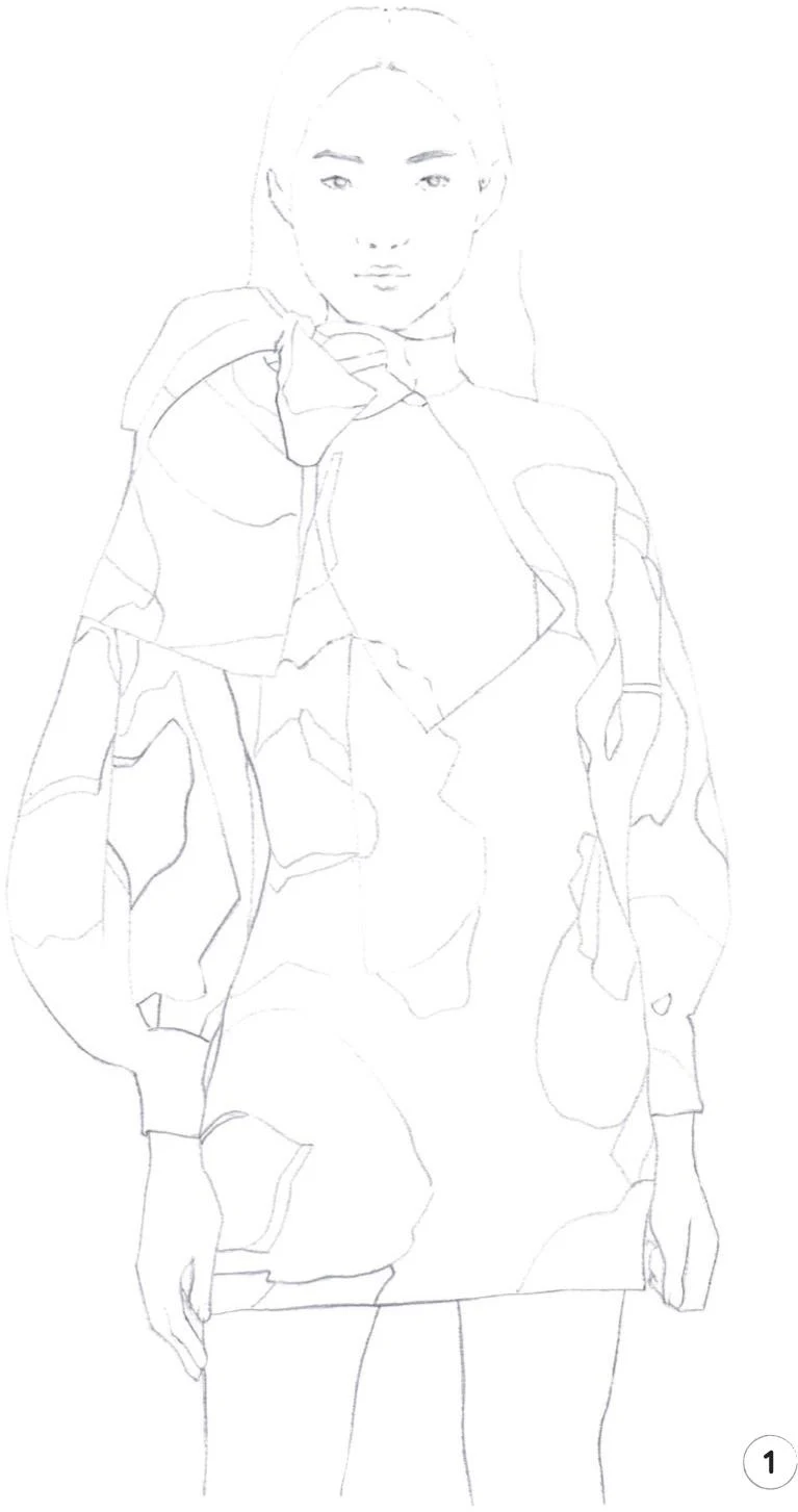
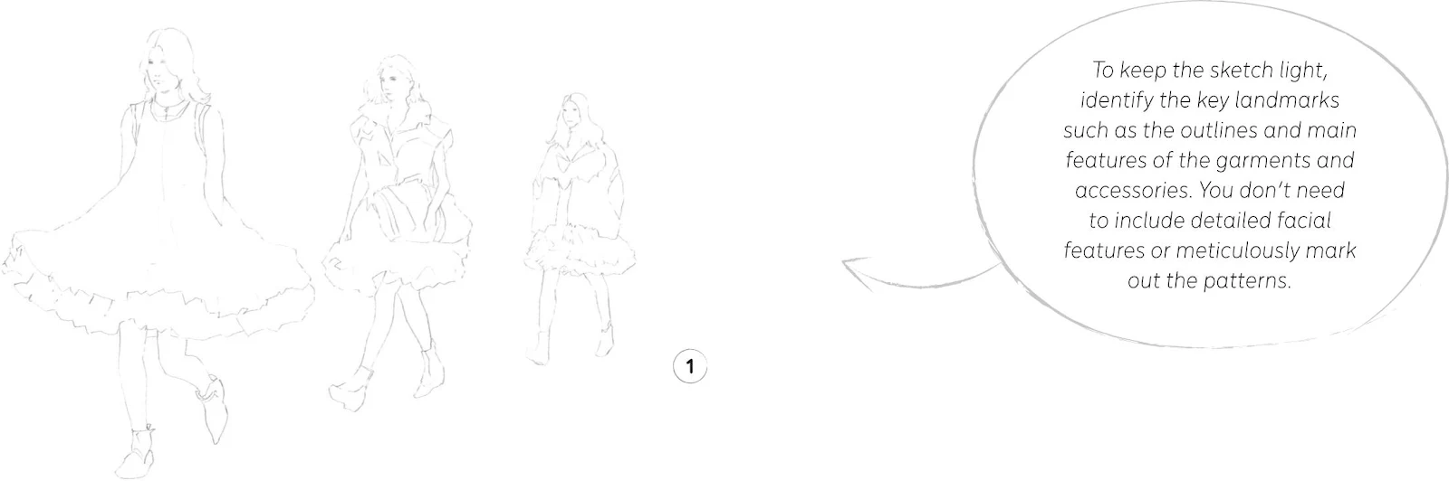
1. Our starting point, as always, is a pencil sketch of the full illustration. This time we are working with a challenging print on the dress: be sure to include all the landmarks you’ll need to guide you when adding paint, but try—as usual—to keep them as light as possible.
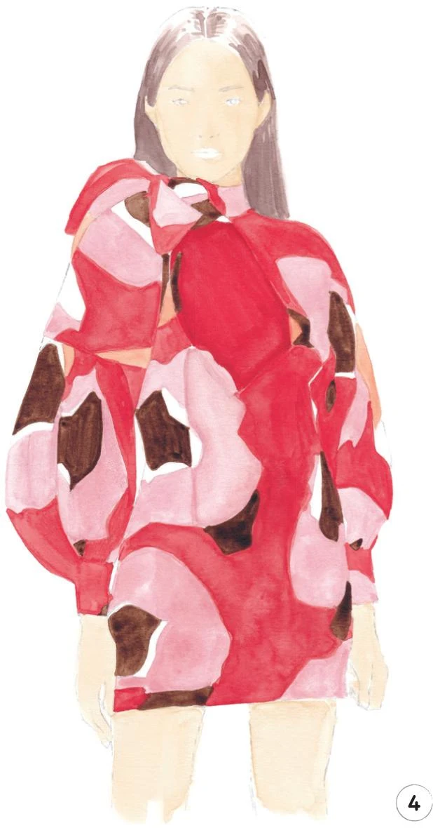
2. Start by painting the skin: face, hands, and legs. For the skin tone, mix Cadmium Red, China White, and a little bit of Cadmium Yellow. Take your time to find the right shade. Use the mop brush to create an even surface on the skin to achieve a nice balance across the whole work so the print dress will be the main focus.
3. There are five colors in the dress: white, pink, orange, red, and brown. We’ll use the paper for the white parts, and start to paint with the pale colors. Mix Opera Rose, China White, and a tiny bit of Cadmium Yellow to obtain the pink shade. Use a round brush number 1, and keep the paint quite homogeneous. Start to create a soft line for the seam of the dress down the middle of the torso. Next add the small orange parts of the pattern, mixing Cadmium Red and Cadmium Yellow.
4. It’s time to add some red paint to the dress. I mixed some Winsor Red Deep with Cadmium Red and a little bit of China White to obtain a good, bright shade. I suggest using the round brush 1 for all the smaller sections, using the mop brush 2 for bigger areas such as the torso. Use Vandyke Brown to fill the remaining parts of the pattern. Add a mid-tone layer on the hair, using the round brush 1: mix Opera Rose, Vandyke Brown, and a bit of Indigo to keep it looking natural. Leave some white paper showing on both sides to start to create the reflections on the hair.
5. Now that we have one layer of paint over the whole structure of the illustration, you can erase what’s left of our pencil lines. In order to give the dress some volume, let’s add the dark tones to the pattern. Mix some Vandyke Brown into the pink and red shades we made for the dress in Steps 3 and 4. Start working the bow a little to make it more visible and clear, adding the darker tones where the bow creates shadow.Add some more definition to the sleeves and at the sides of the torso and hips.
6. Now add some details to the face, hands, and legs. There is already a lot going on with the dress, so keep things quite simple on the face. Use the E000 marker to create some dark tones under the eyebrows and nose and on the sides of the face, then use the E21 marker for darker areas such as in the ears and on the neck. For the lips, use the RV000 marker. The Beige Red pencil is a good choice for accentuating the nose a little. To finish the face, use the Walnut Brown pencil to draw the eyes, eyebrows, and a soft line between the lips. Use the E000 and E21 markers once again to create the dark tones on the hands and legs. Now use the Cinnamon pencil to accentuate the outlines of both hands and legs.
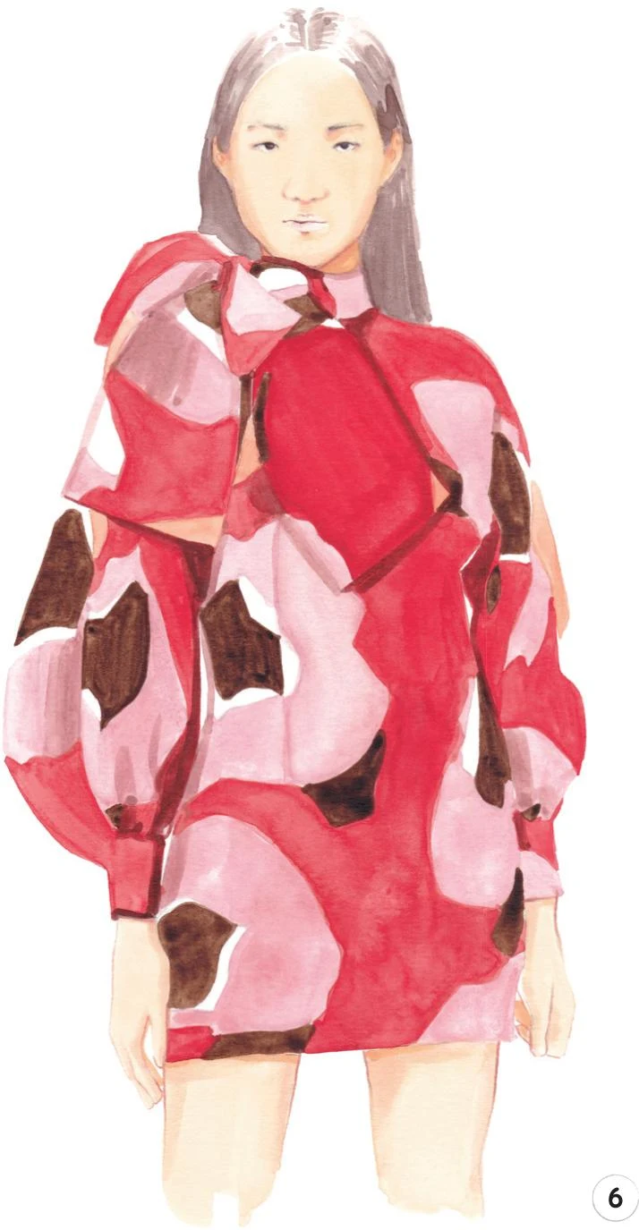
7. Refine the dress a bit more by using a dark shade of paint (Vandyke Brown and a little bit of Indigo) and the round brush 0 to create a subtle border to accentuate the bow and the neck. Add some details to the sleeves, torso, and up the legs. For the final touch, add a dark tone to the hair, mostly at the sides of the neck.
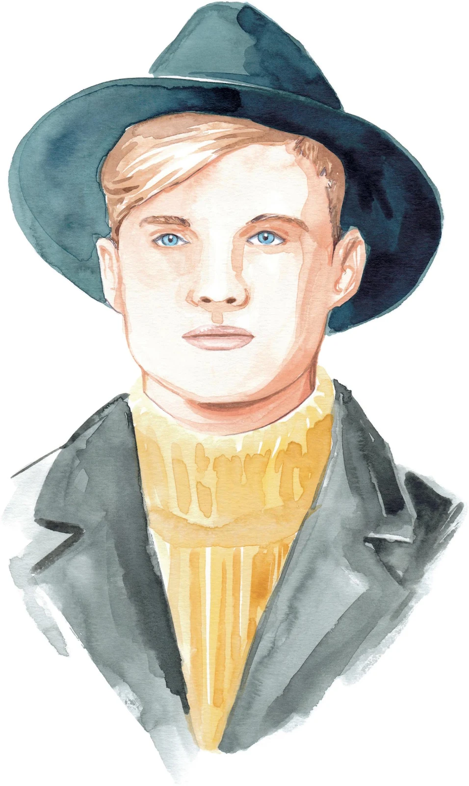
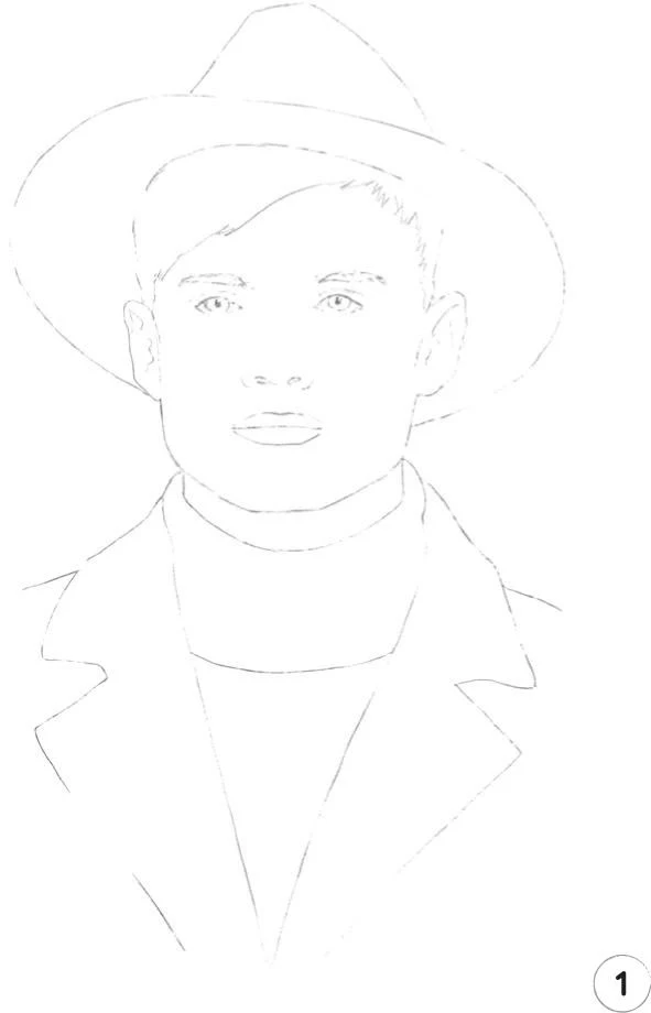
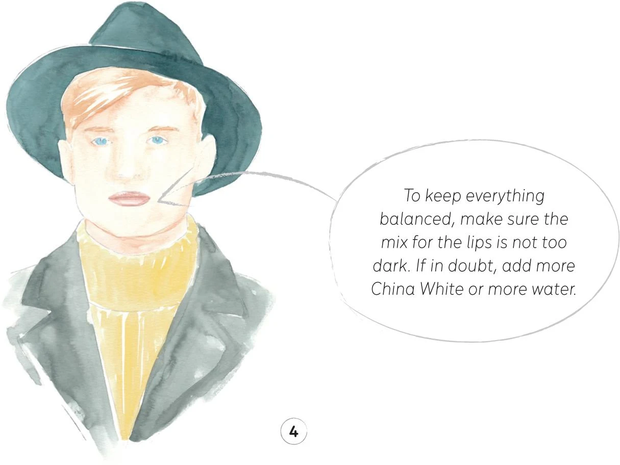
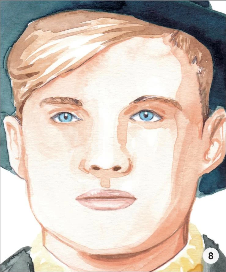
Boy with hat
LEVEL: INTERMEDIATE BRAND: AGNÈS B.
Let’s dive into our second menswear tutorial, with a close-up of a male model wearing a fedora hat. Remember you can refer back to Creating a Character: Men’s faces for more tips and techniques.
MATERIALS
Essentials:
- fine pencil
- eraser
Paper:
- A4 watercolor paper (300 GSM)
Brushes:
- squirrel mop brush size 2
- round synthetic brush number 0
- round synthetic brush number 1
- round synthetic brush number 2
Paints:
- China White
- Yellow Ochre Light
- Vandyke Brown
- Indigo
- Cadmium Red
- Cadmium Yellow
- Opera Rose
- Cerulean Blue
- Cobalt Turquoise
Pencil:
- Walnut Brown 177
Copic Ciao Markers:
- Warm Gray No.2 W-2
- Pale Blue Gray B60
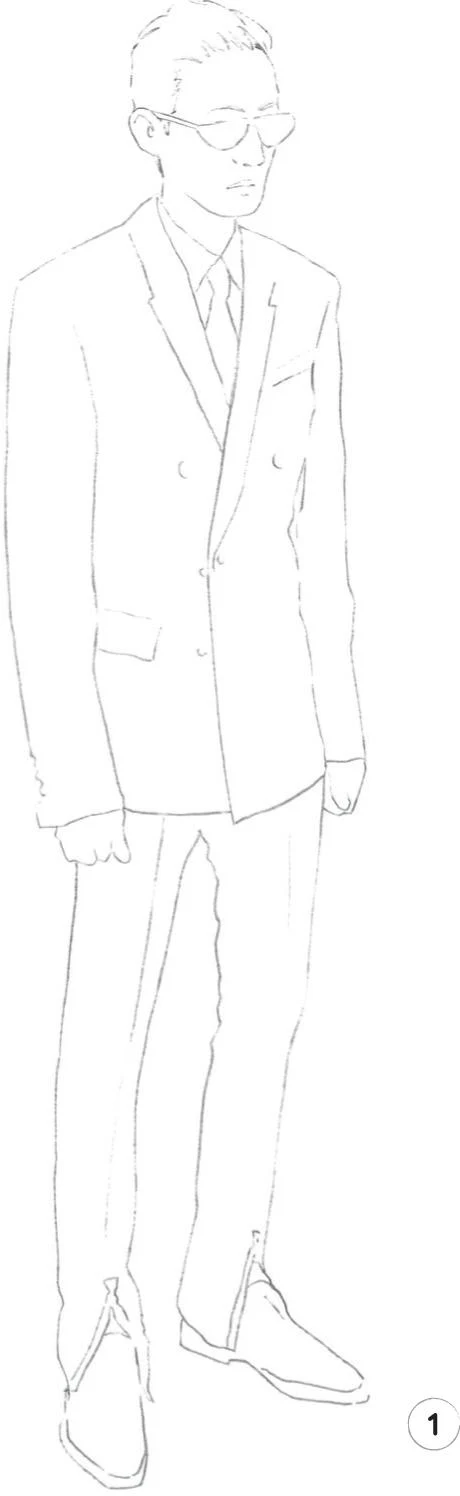
1. A light sketch of the whole illustration is once again the first step. The shapes of this illustration are relatively simple—focus your attention mostly on the model’s eyes.
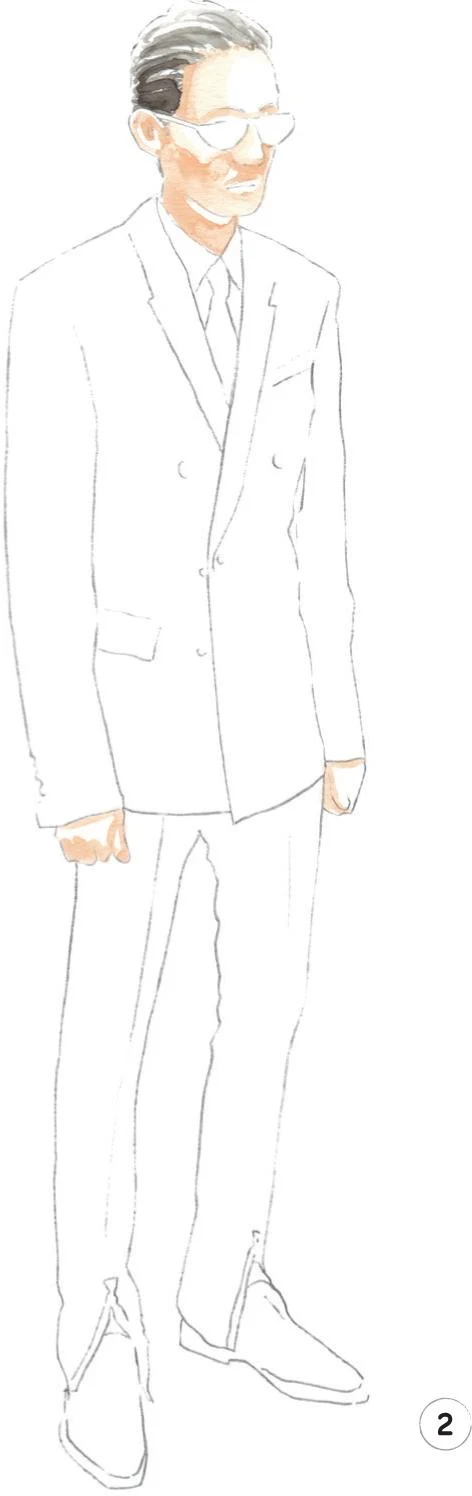
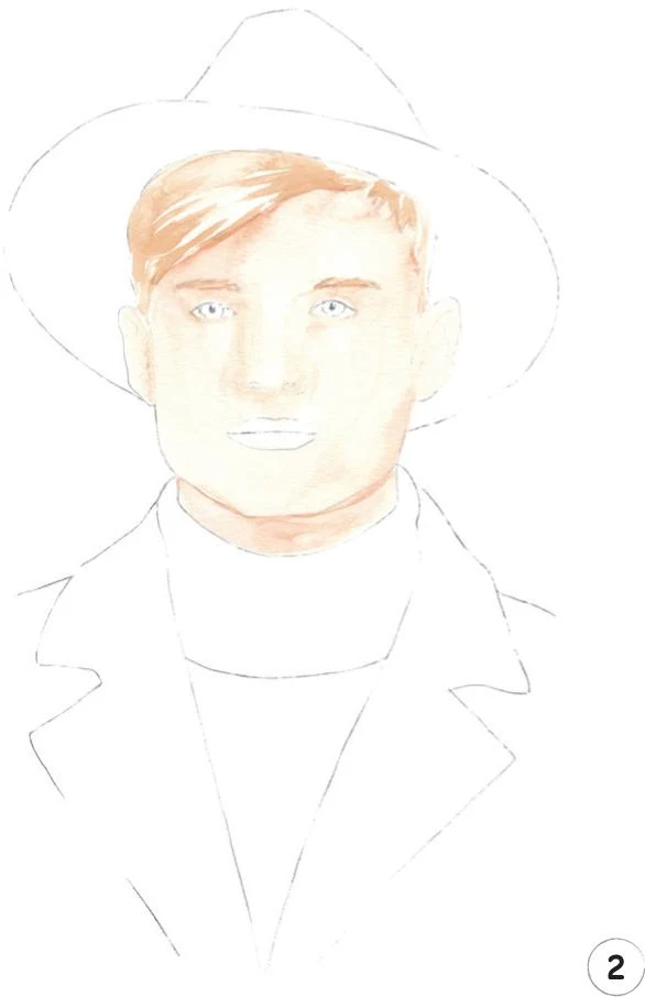
2. Let’s begin by creating a mid-tone for the skin and then the hair. For the skin, as we’ve done before, mix Cadmium Red, Cadmium Yellow, and China White.
Use a round brush 1 for the smaller areas of the face, like the eyebrow arches and the nose, and a mop brush 2 for the rest of the face and neck. Apply your mix, taking into consideration that the source of light comes straight in from the left.
For the hair, mix some Yellow Ochre Light with China White and apply the paint with a round brush 2, using a number 1 for the smaller areas on the right. Remember to leave some white paper to act as the highlights. Use the same mix and a round brush 0 to paint the eyebrows.
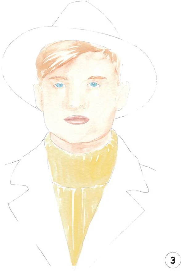
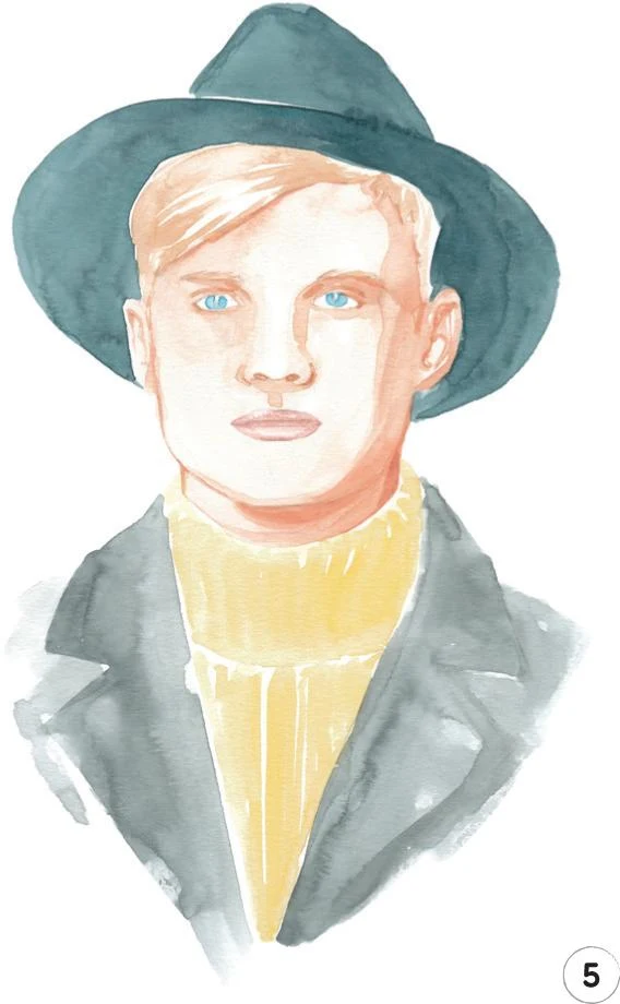
3. Let’s add some color to the irises. Mix some Cerulean Blue and China White and apply lightly with the round brush 0.
For the lips, mix some Opera Rose with Cadmium Red and China White. Use the round brush 0 so you can be as precise as possible.
Now add a mid-tone for the sweater. Mix some Yellow Ochre Light with Cadmium Yellow and China White. Use the mop brush to start building the structure of the sweater with soft vertical lines on the collar and then on the chest.
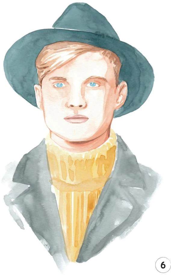
4. In this step, we’ll add a mid-tone to the hat and jacket. For the hat, mix Cobalt Turquoise, Indigo, and Vandyke Brown; for the jacket, mix Vandyke Brown, Indigo, and China White for a shade of gray. I applied the mixes for both the hat and jacket with the mop brush.
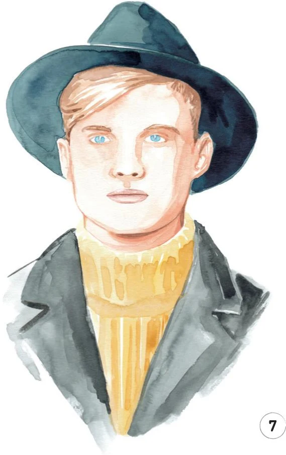
5. Erase any visible sketch lines, then focus on the face and the neck to add a darker tone. Use the same mix as before (Cadmium Red, Cadmium Yellow, and China White), creating darker strokes under the eyebrows and along the nose by using the round brush 1. To better define the nostrils, you can use the round brush 0.
Use the round brush 2 and the mop brush to paint a soft dark shadow on the right-hand side of the face. Add some small strokes on the ear folds.
For the neck, use the round brush 2 to add the darkest area of shadow cast by the chin on the neck. Keep diluting the mix to paint the rest of the neck.
6. Use Yellow Ochre Light and the round brush 2 to add a darker tone to the hair, then with the round brush 0 finely define the eyebrows and the nostrils. Add a soft line between the lips and an outline to the chin and up around the face.
Now mix Yellow Ochre Light and Cadmium Yellow, and use the mop brush to add some darker tones on the sweater for texture.
7. Let’s add some shadows on the hat and jacket as well. For the hat, mix Cobalt Turquoise with Indigo and use the mop brush. Start at the right-hand side, adding water as you move across to the left.
For the jacket, mix Indigo and Vandyke Brown, still working with the mop brush. Use the tip to outline parts of the jacket.
8. For the final step, let’s focus on the eyes. Use the Copic Marker B60 to create a soft, thin shadow on the sclera of both eyes, right under the top lids. Outline the top lid with a Copic Marker W-2, then use a Walnut Brown pencil to define the top lid and the pupil. Continue with this pencil to add more detail to the eyebrows and better definition to other areas such as the left ear lobe. Finally, add a soft line between the neck and the sweater.
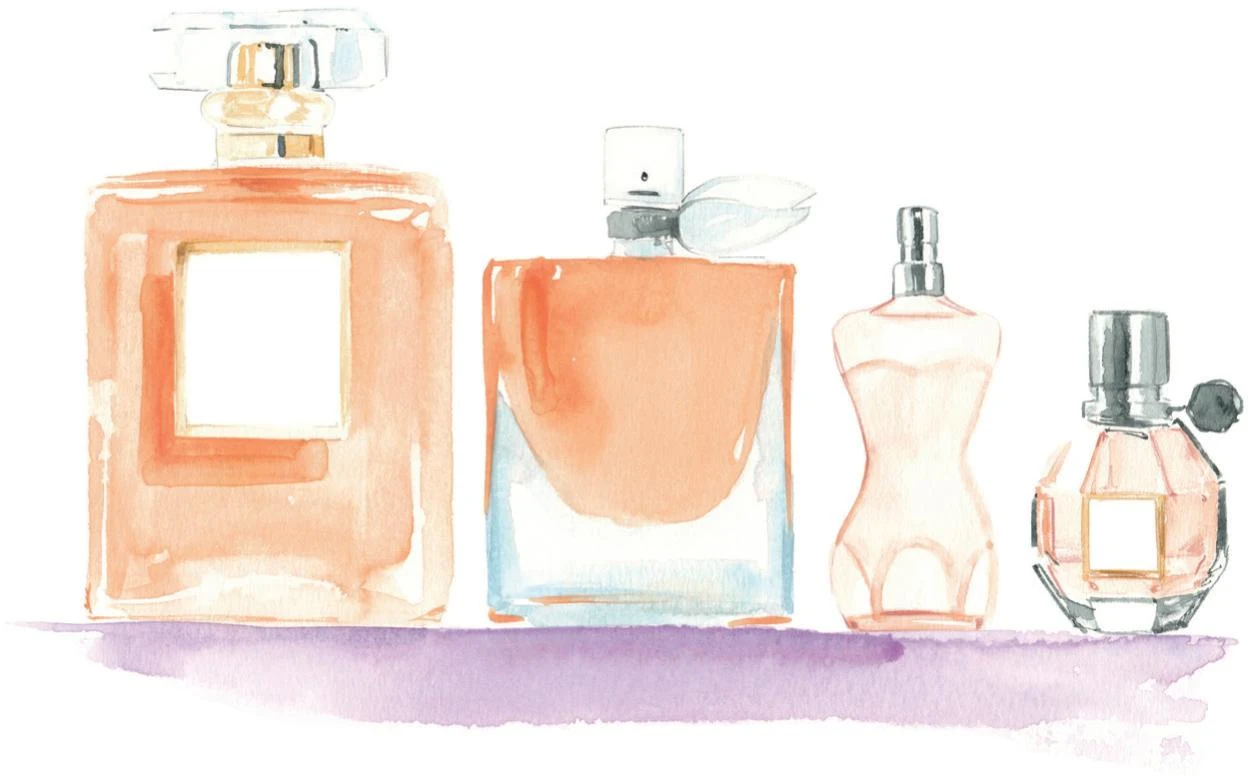
Perfumes
LEVEL: INTERMEDIATE
BRAND: CHANEL, LANCÔME, JEAN PAUL GAULTIER, VIKTOR&ROLF
Let’s add another piece to our growing portfolio by working on this composition of renowned fragrances. The aim here is to reproduce the shiny surface typical of glass, so remember to leave some small white areas to act as reflections.
MATERIALS
Essentials:
- fine pencil
- eraser
Paper:
- A4 watercolor paper (300 GSM)
Brushes:
- squirrel mop brush size 2
- round synthetic brush number 0
- round synthetic brush number 1
- round synthetic brush number 2
Paints:
- China White
- Yellow Ochre Light
- Vandyke Brown
- Indigo
- Cadmium Red
- Cadmium Yellow
- Opera Rose
- Cerulean Blue
- Cobalt Turquoise

Pencils:
- Cold Gray 235
- Cinnamon 189
- Raw Umber 180
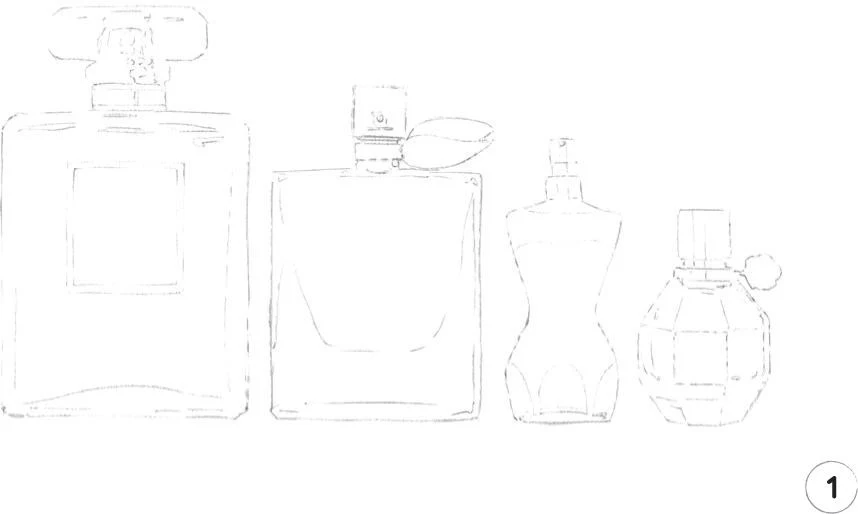
1. As we’re going to create some transparent surfaces, keep your first sketch quite clean. Draw out the full illustration as usual.
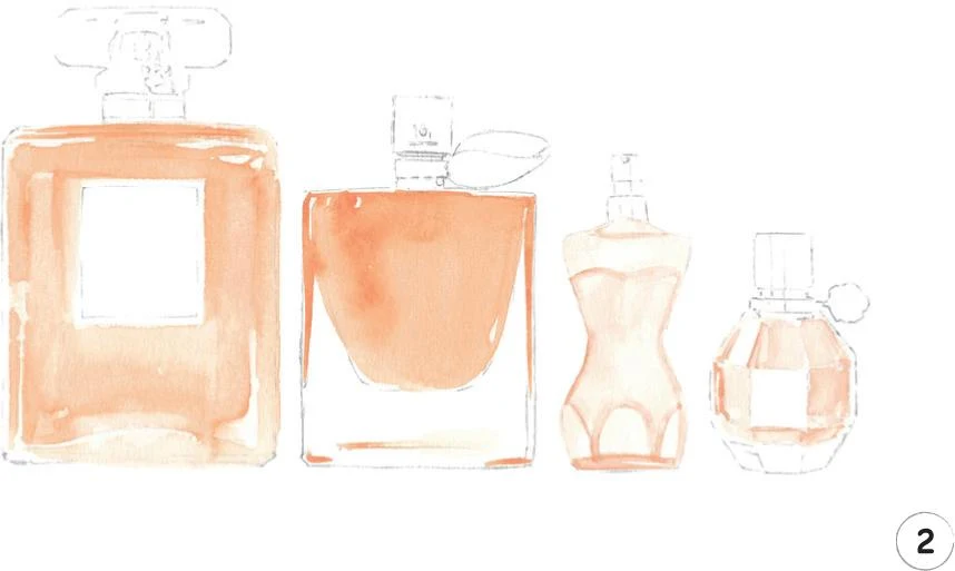
2. To create the first layer for the two larger bottles on the left, combine Cadmium Red, Cadmium Yellow, and China White. Apply the mix with the mop brush, using the tip for thinner lines.
For the remaining two bottles, mix Opera Rose, Cadmium Yellow, and China White. Outline the body-shaped bottle using a round brush 1, then dilute the paint on the paper to fill the shape. Swap to a round brush 0 to repeat this on the final bottle, leaving a small white reflection at the top left.
3. Mix some Yellow Ochre Light, a little Cadmium Yellow, and China White. With the round brush 0, paint the golden neck and cap of the first bottle and the borders of the labels on the first and last bottles.
Now mix some Cerulean Blue, China White, and a little Opera Rose and paint the lower glass of the second bottle, outlining the bottle a little on the sides and base with the round brush 1. Use the mop brush with some water to blend the color into the rest of this area, leaving the inner part as white as possible.
With the same mix and the round brush 0, paint the neck, tap, and the leafy bow. Apply this same mix to the crown of the first bottle with the round brush 1, focusing on a few lines to suggest the depth of the glass.
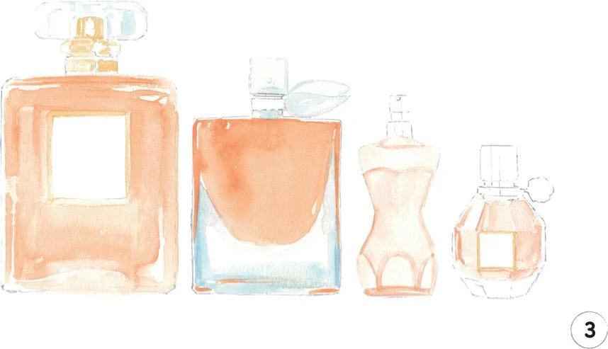
4. Work some dark details on each bottle with the round brush 0. For this, mix Vandyke Brown and Indigo to make a black, and apply it with small, thin lines on the crown of the first bottle and then on the neck of the second one. For the body-shaped bottle, we want to reproduce a shiny metallic surface: create some thin vertical lines on the neck and cap, leaving some areas white and shading others with some water to get a gray tone. Add some detail to the body of the last bottle in a similar way, particularly around the base.
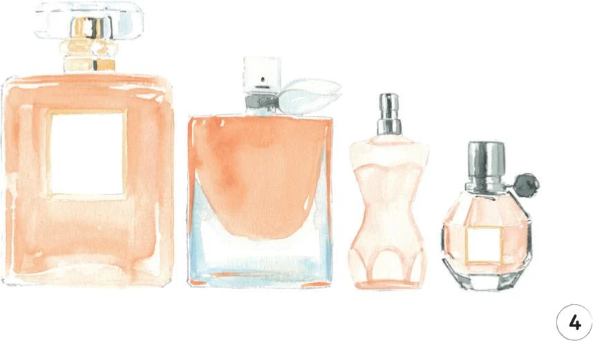
5. Rub out any visible pencil lines. Use the initial mix from Step 2 to add a shadow behind the label on the first bottle, using a round brush 2. Continue with this brush to create more contrast on the second bottle, applying a small stroke on the left-hand side. Swap to the round brush 0 to paint some thin horizontal lines at the top of the first bottle.
Now, with a Cold Gray colored pencil, add definition at the tops of the first two bottles. Swap to a Raw Umber pencil to define the two labels, then use a Cinnamon pencil to outline the body-shaped bottle a little.
To finish, mix Opera Rose, China White, and a little Cobalt Turquoise, and with the mop brush, create a fine horizontal line along the bottom of the composition.
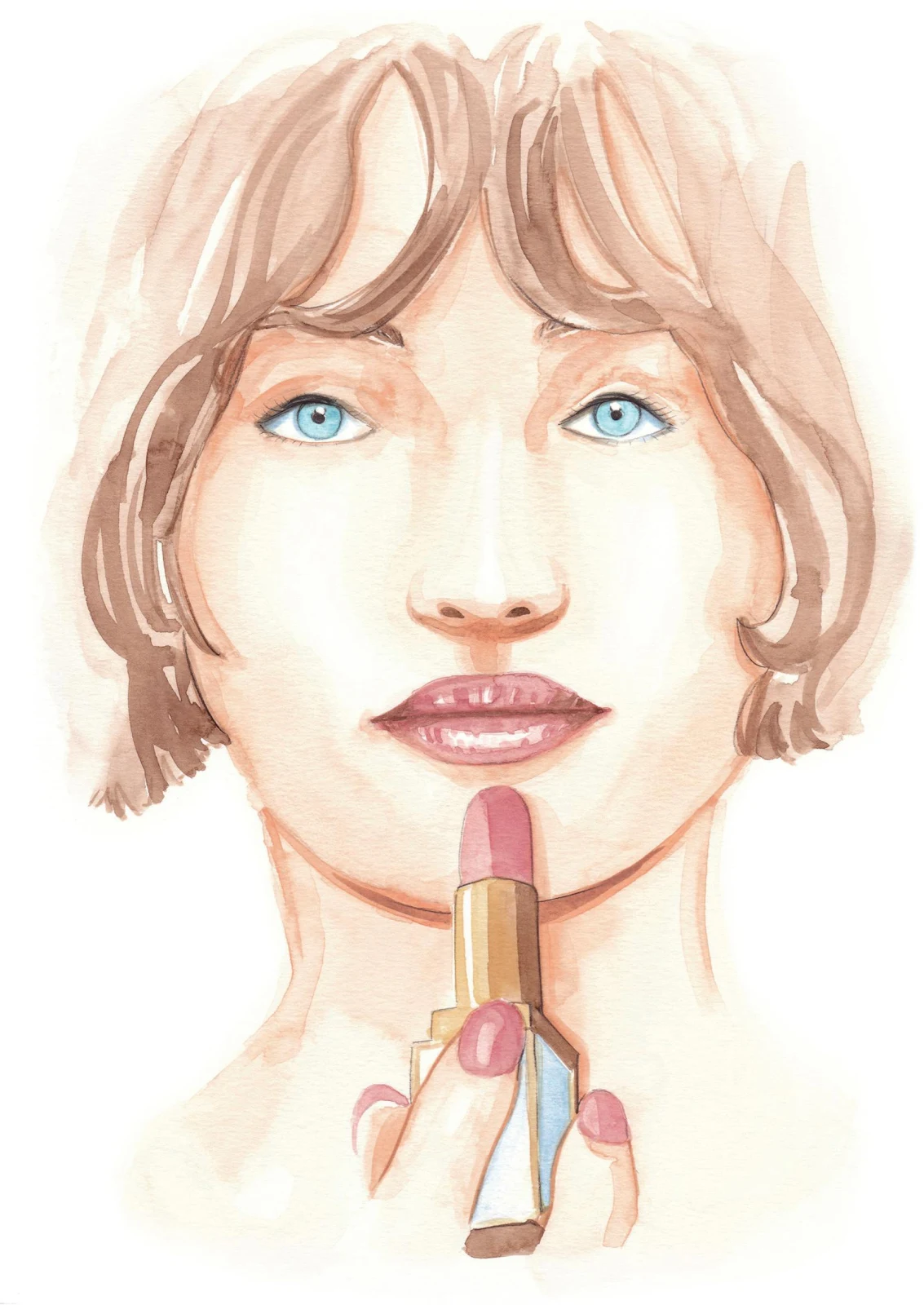
Focus on beauty
LEVEL: INTERMEDIATE
The beauty industry often works with illustrators, so let’s consider some work of this type for your portfolio. With this tutorial we’ll create a beauty illustration, depicting a girl putting on some red lipstick.
MATERIALS
Essentials:
- fine pencil
- eraser
Paper:
- A4 watercolor paper (300 GSM)
Brushes:
- squirrel mop brush size 2
- round synthetic brush number 0
- round synthetic brush number 1
- round synthetic brush number 2
Paints:
- China White
- Yellow Ochre Light
- Vandyke Brown
- Cadmium Red
- Cadmium Yellow
- Cerulean Blue
- Opera Rose
- Winsor Red Deep
Pencil:
- Walnut Brown 177
Copic Ciao Markers:
- Warm Gray No.2 W-2
- Pale Blue Gray B60
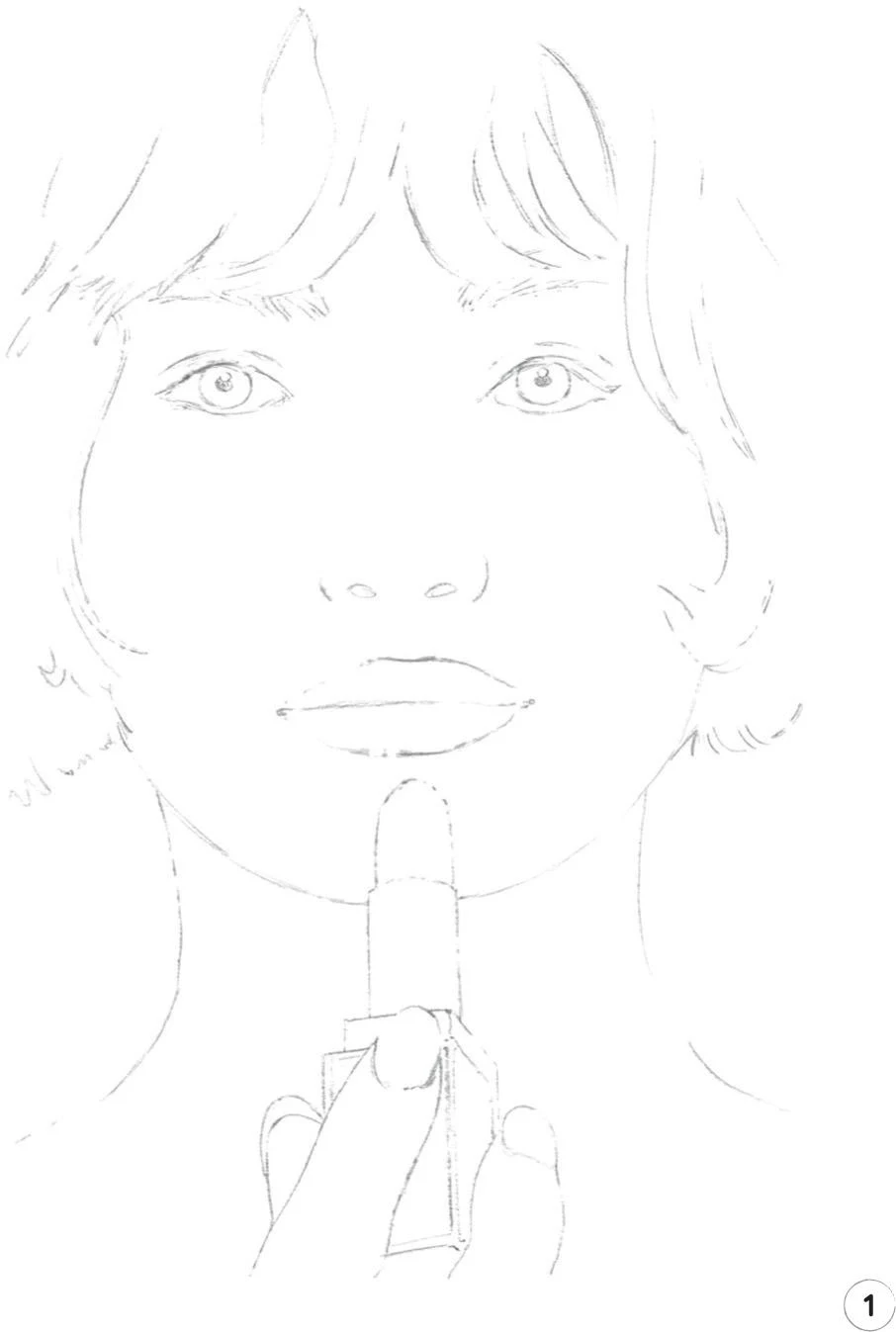
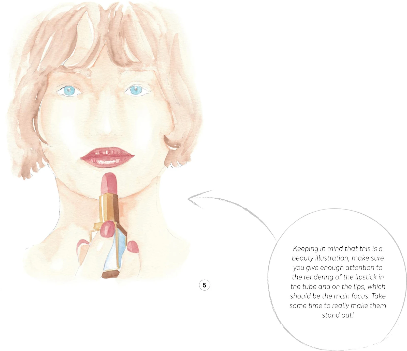
1. When sketching out what is essentially a close-up of a girl, include enough details for the eyes. Also make sure you give yourself enough landmarks for the lipstick and fingers.
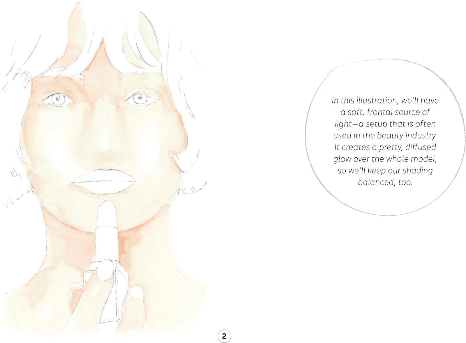
2. The skin occupies a large part of the illustration—and we’ll need this mix again for Step 7—so prepare plenty of paint for the mid-tone, mixing Cadmium Red, Cadmium Yellow, and China White.
The best choice here is the mop brush 2, using its tip for the small parts such as the fingers and between the hair on the forehead. Remember to leave some whiter areas at the nose and cheeks, and dilute the mix toward the bottom of the illustration so it fades away under the neck to create a nice effect.
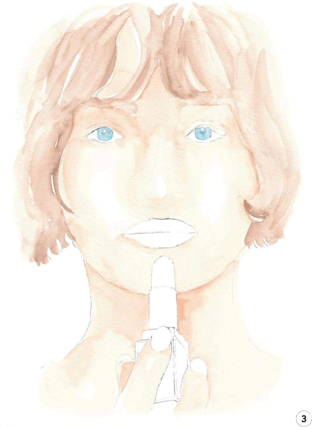
3. Now let’s create the mid-tone for the hair and eyebrows. I mixed Vandyke Brown with a little China White and Yellow Ochre Light. Slightly dilute this mix and apply it with the mop brush, keeping your strokes light.
Mix the eye color from Cerulean Blue and a little China White, and paint the iris with a round brush 0.
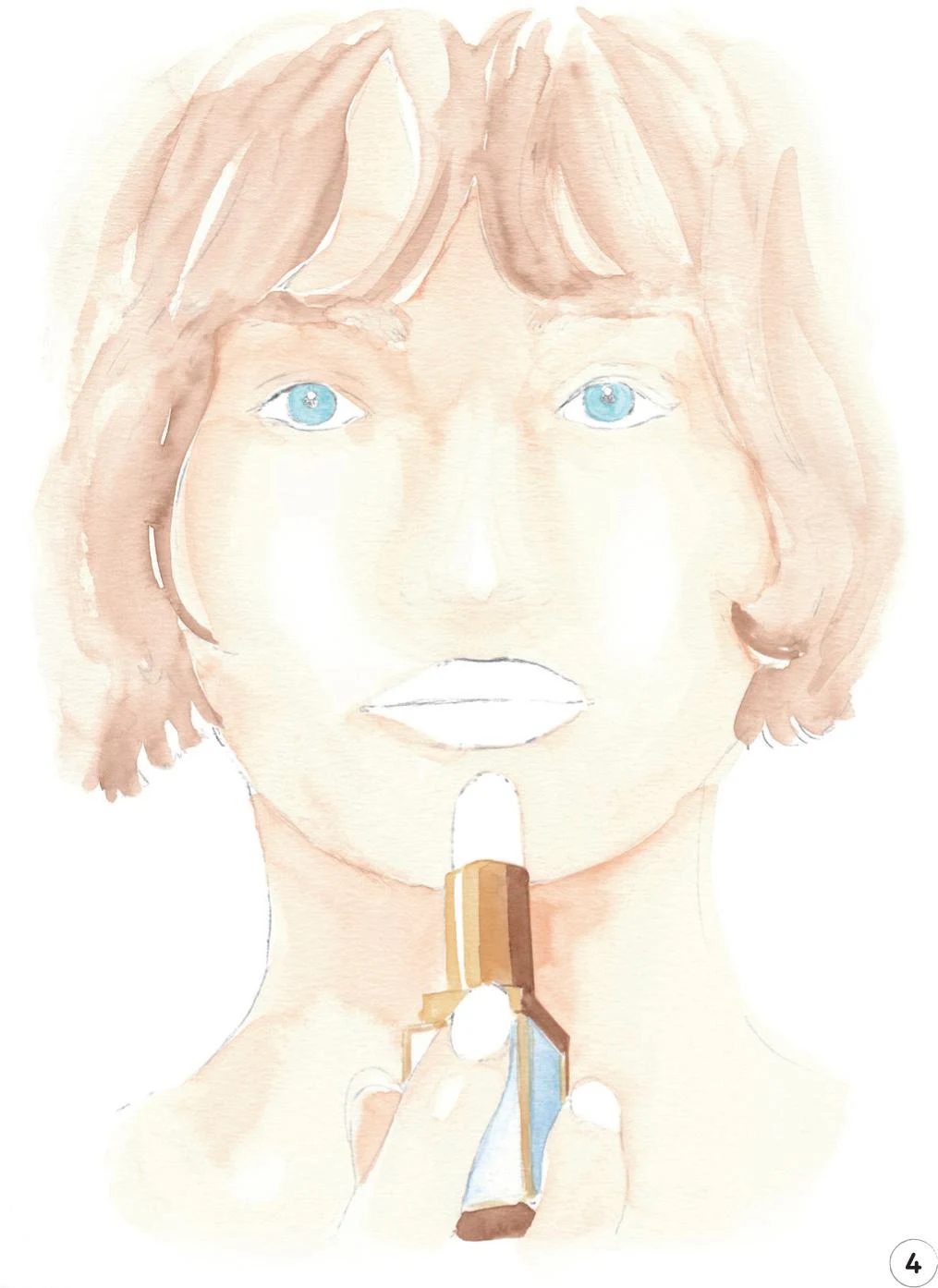
4. In this step, we’ll focus on the lipstick case, creating different layers to reproduce the shiny surface. Mix some Cerulean Blue with a little China White and Opera Rose, then, with the round brush 0, paint the right-hand side of the case, keeping the color even. Use the same mix to add a soft shadow at the front of the lipstick beneath the finger. Add a little bit of water to complete this side of the case, to differentiate it from the first side that’s slightly in shadow.
Mix some Cadmium Yellow with a little Yellow Ochre Light, and with a round brush 1, start painting the top of the lipstick tube with some vertical strokes. Be sure to leave a white line as the highlight. Use the same mix to add details to the rest of the case. Now mix some Yellow Ochre Light with a little Vandyke Brown and add a larger vertical line with the same brush down the middle of the lipstick tube. Leave to dry. Create a dark tone by adding more Vandyke Brown to the mix, and apply it to the right-hand part of the lipstick tube, the small rectangle below, down the narrow strip on the right, and then on the base of the lipstick.
5. Now we’re going to add the red areas: the lips, the tip of the lipstick, and the nails. Start with the mid-tone, mixing Cadmium Red with a little Winsor Red Deep and China White. Apply with a round brush 2, leaving small white areas on the lips for the highlights.
Let this layer dry, then add more Winsor Red Deep to your mix and apply it to the same areas to create a darker value.
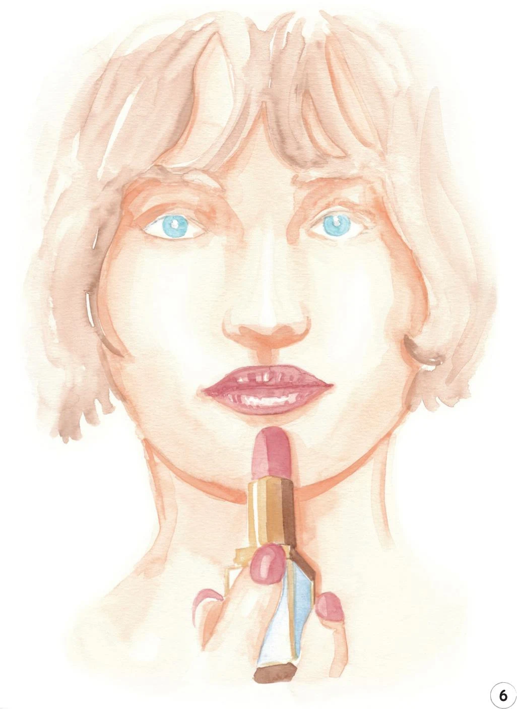
6. Erase any unnecessary pencil lines and let’s move on to add a dark tone to the skin. Use the mix from Step 2, but slightly less diluted, and the round brush 2. Start adding your mix under the eyebrows and on the side of the face. Add some soft strokes to the visible parts of the forehead. Use the round brush 1 to add a dark tone beneath the nose and a soft stroke under the lips. If needed, use the mop brush to add more value on the cheeks, then with the round brush 2 create a shadow under the chin and define the sides of the neck slightly.
Add some dark values on the fingers with the round brush 1 and create the soft shadow cast by the lipstick on the neck and the face.
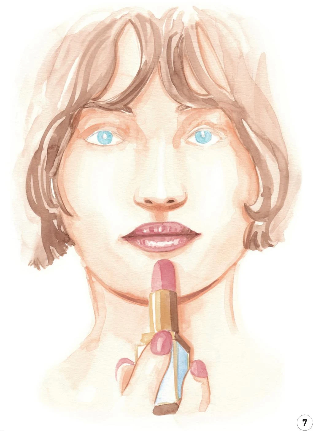
7. Let’s now add some dark tones to the hair by applying some slightly diluted Vandyke Brown with the tip of the mop brush. Then, with the round brush 0, add thin strokes to better define the hair of the eyebrows. You can also carefully add the nostrils.
To bring the mouth to life, add some darker tones at the corners of the lips and introduce a soft line between them.
Add some Vandyke Brown to the skin tone mix we created for Steps 2 and 6. Apply it with some light strokes under the nostrils, using the round brush 1. With the same brush, outline the fingers softly.
To complete this step, use the same mix and brush to accentuate the shadow under the chin.
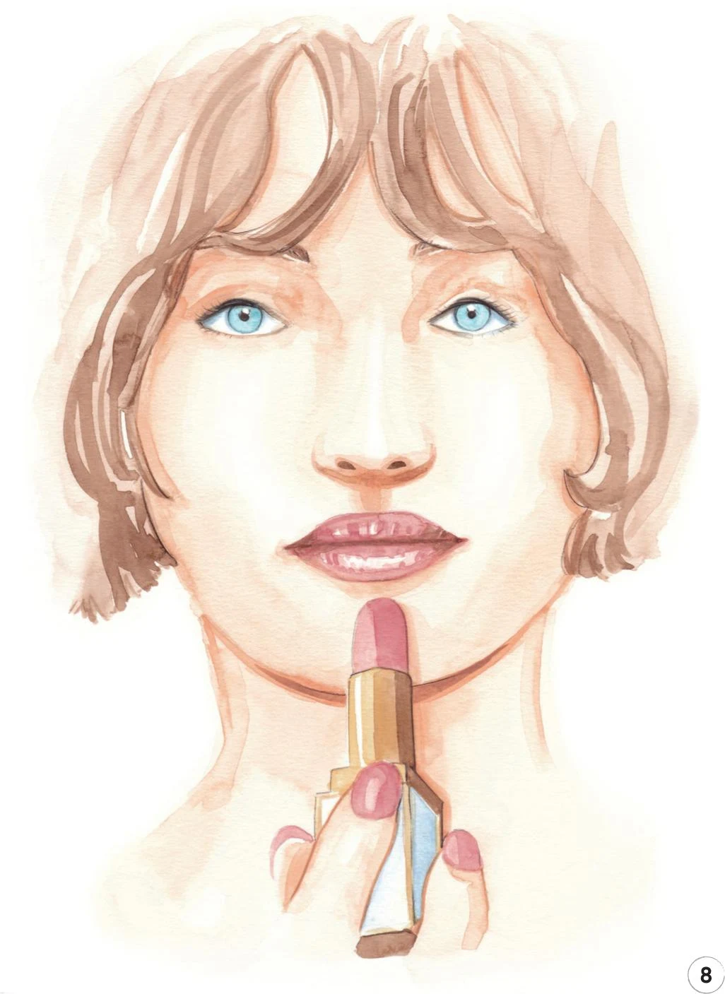
8. For our final step, we’ll focus on the eyes and add some finishing touches. Apply some Copic Marker B60 under the upper lids to create a soft, thin shadow on the sclera. Outline both lids with a Copic Marker W-2 and then, with a Walnut Brown pencil, add the pupil, outline the whole iris, and draw both upper lids. You can also add some eyelashes, including a few small ones on the lower lids.
To complete our illustration, continue with the Walnut Brown pencil to define the lipstick and add some hairs to the eyebrows.
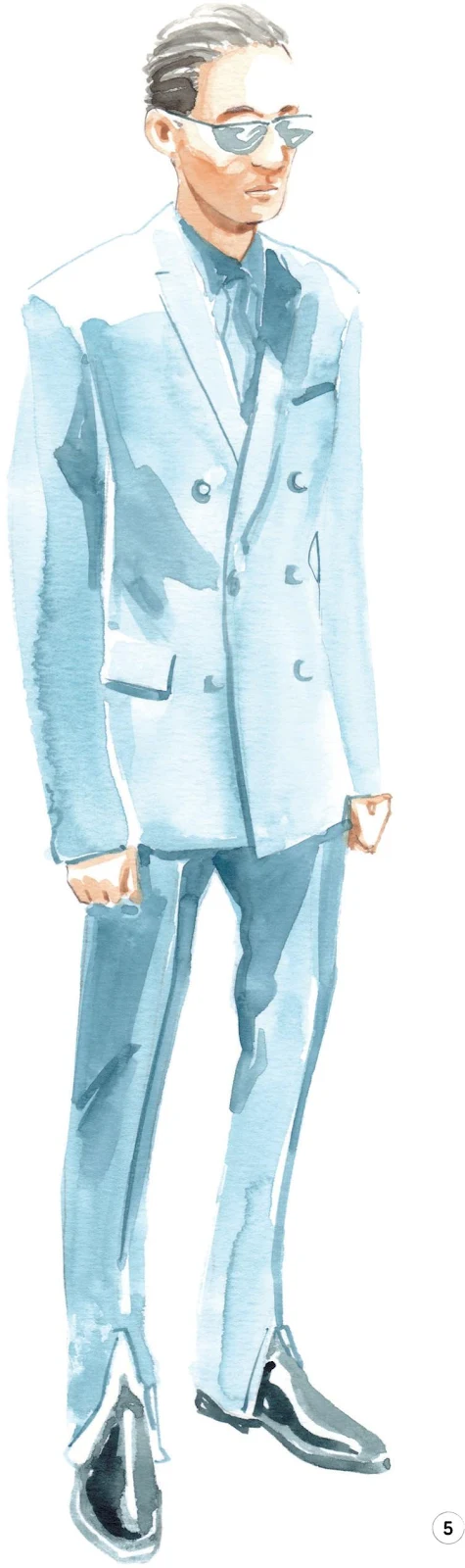
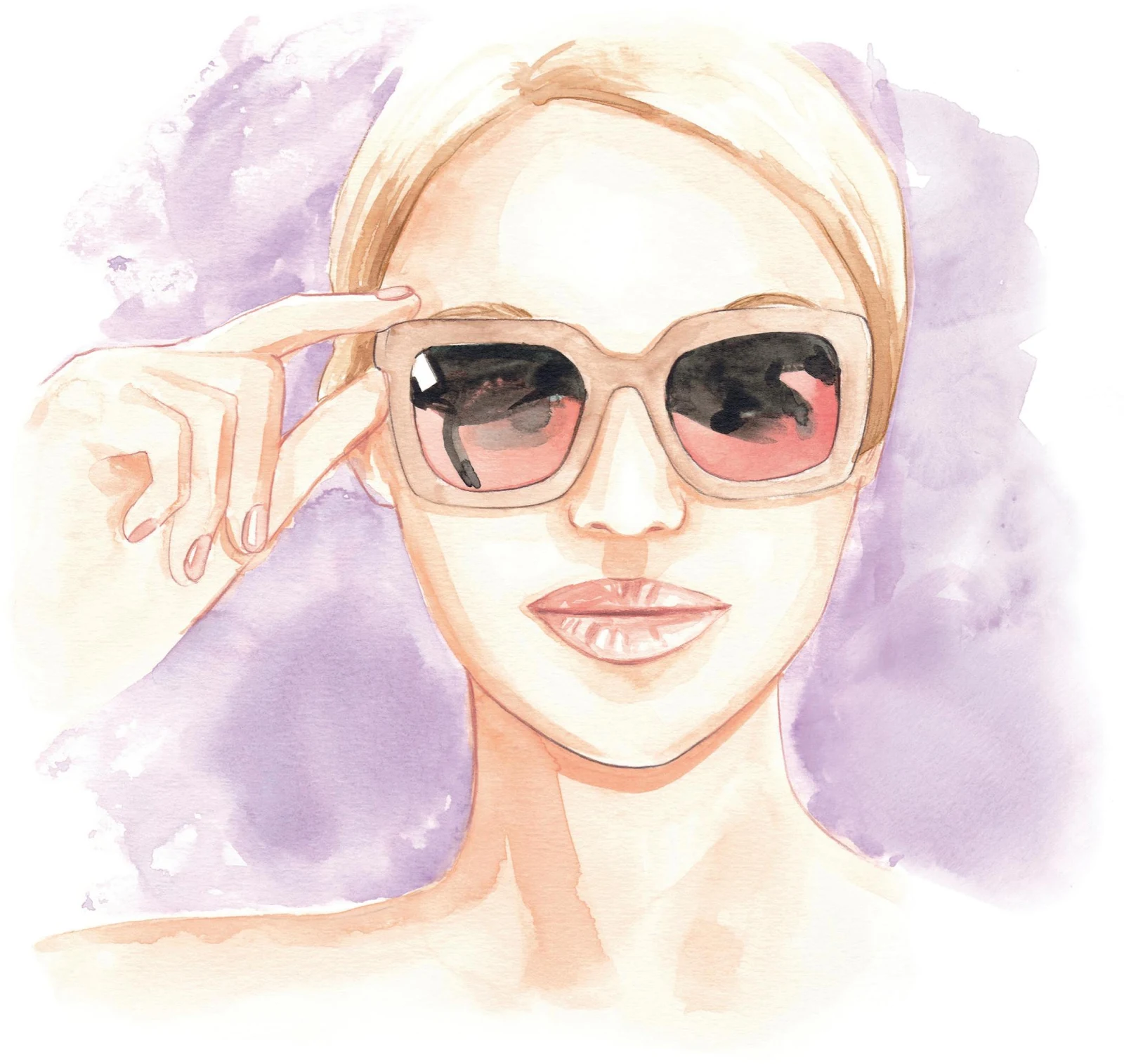
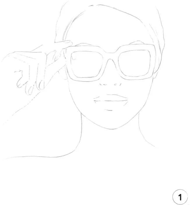
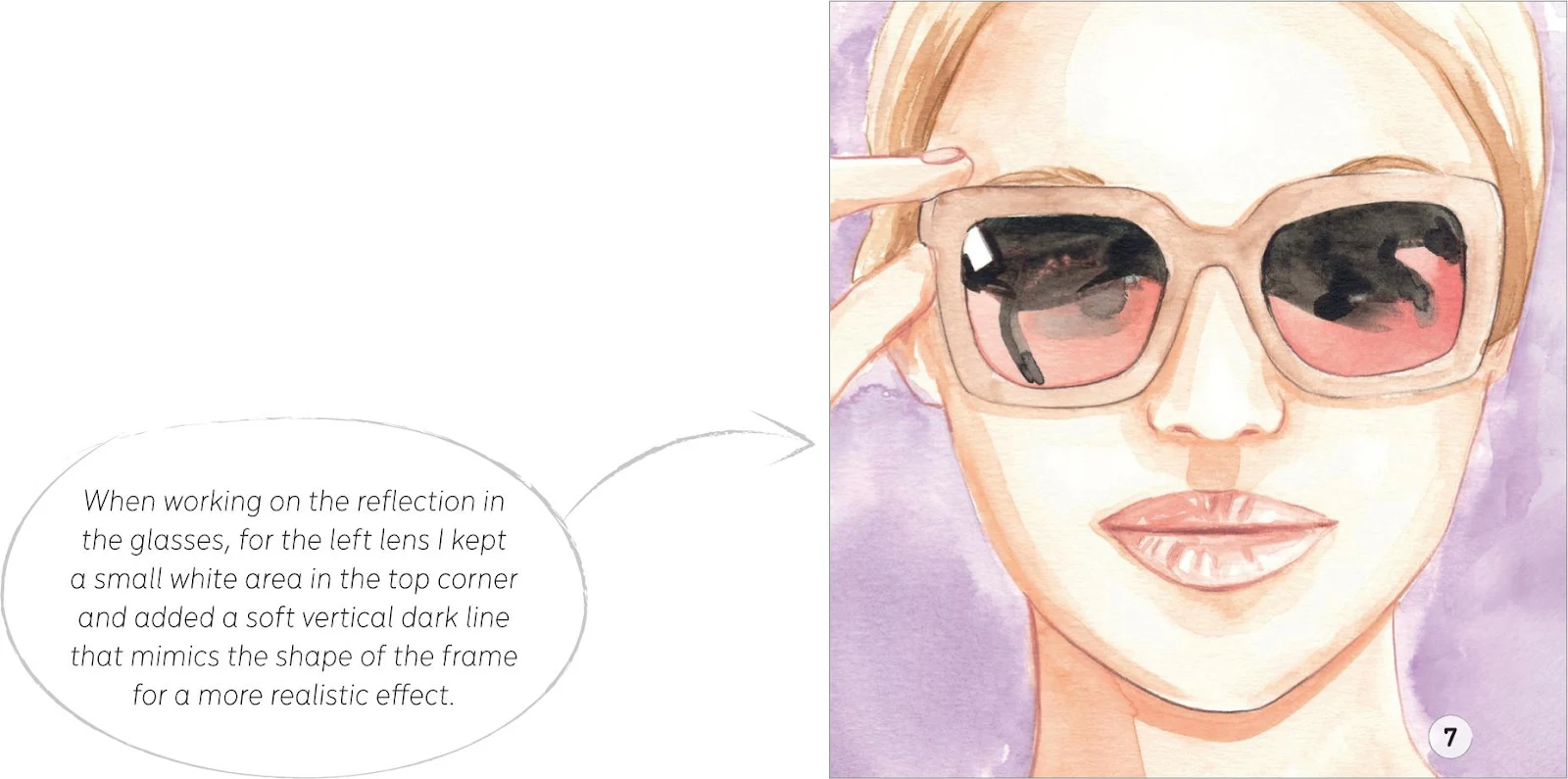
Girl with sunglasses
LEVEL: INTERMEDIATE BRAND: BURBERRY
In this tutorial, the focus is on the pair of sunglasses, with the pose enhancing the feeling of an illustrated campaign. Also, for the very first time, we’re going to add a background to our subject!
MATERIALS
Essentials:
- fine pencil
- eraser
Paper:
- A4 watercolor paper (300 GSM)
Brushes:
- squirrel mop brush size 2
- round synthetic brush number 0
- round synthetic brush number 1
- round synthetic brush number 2
Paints:
- China White
- Yellow Ochre Light
- Vandyke Brown
- Indigo
- Cadmium Red
- Cadmium Yellow
- Opera Rose
- Winsor Red Deep
- Cobalt Turquoise
Pencils:
- Walnut Brown 177
- Cinnamon 189
- Raw Umber 180
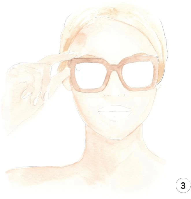
1. This illustration includes two notoriously tricky elements to draw: hands and sunglasses. The sunglasses in particular can give you a hard time as they need to be symmetrical, so take your time when sketching to get them right. Remember that the aim here is to have enough detail so that you feel more confident approaching the following steps.
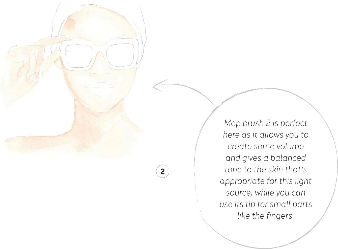
2. Create the mid-tone for the skin. To achieve the right shade, mix Cadmium Red, Cadmium Yellow, and China White. As with the Focus on beauty illustration, we have a frontal source of light that gives a diffused glow over the whole illustration.
For this first layer, I suggest using mop brush 2, utilizing the tip for small parts like the fingers. Remember to leave some lighter areas on the nose and the forehead as the highlights.
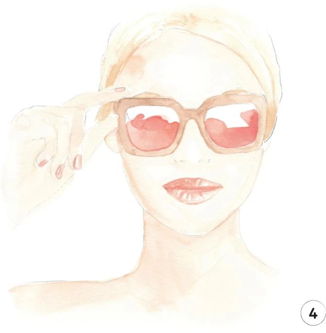
3. Now mix some Yellow Ochre Light with a little China White. Using a round brush 2, apply it to the hair, leaving some white areas to act as highlights as usual. Use the same paint mix and a round brush 0 to paint the eyebrows.
Now mix some Yellow Ochre Light, Vandyke Brown, and a little China White. Use this mix to paint the frames of the sunglasses with a round brush 1, keeping the color and tone almost even.
4. Let’s create the first layer for the lenses of the sunglasses. Mix Cadmium Red and China White and apply with the mop brush onto the lower part of the lenses. You can use the round brush 0 to retouch any small areas next to the frames if needed.
Now mix Yellow Ochre Light and Winsor Red Deep, and paint the lips with the round brush 1. Remember to leave small areas as the highlights. Use the same mix to paint the fingernails, but as these are such small areas, use the round brush 0. Leave some white paper showing to act as the highlights on the nails.
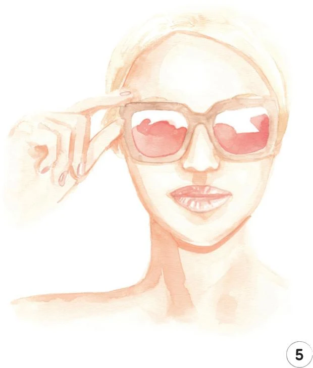
5. Once everything has dried, erase any remaining visible pencil lines, then we can focus once more on the skin.
With the same mix as used in Step 2 (Cadmium Red, Cadmium Yellow, and China White), start adding some shadows on the face. Work the nose with the round brush 1, then add a soft line under the sunglasses frames to imitate the shadows they cast on the face. Keep adding more dark strokes at the side of the face, chin, and forehead. Create a deeper shadow under the chin with the round brush 2, then switch to the mop brush to work the rest of the neck.
Now focus on the hand, using the round brush 0 for precision. Start by adding a shadow between the little finger and the palm, then add a soft shadow to every finger to really add dimension.
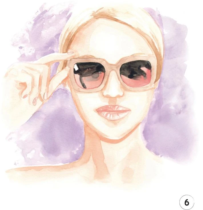
6. In this step, we’ll add a dark tone to the hair and eyebrows. Mix Yellow Ochre Light with a bit of Vandyke Brown, then use the round brush 1 to add some strokes to act as shadows, mostly around the hairline. Use the round brush 0 to define the eyebrows.
We’re now going to work the lenses of the sunglasses, adding a very dark tone in order to imitate the reflective surface that’s typical of certain styles. Combine Indigo and Vandyke Brown, and apply the mix across the top section of both the lenses.
It’s time now to add a background. Mix Opera Rose with China White and a little Cobalt Turquoise in order to obtain a shade of lilac.
Use the mop brush to apply this mix, starting from the area between the neck and the hand. Add water whenever it’s needed and use the tip of the brush when you reach your outline to be as precise as possible. Let everything dry and move on to the following step to complete this illustration.
7. Let’s now add some definition to the whole illustration using three pencils. Start with the Cinnamon pencil to softly outline the face, neck, and fingers. Draw the nostrils, then move on to the lips to add more definition. Use the Walnut Brown pencil to accentuate the line between the lips and then softly outline the lenses and frames if needed. Lastly, use the Raw Umber pencil to add definition to the hair and eyebrows.
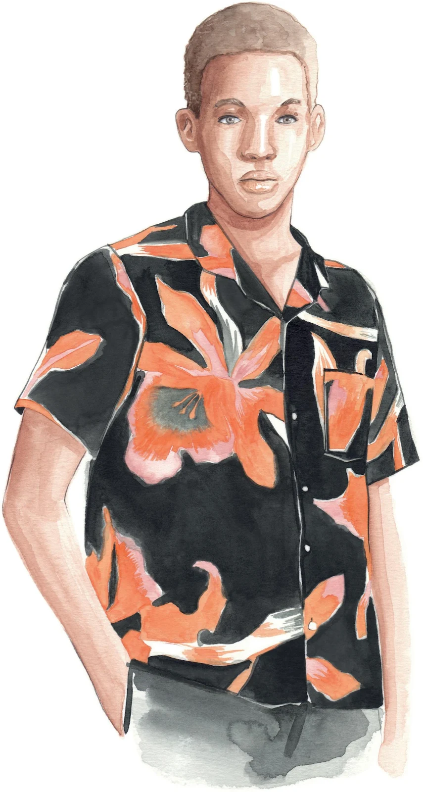
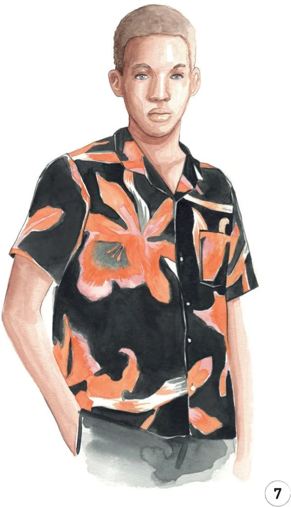
Man in print shirt
LEVEL: INTERMEDIATE BRAND: NOMA T.D.
It’s time to explore another intricate print, this time from a menswear point of view. Take a deep breath and be as patient as possible as this is going to be a slow, meditative process!
MATERIALS
Essentials:
- fine pencil
- eraser
Paper:
- A4 watercolor paper (300 GSM)
Brushes:
- squirrel mop brush size 2
- round synthetic brush number 0
- round synthetic brush number 1
- round synthetic brush number 2
Paints:
- China White
- Yellow Ochre Light
- Vandyke Brown
- Indigo
- Cadmium Red
- Cadmium Yellow
- Opera Rose
Pencil:
- Walnut Brown 177
Copic Ciao Markers:
- Warm Gray No.2 W-2
- Pale Blue Gray B60
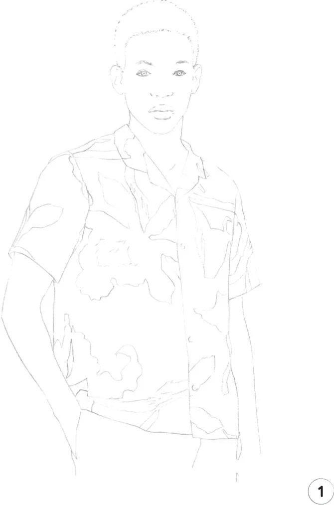
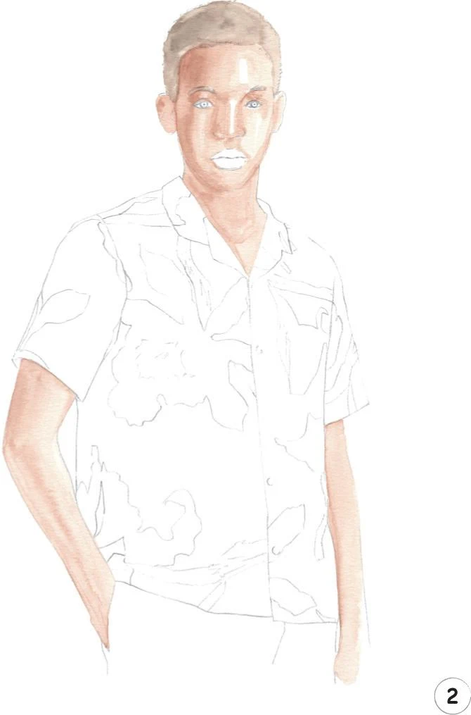
1. Our first step, as always, is a pencil sketch of the whole illustration. Since we’re dealing with a slightly complicated print on the shirt, make sure you include all the landmarks you’ll need before you start to add color.
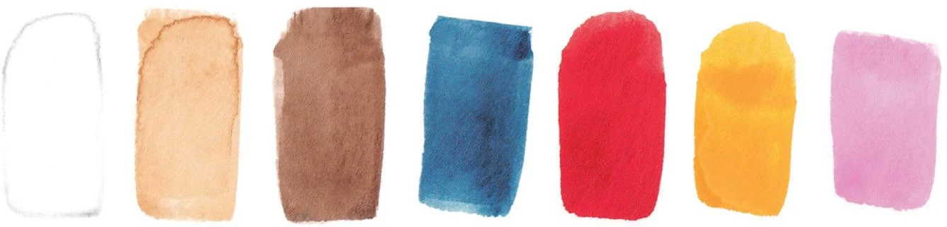
2. In this step, we’ll create a mid-tone for the skin and hair. For the skin, mix Cadmium Red, Yellow Ochre Light, Vandyke Brown, and China White. Here, the light is coming from the right, so keep this in mind during the whole process. Apply the mix with a round brush 0 on the face, starting from the left-hand side and adding more water as you work toward the right.
Remember to leave some unpainted white areas on the nose and forehead, and don’t yet color the lips. For the neck and arms, use a round brush 1 or 2—whichever you feel more comfortable with.
To create the hair mid-tone, apply a slightly diluted Vandyke Brown paint with the round brush 1, again starting from the left-hand side of the head, as it’s in shadow. Carefully add the eyebrows with the round brush 0.
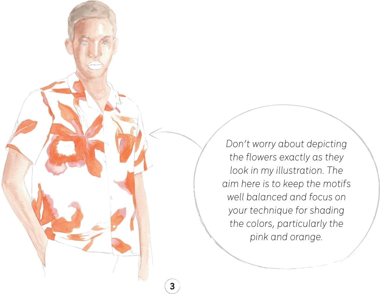
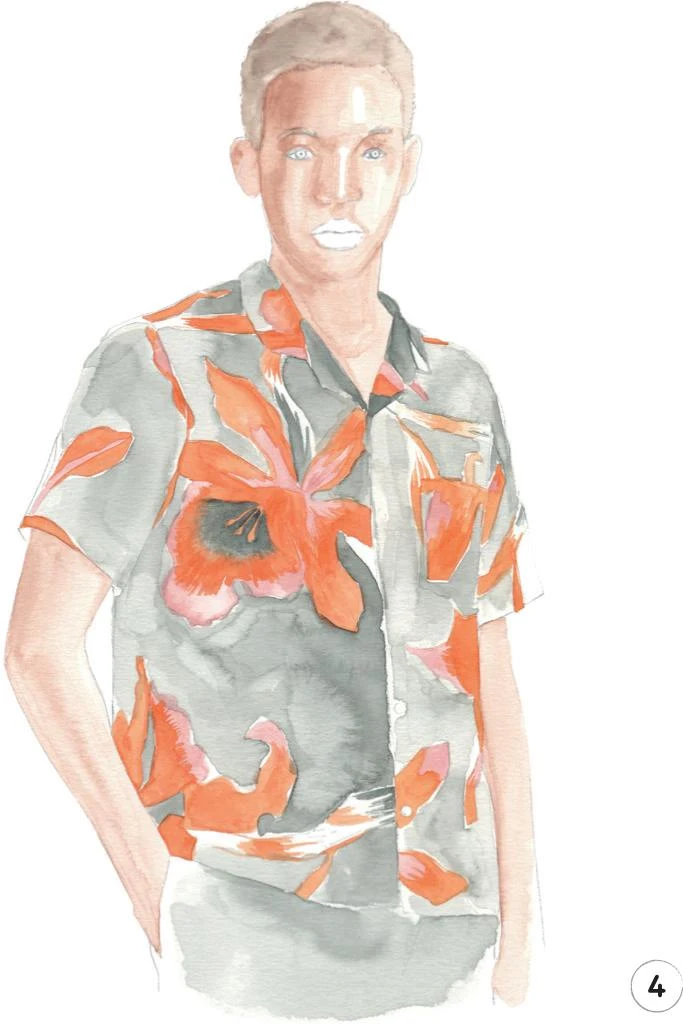
3. Now let’s focus on the floral print of the shirt. The motifs include four colors: pink, orange, gray, and white. Let’s begin by adding the pink, then the orange. Mix some Opera Rose and China White to obtain a nice dusky shade of pink. For the orange, mix Cadmium Red and Cadmium Yellow. Use the round brush 0 to paint the detailed flowers. This a slow and meticulous process, so settle in and give yourself plenty of time.
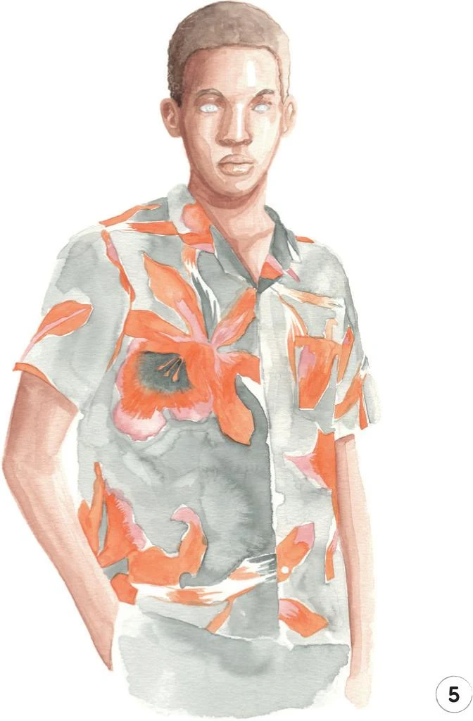
4. In this step, we’re going to create a shade of gray by mixing Vandyke Brown, Indigo, and China White. With the round brush 0, add some small strokes to the middle of the flower on the chest.
Then, with a mop brush 2, create a layer of gray across the whole shirt, leaving some small areas unpainted for the white of the pattern. This gray layer will work as the foundation for the black, helping smooth the transition between the motifs and the main color of the shirt.
Complete this step by adding some gray paint to the pants.
5. Let everything dry, then erase any visible pencil lines. We’ll now add a dark tone to the skin and hair.
Prepare more of the mix from Step 2 (Cadmium Red, Yellow Ochre Light, Vandyke Brown, and China White), but use less water to keep it darker. Use the round brush 0 to apply it under the eyebrows and around the nose. With the round brush 1, paint the rest of the face and the neck, then use the round brush 2 for the arms.
Use the same mix to add the lips with the round brush 0.
For the hair, use some Vandyke Brown with the round brush 1. Start from the left-hand side of the head and add more water as you approach the right. Define the eyebrows with the round brush 0.
6. In this step, we’re going to add the black to the shirt and pants. Mix Vandyke Brown and Indigo and choose your round brushes (from 0 to 2) according to the size of the area you’re painting. For example, the round brush 0 is perfect for outlining delicate areas such as the pocket, the collar, and the buttons.
To complete this step, add some black to the pants, imitating the lines of the seams.
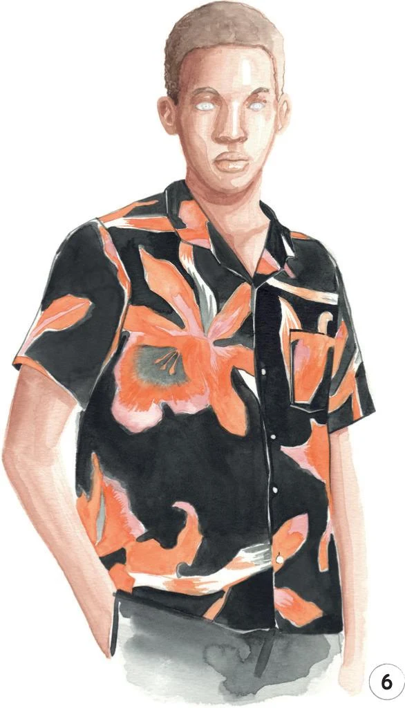
7. Now it’s time to focus on the final details using markers and pencils, particularly on the eyes. Use the tip of a Copic Marker B60 to create a soft shadow on the sclera of both eyes. Then, gently outline both lids with a Copic Marker W-2, and use a Walnut Brown pencil to define the eye and its pupil. Add a line between the lips and small dots for the nostrils. Continue to add definition with the pencil wherever you feel your figure needs it, for example on the ears, the face, and also the arm on the left.
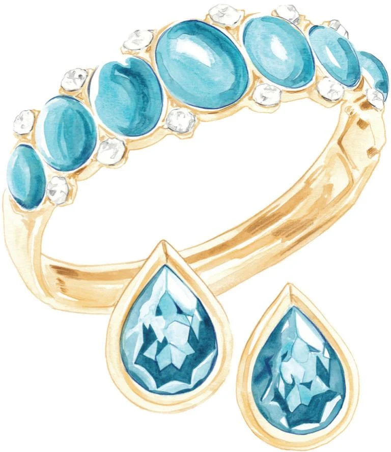
Vintage jewelry
LEVEL: HIGH BRAND: YVES SAINT LAURENT
We’ve now reached the highest level of our tutorials; the final part of our journey in which you’ll create some very special projects. Let’s start with this illustration, inspired by a beautiful set of jewelry. Recreating unique accessories like this is something you may want to explore more, as they have quite a central role in fashion.
MATERIALS
Essentials:
- fine pencil
- eraser
Paper:
- A4 watercolor paper (300 GSM)
Brushes:
- squirrel mop brush size 2
- round synthetic brush number 0
- round synthetic brush number 1
- round synthetic brush number 2
Paints:
- China White
- Yellow Ochre Light
- Vandyke Brown
- Indigo
- Cadmium Yellow
- Cerulean Blue
Pencils:
- Raw Umber 180
- Cold Gray 235
- Indanthrene Blue 247
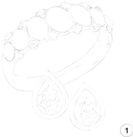
1. As with the previous levels, a light sketch of the whole illustration is the first step. Make sure you include enough landmarks, especially for the blue stones of the earrings.
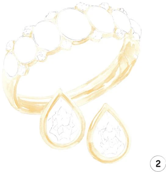
2. Let’s begin with the mid-tone for the golden parts of the bracelet and earrings. Mix Yellow Ochre Light, Cadmium Yellow, and China White. Apply to the small sections between the stones of the bracelet with a round brush 0, and switch to a round brush 2 for the rest of the metallic parts.
Be careful to leave some white areas, to start building the shiny surface of the jewelry. Pick up a little more clean water on your brush as you apply the paint, for nice smooth shading.
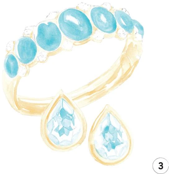
3. Now to add color to the blue stones using some Cerulean Blue. I applied the color on the stones of the bracelet with the mop brush, leaving some white areas to act as the highlights.
For the earrings, I recommend using the round brush 0. You need to be quite precise and meticulous here, creating small areas of color to reproduce the faceted surface of the stones. Leave some areas blank to act as highlights.
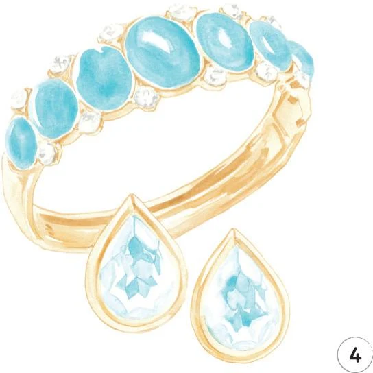
4. For the clear stones, let’s mix some Indigo with Vandyke Brown. Use plenty of water in your mix to get the right shade, then use the round brush 0 to carefully add some strokes to suggest the faceted surface.
Once everything has dried, erase all of the sketch lines.
Now add some dark tones to the gold using Yellow Ochre Light. Start with the top of the bracelet, applying the color with the round brush 0 and using small strokes to build up the structure. Use the round brush 2 for the lower part of the bracelet, defining the shadows.
For the earrings, return to the round brush 0, softly outlining both elements and accentuating the darker sections.
5. Now to add some dark tones to the blue stones. Mix Cerulean Blue with a little Indigo, and use the round brush 0 to add a little shadow around each stone on the bracelet.
With the same mix, add shadows to the stones of the earrings, alternating the round brush 0 with a number 1 to create small darker areas and suggest depth. Remember you can dilute the mix to create different tones, and leave some white areas for highlights.
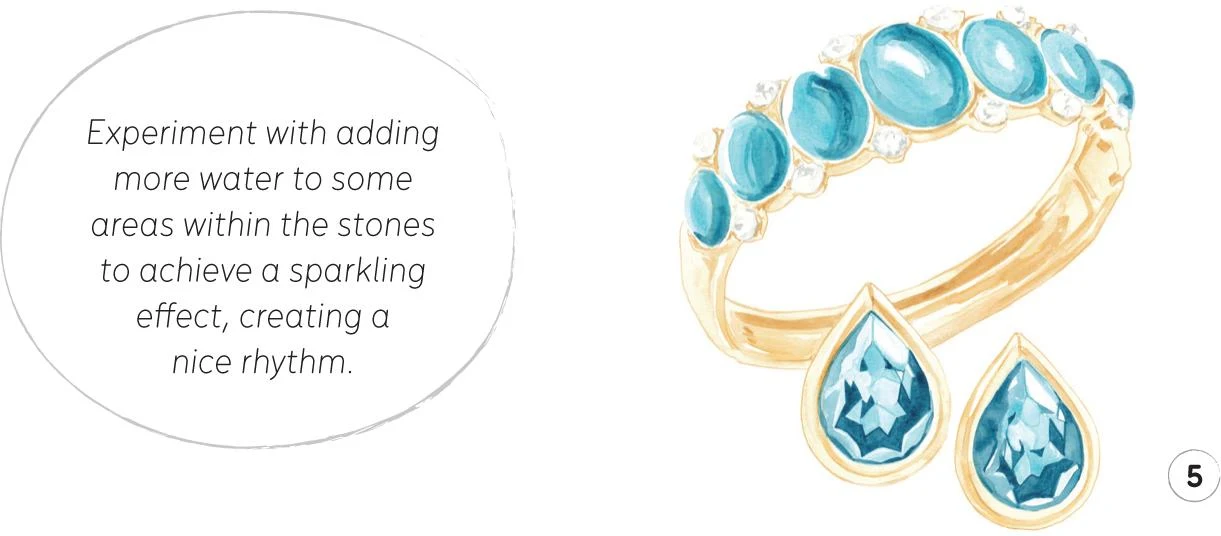
6. For the final step, use colored pencils to add definition. Start with the Cold Gray pencil and add some thin lines on the clear stones. Then use the Indanthrene Blue pencil to define the blue stones on the bracelet and outline the ones on the earrings.
Finally, outline the earrings with the Raw Umber pencil, particularly the one that overlaps the bracelet. If needed, darken some areas inside the bracelet.
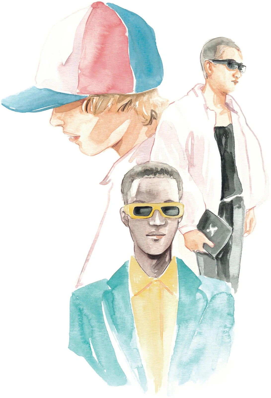
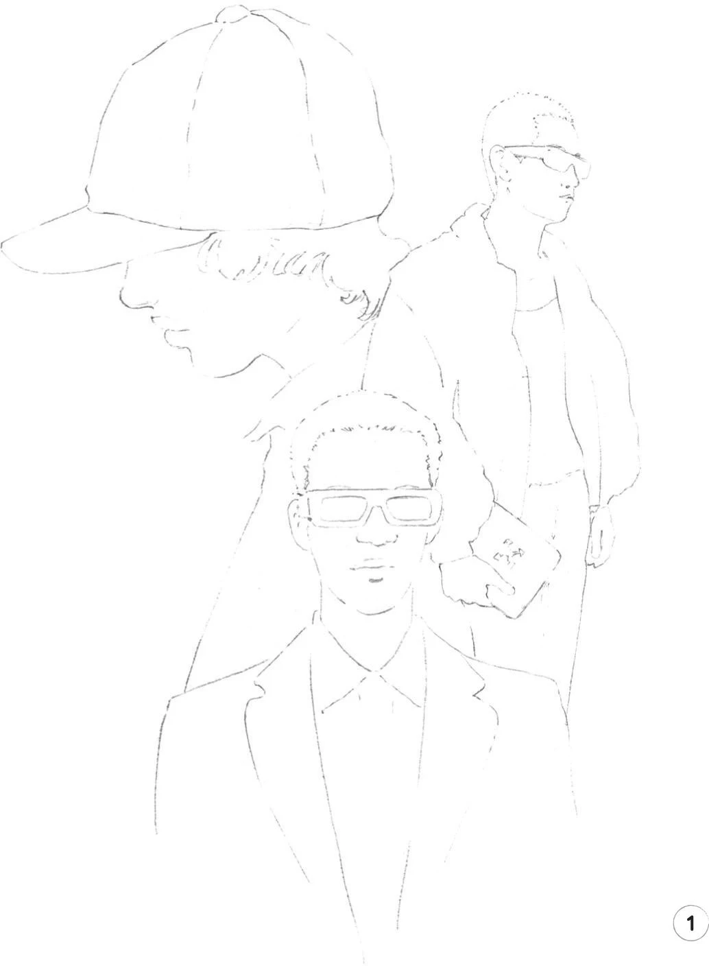
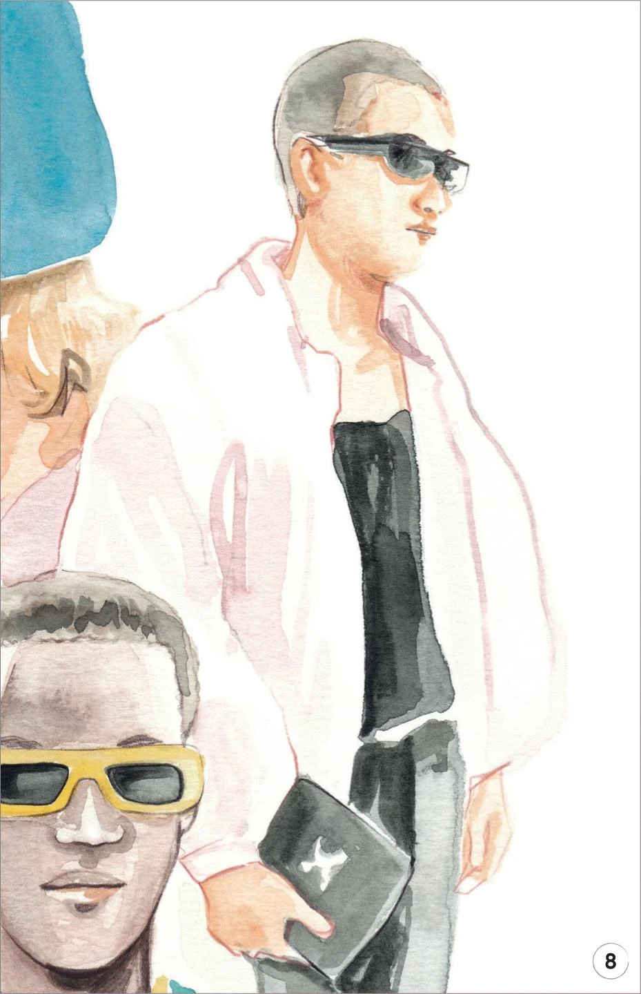
Menswear composition
LEVEL: HIGH BRAND: OFF-WHITE C/O VIRGIL ABLOH
In this project, I’m inviting you to create a composition that features a few different characters. I have always found this kind of illustration quite compelling as it allows you to show various sides of a collection in just a single image.
MATERIALS
Essentials:
- fine pencil
- eraser
Paper:
- A4 watercolor paper (300 GSM)
Brushes:
- squirrel mop brush size 2
- round synthetic brush number 0
- round synthetic brush number 1
- round synthetic brush number 2
Paints:
- China White
- Yellow Ochre Light
- Vandyke Brown
- Indigo
- Opera Rose
- Cadmium Red
- Cadmium Yellow
- Cobalt Turquoise
- Cerulean Blue
- Winsor Red Deep
Pencils:
- Walnut Brown 177
- Cinnamon 189
- Black 199
1. As this is a composition, your initial sketch may take a bit more time than usual. Make sure you include all the landmarks you’ll need before moving on to the next step.
2. Here, we’ll create a mid-tone for the skin and the hair of each of the three characters. For the skin of the top two characters, mix Cadmium Red, Cadmium Yellow, and China White. Apply it with a round brush 2 for the character on the left and a round brush 1 for the model on the right. For the character in the middle, mix Cadmium Red, Cadmium Yellow, China White, Vandyke Brown, and a little Indigo, and apply it with the round brush 1.
For the hair of the character on the left, I used some Yellow Ochre Light. For the other two, I used a mix of Vandyke Brown and Indigo slightly diluted. Use the round brush 1 for all three characters.
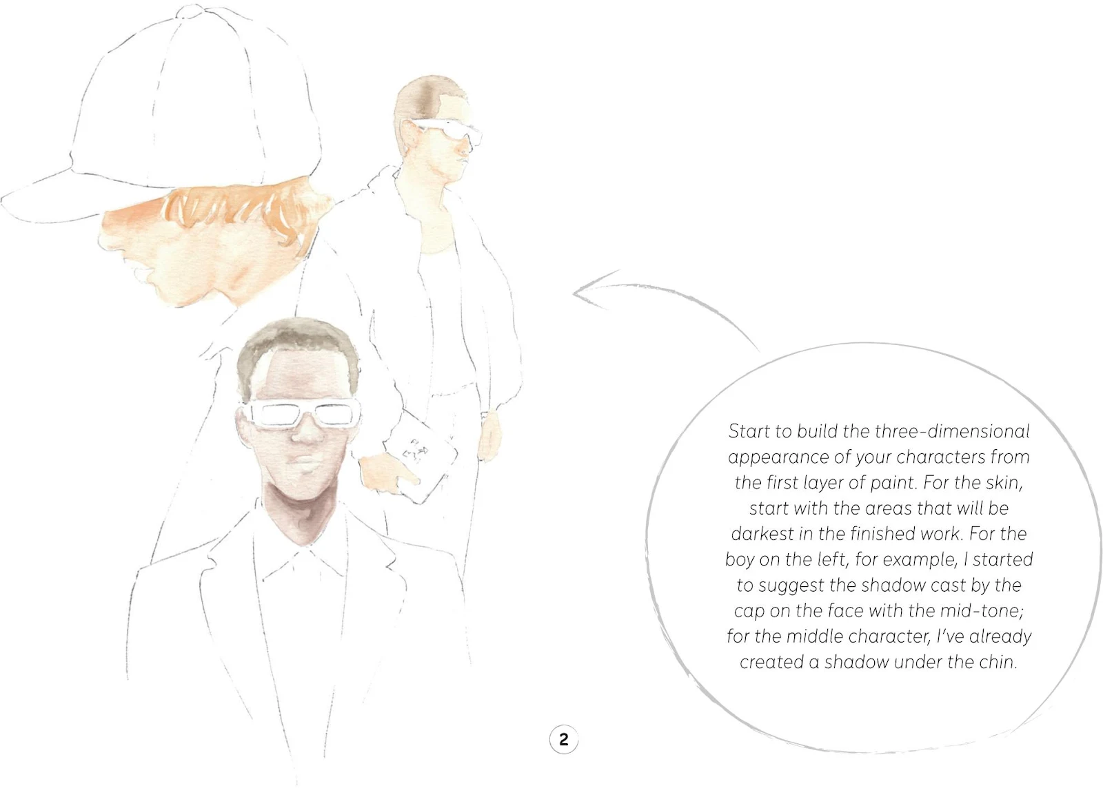
3. In this step, we’re going to add some color to the cap, using the mop brush. Start by mixing Cadmium Red with a little Winsor Red Deep and paint the middle portion of the hat. Then mix Cerulean Blue and a bit of Indigo to paint the visor and the right-hand section.
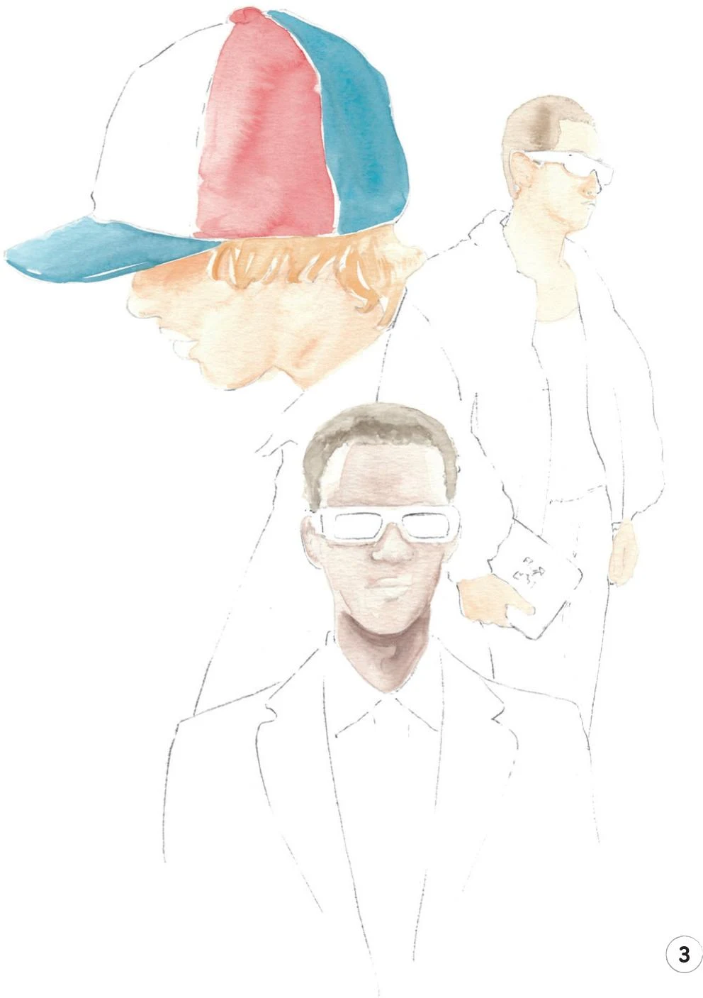
4. Combine some Opera Rose, Cadmium Red, China White, and a little Cerulean Blue. Apply this light mix with the mop brush to add some value to the remaining portion of the cap. Repeat on his shirt. Softly outline the left-hand edge of the cap with this mix, using a round brush 0.
Similarly, use the same mix on the jacket worn by the model on the right, using the round brush 1. Outline the jacket in some places with the round brush 0.
Now mix Vandyke Brown and Indigo, adding a little more water than usual to obtain a soft shade of black. Start applying this mix to the sunglasses and the bag of the character on the right, using the round brush 0. Leave a small white area on the bag, to imitate the logo of the brand. Use the same mix with the mop brush on the top and the pants of the same model.
Continue with the same dark mix to paint the lenses of the sunglasses of the model in the middle, using the round brush 0.
5. Mix some Cadmium Yellow with a little China White and use the round brush 0 to paint the frames of the middle model’s sunglasses. Add the same mix to his shirt with the round brush 2.
Now use some Cobalt Turquoise and the mop brush to paint his jacket, picking up a little more water on the brush as you move toward the bottom right so the color fades away gently.
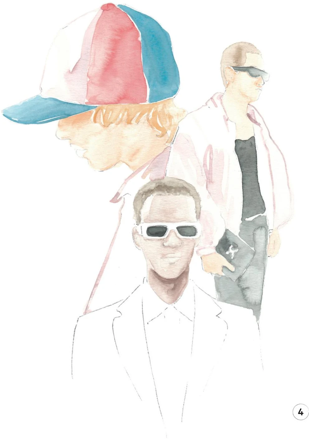
6. You have now completed the first layer of almost the whole illustration. Erase any remaining pencil lines, then we’re ready to add some dark tones to the skin of the three characters. For this, we’ll use the mix from Step 2 (Cadmium Red, Cadmium Yellow, and China White). For yet darker areas, such as the shadow cast by the cap’s visor, mix in some Vandyke Brown.
Paint the middle model’s upper lip with the dark-tone mix, then add a little Opera Rose to it for a brighter tone on the lower lip.
Using Vandyke Brown, add some dark tones to the hair of the right-hand and middle characters. For the model on the left, add some Yellow Ochre Light.
To complete this step, mix some Cadmium Yellow and a little Cadmium Red. With the round brush 1, softly define the collar of the yellow shirt.
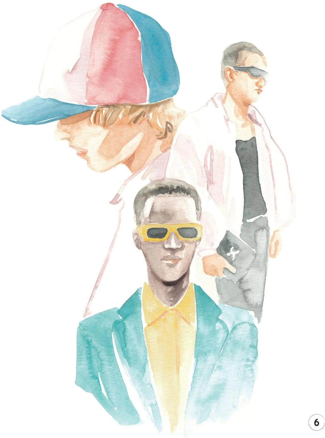
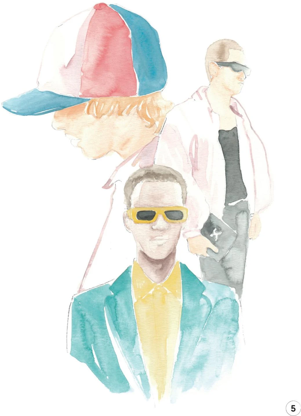
7. To complete the painting stages, add some more of the black mix (Vandyke Brown and Indigo) on the body and the bag of the model on the right, then leave everything to dry.
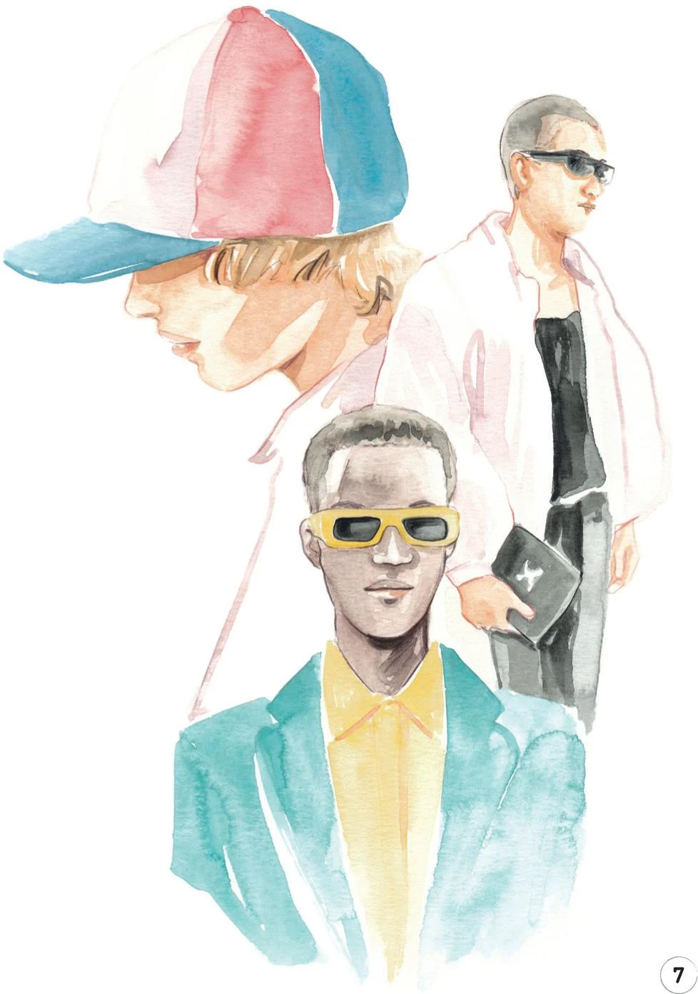
8. We can now add the final touches with some colored pencils. Use the Cinnamon pencil to add definition to the skin of the top two characters, particularly the profile of the one on the left. With the same pencil, outline parts of the jacket on the right.
The Walnut Brown pencil can be useful for adding more dark tones to the hair of the character wearing the cap and to define everyone’s lips. Continue with this pencil to add more definition to the hair and the face of the middle model, including his eyebrows and sunglasses.
Use a Black pencil to refine the lenses of the sunglasses and any other dark parts of the model on the right.
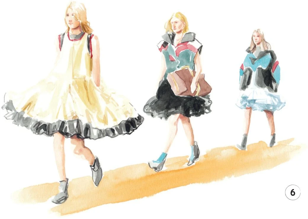
Catwalk moment
LEVEL: HIGH BRAND: LOUIS VUITTON
For this project, I have in mind something a bit different. I would love for you to be more instinctive in order to create a piece that captures the atmosphere of a fashion show. Think of a sketchy and energetic vibe; forget about being precise and simply enjoy the strokes of your watercolor brush!

MATERIALS
Essentials:
- fine pencil
- eraser
Paper:
- A4 watercolor paper (300 GSM)
Brushes:
- squirrel mop brush size 2
- round synthetic brush number 0
- round synthetic brush number 1
Paints:
- China White
- Yellow Ochre Light
- Vandyke Brown
- Indigo
- Opera Rose
- Cadmium Red
- Cadmium Yellow
- Cobalt Turquoise
- Cerulean Blue
- Winsor Red Deep

Pencils:
- Walnut Brown 177
- Cinnamon 189
- Raw Umber 180
Copic Ciao Marker:
- Pale Fruit Pink E000
1. For the light sketch of the whole illustration, keep it simple! Avoid adding too many details here, as the focus should be on the overall look of the artwork.
2. Let’s begin by adding a skin tone and hair color to each of the three characters. For the skin, mix Cadmium Red, Cadmium Yellow, and China White. As the areas of skin in this illustration are small, we’ll add all the shading now, diluting the mix with water when necessary and adding Vandyke Brown to the mix to create the darker tones, which I’ve used for shadow on each model’s back leg, for example. For the hair, I used Yellow Ochre Light for the first model, mixed Cadmium Yellow and Yellow Ochre Light for the second one, and Vandyke Brown for the third. For this whole step, alternate between a round brush 0 and 1, according to the size of the area you’re painting.
3. In this step, we’re going to work on the dress worn by the first model, plus a few other details. For the dress, mix Cadmium Yellow, China White, and a bit of Yellow Ochre Light. Apply to the dress with the mop brush, mostly using the tip. Once the paint is dry, add some darker lines to imitate the small folds of the fabric—to do this, add a very small amount of Vandyke Brown to the mix, and apply with the round brush 0.
You can also use the same mix to paint the yellow details on the bag held by the second model.
Now mix some Cadmium Red and Winsor Red Deep, and with the round brush 0 you can paint the red details on all three models.
4. Let’s keep building our illustration by adding more color. Use some Cerulean Blue with the round brush 1 to add details to the shoes of the second model and the jacket of the third. Add some Vandyke Brown to Cerulean Blue, and paint the chest of the second model, still using the round brush 1.
Now mix Cobalt Turquoise and a bit of Opera Rose to obtain a nice shade of violet. Use this mix and the round brush 0 to gently build up the volume of the white skirt of the third model—paint only the dark parts of the skirt, leaving the rest paper-white.
Lastly, use some Vandyke Brown and the round brush 1 to finish the bag held by the second model.
5. Use a watery mix of Vandyke Brown and Indigo for a soft shade of gray and add to all the black parts of our illustration: the details on the body and the lower skirt for the first model, the collar and skirt of model two, and the jacket of our last character. Use the mop brush, mostly employing its tip, to keep the strokes vibrant. Paint in all the shoes, too.
Wait for everything to dry, then erase all the visible sketch lines.
Use the same mix of Vandyke Brown and Indigo, but this time with less water, to add a deeper black to our catwalk. Use the round brush 0 or 1 for more precise strokes to render the folds of the skirts and other details.
6. We’ll add some final details now, but not too many, or we’ll lose the sketchy vibe of our illustration. Accentuate the shadows and define some other areas with the Cinnamon pencil. Use the same pencil along with the Walnut Brown pencil to add some detail to the faces: the eyes, nostrils, and lips. Also add some dark tones to the legs, especially where the skirts cast shadows.
Continue with Walnut Brown to add some definition to the third model’s hair, then define the bag held by model two. Switch to the Raw Umber pencil for the hair on the first and second models, then add a few lines to the dress of the first model.
To add the runway, mix some Cadmium Yellow and a little Cadmium Red, and with the mop brush, create a soft diagonal line under the feet of the models.Finally, use the Copic Marker E000 to add some small shadows to the faces of the models if needed.
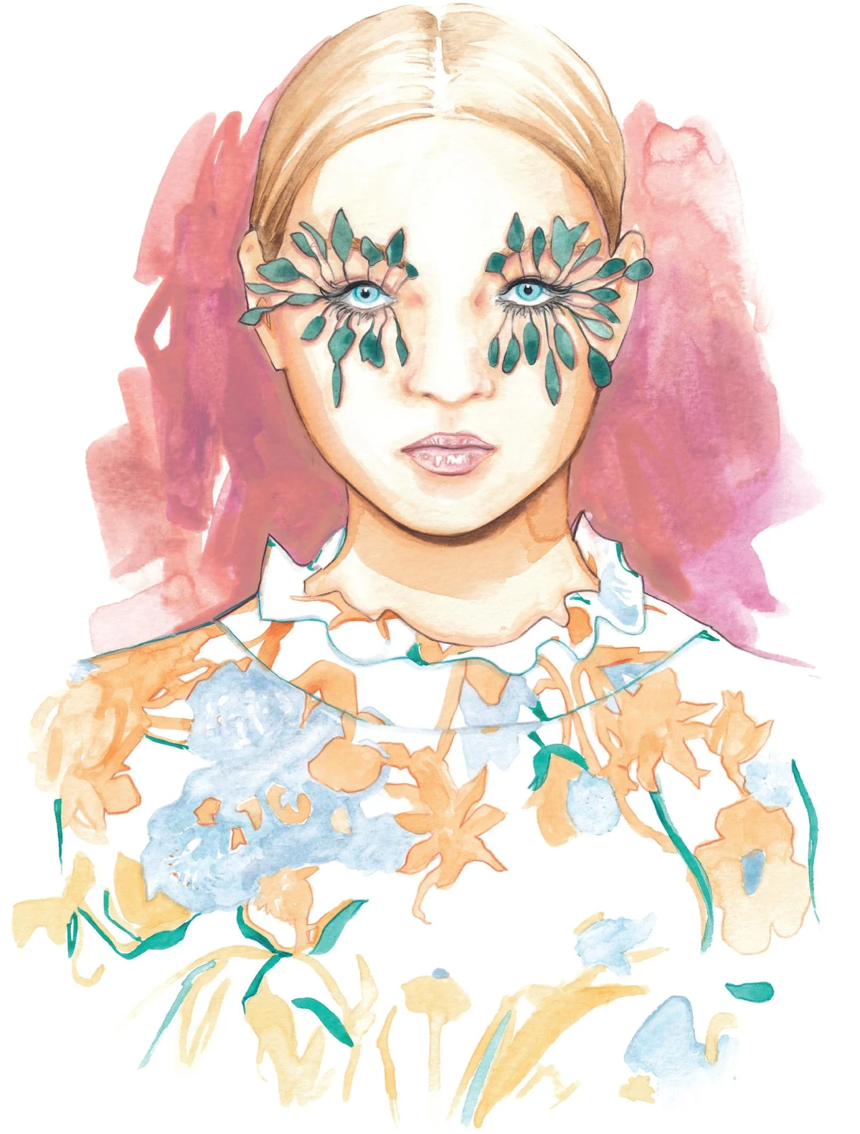
Close-up beauty look
LEVEL: HIGH BRAND: PAT MCGRATH MAKEUP FOR VALENTINO
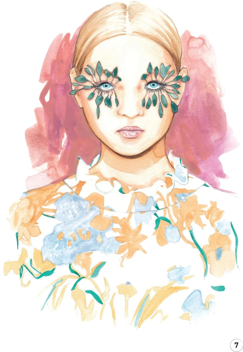
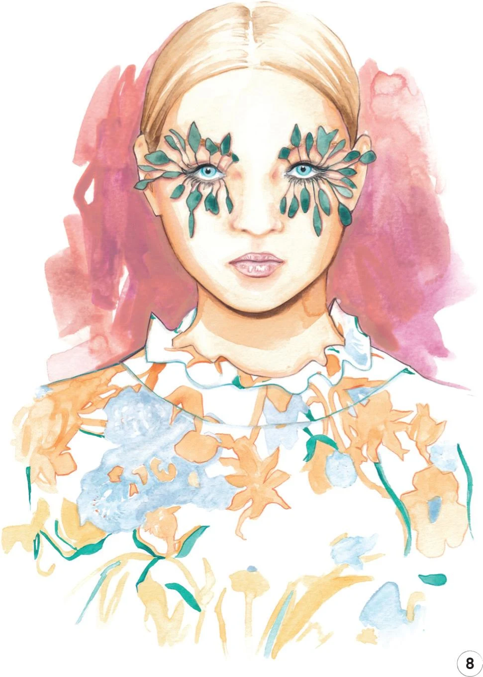
We are almost at the end of our watercolor journey, so I thought it was time for us to work on something special: exploring how fashion and beauty work together so well. For this tutorial, we’re going to create an intricate makeup look and match it with a bold flower print for a very elegant final result: you’ll need to stay focused, patient, and precise!
MATERIALS:
Essentials:
- fine pencil
- eraser
Paper:
- A4 watercolor paper (300 GSM)
Brushes:
- squirrel mop brush size 2
- round synthetic brush number 0
- round synthetic brush number 1
- round synthetic brush number 2
- flat synthetic brush number 10
Paints:
- China White
- Yellow Ochre Light
- Vandyke Brown
- Indigo
- Opera Rose
- Cadmium Red
- Cadmium Yellow
- Cobalt Turquoise
- Cerulean Blue
- Viridian
Pencils:
- Walnut Brown 177
- Cinnamon 189
- Beige Red 132
- Black 199
- Cobalt Turquoise 153
- Light Cadmium Red 117
Copic Ciao Markers:
- Frost Blue B00
- Pale Blue Gray B60
- Warm Gray No.2 W-2
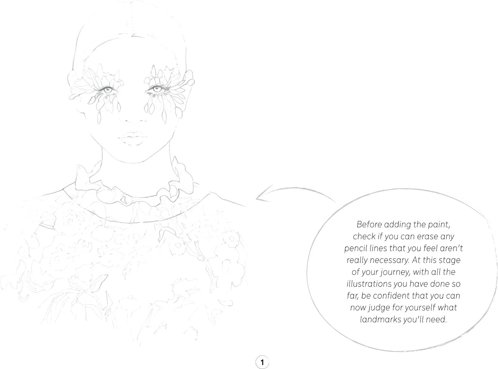
1. For this pencil sketch, be as detailed as possible, especially with the leaves around the eyes and the print of the dress. Be sure to include all the landmarks needed, but remember to keep these lines as light as possible so that our sketch stays clean.
2. For this step, focus on the face and neck. For the skin tone, mix Cadmium Red, China White, and a little bit of Cadmium Yellow. For this illustration, we’re working with a frontal light, to keep the work well-balanced and clean and let the makeup really pop.
Once you have the right shade for the skin, create a soft outline of the face and neck with the round brush number 1, leaving some lighter zones as you work inward.
Use a round brush number 2 to go back over some darker parts, such as along the nose at the inner edge of the eyes, inside the ears, under the chin, and on the sides of the face.
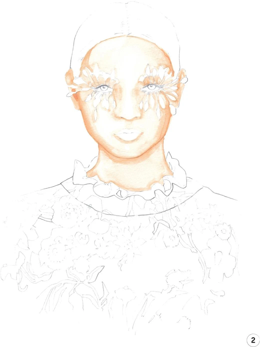
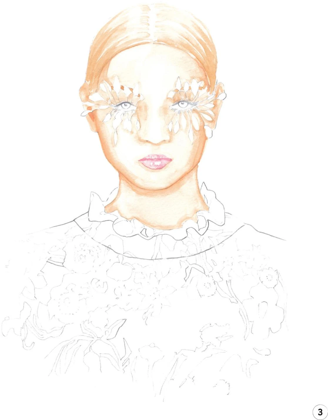
3. Create a mid-tone for the sides of the hair, using Yellow Ochre Light and the round brush 1. Start from above the ear and gently shade in the color, leaving the white of the paper as the light on the hair as you move upward. You can add some little brush strokes in the middle of the head, to start giving more volume to the hair. Continue with Yellow Ochre Light and the round brush 1 to color the eyebrows where they are visible between the leaves, trying to be as precise as possible.
To complete this step, mix some China White and Opera Rose, then add a tiny touch of Cadmium Yellow. Using the round brush 1, add some paint to the lips. Be very careful, and leave some small dots of paper unpainted to represent the highlights on the lips.
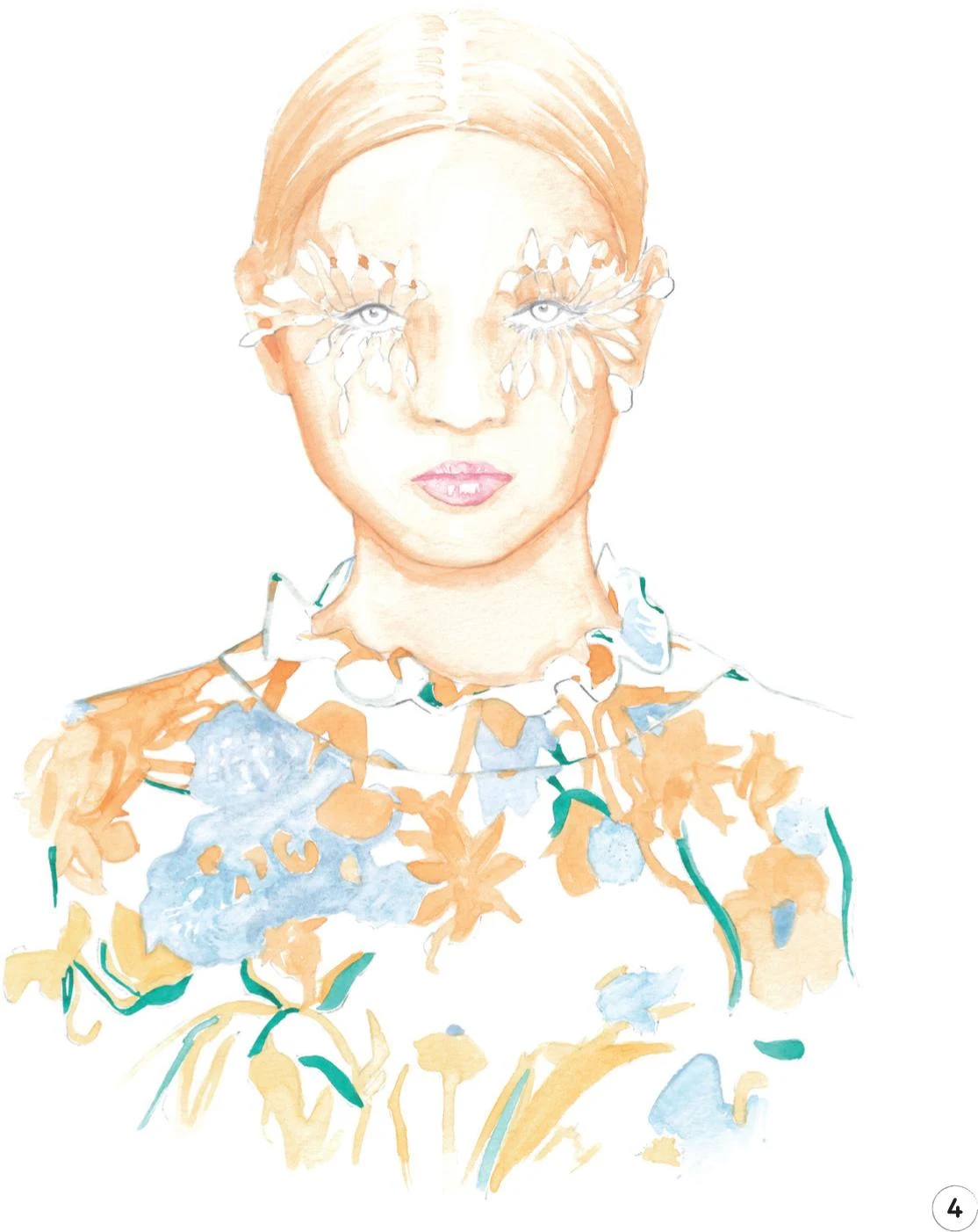
4. Add some color to the dress for the flowers and leaves, using the round brush 1 throughout. Start with the light colors such as the blue periwinkle flowers, mixing China White with Cerulean Blue and a touch of Opera Rose.
For the orange flowers, mix Cadmium Red, Cadmium Yellow, and China White. As you work down the print, gradually add more and more Cadmium Yellow to the mix so the flowers appear to fade away toward the bottom of the illustration. The lowest flowers are a pale, almost yellow color.
Now add the thin green leaves, mixing Viridian with some China White and a little Cobalt Turquoise. Complete the fabric print with the blue periwinkle mix (China White, Cerulean Blue, and a little Opera Rose). Gently outline the ruffle collar, the seam line at the bottom of it, and the shoulders.
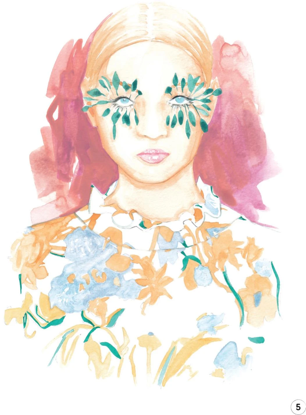
5. Next, we’ll add a splash of color to the background, to help the face and makeup really stand out. Mix some Opera Rose, China White, and Cadmium Yellow. For precision, use the round brush 1 to outline the character first, then you can move on to use a mop brush 2 for the rest of the background with no risk of damaging the work already done on the face. Be playful with the background—for the outer parts, use more water to soften the edges. For a lively effect, use a flat synthetic brush number 10 to help keep the background vibrant.
Now use the round brush 1 to color the leaves of the makeup, using a mix of Viridian and China White. You’ll need to be quite focused and precise for these leaves. Once the background has dried, erase the sketch lines around the makeup leaves. With some black mixed from Vandyke Brown and Indigo, use a round brush 0 to paint in the top and bottom eyelids and the upper and lower lashes. To color the iris, use the Copic Marker B00.
6. Now erase any remaining pencil lines from the print of the dress and elsewhere. Mix some Vandyke Brown and Yellow Ochre Light, and add some dark tones to the hair with the round brush 2, starting above the ears. Once that has dried, use a Walnut Brown pencil to add some nice outlines to the sides of the head.
To create more depth, add the dark skin tone to the neck, right under the chin, using a mop brush. Once dry, add a thin line right under the chin with a mix of Vandyke Brown and Yellow Ochre Light. Also outline the sides of the face a little, using the round brush 1.
To complete this step, we can work more on the face with the Pale Fruit Pink Copic Marker E000. Add some dark tones where needed, such as under the eyebrows and around the lips. For the smaller parts, such as the corners of the eyes, for example, you can also use the Cinnamon and Beige Red pencils.
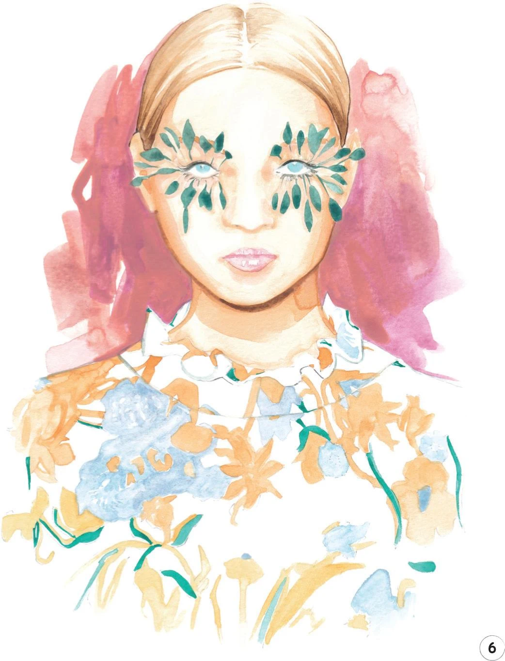
7. Now focus on the eyes, eyebrows, and the makeup leaves. For each eye, use the Copic Marker B60 to create a soft shadow on the sclera, right under the top lids. Outline both lids using the Copic Marker W-2. A Black pencil is perfect for adding more lashes, then use a Cobalt Turquoise pencil to outline the corneas. Complete the eyes with a Black pencil to draw the pupils, leaving a small white dot on each as its highlight.
With the Walnut Brown pencil, create a very thin outline on the leaves around the eyes. You can add more depth with the Cinnamon pencil, creating thin shadows below each leaf. Add some definition to the nose, if needed, using the Cinnamon and Beige Red pencils, and draw small nostrils with Walnut Brown.
Now add some dark tones to the lips, to define them better. Using the Cinnamon pencil, create a soft line between the upper and lower lips and underline where needed.
As the final touch for this step, outline the sides of the face and the neck with the Walnut Brown pencil and add some small marks to define the eyebrows.
8. To complete this illustration, add a few more details to the dress. In particular, outline some of the orange flowers using the Light Cadmium Red pencil. Add definition to the ruffle collar, the seam line below, and the shoulders, using the Cobalt Turquoise pencil.
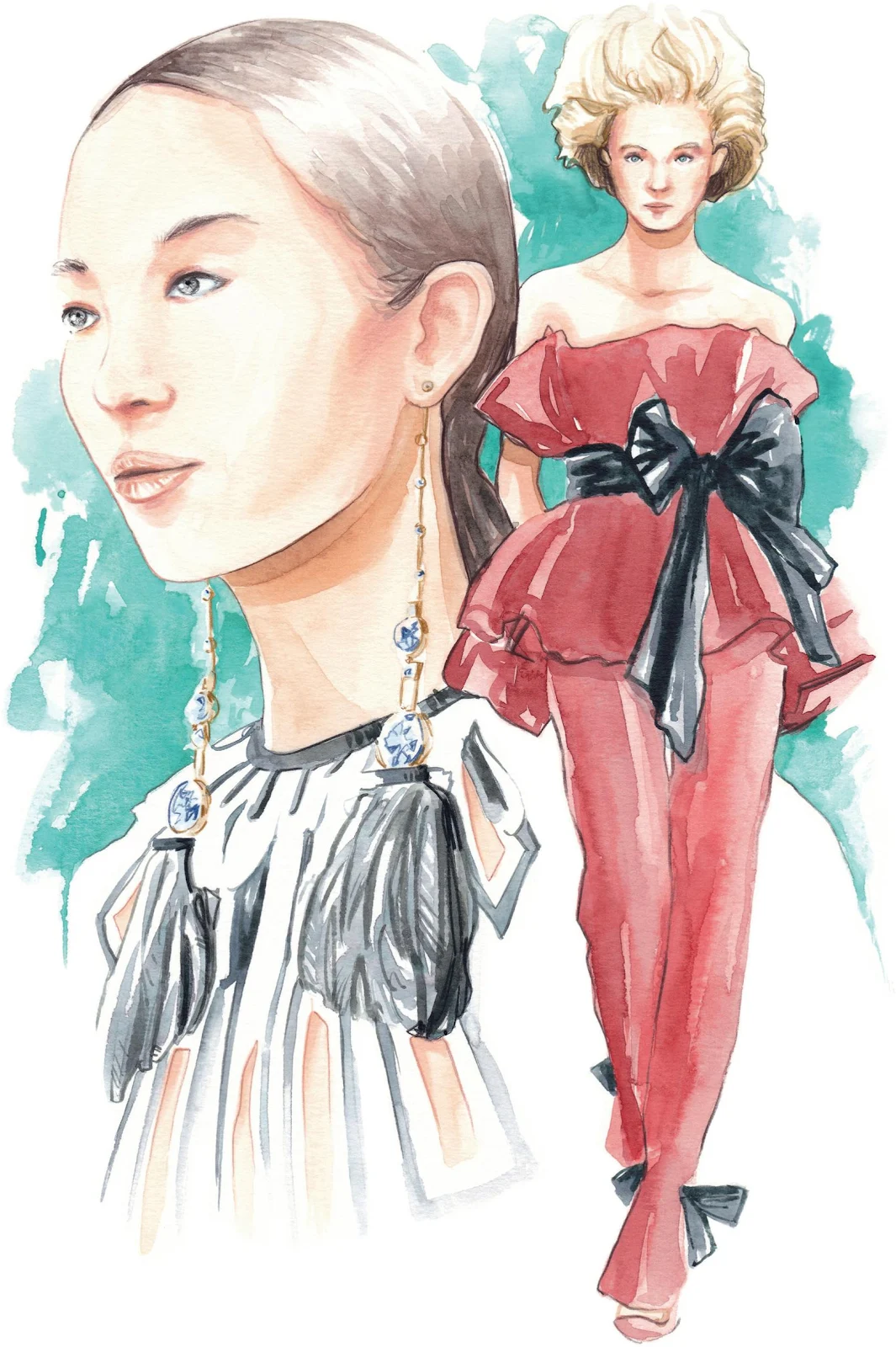
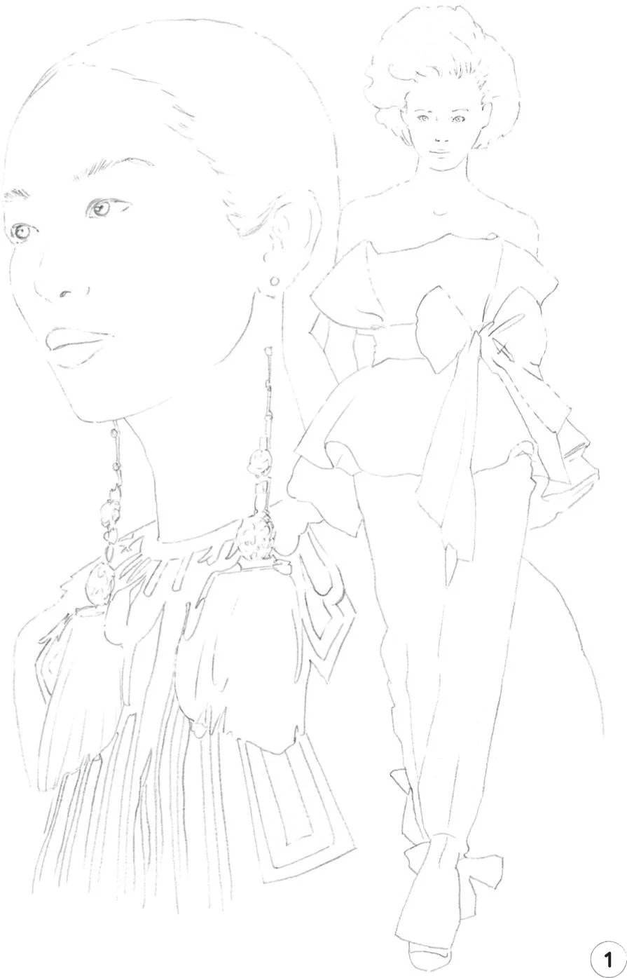
Womenswear composition
LEVEL: HIGH BRAND: VALENTINO
Now for another challenging composition, this time for a womenswear collection. The illustration includes two characters, with one wearing some demanding earrings! We’re going to add a background to make everything even more compelling and complete.
MATERIALS
Essentials:
- fine pencil
- eraser
Paper:
- A4 watercolor paper (300 GSM)
Brushes:
- squirrel mop brush size 2
- round synthetic brush number 0
- round synthetic brush number 2
Paints:
- China White
- Yellow Ochre Light
- Vandyke Brown
- Indigo
- Opera Rose
- Cadmium Red
- Cadmium Yellow
- Cobalt Turquoise
- Winsor Red Deep
Pencils:
- Walnut Brown 177
- Cinnamon 189
- Beige Red 132
- Black 199
- Cobalt Turquoise 153
- Indanthrene Blue 247
- Cold Gray 235
- Raw Umber 180
Copic Ciao Markers:
- Pale Fruit Pink E000
- Warm Gray No.2 W-2
- Pale Blue Gray B60
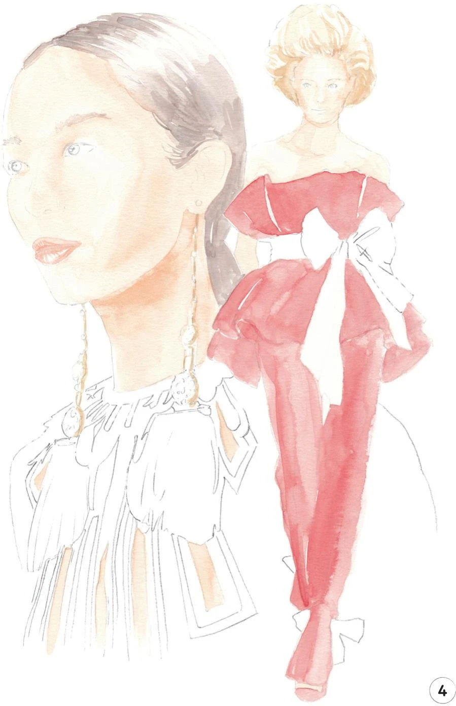
1. Considering the complexity of this composition, your initial pencil sketch should have all the landmarks you’ll need during the whole process. In particular, focus your attention on the earrings and the details on the dress of the model on the left. Be sure to understand the complex structure of the dress before you think about adding any color.
2. Now create a mid-tone for the skin of both characters, mixing Cadmium Red, Cadmium Yellow, and China White. Use a mop brush for the figure on the left, starting in the darkest area under the chin and then shading gently over the rest of the neck and face. Then, with a round brush 0, paint the small areas of skin visible through the dress.
Move on to the figure on the right and continue with the round brush 0 to carefully paint the face, body, arm, and the small part of the foot that’s visible inside the shoe.
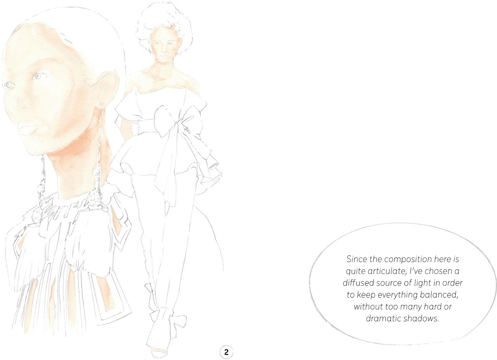
3. We’ll now add some color to the hair. Mix some Vandyke Brown, China White, and a little Cobalt Turquoise and Opera Rose to create a mid-tone for the hair of the model on the left. Begin to apply this mix with a round brush 2, leaving some white areas to act as highlights, then use the round brush 0 for the smaller areas, including the eyebrows.
For the other model, mix Yellow Ochre Light with a little China White and apply it with the round brush 0. Continue with the same mix and brush to add the golden parts of the earrings of the first model.
4. In this step, we’ll add a mid-tone to the dress and the shoe of the model on the right. Mix Cadmium Red with a little Winsor Red Deep, and apply it with the mop brush, using the tip of the brush for the small areas.
Now combine the skin mix from Step 2 (Cadmium Red, Cadmium Yellow, and China White) with a little of the mix we created for the dress (Cadmium Red with a little Winsor Red Deep). With the round brush 0, gently paint the lips of the left-hand model, leaving highlights as always.
5. For the dark details of the dress on the left, mix some Cobalt Turquoise, Opera Rose, and a little Vandyke Brown. Apply this using the round brush 0, then paint the irises with the same mix. Switch to the mop brush, and add the lower, feathery parts of the earrings.
Let’s use the same mix with the round brush 2 to add the bows at the waist and the ankles of the model on the right.
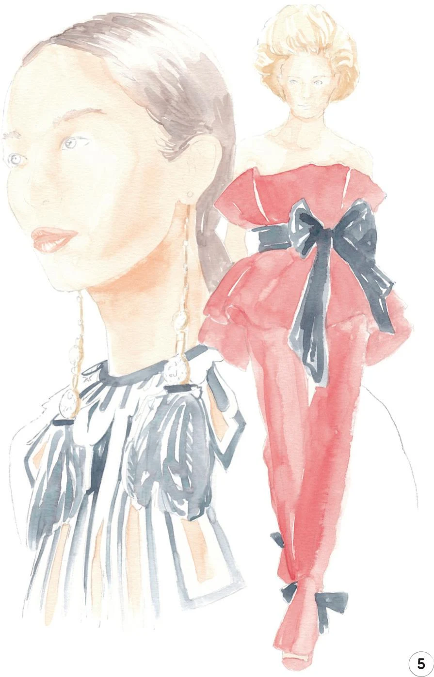
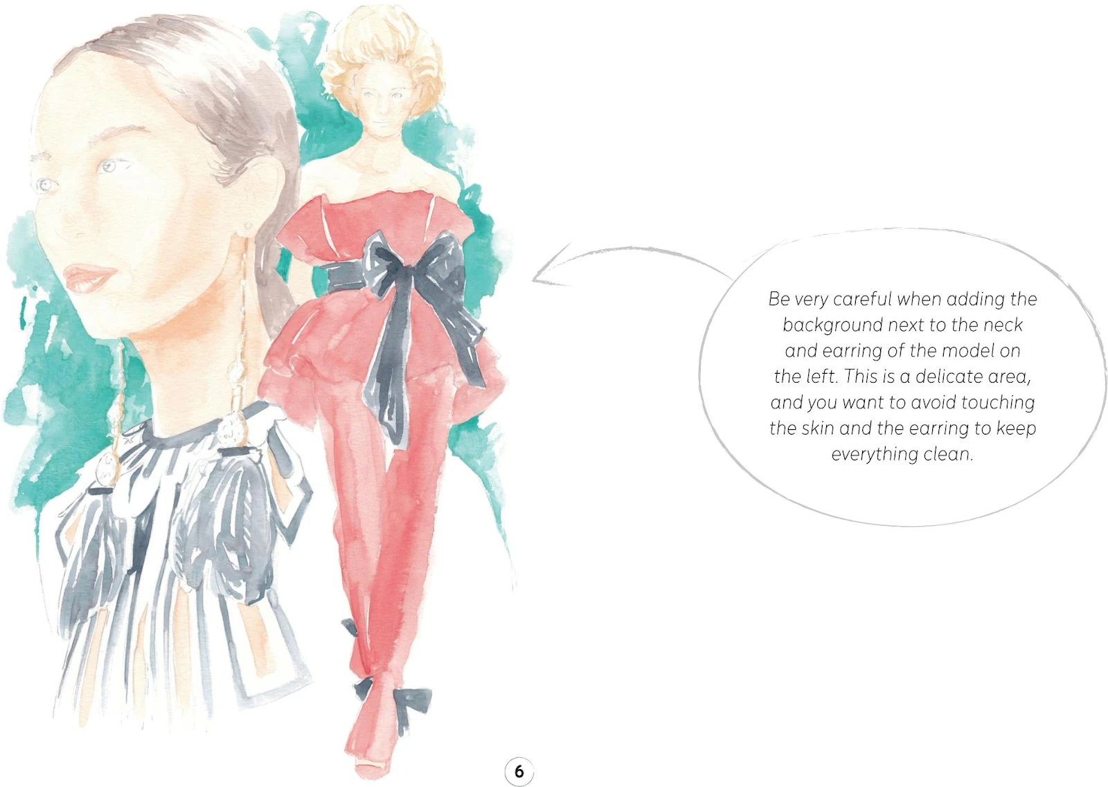
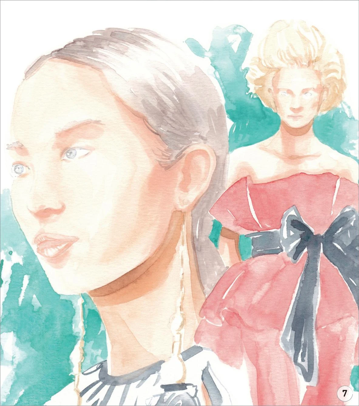
6. In this step, we’ll add an abstract background in a beautifully contrasting color. Mix Cobalt Turquoise with a little China White, then add some strokes around the figures, keeping it playful but balanced. Use the mop brush for the freer strokes, adding more water to the mix to soften the color in places, and employ the round brush 0 for smaller areas such as around the arm of the model on the right.
7. Now that we have applied the first layer of paint for almost the full illustration, you can erase any unnecessary pencil lines, then we can focus more on the skin and hair of the two characters.
Start by adding a little Vandyke Brown to the skin-tone mix we created in Step 2 (Cadmium Red, Cadmium Yellow, and China White). Use the mop brush to add this beneath the chin of the model on the left, then switch to the round brush 0 to do the same for the model on the right. Add a shadow to her arm, cast by the dress. Leave everything to dry.
8. To refine the skin, use the Copic Marker E000 to add more dark tones to both characters, working under the eyebrows, around the noses, and then a little on the cheeks and the ears. Don’t forget the small areas visible under the dress of the model on the left or the body of the model on the right.
9. In this step, we’ll focus on the hair of both characters. Use some Vandyke Brown to add some shadows to the hair of the model on the left, using the round brush 2 for the lower section next to the neck and ear, and switching to the round brush 0 for the upper part of the head.
Continue with the round brush 0 to add a mix of Yellow Ochre Light and a little Vandyke Brown to the hair of the second model. Also outline the voluminous hair a little.
10. Now mix some Winsor Red Deep with a little Vandyke Brown and use the mop brush to add dark tones to the dress of the model on the right. Mix Indigo and Vandyke Brown to create a nice natural shade of black, then apply it to the bows at the waist and ankles of the dress, using the round brush 2 and swapping to the 0 where required for smaller, more precise strokes.
Apply the same black mix on the feather earrings of model one, once again alternating the round brushes 2 and 0. Finally, add some definition to the detailing of her dress, using the round brush 0.
11. Here we’ll add the finishing touches to the model on the left. Use the Copic Marker B60 to create a soft, thin shadow on the sclera of both eyes, drawing right under the top lids. Outline the top lids with a Copic Marker W-2, then use a Walnut Brown pencil to define the top lid. Add the pupil, then switch to the Black pencil to add more tone to it.
Use the Cinnamon and Beige Red pencils to darken the areas around the eyes, under the eyebrows, the nostrils, and the ear. With the Cinnamon pencil, softly define the left-hand side of the face, add some dark tones to the lips and outline the cutouts of the dress where the skin shows through.
Swap back to the Walnut Brown pencil to add some strokes to the eyebrows, create a soft line between the lips, and give more definition to the nostril.
Moving on to the earrings, use the Copic Marker B60 to add some tone to the stones. With the Indanthrene Blue pencil, continue to refine them, imitating the reflective surface. Use the Raw Umber pencil to add some dark tones and refinement to the golden parts.
Add a soft Cold Gray pencil line around the shoulders.

12. To complete this illustration, let’s focus on the second model. Use the Cobalt Turquoise pencil to softly draw in her pupils, then switch to the Walnut Brown pencil to define the rest of the eyes. With the same pencil, add some dark tones to the hair, a soft line between the lips, and an outline to the shoulders and dress where some definition is needed.
Use the Cinnamon and Beige Red pencils to add the lips and give some dark tones to the skin, and you’re done!

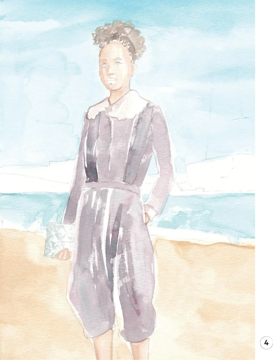
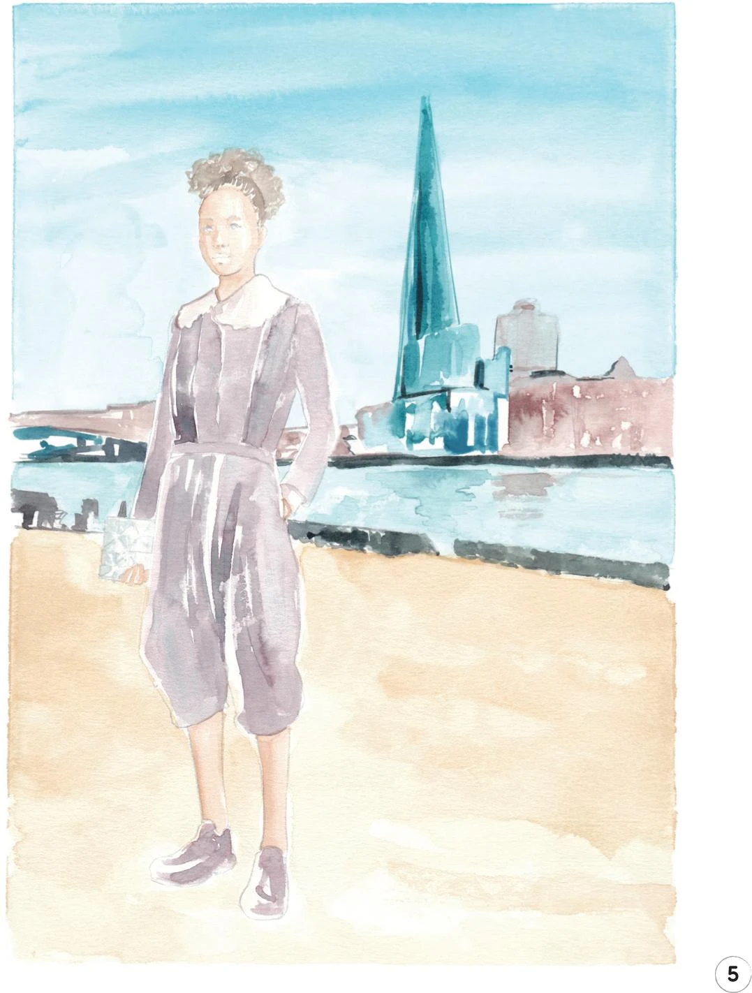
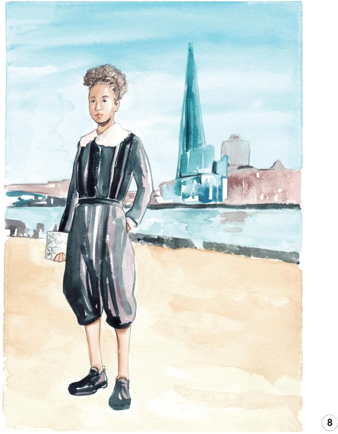
Editorial with background
LEVEL: HIGH
BRAND: COMME DES GARÇONS + EYTYS PHOENIX + ISSEY MIYAKE
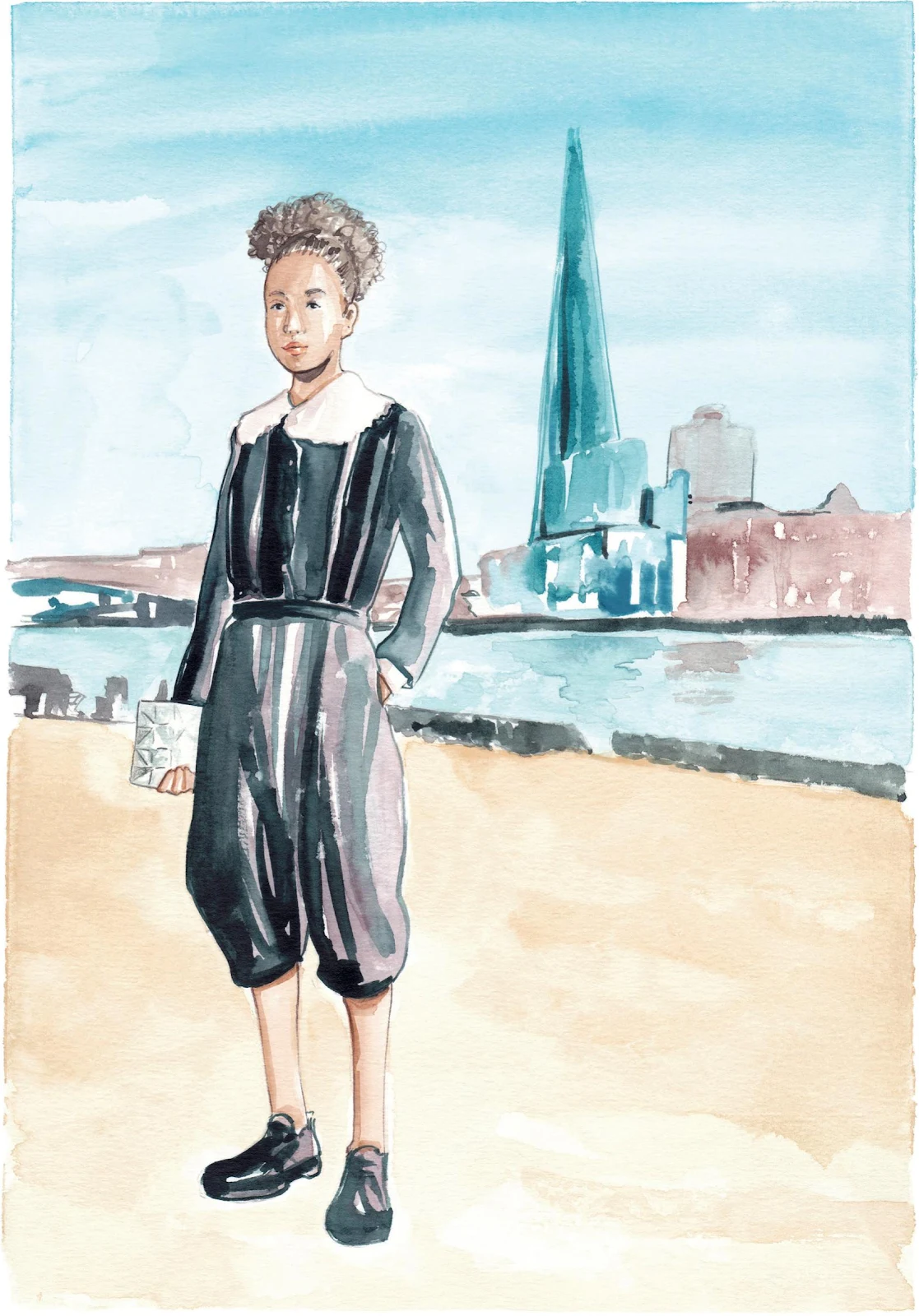
For our final tutorial, I am inviting you to place your character within a setting. So far we have worked with white or abstract backgrounds, but adding an environment gives even more depth to your work. By adding a landscape, your illustration will acquire an editorial feel, like those in the pages of a fashion magazine. Our scene here is a view from the River Thames, with London’s iconic Shard building in the background.
MATERIALS
Essentials:
- fine pencil
- paper tape
- eraser
Paper:
- A4 watercolor paper (300 GSM)
Brushes:
- squirrel mop brush size 2
- round synthetic brush number 0
- round synthetic brush number 1
- round synthetic brush number 2
Paints:
- China White
- Yellow Ochre Light
- Vandyke Brown
- Indigo
- Opera Rose
- Cadmium Red
- Cobalt Turquoise
- Cerulean Blue
- Winsor Red Deep
Pencils:
- Walnut Brown 177
- Venetian Red 190
- Black 199
- Cold Gray 235
Copic Ciao Marker:
- Soft Sun E21
1. For the initial pencil sketch, define the figure, but keep the background quite light. Although we are adding a landscape, the character and the garments should always be the focus of our artwork.
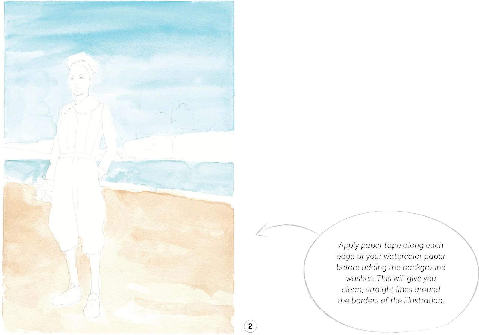
2. Now we’re ready to start with the background, building up the first layer straight away. First, apply a tape border around your paper (see tip). Mix some Cerulean Blue with China White and start applying a wash at the top of the paper for the sky (see Exploring Watercolor: Practice Exercises—Washes). Be careful as you approach the figure, particularly around the face and collar. Otherwise, fill the whole space, covering most of the buildings—this will give the smoothest result and we’ll use darker paints over the top later. Add a tiny amount of Vandyke Brown to your mix and paint in the river. Now use Yellow Ochre Light on the lower part of the paper for the sand. For this whole step, I used the mop brush to create a soft texture and even color.
Once your paint is completely dry, remove the paper tape from your paper. Be very careful—remove it slowly so you don’t do any damage.
3. Let’s move on to the model, starting with the first layer for the skin and hair. For the skin tone, mix Yellow Ochre Light, Cadmium Red, and Vandyke Brown. Apply it to the face and hands with a round brush 0, and use a number 1 on the legs. For the hair, slightly dilute some Vandyke Brown, and apply it with the round brush 0.
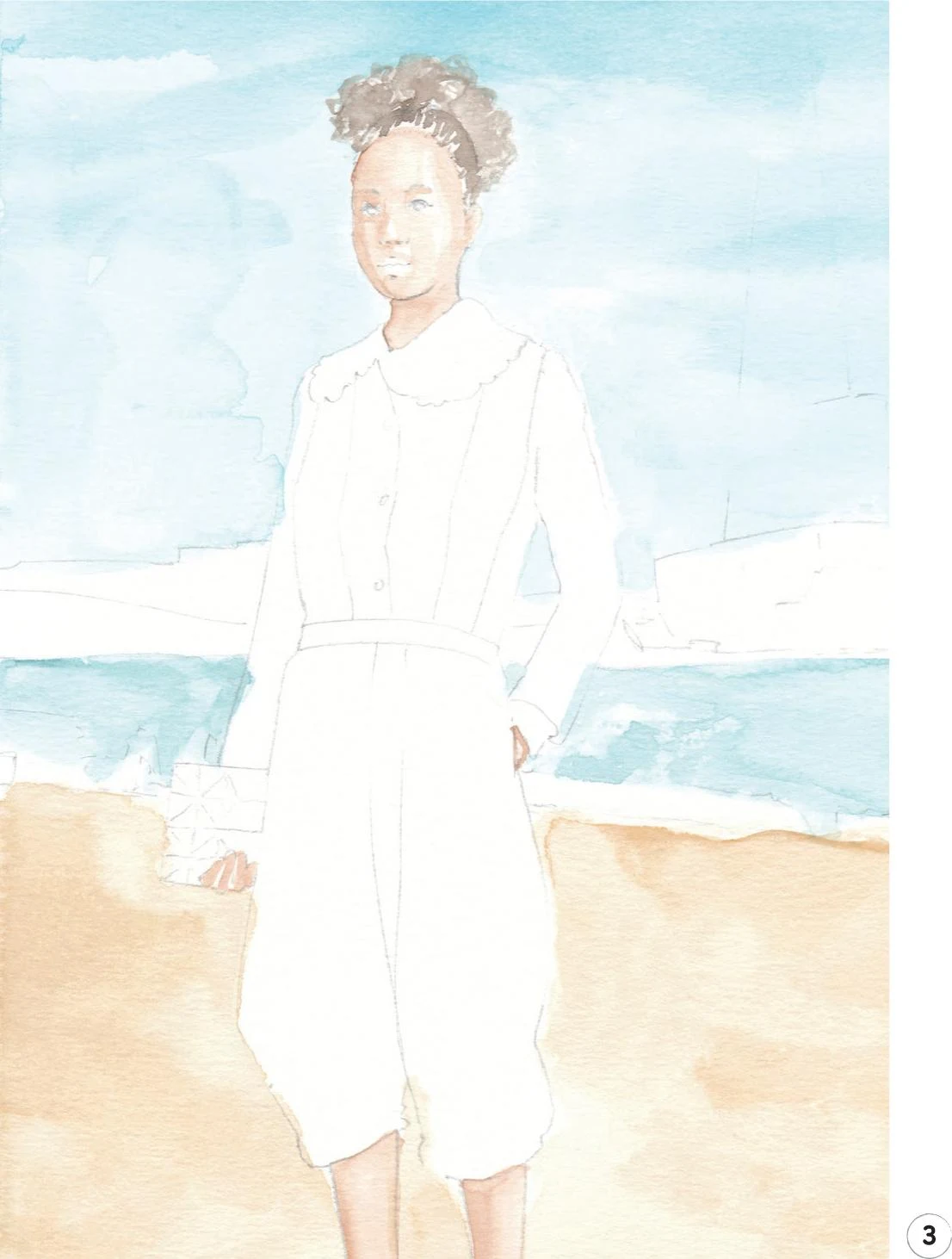
4. For the garments, mix some Opera Rose, Vandyke Brown, and China White. Use the round brush 0 to outline the white collar and the shirt cuff a little, and also add some tones.
Now mix some Winsor Red Deep and Cobalt Turquoise to create a shade of violet, and use it on the clothes and shoes as a mid-tone, alternating the round brush 1 with a number 2 as necessary.
Use lots of water for a mix of Indigo and Vandyke Brown to create a light shade of gray, then apply to the purse using the round brush 0.
5. We’ll now return to the background to paint the buildings. Aim for an almost impressionistic feel without too many details so the focus stays on the model. We’ll keep everything homogenous by using shades of blue, brown, and black. Add some darker tones to the river banks and, for an even more realistic feel, add some reflections of the buildings in the water. In this step, alternate the round brushes 0 and 1 according to your needs.
6. Erase all the remaining pencil lines, and let’s move back to the figure to add some dark tones to the skin. Use the mix from Step 3 (Yellow Ochre Light, Cadmium Red, and Vandyke Brown) and the round brush 0.
Use some Vandyke Brown to give some dark tones to the hair and add a more pronounced shadow under the chin and the ear.
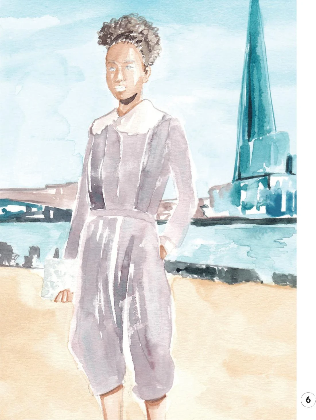
7. Combine Vandyke Brown and Indigo and use this mix on the garments and shoes, applying it with the round brushes 0, 1, or 2 depending on the size of the area. Work over the fabric in order to create volume and reproduce the folds. Add gentle outlines where needed, using the round brush 0.
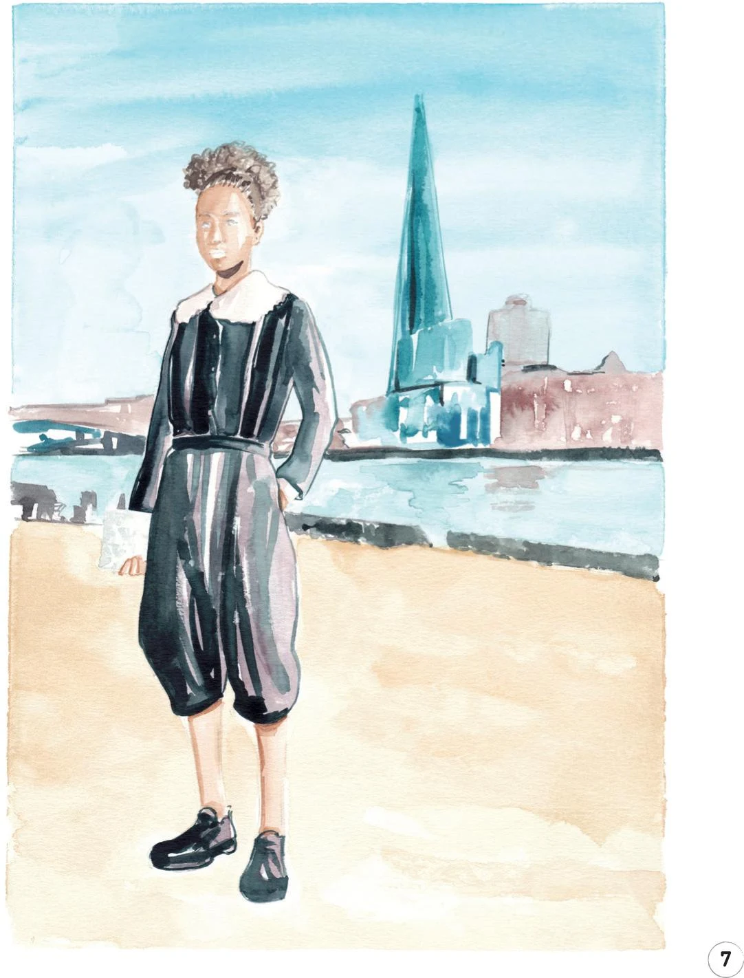
8. For the final step, let’s focus on some details. Use the Copic Marker E21 to gently draw the lips, then with the Venetian Red pencil, add some small shadows to them.
Use the Walnut Brown pencil to add definition to the face, neck, hands, and legs. With the same pencil, draw the eyebrows, add more hair, and create a soft line between the lips.
A Black pencil is the best choice to draw the eyes.
To complete your final illustration, use the Cold Gray pencil to define the purse and add any final details.
READY FOR BUSINESS
In this chapter, we’re going to look more closely at aspects of fashion illustration for a viable career. In an increasingly digital world, it’s vital that you can create digital files of your work, so first we’ll look at digitizing your illustrations to post online, build a digital portfolio, present to clients, and more. We’ll also look at how you might use your scans within mixed media work, and finally I’ll discuss my live work.
Digitizing your work
Scanning my work is the ultimate step for each new illustration. Part of being a professional illustrator is presenting your work at its best, and to this end you should consider cleaning and editing your work in Photoshop. We’ll take a look at how and why over the following pages.
SCANNING
Although I sometimes use my phone to take “work in progress” pictures for my social network accounts, the best way to convert illustrations into digital form is with a scanner. Today’s scanners are pretty affordable, and buying one is a worthwhile investment that will improve your work significantly. An A4 scanner is usually sufficient—if you work on larger formats, scan your work in sections and merge them in Photoshop. Always scan your illustrations at 300 dpi (dots per inch). This setting is indicative of the quality of your digital file, and is sufficient for most professional uses, but if in doubt (think of large scale work), double-check with your client. Remember to keep your scanner clean, because any dust or stains on the surface are going to be on your digital files, too.
EDITING IN PHOTOSHOP
Once you have converted your illustration to digital, the next step is a little bit of editing and cleaning up in Photoshop. The following pages are not intended as a full guide to the wonders of this software, as mastering Photoshop takes time, but I’ll give you some tips about the tools I use when editing my work.
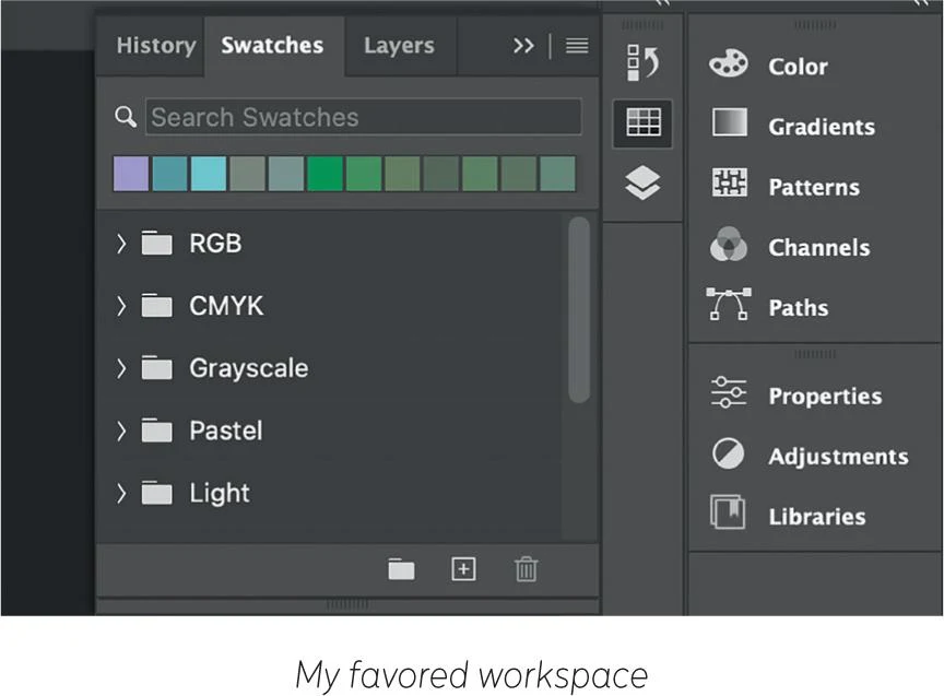
First, organize your workspace (click on Window > Workspace for some templates), keeping only the windows you’ll use most often. For me, these are Layers and History. I also favor Swatches over Color Palette, as I find it more practical (see ‘My favored workspace’ image).
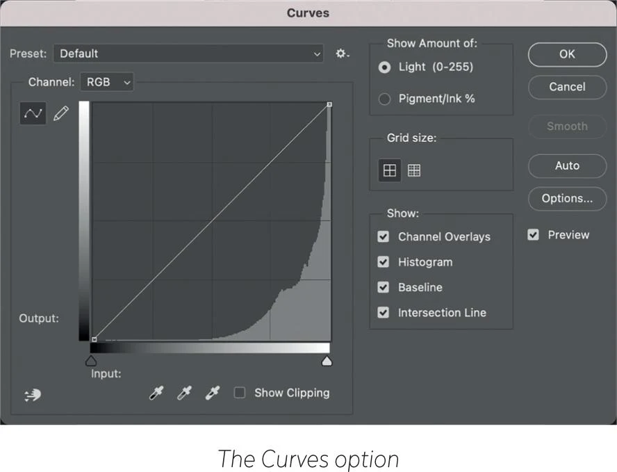
Next, open your scanned file to adjust the whiteness of the paper. Often watercolor paper is not perfectly white. Some people prefer to maintain the slightly yellow hue of the paper once digitized, but I prefer to set it to as white as possible. The simplest way to do this is using the Curves option from Image > Adjustments, then use the eyedropper to sample the whitest point of your illustration (see ‘The Curves option’ image). If you are working on a black and white illustration, you can also sample the blackest point with Curves. Sometimes this feature can be too strong, and it’s better to combine Curves with another function: Brightness/Contrast (also from Image > Adjustments). A freshly scanned file may look a bit dull compared to the original, but a little more contrast and a little less brightness are usually all that you need to restore it to its original glory.
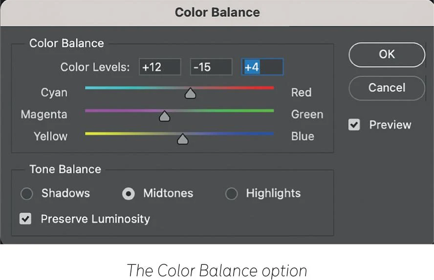
Another useful function, again from the Adjustments menu, is Color Balance (see ‘The Color Balance option’ image). By moving the pointers, you can adjust the color feel of your work. This function is useful for tweaking a color that feels slightly wrong or to accentuate the sense of light with, perhaps, a hint of yellow, and so on. It doesn’t substitute colors, it just adjusts them slightly. You can apply this change to specific areas of your work using the selection tool. For all of these functions, tick the Preview box to see the results before you commit.
USING THE TOOL PALETTE
On the left of your workspace, you’ll find the Tool Palette window that contains extra tools that may be helpful when editing your illustration. Simply hover your mouse over each tool to see its name and a brief description. Here are the ones that I use the most:
- Eraser: once you’ve adjusted the Brightness/Contrast of your illustration, the Eraser can be a useful next step, especially if, like me, you usually have lots of white areas in your illustrations. This tool erases any marks or blemishes on your sketch.
- Spot Healing Brush: unlike the Eraser tool that works with a white area, this tool samples pixels from around a blemish, then matches them to “heal” the imperfection. It’s particularly effective if you need to heal a mark in an area full of colors and nuances, removing the blemish and keeping everything clean.
- Blur: this handy tool lets you smooth and blur some areas that you feel are too sharp.
- Dodge/Burn/Sponge: you can find these three tools under the same tab (see ‘Dodge, Burn and Sponge’ image). Dodge and Burn work similarly to Brightness/Contrast, but you choose the areas that you want to lighten or darken. The Sponge tool edits the saturation of a chosen area—if you feel like some parts of your sketch are chromatically loaded, this is the tool for you.
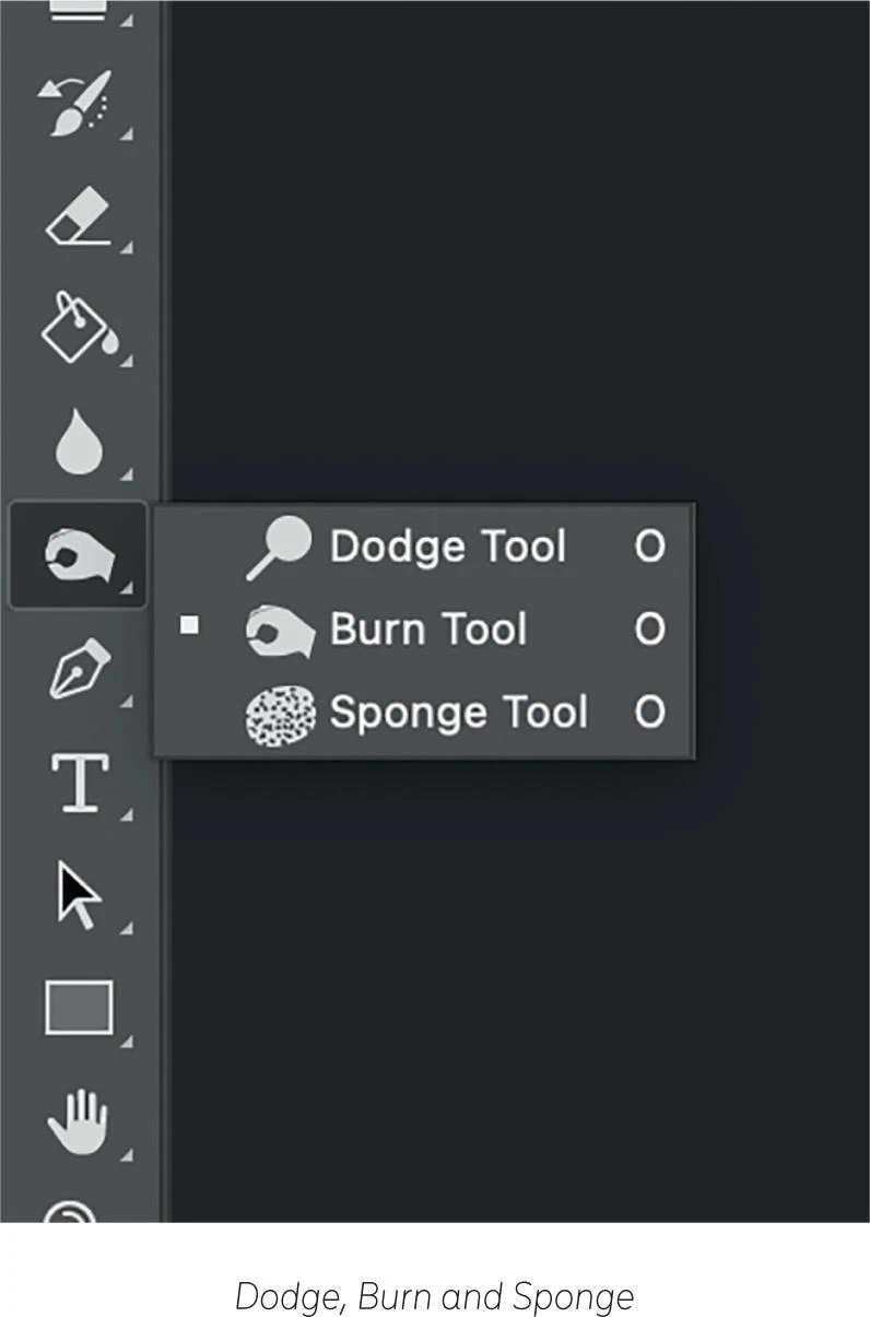
You can edit the intensity and the size of almost all the tools of the palette—use the menu that appears on the top of the window each time that you select a tool. For example, you can adjust the size of the Eraser tool to small (see ‘Adjust the size of your Eraser tool’ image) so you can be as precise as possible for detailed work—and so on for the rest of the tools.
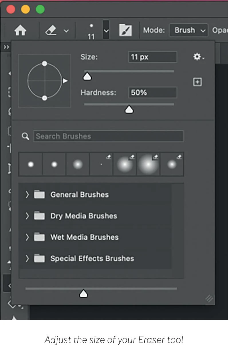
There are many other tools available, and I have only presented some of those that I use in my work. There are many more that you should explore, as you may want to incorporate them into your process. For example, try working with all the different selection tools, the brushes, the type tools to create text, and the zoom and the hand tools that you’ll soon find essential while working.
PUTTING IT ALL TOGETHER
In the sample illustration below, you’ll see the benefits of a little editing. I started with Curves and Brightness/Contrast (see Editing in photoshop) to restore the scan to the quality of the original artwork, then I cleaned up any marks. I also used the Burn tool to darken some areas, such as the inside of the skirt at the bottom of the illustration, in order to create more contrast and to better balance the whole sketch.
Mixed media
Over the pages of this book, I’ve made no secret of my love for watercolor. But although watercolor is my favorite technique by far, I’ve found pleasure in mixing media and trying out new mediums. The results can be raw and unexpected, but they have helped me experiment and achieve new goals. In fashion illustration, as in art in general, we should never stop learning and exploring, as it keeps our work fresh and exciting (see Developing Personal Style). Use all the tools now at your disposal, and get out of your comfort zone as much as you can!
ACRYLIC
Acrylic is quite an adaptable medium. It is water-soluble, but once dry becomes resistant to water, so it demands quick work. It usually has a matte value once dry, sharing some similarities to techniques like oil or watercolor. In these illustrations below, I mostly used the acrylic on the background to give more character to my work and create a contrast with the delicacy of watercolor.
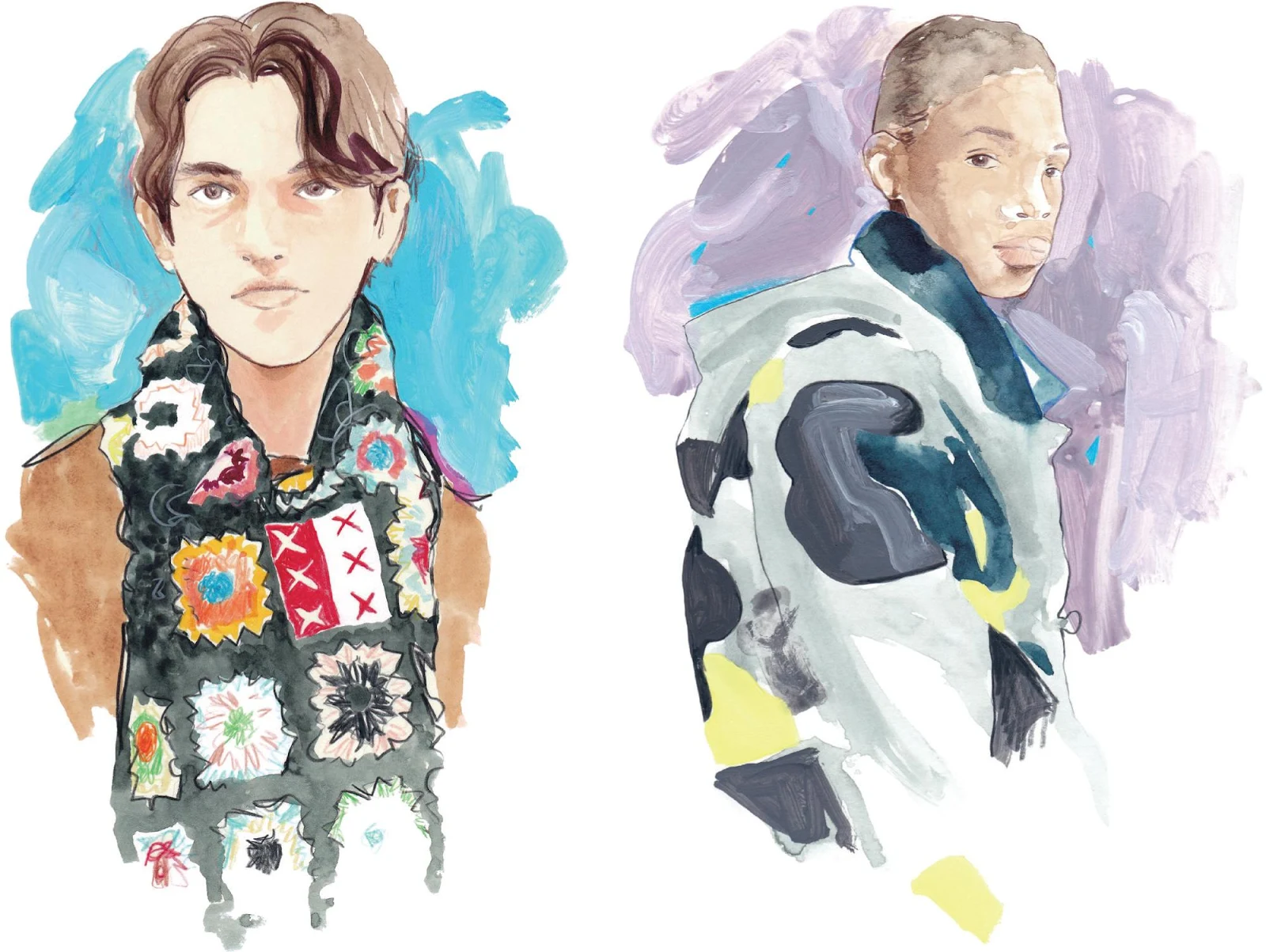
INKS
Inks work similarly to watercolors, but they can be much more playful and create very surprising results. What may really strike you is their brightness that can definitely help you reach distinctive outcomes.
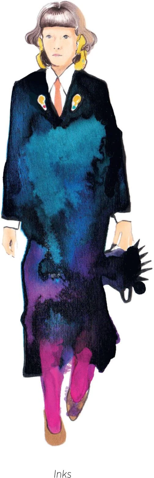
PASTELS
Uniquely versatile, soft pastels have secured a special place in the work of many artists as they can be used to create soft surfaces, but with a solid consistency. In the Pastels sketch, I applied some pastels over the watercolor in order to give more texture to the polka dots of the dress. Oil pastels are also worth mentioning—with a thicker and more dense composition, their results may be quite different from those created by soft pastels, giving new and interesting effects.
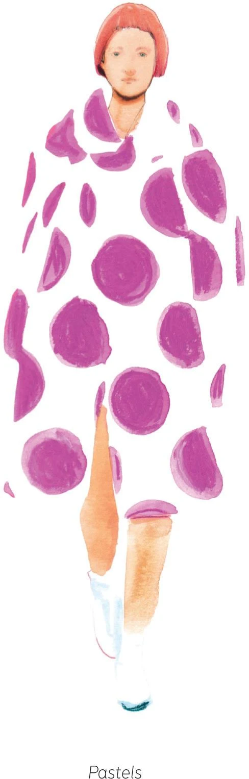
DIGITAL COLLAGE
Collage, whether it’s analog or digital, has a long history as it allows great flexibility and creativity in your work. For Collage 1—and the illustration featured on the title page of this chapter—I scanned some dried flowers, then added them to the background in Photoshop, mixing them with some splashes of watercolor.
In Collages 2 and 3, I worked in a similar way, digitally adding some pieces of fabric to the background, then blending them with the main figures.
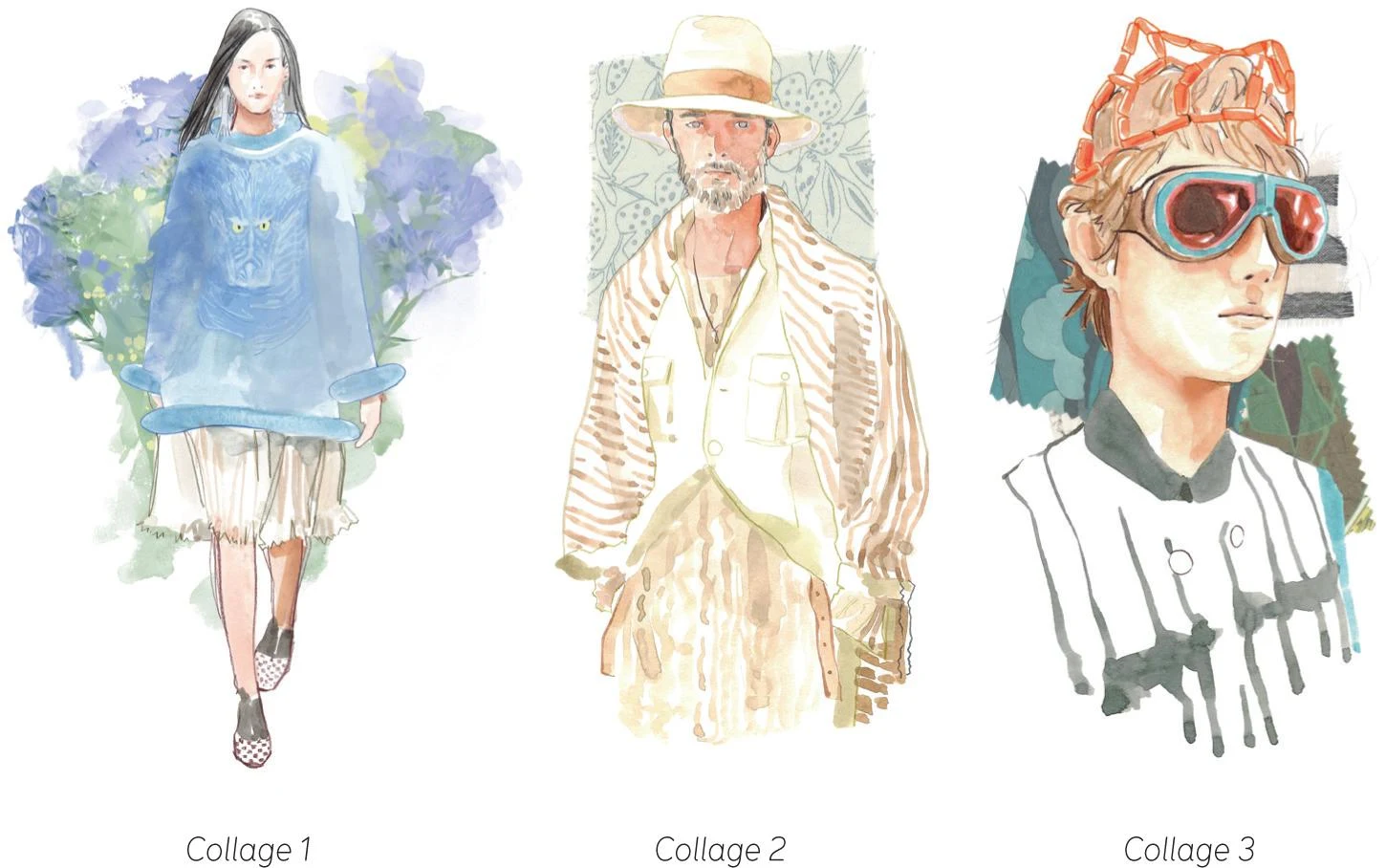
Working live
Sketching and painting live has been a huge part of my work as an illustrator. I’ve had the pleasure of working live during fashion shows and backstage at London and Paris Fashion Weeks, at exclusive events for luxury brands and corporate gatherings, and to document art performances. Working live is quite challenging, but it allows me to work in a different way and is ultimately an enriching experience. Learning how to work fast helped me develop as an artist and improved my skills generally, also informing my studio work.
Live work requires a completely different mindset to studio work, with time being the biggest difference. In particular, the chaos of backstage during a fashion show comes to mind—with makeup artists, hairstylists, and photographers all working simultaneously, it’s not always easy to find your way. At the same time, I learnt a lot, and it’s a thrilling experience. Besides, working live landed me some big projects with major fashion brands.
Challenge yourself and try out your skills as a live illustrator. Practice as much as you can in order to acquire confidence and optimize your time. Here are some tips that will make the task easier for you.
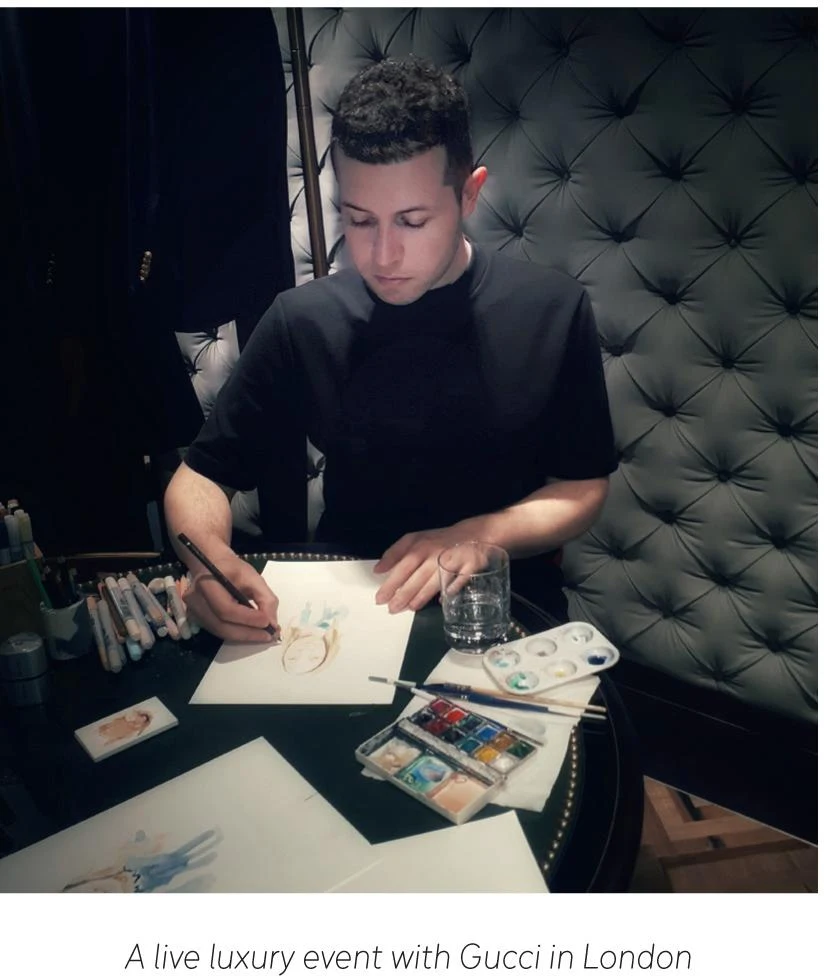
HOW TO WORK FAST
It’s worth taking a few seconds before starting your live sketch to consider the pose and choose the focus of your illustration. Visualize this in your head rather than on paper—it’s better to have a quick plan rather than none at all. The more you practice, the less time you’ll need to visualize your idea.
Taking a moment to observe will help you quickly identify the most important characteristics of your subject, whether it’s a face, a complete figure, or a garment. In a quick sketch, you won’t be able to include every detail, so these unique features are going to be the focus of your sketch. The aim is to capture an attitude—a feeling—so work toward building this into a sketch.
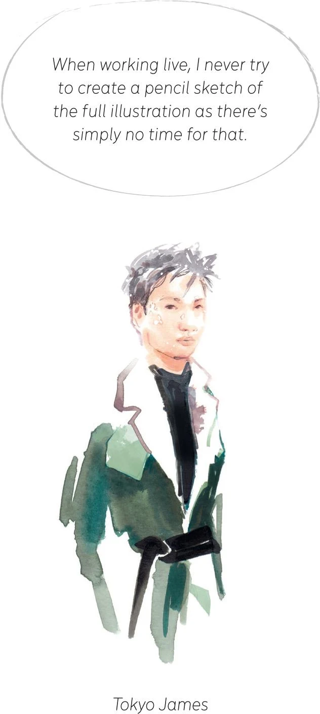
WHAT TO TAKE WITH YOU
As well as adjusting your expectations, you’ll need to reconsider your equipment and materials. As you won’t have much time, keep it simple and stick to the essentials. Only bring the materials that you use most or that you know you’ll need (sometimes a client can give some hints about a specific color palette, for example). Remember also that with watercolor you are able to mix and create any color you need in just a few moments from a basic set. It could be useful to prepare some mixes in advance, such as skin tones or anything else you feel will be necessary for a particular job.
You may want to try out some water brushes. These special brushes are equipped with a reservoir of water, so you won’t have to carry a jar of water with you, and you can also work more quickly. I rarely use water brushes in my studio, but they can be handy when working live.
Earlier on in this book, I stated that with watercolor you must be patient and let everything dry. When sketching live, however, you’ll have to rethink, as you literally won’t have the time for the drying process. When working live, I tend to use markers and pencils a little more than usual to get around this.
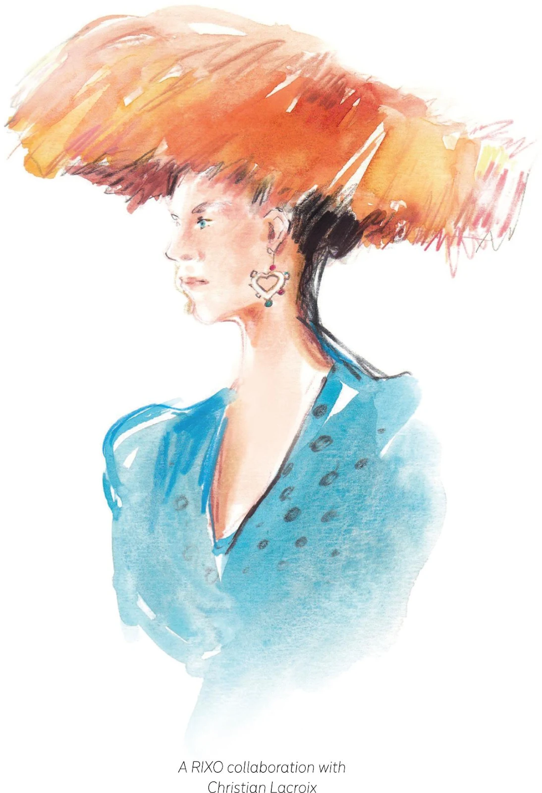
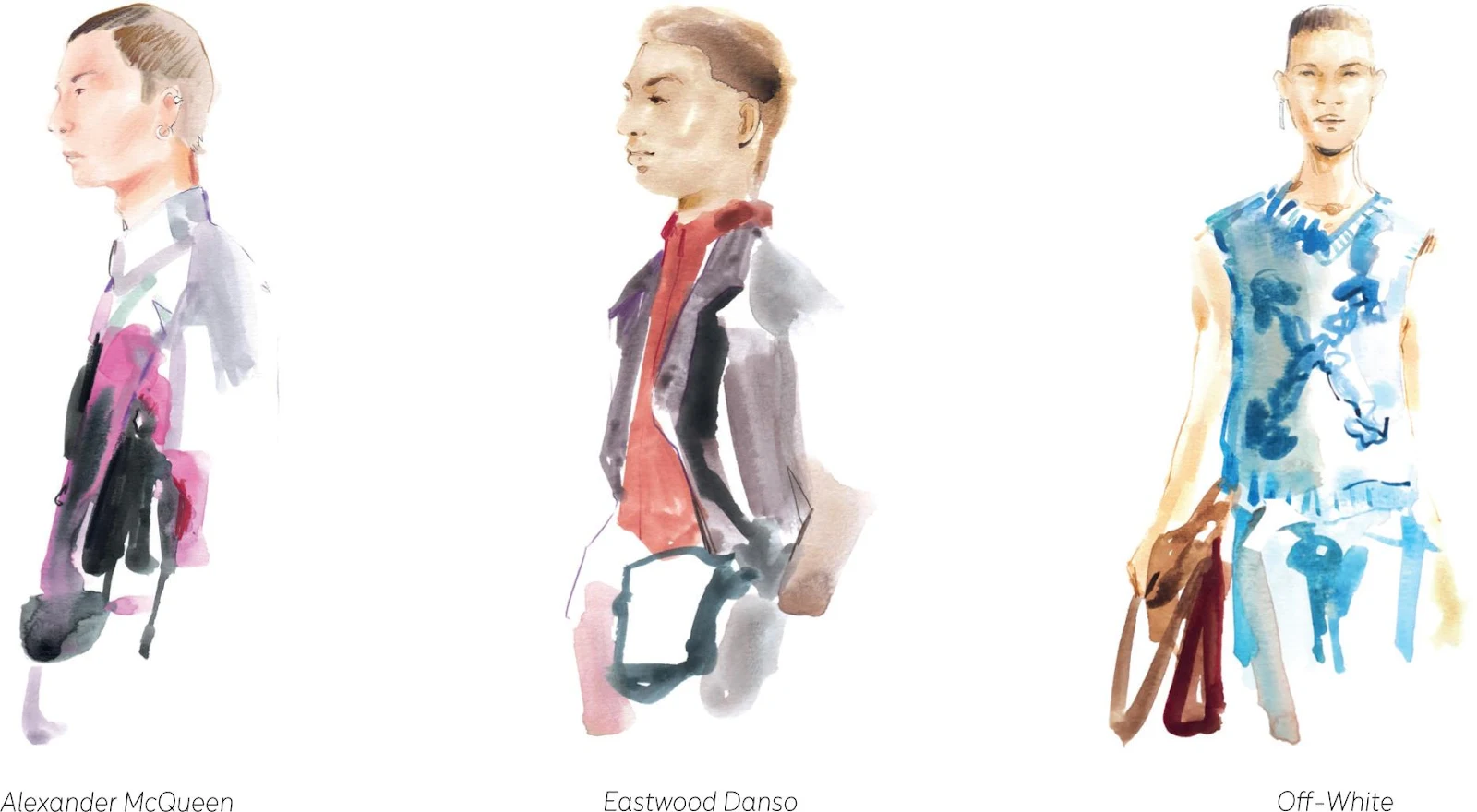
STRIPPED BACK RESULTS
All the sketches on this and the previous pages were created within minutes during fashion shows or backstage. As you can see, they are more essential than my studio illustrations, but the results are also fresher, which has a value all of its own. I’ve worked quickly, with speedy brush strokes, accepting any imperfections and focusing on the result rather than dwelling on details, perhaps with the exception of the faces.
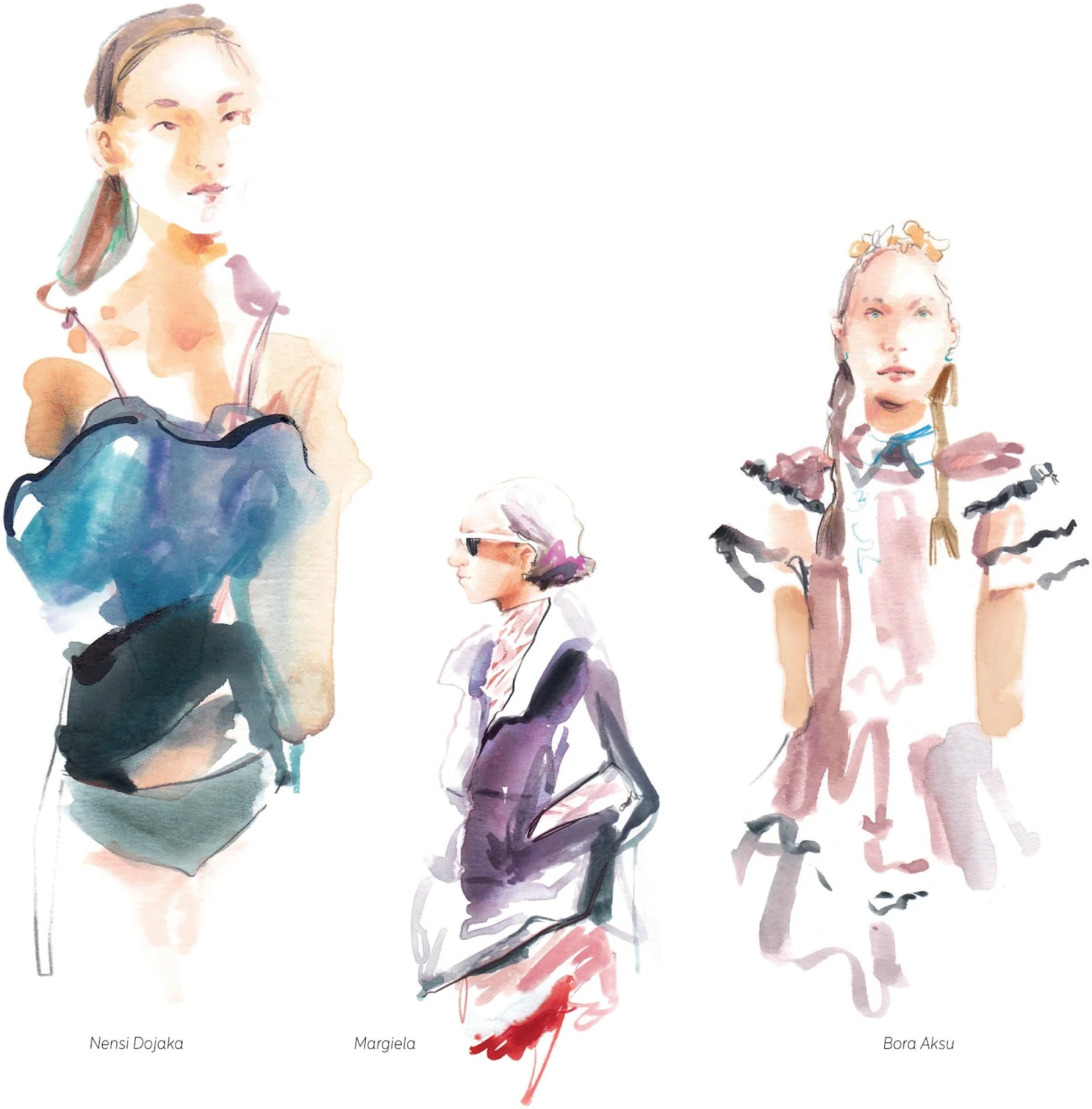
Developing personal style
Finding your style will become important to you as an artist and illustrator, especially when starting out in business. Having a personal style allows you to develop professionally. It’s what makes you unique, helping you stand out from other illustrators so that people may start requiring your services specifically.
Finding your style is like finding your voice. It’s a mix of many things—it could be a particular color palette; the object, nature, and focus of your work; some recurring themes; or a distinctive way of drawing and stylizing figures, shapes, and textures. Mediums and techniques can sometimes help you find or define your style. They can help you along the way, like learning by trial and error and then selecting what makes you spark.
From my perspective, practice is, once again, the foundation for finding your style. Keep drawing and sketching—be curious, be open, look around you, and observe the work of the masters and contemporary artists. This doesn’t mean you should merely copy someone else, but their work will help you understand things and see how to solve certain issues. Drawing from life is also a good way to train yourself.
Another point worth mentioning is that your style shouldn’t be fixed and invariable. It will evolve along with your practice and personality, adapting to your ever-growing taste. I wouldn’t be happy if my style was to be the same in ten years’ time; I like to think that my style keeps developing. I enjoy looking back at my old work and seeing how I’ve overcome its flaws and enhanced its merits. I can then keep pushing further.
I hope the pages of this book have given you a fresh take on watercolor and fashion illustration, helping you explore your creativity, expand your vision, and ultimately thrive as an illustrator.
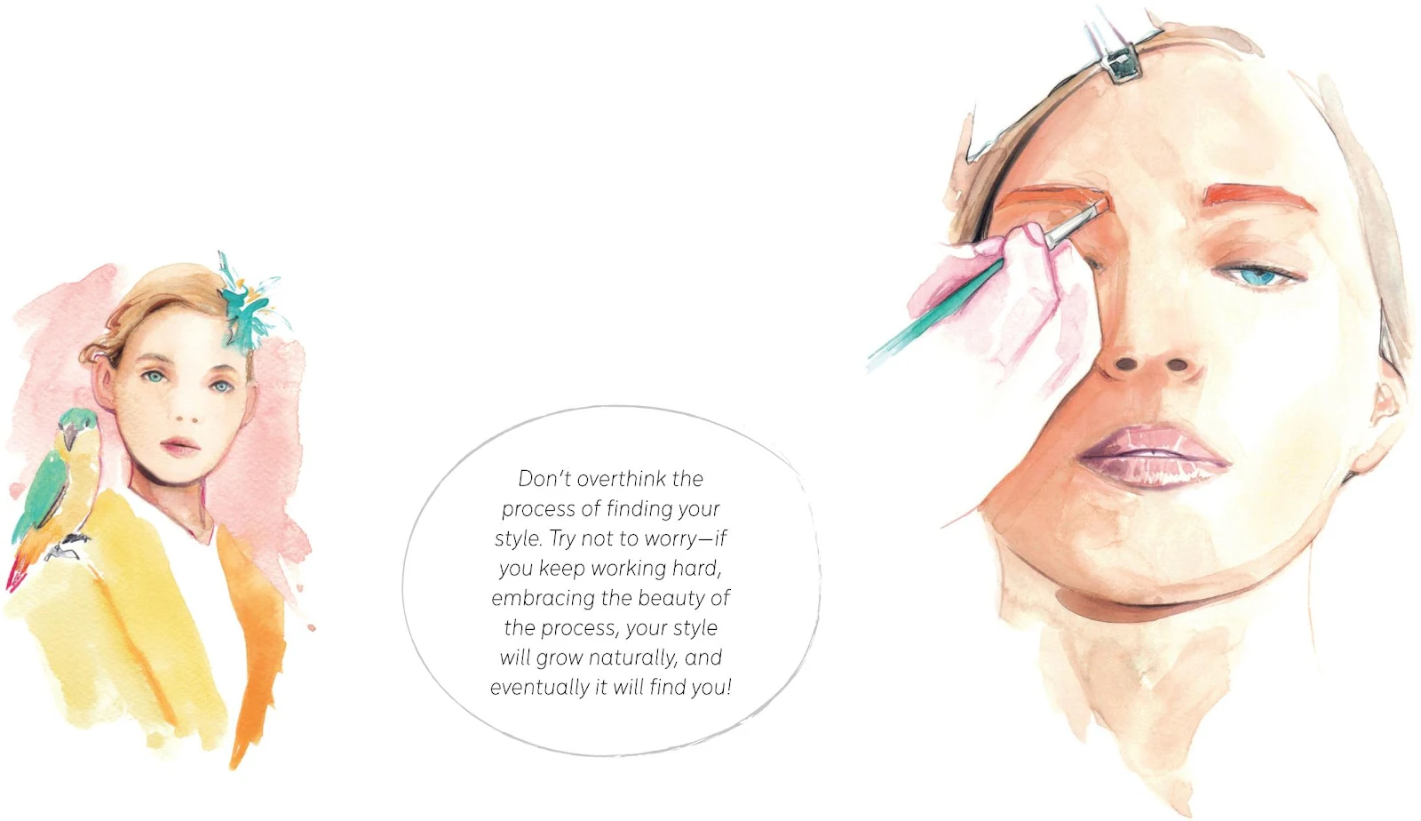
About the author
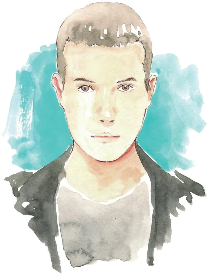
Francesco Lo Iacono’s career as a full-time fashion illustrator has taken him from Palermo to Paris, where he worked for a trend-forecasting agency, and he is currently based in London. He usually works from his home studio or at the shows during Fashion Week, where he sketches live backstage or on the catwalks for the likes of JW Anderson, Off-White and Loewe. Francesco has worked with a wide range of clients, including fashion designers, high-end department stores, and fashion magazines—for Dior, Louis Vuitton, Gucci, Fendi, REDValentino, Bottega Veneta, Vogue Japan, Salvatore Ferragamo, Ted Baker, L’Officiel Italia, Paul Smith, rag & bone, Paris Fashion Week, CFDA, Selfridges, Harvey Nichols, and more. He has also been one of the judges for the first three editions of the Fashion Illustration Drawing Awards (Fida).
Visit www.francescoloiacono.com or check his Instagram @franloiacono to see more of his work, and feel free to tag him whenever you refer to one of the projects in this book.
Acknowledgements
For the exercises and tutorials in this book, I’ve used Winsor&Newton for the watercolors, Faber-Castell for the colored pencils, and Copic Ciao markers.
I would like to warmly thank:
Ame Verso for first believing in me, Claire Coakley for looking after this book, and everyone at David and Charles who worked on this project with such great care and attention.
Marie-Claire Westover, my agent, for always having my back and for her precious help.
Patrick Morgan, for kindly writing the foreword and for highlighting the value of fashion illustration.
My family, and my parents in particular, who have always been there for me.
My French family and particularly Odile for her sincere enthusiasm.
Antonella, Elena, and Gilda for their friendship and steady encouragement.
Everyone who has been supporting my work over the years making this possible and everyone who is joining my journey starting with this book.
Patrice, most importantly, for trusting in me and for being so very supportive and patient during this whole process and for my career over the past years.
A DAVID AND CHARLES BOOK
© David and Charles, Ltd 2021
David and Charles is an imprint of David and Charles, Ltd
Suite A, Tourism House, Pynes Hill, Exeter, EX2 5WS
Metin ve Tasarımlar © Francesco Lo Iacono 2021
Düzen ve Fotoğrafçılık © David and Charles, Ltd 2021
İlk olarak 2021'de İngiltere ve ABD'de yayınlandı
Francesco Lo Iacono, 1988 tarihli Telif Hakkı, Tasarımlar ve Patentler Yasası uyarınca bu çalışmanın yazarı olarak belirtilme hakkını ileri sürmüştür.
Her hakkı saklıdır. Bu yayının hiçbir kısmı, yayıncının önceden yazılı izni alınmaksızın, elektronik veya mekanik olarak, fotokopi, kayıt veya başka bir şekilde hiçbir biçimde veya hiçbir yöntemle çoğaltılamaz.
Okuyucuların bu kitaptaki tasarımlardan herhangi birini kişisel kullanımları için ve yayıncının önceden izni olmaksızın çoğaltmalarına izin verilmektedir. Ancak bu kitaptaki tasarımların telif hakkı saklıdır ve yeniden satış amacıyla çoğaltılamaz .
Yazar ve yayıncı, kitaptaki tüm talimatların doğru ve güvenli olmasını sağlamak için her türlü çabayı göstermiştir ve bu nedenle, ne şekilde ortaya çıkarsa çıksın, kişi veya mallarda meydana gelebilecek herhangi bir yaralanma, hasar veya kayıptan dolayı sorumluluk kabul edemez.
Üretici isimleri ve ürün çeşitleri, telif hakkı veya ticari markaları ihlal etme amacı gütmeden okuyucuların bilgisine sunulmaktadır.
Bu kitabın katalog kaydı Britanya Kütüphanesi'nde mevcuttur.
ISBN-13: 9781446308738 ciltsiz
ISBN-13: 9781446380826 EPUB
Resim telif hakkı
Fotoğraf sayfa 12 © 2021 Alberto Romano
